Line25 is reader supported. At no cost to you a commission from sponsors may be earned when a purchase is made via links on the site. Learn more
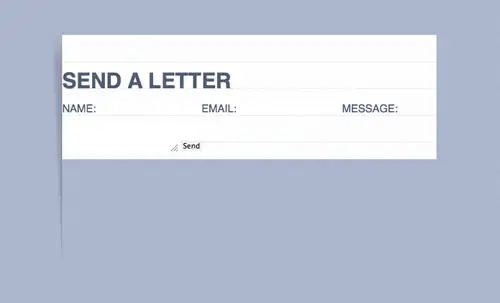
Follow this step by step tutorial to create a traditional pen & paper inspired contact form in HTML and CSS. We’ll use a mix of basic and intermediate CSS techinques to give the form the appearance of a letter, then use the @font-face CSS property to transform the digital text into handwriting.
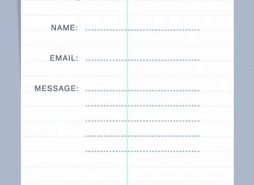
The form we’re creating is styled with a lined background texture and a subtle shadow to give the impression of a paper sheet. The title and form fields will be styled as digital text, but instead of using rectangular form fields we’ll create dotted lines with a cursive font to give the appearance of a handwritten letter.
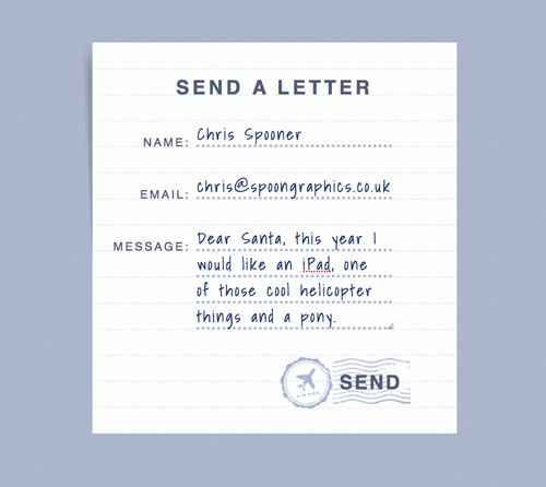
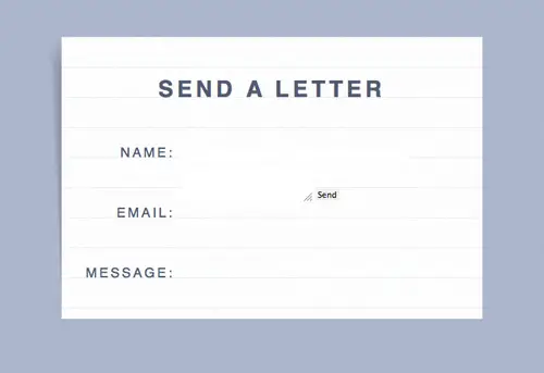
View the letter style contact form demo
The Photoshop concept
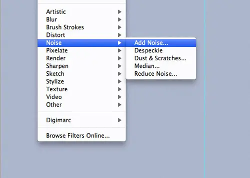
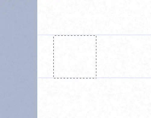
Before getting started with any coding I like to create a Photoshop concept to gain an initial idea of how the design will look. Start by giving the background a subtle Noise overlay with settings of 2% Uniform, Monochromatic.
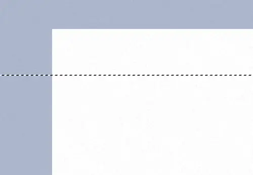
Draw a white rectangle in the centre of the canvas then fill a 1px horizontal line with a light blue colour to replicate the pattern found on lined paper pads.
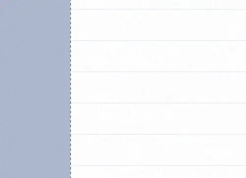
Hold ALT and hit the cursor keys to make a duplicate, then hold Shift and move the duplicated line 4 times (40px) to create a full page of lined paper.
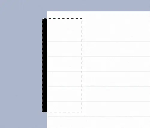
Fill a black rectangle on a layer underneath the main page. This will be the base of our subtle page curl shadow.
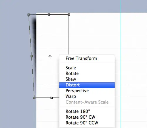
Give the rectangle a Gaussian Blur, then press CMD+T to transform the shape. Right click and select Distort in order to hide the bottom corner behind the main page.
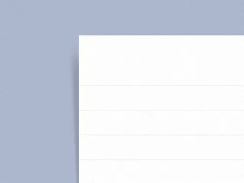
Reduce the opacity of the shadow to finish off the page curl effect.
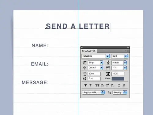
Use typical font styling to create the printed portions of the letter. Make sure each text item is aligned to the baseline grid created by the lined pattern.
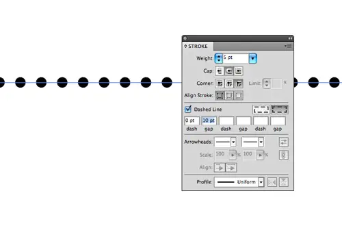
Switch over to Adobe Illustrator in order to create a dotted line effect. Illustrator’s Stroke tool makes it easy to create a series of circular dots by adjusting the Dash and Round cap settings.
Paste the lines back into the Photoshop document and align them according to the baseline grid.
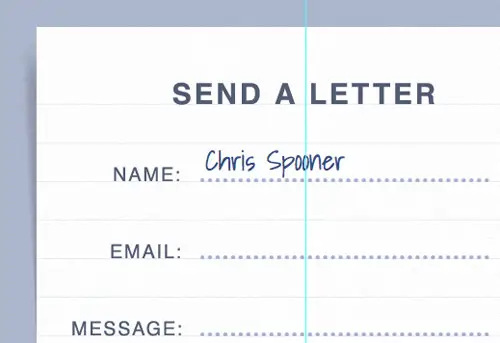
The font styling within the form fields will be created with a handwritten font to give the appearance of a traditional pen & paper based letter. We’ll use Google Fonts to do this in CSS, so for now paste in some placeholder text.
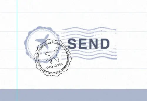
Use a set of postage mark Photoshop brushes to style the send button to relate to the traditional handwritten letter theme.
Once the PSD concept is complete image graphics can be exported for use in the HTML/CSS version. Draw selections to create repeating swatches of the textured and patterned backgrounds.
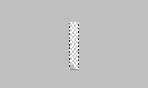
Make sure an area of white space is included in the dotted image graphic in order to preserve the spacing and line height when the file is repeated.
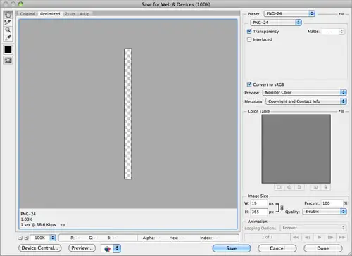
Export any graphics that require a transparent background as PNG-24 images so they can be overlaid on the backgrounds without issue.
The HTML Structure
<!DOCTYPE html> <html> <head> <meta charset="utf-8" /> <title>Pen & Paper Form</title> <link href="style.css" rel="stylesheet" /> </head> <body> <div id="container"> </div> </body> </html>
Create a new HTML document and enter the basic structure of a HTML5 page, including the Doctype, page title, link to the CSS stylesheet and a simple container div to house our form.
<h1>Send a Letter</h1>

<form action="" method="post">
	<fieldset>
		<label for="name">Name:</label>
		<input type="text" id="name" name="name" />

		<label for="email">Email:</label>
		<input type="email" id="email" name="email" />

		<label for="message">Message:</label>
		<textarea id="message" name="message"></textarea>

		<input type="submit" id="send" value="Send" />

	</fieldset>
</form>
Type out the elements to create the overall form. The new HTML5 type="email" attribute can be used on the second form field, but otherwise the syntax is basic HTML. Make sure your labels correspond to the ID of each input for extra accessibility and usability points.
The CSS Styling
body, div, h1, form, fieldset, input, textarea {
	margin: 0; padding: 0; border: 0; outline: none;
}

body {
	background: #abb5cb url(blue-bg.png);
	font-family: Helvetica, Sans-Serif; color: #525c73;
	line-height: 40px; text-transform: uppercase;
}


#container {
	width: 560px; margin: 100px auto; padding: 51px 0 0 0;
	background: url(lines.png); position: relative;
}
	#container:before {
		content: ""; width: 19px; height: 365px; position: absolute; left: -19px; top: 0;
		background: url(shadow.png);
	}
The CSS file begins with a simple reset to remove any browser default styling, then the overall page styling can be added to the body. The #container div is transformed into the paper page with the help of the lined background image, then the shadow is added with the help of the :before selector. Absolute positioning is used to shift the shadow to the left of the main page so it aligns correctly.
h1 {
	font-size: 30px;
	text-align: center; letter-spacing: 5px;
	margin: 0 0 44px 0;
}

label {
	width: 150px; display: block;
	text-align: right; float: left;
	font-size: 18px; letter-spacing: 3px;
	margin: 0 10px 40px 0; clear: left;
}
Next up in the CSS is the styling of the printed or digital text. The Helvetica font family and colour is specified back in the body declarations, so all that’s left is to set the font sizing and to add some letter spacing to match the Photoshop concept. Adjust the margin under the header to keep everything aligned to the baseline and use a specific width on the labels so they all align flush to the right.
input {
	width: 300px; height: 40px; float: left; margin: -14px 0 0 0;
	background: url(dots.png);
	font-family: 'Shadows Into Light', cursive;
	font-size: 24px; color: #18326d; letter-spacing: 3px;
}

textarea {
	width: 300px; height: 200px; float: left; margin: -14px 0 40px 0;
	background: url(dots.png);
	font-family: 'Shadows Into Light', cursive;
	font-size: 24px; color: #18326d; letter-spacing: 3px;
}
The styling for the input fields begins as normal with a specific width and height, but instead of an outlined rectangle our fields are converted into dotted lines with the help of the dotted background image. The white space included in the image will allow the inputs and texarea elements to expand to any size. Grab the @font-face code from the Google Web Fonts page for Shadows Into Light and add it to the CSS to convert the input text into handwriting then adjust the margin to align the text above the dotted line.
input#send {
	width: 202px; height: 84px; float: right;
	margin: 0 70px 36px 0; padding: 0 0 0 77px;
	background: url(post-mark.png);
	font: bold 30px Helvetica, Sans-Serif; text-transform: uppercase; color: #525c73;
	cursor: pointer;
}
The final portion of CSS styles up the Send button. Currenly this input element is being styled by the generic input CSS declarations, so some properties need to be reverted. Otherwise the main graphic is added as a background image and the whole element is moved into place with margins.
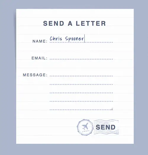
UPDATE! Auto-Expanding Textarea

James Seymour-Lock made a great suggestion on Twitter that the textarea should expand as the user types in order to hide the ugly scroll bar. Why didn’t I think of that?!
$(document).ready(function() {
	$('textarea#message').autoResize();
});
This cool functionality can be easily added with the help of a ready made jQuery plugin. jQuery.fn.autoResize provides the exact effect we need. Add the script files to the head of the HTML file and activate the jQuery plugin.
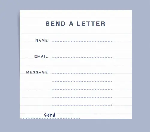
The Final HTML/CSS Form
This leaves the styling of our handwritten letter inspired form complete. The lined background image and page curl shadow give the appearance of an actual sheet of paper, whereas the dotted lines and handwriting font styling replicate how printed forms are filled out in real life.
Comments are closed.