Line25 is reader supported. At no cost to you a commission from sponsors may be earned when a purchase is made via links on the site. Learn more
Throughout the year I’ve showcased my favorite website designs findings in the Line25 Sites of the Week roundups. This special near-end of year post showcases the best of the best, pulling together the best website designs of 2018 into one showcase of super cool sites.
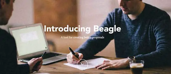
Beagle
Beagle website is a great example of a responsive web design and has an elegant and interactive website layout.
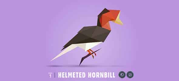
Species-in-pieces
This website aims to raise awareness about 30 endangered species in an interactive and creative way.
A Quest
This digital agency is formed of a very experienced multidisciplinary team and has quite a classy website.
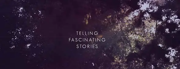
Who We Are
This website tells the story of each of Blacknegative’s fascinating projects. They use a creative slideshow layout for their portfolio.
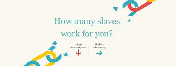
Slavery Footprint
This is yet another website that focuses on raising awareness, this time on slavery. It uses an interactive design that makes readers wonder about the things they have and do.
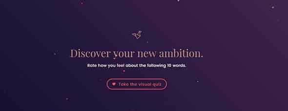
Unpigeon
Take a look at Unpigeon’s website. They use powerful and interactive visuals to help people discover new ambitions.
Jordan Sowers
This website uses a centered vertical slideshow before laying out any other content. This is also a business card website for Jordan Sowers.
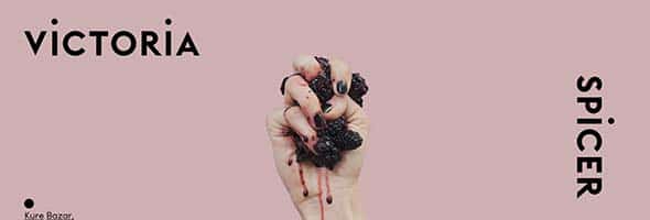
Vspicer
Victoria Spicer’s website uses powerful images in a very creative way to present content to their readers.
Emmitfenn
This is a music portfolio presented in a very creative way through their web design layout.
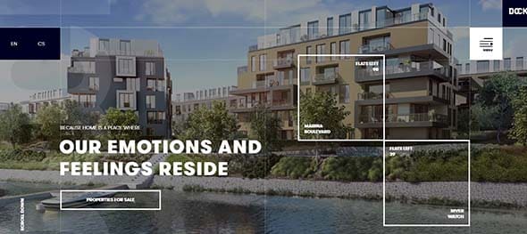
Dock
This website has a very friendly and dynamic interface and focuses on presenting their for-sale properties.
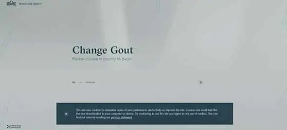
Changegout
This is yet another interactive website example that I believe is amongst the best of this year. Check it out to find out whether we think the same about Gout.
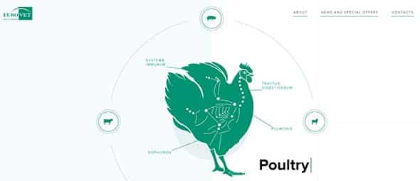
Vet
This is the presentation website of a veterinary products developer and distributor with quite an awesome website. This website could serve as inspiration for your next project thanks to its innovative idea of web design layout.
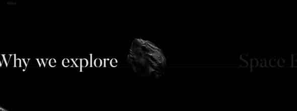
Space.vanderlanth
This horizontal website talks about space exploration using a dark background and a linear way of presenting content.
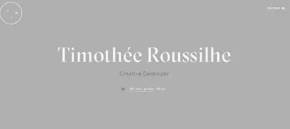
Tim Roussilhe
Tim Roussilhe’s website is a modern and classy example of a creative developer’s portfolio. It has a simple, minimalist design.
The Feebles
The Feebles has a colorful and playful website layout. They also have a lot of experience in creative businesses.
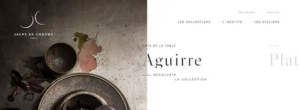
jaunedechrome
Jaune de Chrome is yet another example of a minimalist and sensitive web design that can serve as good inspiration for your next project.
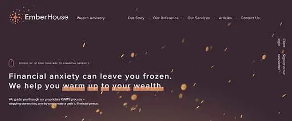
Emberhouse
They offer good solutions for your problems and they have an amazing interface. They use typography and animations to present content.
Flavinsky
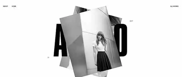
This website presents a portfolio or works done by Flavien Guilbaud in a creative way through a vertical slideshow.
Biron
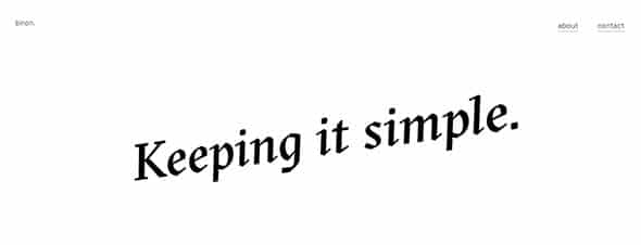
This website belongs to a freelance digital designer called Chris Biron and his web design layout keeps it simple and nice.
Daoust Lestage
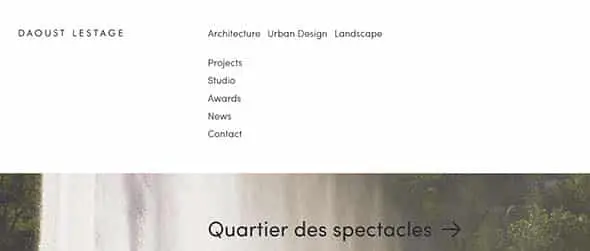
This is Daoust Lestage architecture portfolio. His works are presented as a slideshow that also uses typography.
Narrow Design
This is quite an interesting example of an interactive website. Narrow Design’s website layout uses geometry as its main creative motif.
Agence-belle-epoque
Agence-belle-epoque is yet another example of a sensitive web design layout that focuses on images and typography to present content.
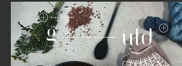
G-uld
This shop’s website uses images, typography, and colors to present its content in a creative and original way.
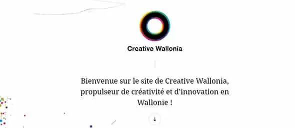
Creative Wallonia
Their website lets you discover step by step everything there is to know about Creative Wallonia.
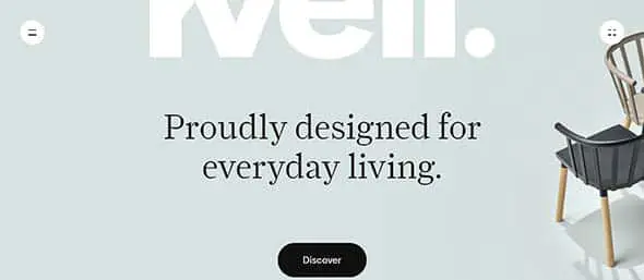
Kvellhome
Kvell focuses on creating functional and easily attainable design for everyone and their website surely expresses creativity and design experience.
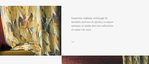
Casamance
They sell elegant home decor products and their website expresses their affinity for sensitive design.
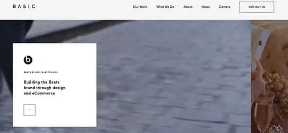
Basic Agency
Basic is a strategic agency for brands and has a really cool interface for their website. Their online presence is based on a simple yet creative web design layout.
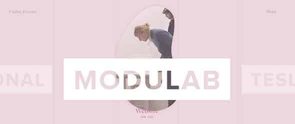
Cedric Pereira
They use a pink palette of colors for their web design layout that gives their site a sensitive and feminine touch.
Vyctoire
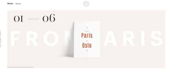
This website belongs to a graphic designer from Paris and he has a well-thought and designed page that proves his vast experience in this line of work.
P22
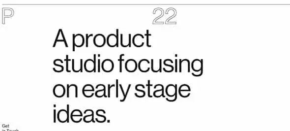
P22 is made of a team of people interested in technology and design and their website uses a lot of typography and animations.
Size
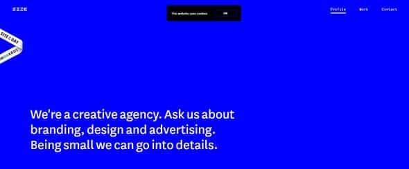
They’re a creative agency and their website uses bold and artistic horizontal bands on which they placed content.
Wokine
Wokine is a digital agency whose website has a very friendly interface that uses vertical scrolling, a large range of colors and typography to present content.
We3.jam3
They focus on growing bright minds whether they’re interested in design or web development. If you’re interested you should definitely have a look on their website.
Merci-Michel
Merci-Michel is formed of a team of digital experts and their website uses a lot of animation clips, illustrations and typography to present content in a creative and innovative way.
Norgram
Norgram’s website focuses on presenting a portfolio of works done by their design studio.
Yatzer
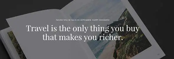
If you’re out of ideas for your next trip you should take a look on this amazing website that will surely help you find the best location for your vacation.
Bigyouth
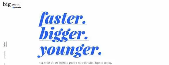
They use bright colors, animations, and typography to present themselves as a digital agency that’s full of experience.
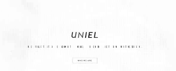
Uniel
This is yet another good example of a creative use of typography and animations and their website might even serve as a good source of inspiration for your next project.
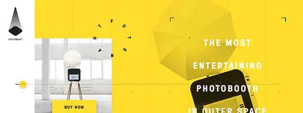
The Fotonaut
They have a colorful and really friendly interface that makes you rethink the way you’ve been designing up until now.
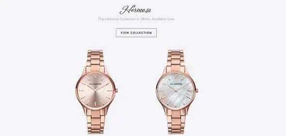
Paul Valentine
Paul Valentine’s website has an elegant web design layout that best suits their beautiful products.
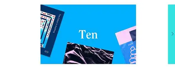
10×16
This is a selection of 1o artistic albums chosen by 16 artists all brought up into a cool website with a minimalist design that only focuses on presenting the project gallery.
Helloheco
This is yet another good example of an interactive website that uses vertical scrolling and animations to present content to their readers.
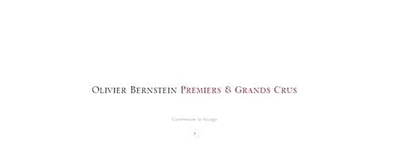
Olivier Bernstein
This horizontal website presents a gallery of images in a minimalist and elegant way. They also use a calming background music.
akita.co.uk
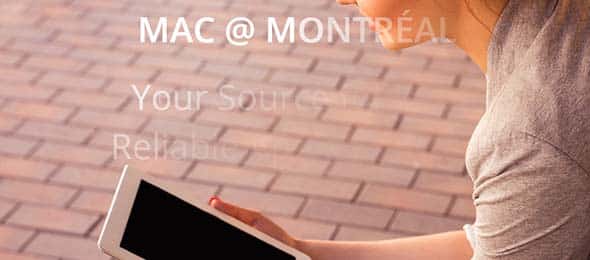
MacaMontreal.com
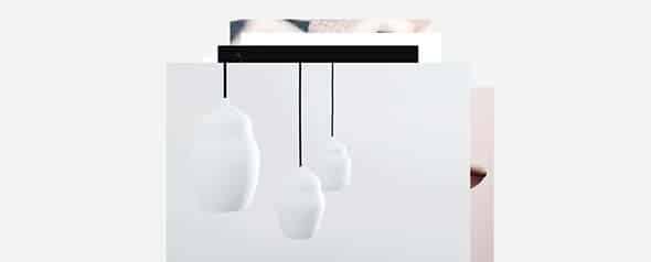
siscottstudio.com
Dribbble
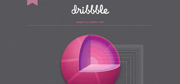
Dribbble comprises all the content related to creativity and technology in one site. This website uses a gray millimetric paper for its background and a pink palette for content, giving it a really friendly and familiar look.
Imagemechanics
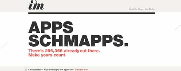
They focus on creating apps and their website uses a huge typography on a horizontal band to point out important content.
Teixido
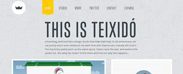
This is another example I find interesting. Teixido uses a light grey grungy texture to give the website a more familiar look and a tactile experience for the readers.
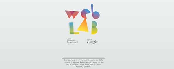
Chromeweblab
They also have a light gray texture that makes their colorful logo stand out. They have an elegant yet friendly interface.
Twlvr
They use a dark background that gives their website a more formal interface. They also use soundtracks, images and typography to layout content.
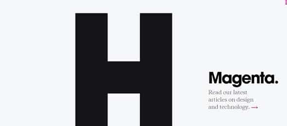
Hugeinc
Did you know there were so many ways to design a creative ‘H’. If not you should definitely check out this cool website and who knows, maybe it will be your net project’s inspiration.
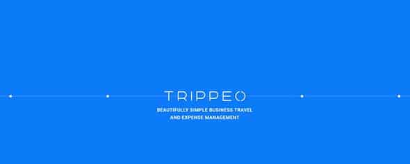
Trippeo
Their aim is to manage all your business and travel expenses and they have a cool and interactive website that uses bold colors, animations, and typography.
DNA
This website presents a music experiment in a creative way. It uses background sounds, images and typography to create a really calming environment.
Legworkstudio
This is yet another example of a website that thrives on creativity. They’re an experienced multidisciplinary team and their website proves it.
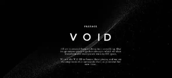
Void
Void has a really cool and interactive website that you don’t want to miss. Check it out to see exactly how creative a site could get.
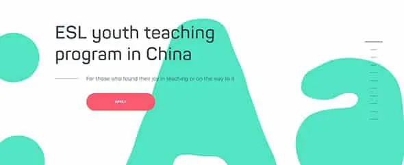
Eslglobal-edu
This friendly interfaced website focuses on presenting a youth teaching program in China through an animated colorful background and typography.
Superduper
They’re a full-service design studio and their website has a dynamic interface thanks to colors, animations and a good choice in typography.
Okakin
This website uses an animated horizontal band full of Chinese typography and grid-type gallery to present content.
District0x
This website uses bold colors and animations to create a friendly and interactive interface for themselves.
SHIFT
Their page uses an intro with short clips of some of their projects while the rest of the website uses a minimalist design and illustrations to present their portfolio.
Pentagram
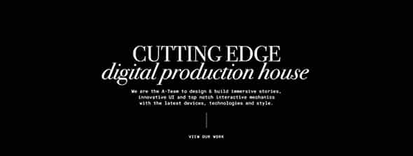
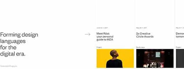
Pentagram is a design company whose website presents a lot of content through images, texts and so much more.
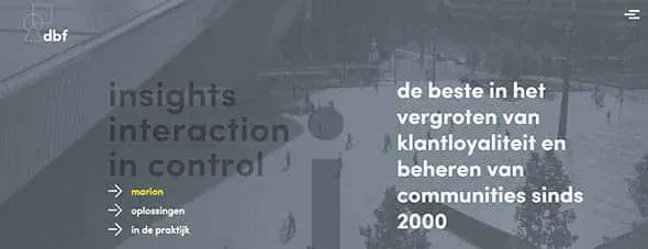
DBF
They’re loyalty experts and they have a colorful and dynamic interface for their website. Check out their website and find out more or simply get inspired by their web design layout.
Rainforestfoods
This website focuses on raising awareness about rain forests which are believed to exist to help man and nature take care of each other. They have an interactive site that uses powerful images for its background.






Comments are closed.