Line25 is reader supported. At no cost to you a commission from sponsors may be earned when a purchase is made via links on the site. Learn more
Red is a vibrant hue that color theorists suggest represents love, anger and in some cultures, happiness, but how is it used in web design? The color red in its many variants seems to be a popular choice with web designers.
In today’s showcase, we take a look at 35 great international examples of red usage in web design. See how this color is used in each design and more interestingly which other colors it is paired with to create striking color schemes.
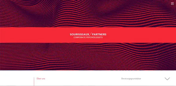
Sourisse Aux Partners
This is a simple red website design with a minimalist design and a large textured image on the homepage.
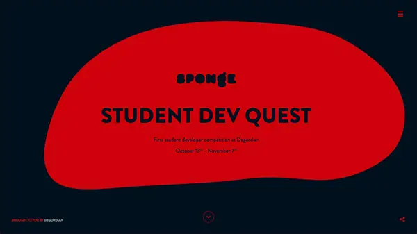
Student Dev Quest
Do you want to go on an epic quest to uncover the magic of coding? Seize the chance to learn about web development and get a scholarship on this awesome website!
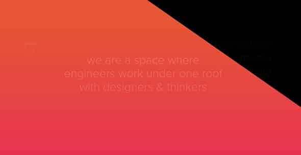
Airnauts
This is a creative one-page website which has a unique layout and an angled, geometry photo overlay which adds dynamism to the design. It uses bright red colors to catch your attention.
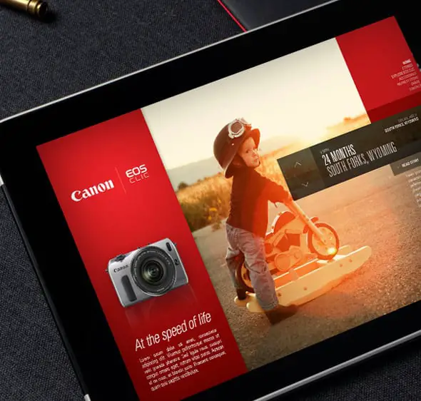
Canon EOS-M / Campaign Microsite
This is the design of the Canon EOS-M campaign. It uses red as an accent color.
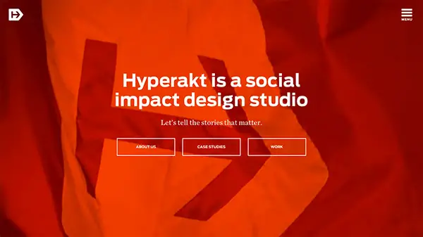
Hyperakt
Hyperakt is a social impact design agency and this is their presentation website. It makes use of bold colors paired with white and fullscreen images and videos.
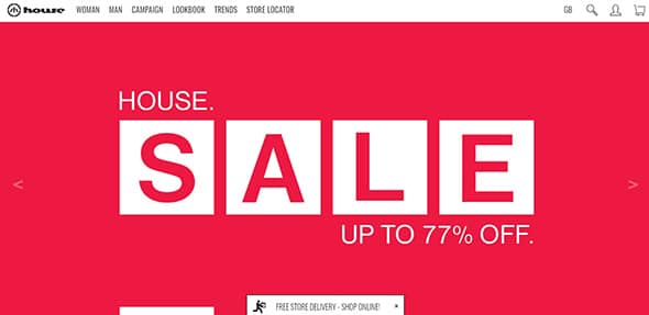
House
You can quickly get your visitors attention by showcasing a big red message. This is a great example which includes a big sales message and a bright eye-catching background color.
Brand Aid
Brand Aid is a creative agency focused on creating unique promotional products for companies. Their presentation website uses a bright red-orange color as an accent.
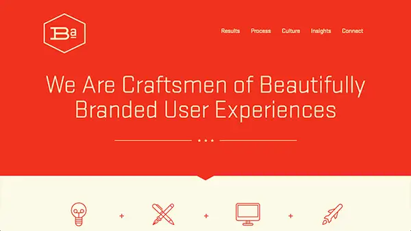
This bold design will definitely get your attention with the help of the colored background and the big heading.
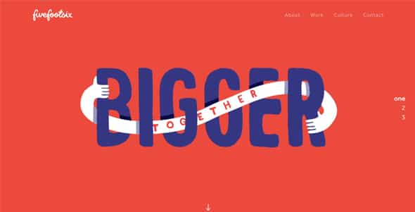
Fivefootsix
This is a beautiful site where the web designer used a full-screen typography animation to capture the visitor’s attention.
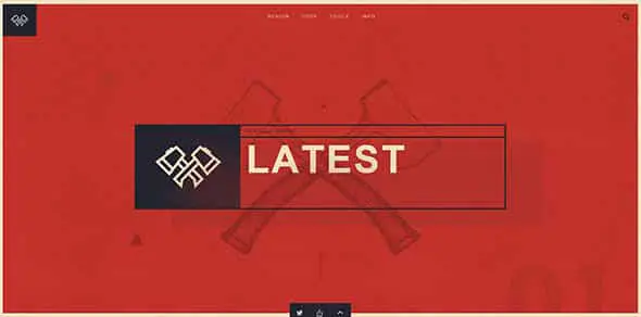
Web Design Field Manual
This website offers a curated resource for web creators. It combines illustrations with dark, red colors and beautiful transitions.
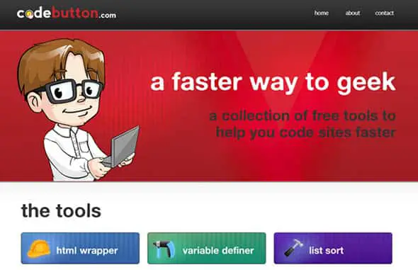
CodeButton
Codebutton.com provides free tools for web developers to speed up the process of performing mundane web development tasks.
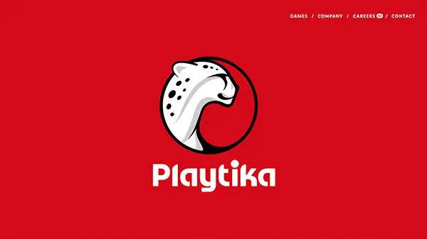
Playtika
Playtika captivates audiences with beautifully produced, highly immersive social games.
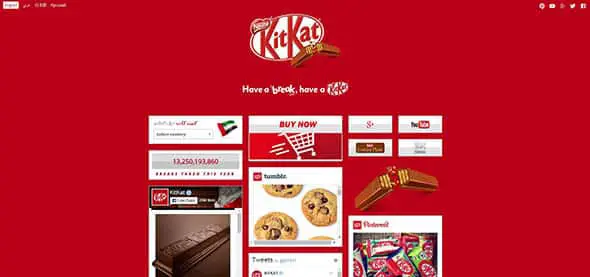
KitKat
This is the website of the popular KitKat. As the product’s branding, this website is all red.
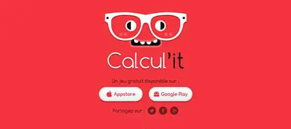
Calcul’it
Calcul’it is a fun game where you must find the various operations of a calculation. This is their presentation website which matches the branding of the app.
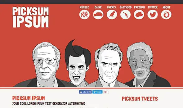
Picksum Ipsum
Do you love movies as much as websites? This movie text generator gives you an alternative to lorem ipsum & allows you to generate quotes for your website.
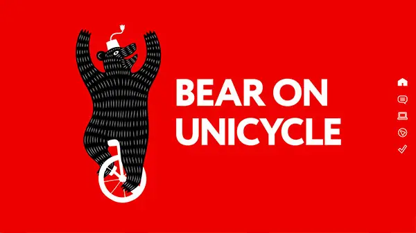
Bear On Unicycle
This is the presentation website for a design studio which specializes in web design and developing websites, and also graphic design and branding.
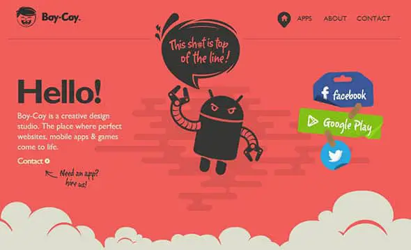
Boy-Coy
Boy-Coy is a creative design studio where perfect websites, mobile apps & games come to life. Their website design perfectly combines illustrations with bold, red colors.
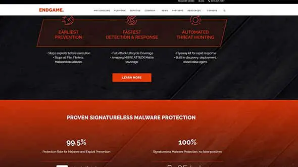
Endgame
This company offers endpoint protection built to stop advanced attacks before damage and loss occurs. Their website is not entirely red, but has plenty of red-orange accents in it.
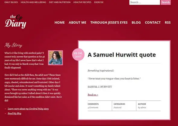
The CP Diary
The CP Diary is a blog by someone with Cerebral Palsy, covering Health and Wellbeing, Diet and Nutrition, Alternative Therapies, Exercise and more. It has a dark, burgundy background and pink accents.
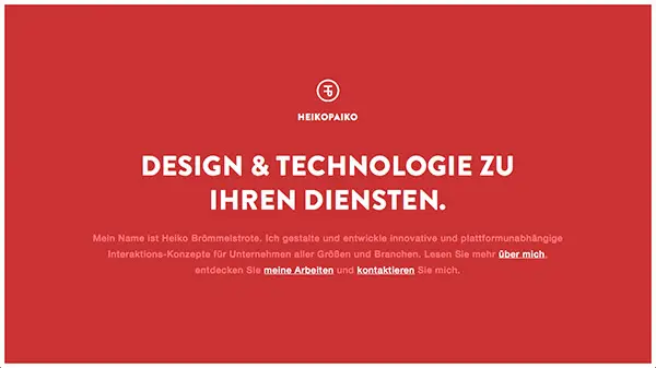
HEIKOPAIKO
This is a gorgeous responsive one page portfolio for German designer Heiko Brömmelstrote. It has a deep, red background we love.
Syropia
Syropia is a one-man design & development studio, focused on crafting elegant web experiences. They use large, red graphic elements all over their website.
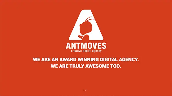
AntMoves
AntMoves is a creative digital agency with experience in a broad variety of digital technologies. They have a cool branding design and the website is all red!
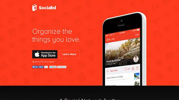
Socialist
Socialist is the new app for iOS 7 that helps you create, collaborate and share lists all in one place. They use an icon-patterned background with deep red color for contrast.
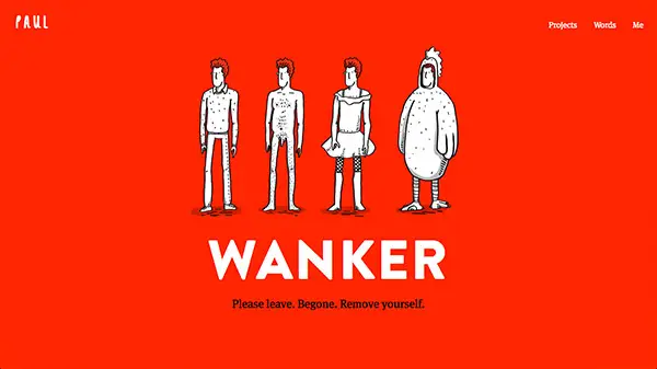
Paul Woods
This is the portfolio website of designer and illustrator Paul Woods. It has a bright red background and lots of funny illustrations.
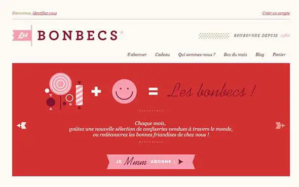
Les Bonbecs
This is a small company’s website with a girly/feminine design. It uses red and pink colors all over the website, but without overdoing it.
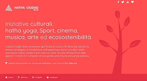
Hatha Ciudad Onlus
This is a presentation website for cultural events regarding yoga, sport, cinema, music and more. It has a flat red design all over the website.
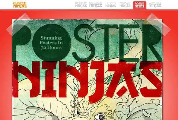
Poster Ninjas
Poster NInja prints posters, banners, foamcore, flyers and postcards.
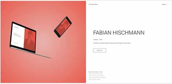
The Brave Man
This is the presentation website of Florian Wacker, a front-end developer with a passion for design and writing from Frankfurt, Germany.
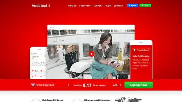
Vodatext
Vodatext is leading SMS Marketing Company in Dubai that offers powerful mobile marketing solutions. They use red backgrounds on their site and contrasting buttons with blue and green colors.
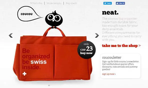
coucou
This is an online shop for selling designer bags. It uses red just as an accent color, the rest of the website is pretty simple, apart from some unique illustrations.
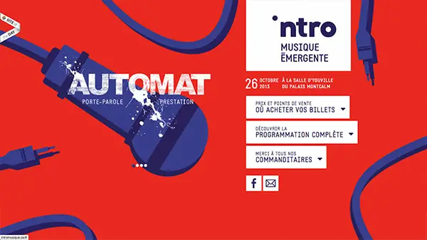
Intro
We love the effects and animations of this website’s background. Did we mention it’s very red?
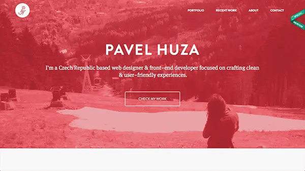
Pavel Huza
This is the portfolio of Pavel Huza – designer and developer specialized in designing web and mobile interfaces.
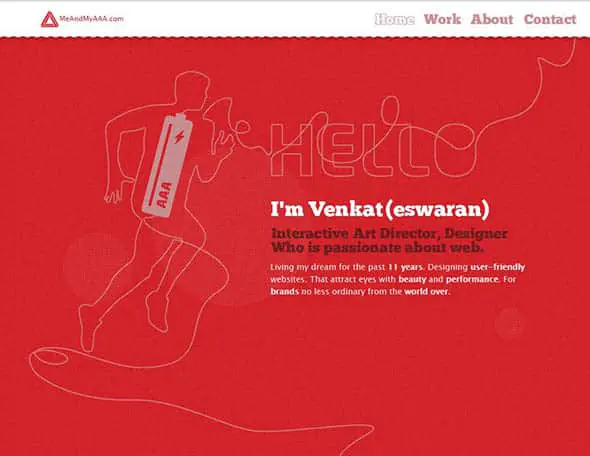
MeandMyAAA
This is another red portfolio website, this time for an art director and designer, passionate about everything web.
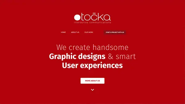
Točka
This is a simple red presentation website design for a studio which specializes in creating graphic designs and smart user experiences.
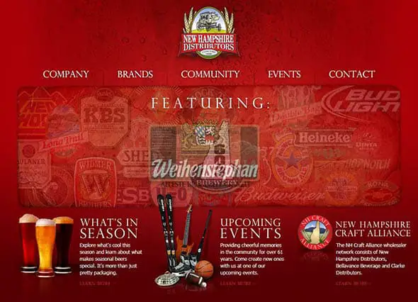
New Hampshire Distributors
This is the presentation website of a beverage company. It combines dark, red colors with grungy textures and image overlays.
Comments are closed.