Line25 is reader supported. At no cost to you a commission from sponsors may be earned when a purchase is made via links on the site. Learn more
With the abundance of gestures and animations being implemented into mobile apps designers are facing the tricky problem of how you present these UI concepts.
Storyboards and static screenshots don’t show any dynamism, whereas wireframes are visually plain and boring. There is one solution that seems to be catching on; the reinvention of the animated GIF. Today’s post rounds up 20 creative examples of how the traditional GIF is now being used to create some amazing UI concepts, presenting the design not only in full
Today’s post rounds up 20 creative examples of how the traditional GIFs are now being used to create some amazing UI concepts, presenting the design not only in full color but also with all the transitions, gestures and animations of a completed app.
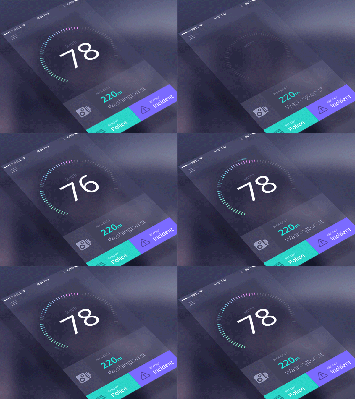
Speedcam App Animation by Jakub Antalik
This is the animation for a new speed cam app created by the designer for Sygic.com.
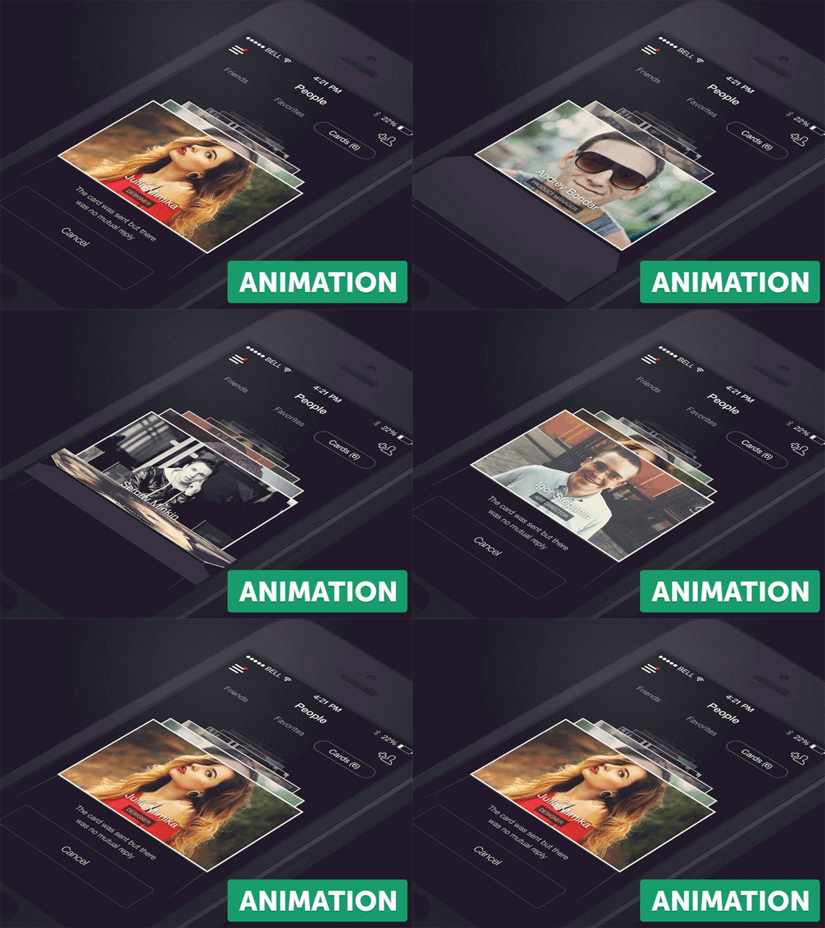
First Shot in Chapps by Dmitriy Chuta
All designers love the freedom to play with animations and fancy ways of interaction. Check out this cool app’s animations and be inspired!
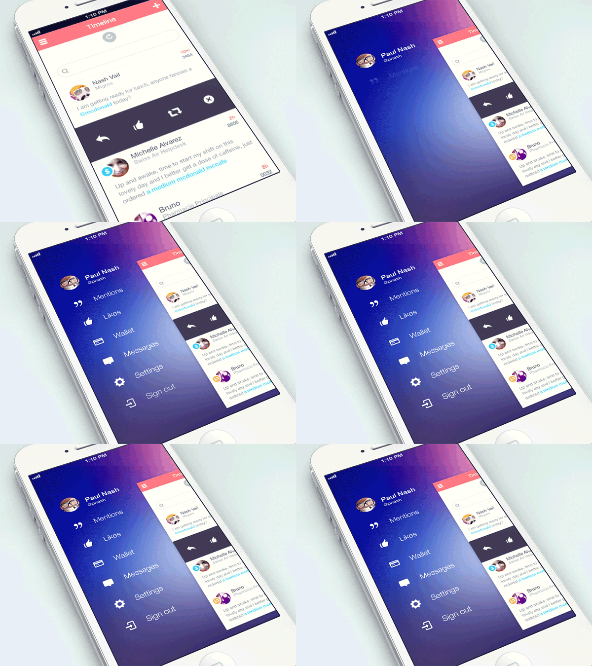
iOS 7 Animation by Fabio Basile
This is a simple iOS7 animation for a profile / social media app. It has a smooth transition for the menu appearance.
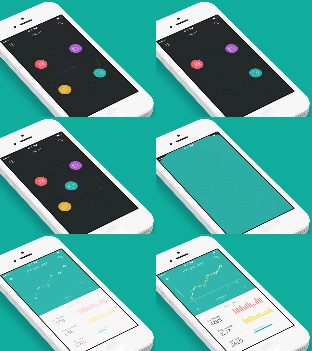
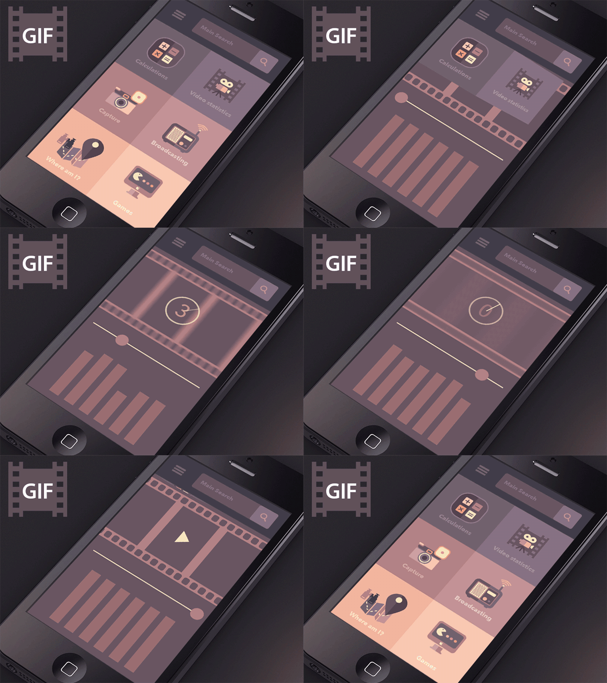
Life Minimal App GIF by Budi Tanrim
This is a great animation created for a minimal app. It contains a dashboard and a really unique, icon-based menu.
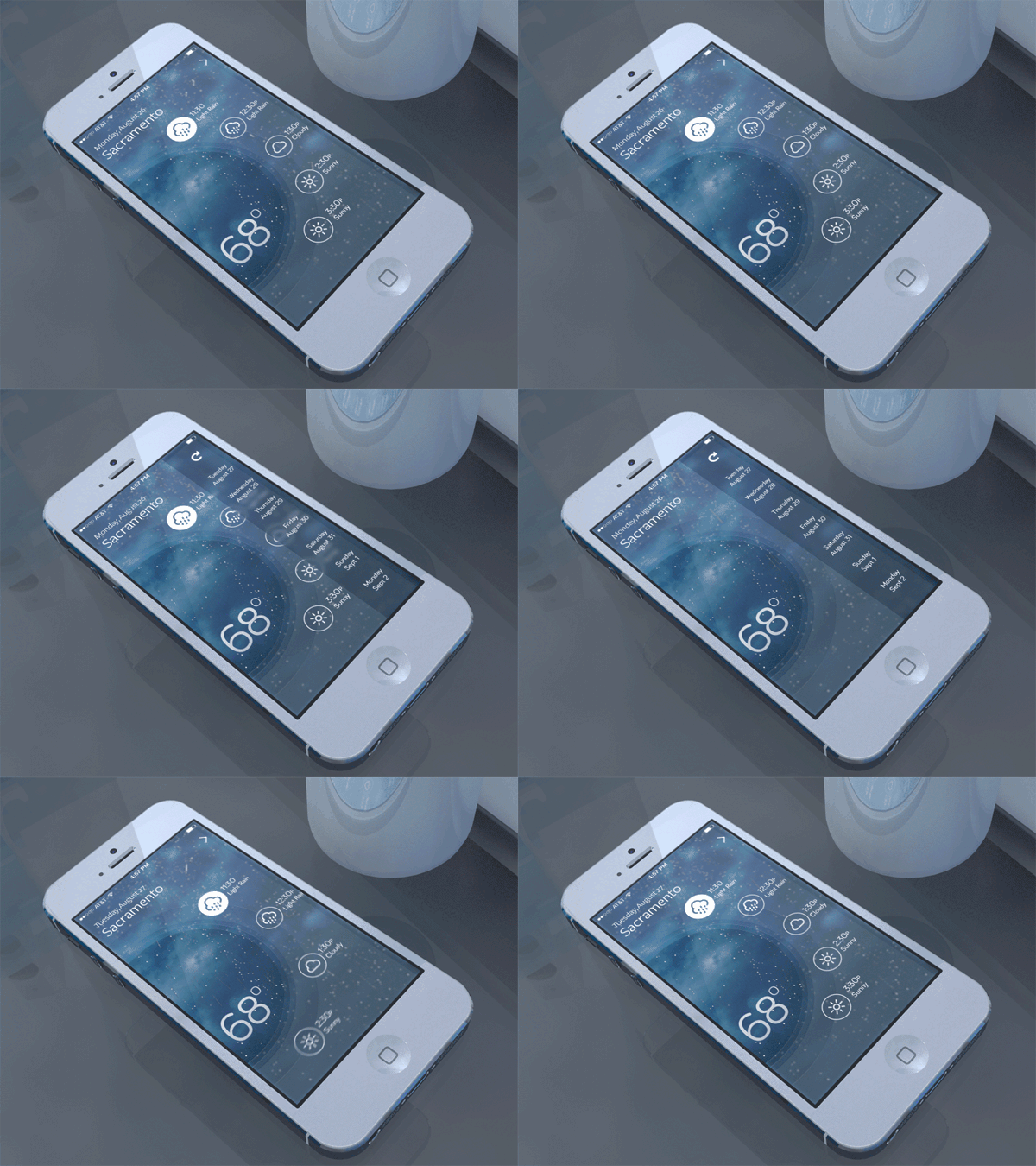
Weather Rebound GIF by Chris Slowik
We love how this weather app was created. The animations create a very nice atmosphere. Have you noticed that it rains on the screen?
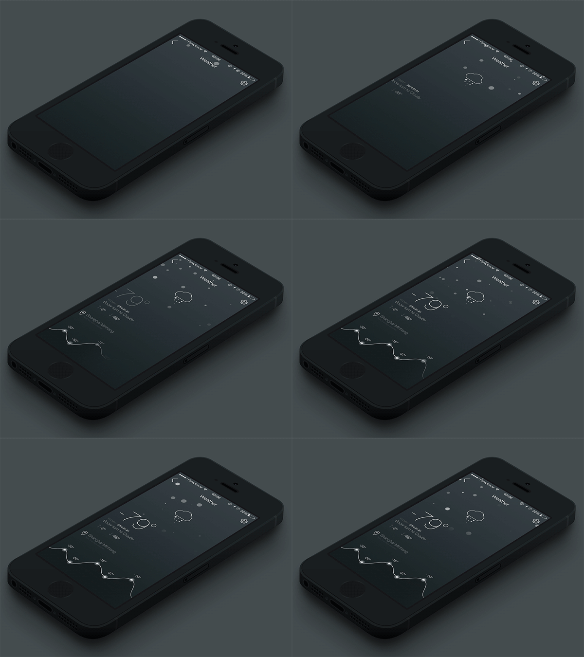
Weather by Beard Chicken
This is another cool weather app, with a dark theme and cool effects for the temperature graph and also the precipitations.
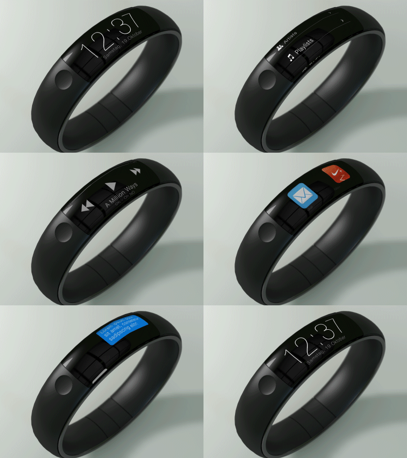
iWatch Mock-Up by Thomas Bogner
This designer had the idea of wrapping the interface around the wrist and have something like the click wheel rotating around my arm. We like it!
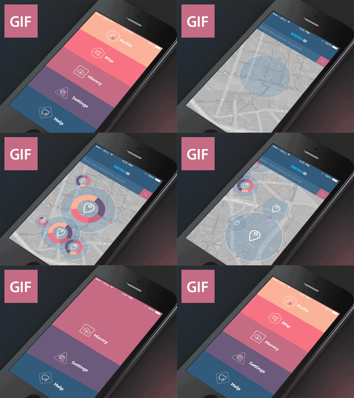
GIF Animation by Sergey Valiukh
Here’s a graphical brain exercise of screen transitions animation skills. It looks great for a transport / map app.
Abracadabra App by Sergey Valiukh
This animation is quite complicated even though it looks very beautiful. We like it but user experience should be tested first before launching it.
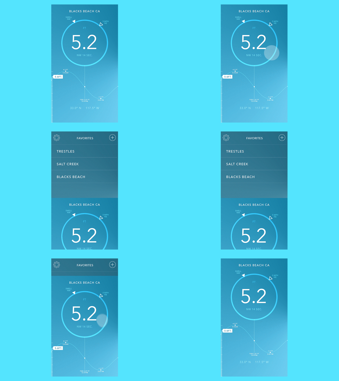
CRNT Favorites by Raleigh Felton
This app UI design lets you pull down to get your favorite locations. The navigation needs some refining though.
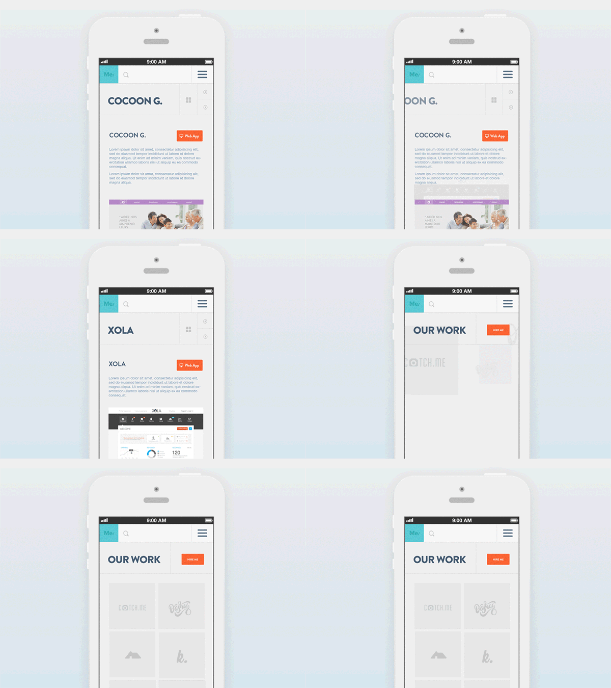
AgenceMe Work Page by Barthelemy Chalvet
This is a simple animation created for a responsive website’s work page. The images have smooth transitions and everything fits perfectly in the layout.
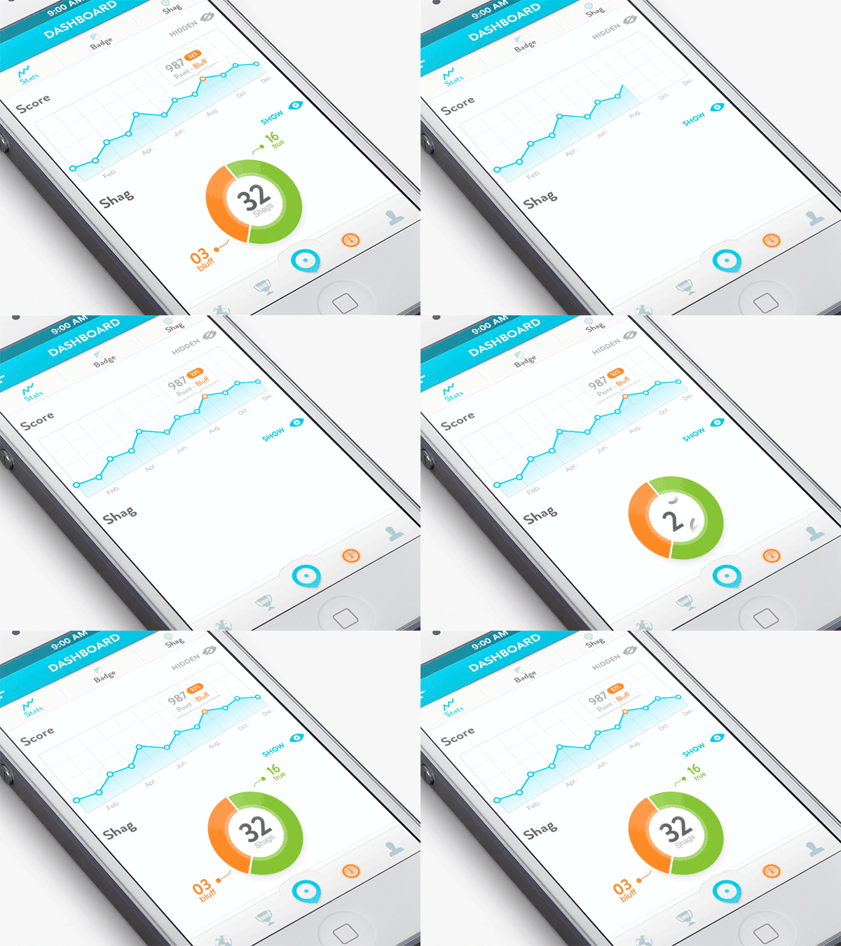
AgenceMe Dashboard by Barthelemy Chalvet
Here’s a simple app dashboard design with great effects for the graphs that show the stats.
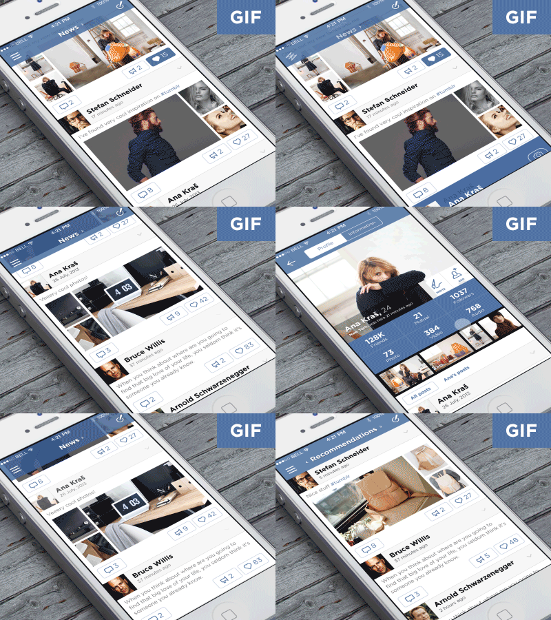
Vk Concept for iOS7 by Ilya Dmitruk
This was a contest for the best design of iOS7 for vk.com. So, here is the designer’s result.
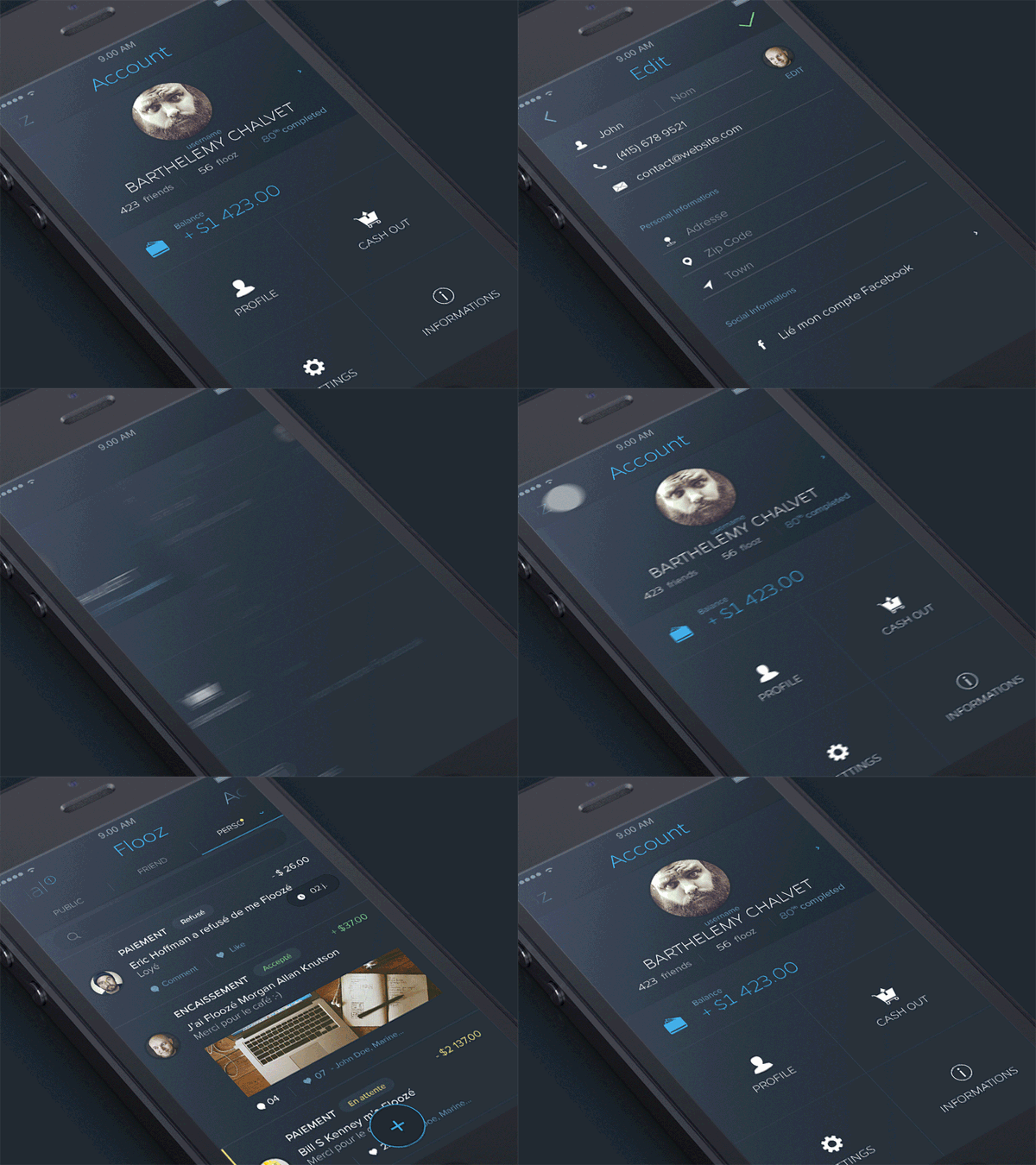
AgenceMe Account by Barthelemy Chalvet
Check out the smooth transitions for switching from one page to another in this app. Great for switching from the feed, to account, to edit page, in any kind of app.
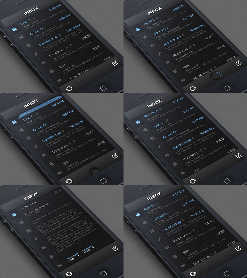
Covert Inbox by Creativedash
This app’s transitions shows you what happens when you get a new message and when you tap on something. Once you tap to view a message you swipe to the right to go back to the inbox.
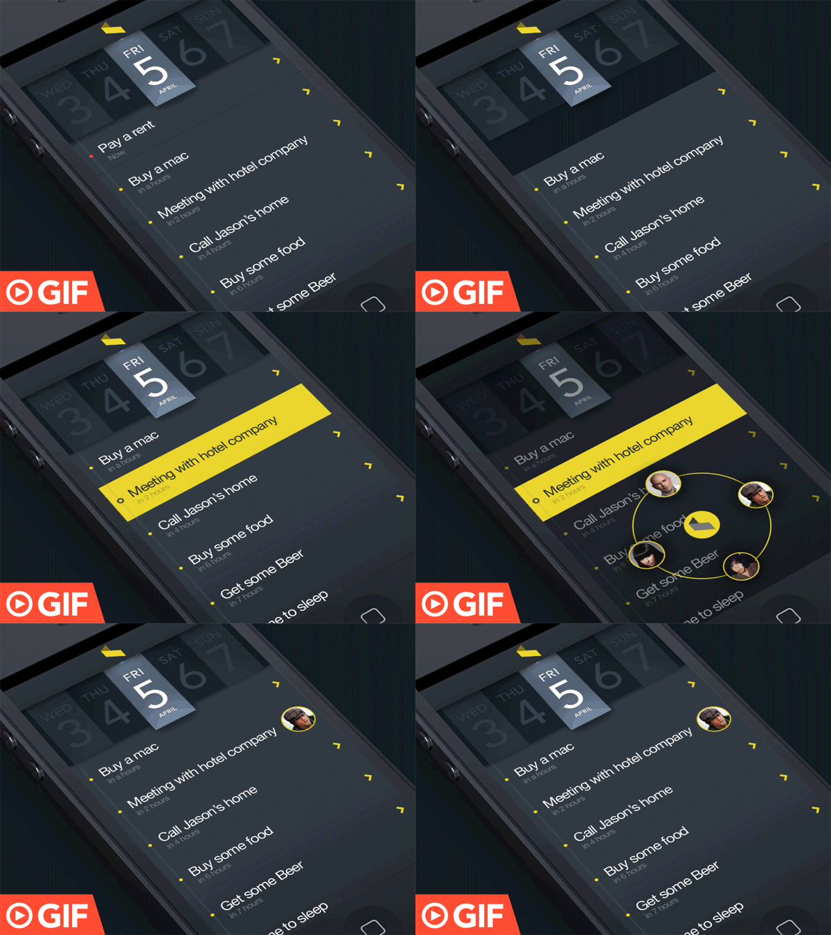
Delete Task and Assign Task in Action by Tobs
This is a cool animation for how to delete a task and assign a task to the teammate in action.
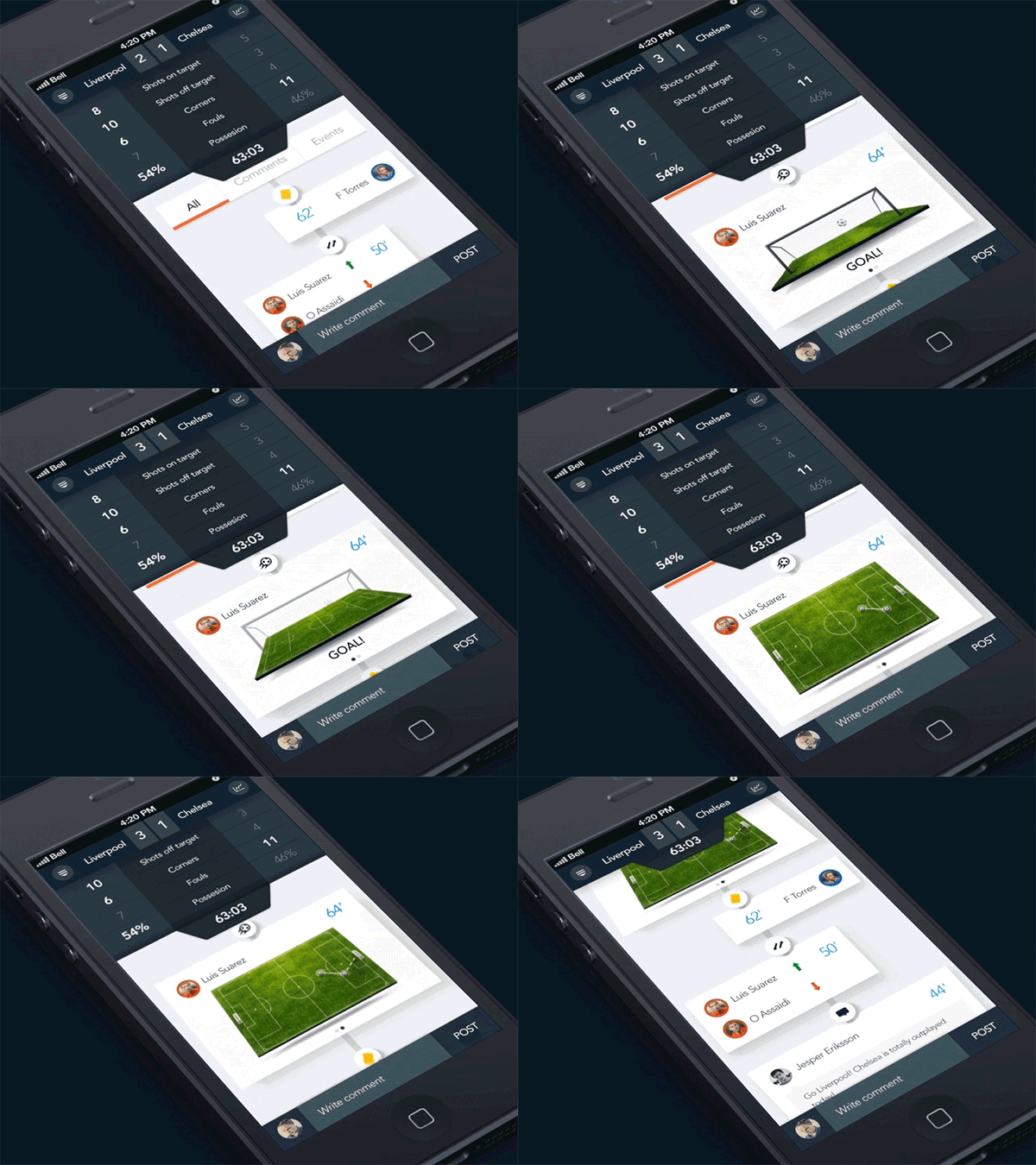
Soccer Analytics by Monterosa
This is a really unique app design for a soccer applications which shows you analytics in a really creative way.
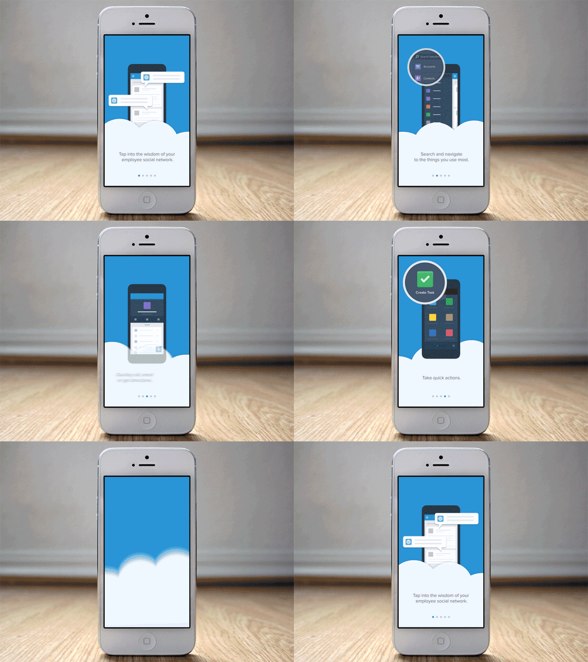
Salesforce Tour by Mark Geyer
Here’s an on-boarding tour concept for Salesforce. Users are able to swipe through the tour (at their own pace) before diving into the app.
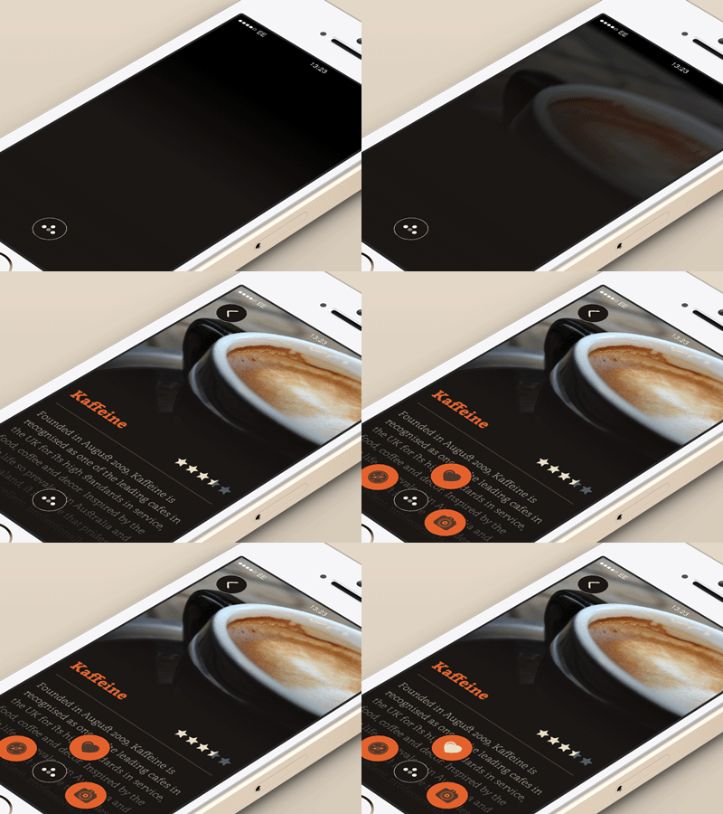
Animation Test by Jamie Heuze
This is an animation test perfect for a blog or a review app. The menu opens up beautifully.
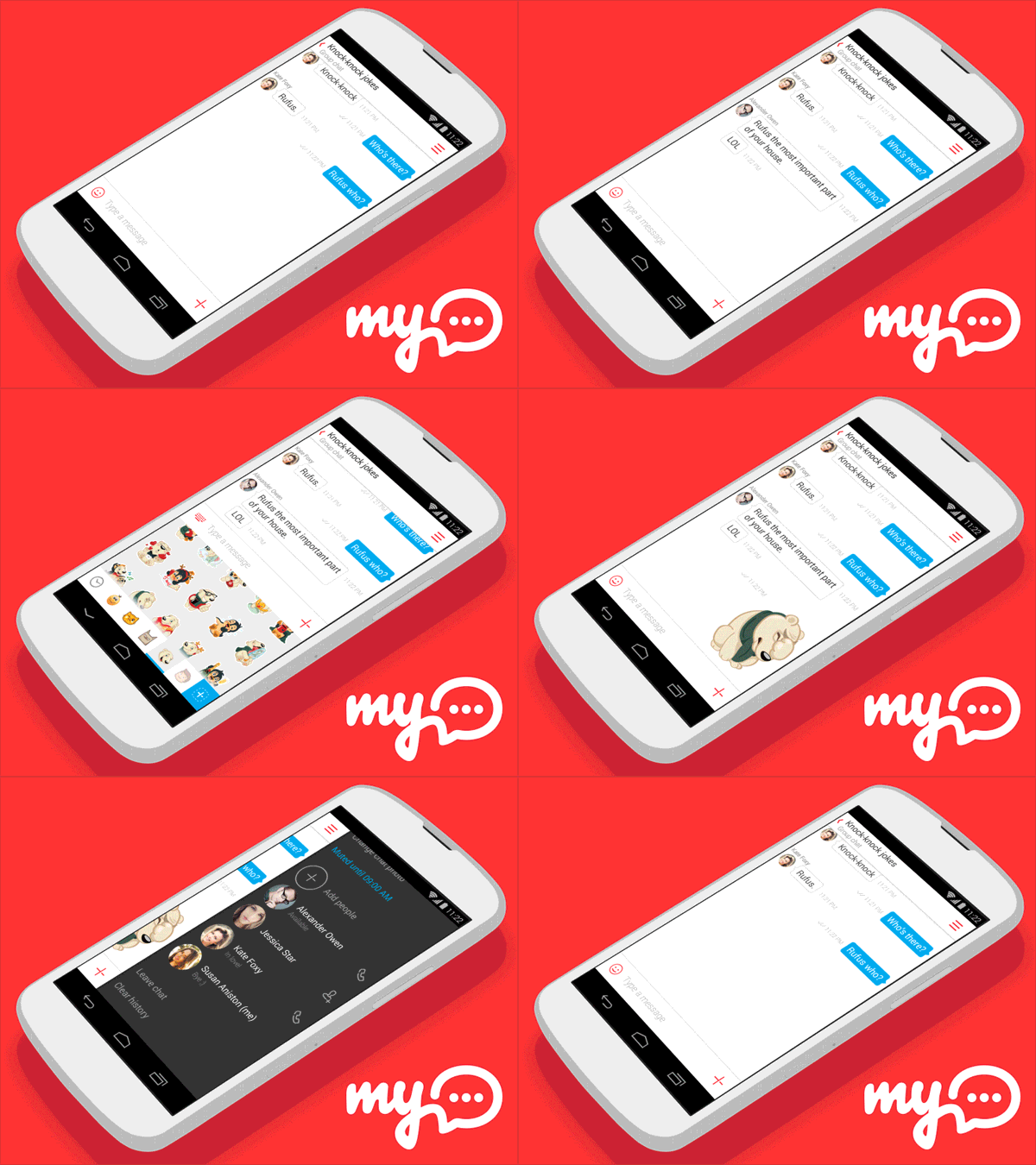
myChat App Concept by Nikolay Kuchkarov
This is the myChat Android app concept for my.com. It has sleek transitions and a great layout.

Wow, Aesthetically very eye charming, what software has been used here ?
We do conversion optimizing for a living and product display (demo) is a great way to improve conversions.
Awesome examples, simple to create and most importantly they will help convert by interacting with their target.
Good job on the gallery.
It is possible to use them in an application?
These designs are so nice,a great share indeed.
It sure would be nice to know more about the process. Great collection!
Wow this is simply awesome. Thanks a lot man.
Great collection of UI designs, Chris!
Thanks for sharing nice article :)
amazing user experience presentation you sharing and i love such way to convince our client with real-time output. Appreciated Chris
Chris you are always great on your blog. Every time when I read your blog post I really learn new ideas and tips. I really appreciate your blog the post and would love to request you to keep on posting.
Thank you so much.
Definitely a cool way to display bit’s and pieces of an app or whatever, but there’s got to be a lighter way to do it. The file sizes are pretty big for each one of those.
Did anyone, back in the day, used to make animated gif ad banner’s for their sites? I forget the name of the software but it used to come packaged with Photoshop and you’d do it frame by frame.
Great Article. I am New Blogger, Your All Tips is Really Helpful for me. Thank you very much for Sharing.
Who would of thought – the animated gif making a comeback. Very Inspiring!
This is an great collection, Chris. I see these on Dribbble and am always in awe. There are some really nice color palettes in here too. Thanks for sharing!
Ironic! I was looking at these earlier today (Monday) and wondering how they’re put together. It would be so great for prototyping! And, now look at your post :)
very elegant examples. Thanks for compiling.
Que buen articulo!!
Que geniales trabajos!!
Saludos desde México
Awesome animations, these are really creative.I will try something in PS6, it has great animation tools for gif creation.
Wow, these are great! thanks for sharing.
Nice, article. What software did they use? Is it AE and some vector graphics?
I know After Effects is their tool of choice, but I’m afraid I have no idea on the actual process!
In After Effects you can create a composition the size of the device screen and do the UI animation in it. Then create a second composition with the device mock-up and add the composition with the UI animation to the second composition. To line the animation up just turn on 3D support and line it up with the mock-up. Once you have that you can export it to a video file and use Photoshop to export it into an animated gif.
Not that I’ve actually done one of these UI animations, I’m just familiar with After Effects and this would be my best guess as to how they would go about it.