Line25 is reader supported. At no cost to you a commission from sponsors may be earned when a purchase is made via links on the site. Learn more
Once upon a time navigation menus were constantly anchored in place along the top or side of a web design, but nowadays as Javascript and CSS animations are becoming more popular, we’re starting to see different navigation UI approaches when it comes to directing your users to where they want to go.
The “hamburger” icon has become the recognized metaphor for the menu, which allows designers to hide away their links until they’re needed.
Today’s post features 30 modern website designs which make use of pop out navigation menus. These sites cleverly bring the menu into view using slide-in or overlay effects.
Visage
Clicking on the menu icon reveals the side menu and the content disappear when the menu is closed. There are smooth transitions involved in this process.

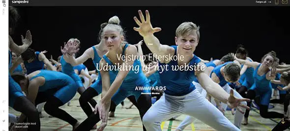
Sampedro
This website design has a hero image placed on the header section paired with a hidden navigation makes the user navigation more intuitive and easier.
We are Empire
We are Empire website has a minimalist design with a hidden navigation marked by a hamburger icon in the top right corner.

Brand Junkie
The navicon for the menu blends perfectly with the environment in this website. It may be difficult to spot right on, but it’s positioned in an intuitive place, the top right corner of the page.

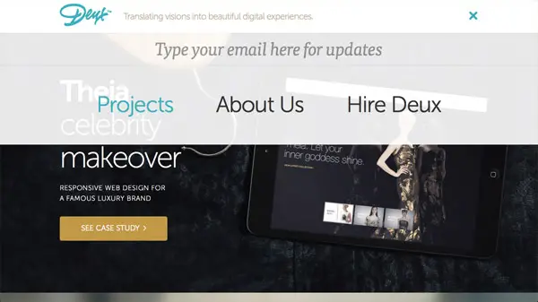
Deux.is
This menu has a smooth transition effect for the menu, plus some subtle colored hover effects for the links.
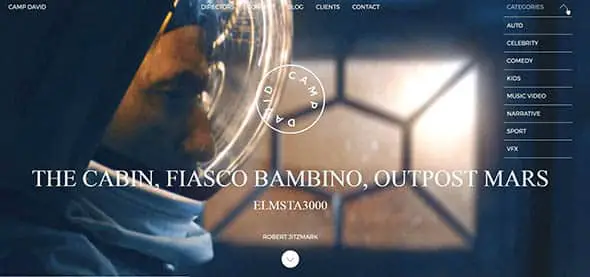
Camp David Film
This website has two navigation systems, one on the top header, and another partly hidden in the top right corner of the page. The secondary navigation can be triggered with a click.
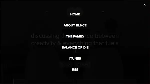
The Blnce
The simple design of the menu goes well with the site. Clicking the hamburger icon opens up a fullscreen, dark overlay menu with white links.
Michael Villeneuve
This is a more simplistic design for a hidden menu. It blends perfectly with the rest of the site and offers a unique user experience.

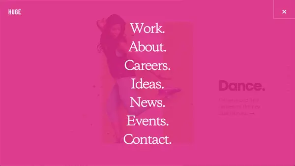
Huge.
The white font color creates a nice contrast against the pink background, and the font is just big enough.
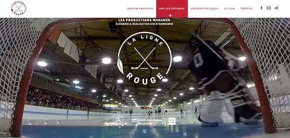
La Ligne Rouge
This top menu opens while hovering on the navicon at the top center of the page. It also pairs nicely with smooth menu transitions and hover effects.
Xander
To find this website’s primary navigation you will have to click the navigation icon in the top right corner of the page. A fullscreen, overlay menu will appear.

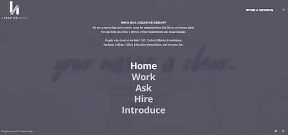
H. Creative Group
This fullscreen menu blends well with the overall design of the website. The subtle hover effect of the menu items adds some extra points to the user experience.
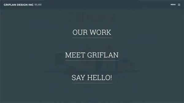
Griflan Design
Clicking the menu icon reveals the big, dark, overlay menu that covers the entire website.
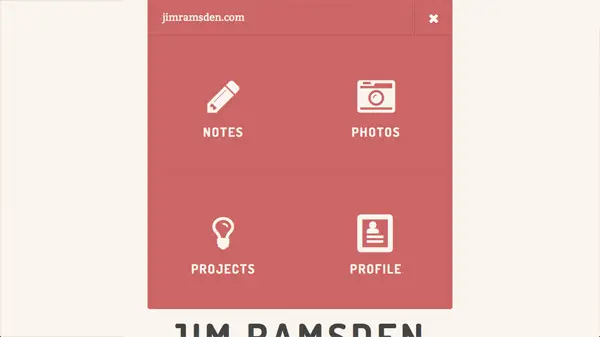
Jim Ramsden
Being hidden initially, hovering over the menu icon reveals the full menu in a unique, interesting layout with icons for each section/page.
Tannbach
This website’s design is marked by some dynamic navigation elements which are triggered when instinctively hovering on the top of the page for finding the menu.

Cofa Media
Cofa Media website has a navigation system based on a hamburger button that subtly uncovers the main navigation of the site while covering the whole screen.
White Boards
The menu icon is non-intrusive and very subtly positioned in the top right corner of this website. Click it to see how it uncovers the primary navigation.

Demodern
Demodern has a distinctive navicon that contrasts the website design. Clicking it uncovers a geometric menu design with subtle hover effects for the links.

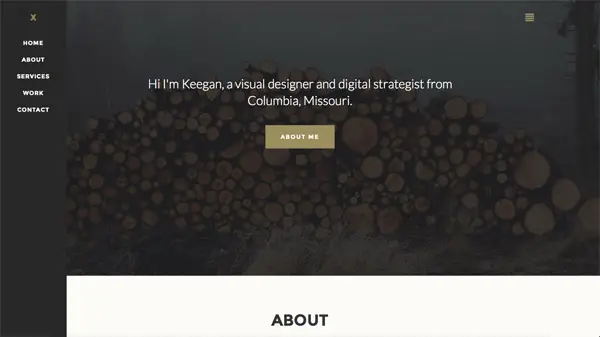
Keegan Burkett
The design of this simple side, slide-in menu is top-class and matched the design style of the whole website.
TOWA
Check out this fullscreen menu that opens when clicking the navigation icon. The menu items are provided with a cool hover effect.
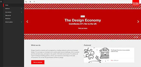
Design Council
The side menu of this website can be toggled on and off. Also, check out the subtle hover effect for the links.
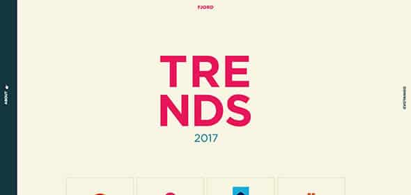
Fjord Trends
This simple website menu instantly catches the visitor’s attention. That’s how you design an efficient side menu!
450 GSM
450 GSM has a right side menu that reveals itself when clicking on the navicon. It is paired with some smooth effects.

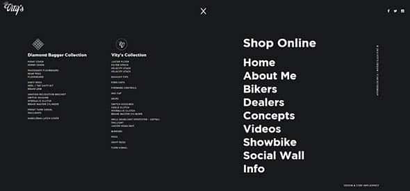
Vity’s Design
This website’s design is accompanied by an elegant side menu that opens in fullscreen mode when you click the burger icon.
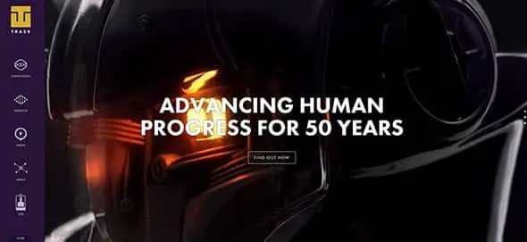
Trask Industries
Take a look at the colorful side menu of this website that instantly catches the visitor’s attention.
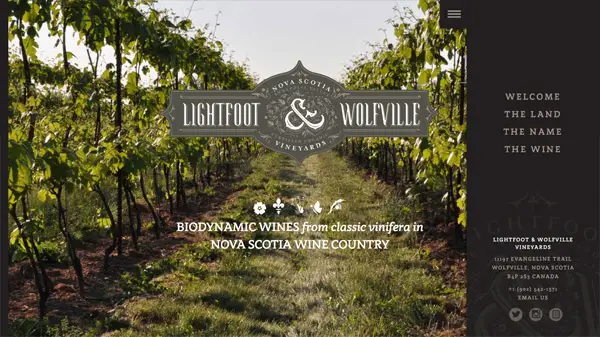
Lightfoot & Wolfville Vineyards
This simple website is accompanied by a very attractive side menu with simple and elegant fonts.
Hyperakt
Here’s another example of a simple side menu that appears when clicking the menu icon revealing the big, bold side menu.

OwnerListens
This simple slide-in menu integrates perfectly with the overall design of the website. The designer kept things simple and user-friendly.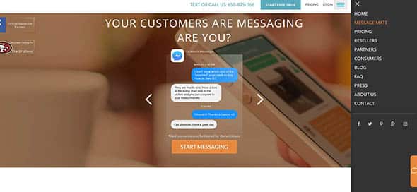
Comments are closed.