Line25 is reader supported. At no cost to you a commission from sponsors may be earned when a purchase is made via links on the site. Learn more
Hamburger menus have gained some popularity in the past few months and are currently being used for both websites and mobile apps. Their role is to help you navigate everywhere, in an easy, mobile-friendly manner. Hamburger icons have become a well-known and easily recognizable UI action button. Although they have a familiar three-bar design, their aspect can vary from a project to another, depending on the chosen style.
Generally, they occupy a small amount of space in the UI and are triggered when clicked on. That is when the full menu navigation is displayed. Also, they can include various animations which only improves their overall design.
In this article, you will find 20 beautiful hamburger menu designs and also some important tips and tricks that help you successfully manage them. For example, when creating this kind of navigation, you should consider its compatibility with various browsers, to make sure it will display perfectly. There is much to be learned about these elements, there are various topics that should be tackled to fully understand what they’re all about.
Take a peek through this excellent hand-picked collection of hamburger menu icons and use them in your upcoming digital projects.
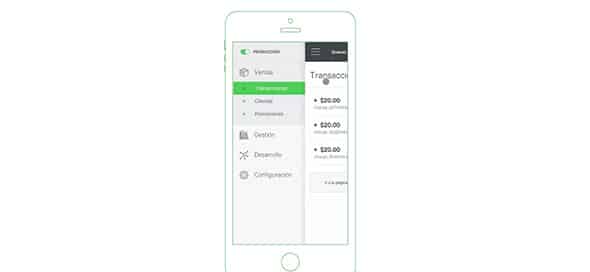
Slideout.js
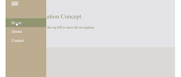
This is a neat sliding hamburger navigation that has a beautiful design and a charming animation. It is a wonderful item that is enabled by touch and it includes native scrolling.
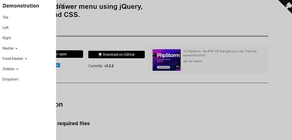
Drawer
Drawer is an excellent jQuery plugin that relies on CSS3 for a simple but very effective transition animation.
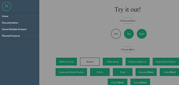
Pure Drawer
The pure drawer comes with outstanding transition effects that will definitely get your attention. Some of them include: slide on top, reveal, slide along, fall in, flip, zoom, etc.
Shifter
Shiffter is another wonderful hamburger menu icon that includes various animations. You can use it for both websites and mobile applications.
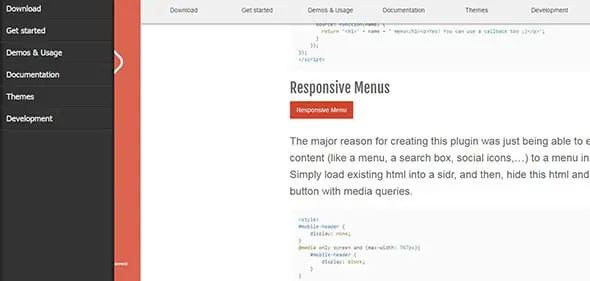
Sidr
Sidr is an excellent hamburger menu that automatically adapts its content to perfectly fit any screen size.
Hamburger Menu to Social Sharing Icons
Hamburger menus can be used for any kind of navigations, for example for social sharing icons. These are hidden from the UI and appear only when you click on the menu icon.
This lovely menu navigation uses a neat hover effect for each menu item. Discover its full features and see if this menu design meets your requirements.
Here is an amazing hamburger menu design which has a unique and very creative animation. This will look stunning in any of your projects, whether websites or apps.
Hamburger Menu to Fullscreen List Menu
This is a great hamburger menu that, when clicked on, it beautifully displays your menu content fullscreen.
Responsive Sidebar Menu
This hamburger menu design has a fully responsive layout that will automatically adapt its content to any screen size.
Multiple Hamburger Menu Animations
Although the generally used hamburger navigation contains three bars, you can also use various designs. Have a look!
Star Wars Lightsaber Hamburger Menu Icon
This is a creative hamburger menu icon with a beautiful design and smooth hover animations. This element was created by Adam Dorling.
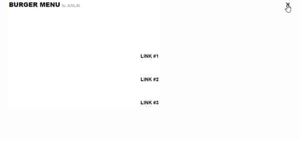
Hamburger Menu to X
Here is another out of the ordinary hamburger menu icon that, when clicked on, it transforms into an ‘X’.
Hamburger Menu Modal Pop Using GSAP
This is an outstanding hamburger menu design that will look stunning in mobile applications. This element has a modal popup that activates when cliked on.
Off Canvas Menu With 3D Effect
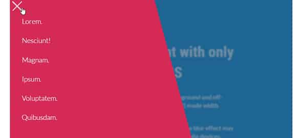
This is a very creative off canvas hamburger menu with a beautiful 3d effect. This design will definitely get your user’s attention.
Toggle Menu That Slides From The Top
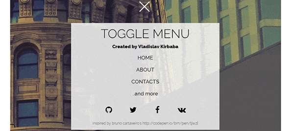
Here is another remarkable hamburger menu design that has a lovely toggle effect with a slide down navigation.
SVG CSS3 Hamburger to Close Button Animation
This amazing menu design was created using SS3. This hamburger navigation icon has a nice animation when clicked on.
Simple Hamburger Menu to X Mark Animation
This is a simple but effective hamburger menu design that turns into an ‘X. The designer created a neat transition between the 3 bars of the menu to the letter ‘X’.
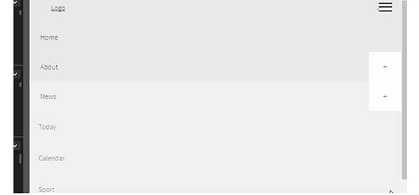
Responsive Mega Menu Snippet with Expandable Sections
This responsive mega menu contains expandable sections that display perfectly in any screen size. You can even add images to the navigation menu.
This is another hamburger navigation design that turns the full menu into a fullscreen view. This design has a smooth transition effect that you’ll love.
