Line25 is reader supported. At no cost to you a commission from sponsors may be earned when a purchase is made via links on the site. Learn more
CSS can sometimes be a tricky business. There are times when even the simplest of layouts take some serious brainstorming! One of those frustrating times is when you want to create a series of columns of equal height, but the content in one column might be longer than the next. Here’s where the Faux Column technique steps in, let’s take a look at how this solution can make even the most complicated layout a breeze to code up.
The example
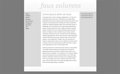
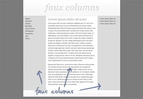
Here’s a quick example I’ve put together to show a typical website layout. The design employs three columns comprising of two grey sidebars and the main central content area.
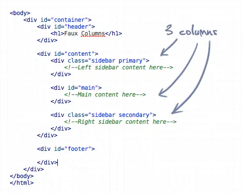
Here’s the HTML for the layout, showing a content div containing the two sidebars and main center column.
The problem
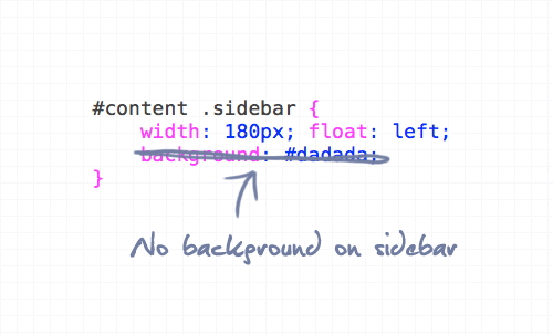
To code this up we would simply float three divs side by side, and add a grey background to the sidebars, right?
Fail! What happens is the sidebars will end at different heights due to the varying length of content in each.
The solution
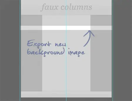
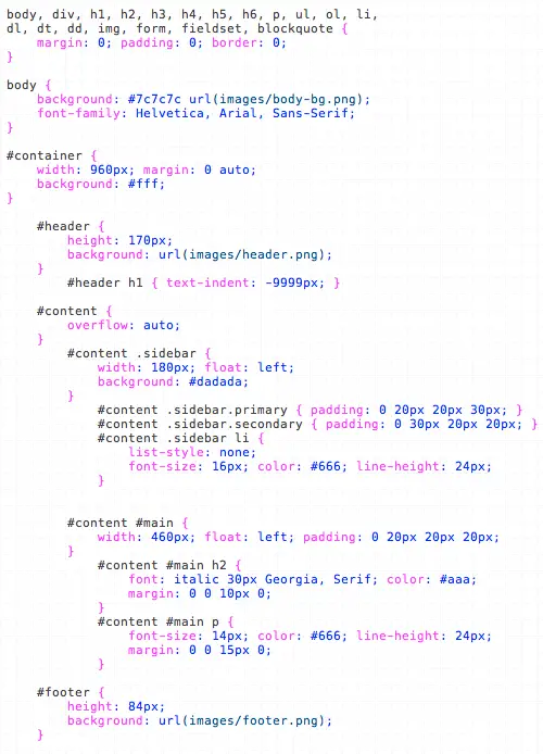
One of the easiest ways to solve this problem is to take a step back from the code and look at how the design can be alternatively sliced to give the impression of equal height columns. Instead of attaching a grey background to each sidebar, we could take a long slice that includes the whole width of the design.
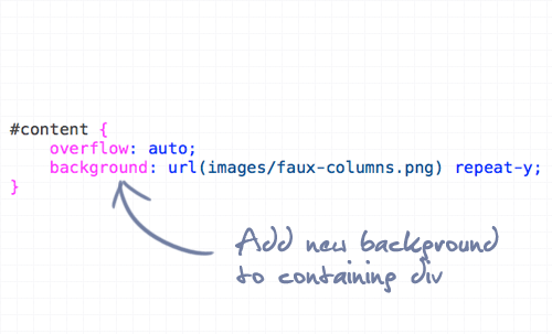
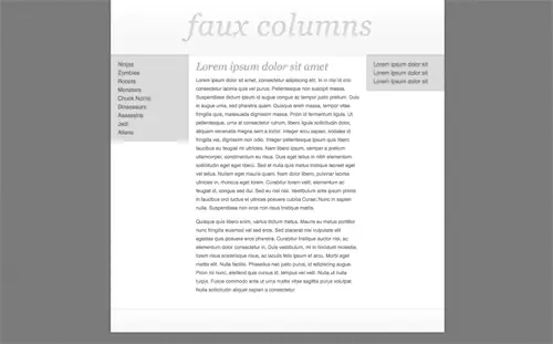
When this slice is attached to the containing div, it gives the impression of a three column layout, but isn’t affected by varying amounts of content.
Being just one image attached to the container means that the graphic will repeat for the entire height of whichever is the longest column.
The demo
Of course, this technique isn’t limited to three column layouts. It can also come in handy for the single left or right aligned sidebar, or even a mega layout with stacks of columns! Check it out in more detail in the coded demo:
Comments are closed.