Line25 is reader supported. At no cost to you a commission from sponsors may be earned when a purchase is made via links on the site. Learn more
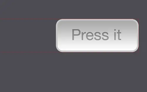
The button is one of the most common elements in the world of the web. In modern web design, buttons are used not only on forms but also as visual aids that draw attention to important elements of the page. Let’s take a look at building a simple button using CSS image sprites, starting right at the beginning in Photoshop and finishing with the complete code example. This one’s a good one for anyone getting started with CSS!
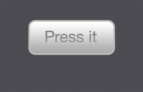
The button we’ll be created takes on traditional styling using subtle gradients and outlines to give the impression of a rounded, three-dimensional object that’s just waiting for a prod from a chubby finger. The button will also use three states, an up/normal state, a hover state that gives a visual clue and a depressed state that gives an element of realism, making it act just like a button in real life.
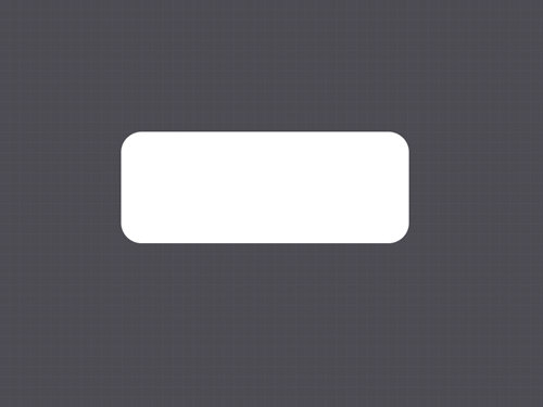
Start work in Photoshop, grab the Rounded Rectangle Tool, enter a large radius figure in the options bar and drag a shape onto the canvas.
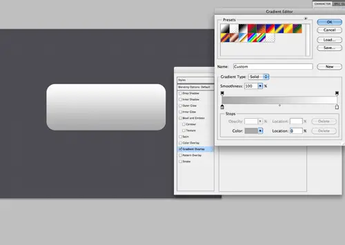
Double click the layer to open up the Layer Styles window. The first style we’ll add is a Gradient Overlay. Adjust the color swatches to fade from #a8a8a8 to #ffffff vertically across the button.
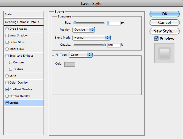
Next, add a stroke to the button. Use the colour #cbcbcb at 5px in size.
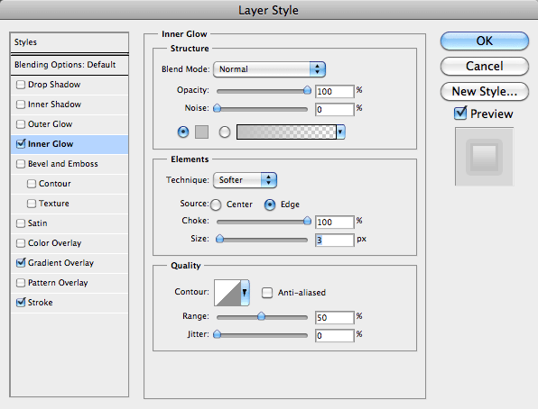
To create an inner-stroke, use the Inner Glow option, but change the settings to Normal / #c2c2c2 / 100% Choke / 3px Size.
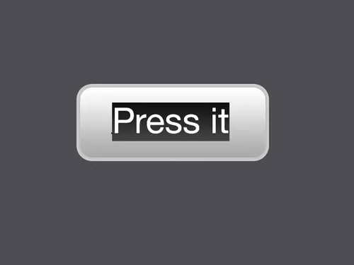
Type out the desired verb or command for the button and set in an appropriate font. Align the text centrally on the button graphic.
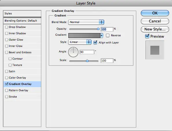
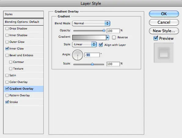
Open up the layer styles for the text and add a Gradient Overlay of #9a9a9a to #7c7c7c.
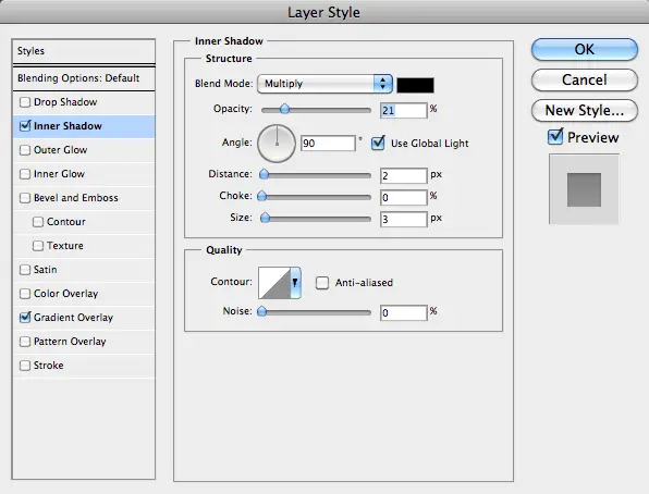
To give the text an etched appearance, add an Inner Shadow. Tone down the effect to 21% Opacity / 2px Distance / 3px Size.
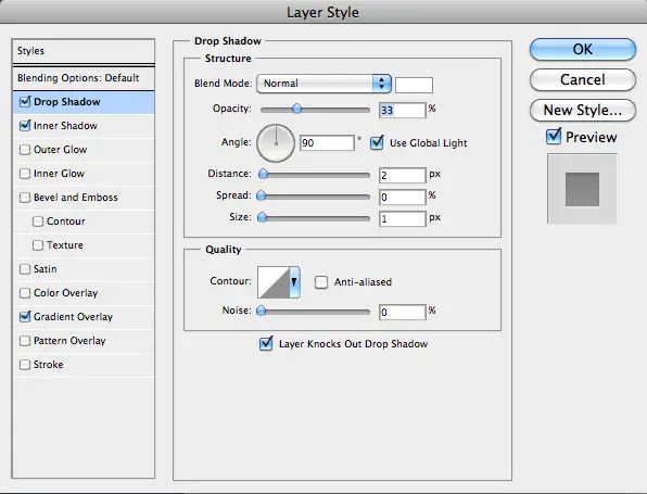
Finally add a subtle highlight to finish off the etch effect using a Drop Shadow. Change the settings to Normal / #ffffff / 33% Opacity / 2px Distance / 1px Size.

Select the button and text layer and drag down vertically while holding ALT and Shift to create a duplicate. Align the duplicate exactly to the bottom edge of the original. Alter the stroke of the duplicate to a slightly darker tone.
Create a third duplicate, this time edit the Gradient Overlay and reverse the direction, this simple tweak gives the illusion that the button has been pressed.
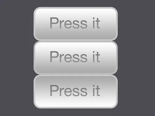
The three button states are complete and ready to be exported. Each graphic has subtle changes that will alter the appearance of the button when coded with CSS.
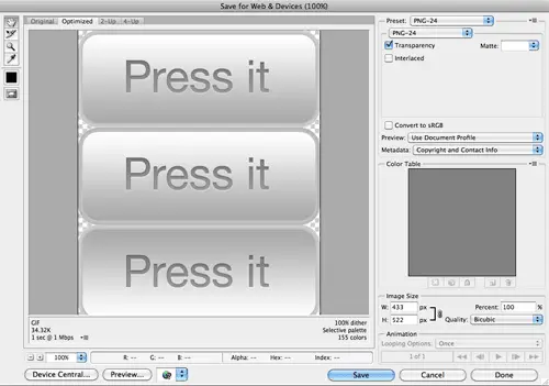
Draw a selection around the buttons, hide the background and Save for Web. Choose the PNG24 option to allow alpha transparency.
<!DOCTYPE html PUBLIC "-//W3C//DTD XHTML 1.0 Strict//EN" "https://www.w3.org/TR/xhtml1/DTD/xhtml1-strict.dtd">
<html xmlns="https://www.w3.org/1999/xhtml">
<head>
<meta http-equiv="Content-Type" content="text/html; charset=UTF-8" />
<title>CSS Button</title>

<style type="text/css">

* { margin: 0; padding: 0; /* Quick and Dirty Reset */ }

body {
	background: url(bg-repeat.png);
}

#demo {
	width: 433px; margin: 100px auto;
}

</style>
</head>

<body>

<div id="demo">

</div>

</body>
</html>
Open up your favorite coding application and create a simple XHTML document.
<p><a href="#" class="press-it-btn">Press it</a></p>
Write out the HTML code for the button. We’ll be using a simple anchor stating the term Press it, as that’s what we have used on the graphic. Being an inline element we’ll contain it within a block element of a paragraph, and give it a class to allow us to target it with our CSS powers.
#demo p a.press-it-btn {
	display: block;
	width: 433px; height: 174px;
	background-image: url(button-sprite.png);
	background-position: top;
	text-indent: -9999px;
}
Next, write out some CSS coding for the button. Firstly we’ll need to change the anchor from its default state of inline element to block. This will then allow us to specify a width and height. Notice the height is of each individual button graphic, not the image sprite as a whole. We can then attach the background image to the anchor and position the background to the top. To finish off the button use a text-indent to shift the rendered HTML wording off screen.
#demo p a.press-it-btn:hover {
	background-position: center;
}
#demo p a.press-it-btn:active {
	background-position: bottom;
}
With the button in place, the pseudo classes can be added to the anchor. Change the background position to center for the hover state and bottom for the active state. This will change the button’s appearance on mouse over and when the user clicks. Give it a test in the browser.
a { outline: none; }
What’s this?! An ugly dotted line around our button on mouse click? Sometimes browsers add their own accessibility features, but they can spoil the look of the design. It can be simply fixed by removing the outline altogether. Leaving it like this is a serious accessibility faux pas, so don’t forget the next step!
#demo p a.press-it-btn:hover, #demo p a.press-it-btn:focus
Because we’ve just removed the browser’s outline, a user navigating by keyboard won’t be able to see where they are on the screen. We can add our own highlighting by adding the focus pseudo class to the CSS, for example, we can style up the button to give the same appearance as a mouse hover.
Great tut Chris as always. love the work you produce. The power of sharing, is the power to evolve.
cool, that’s easy to follow
thank you good work…
Today I’ve tried, but having trouble with hover effect. It’s showing full image I mean other duplicates. Please someone help me.
nice simple and clean i love it!
Works fine in safari…not work in IE 8.. any hack for this…
Very Nice! I love CSS but I’m absolutely a new beginner. :))
This solves the problem of having to make Javascript for roll over images external and unobtrusive – just use css instead. Brilliant
Heard that the “text-indent: -9999px;” will crash the Safari Browser in iphone and ipod touch permanently.. is there any other way other tan using that???
Nice little tut, tnx.
But you’ve forgotten the end tag for the hyperlink. ;-)
[code]
Press it
[/code]
easy, thorough, simple. Perfect for beginners.
easy, thorough, simple. Perfedt for beginners.
Nice, slick looking button. Thanks for this easy to follow tutorial, will be using this at some point!
thanks for trick
why is it that the sprite breaks if you click and drag off the button? I realize that in this example it doesn’t really matter, but I am curious all the same.
nice tutorial… thx for sharing it :D
Frankly speaking, the Internet is a bit tired of all that unuseful rollover “buttons”. There are 2 major flaws about such technique:
1. It is not a button. It is a hyperlink. And hence it won’t be sematically correct to use it as a button. Additionally it’s gonna be painful to attach POST-form submitting on it. All of this eliminates progressive enhancement paradigm
2. May be there is only me considering it as a problem: the button is not translatabe and stretchable.
Anywho, this is not to insult the author. Best wishes!
My thoughts exactly. This can be done with pure CSS, which then would have soo many advantages.
Like no resource (png) to download (faster), button text can be dynamic, etc.
Very nice! Thanks!
Very clean and nice tutorial. Useful too, although I can’t say I didn’t know that before :)
Great tutorial, Chris.
Good info. Thanks for posting.
Outstanding — thank you Chris!
Hi Chris, excellent tutorial!
Did you know that there are generators for building CSS sprites ? I released mine a couple weeks ago. It could saves time to all web designers/developers.
Give it a try: https://css-sprit.es
Awesome tutorial, I’m definitely going to be using sprites more often. Thanks
nice simple, and very effective.
Chris. I think you forgot to close the anchor in the code example.
Very straightforward and illuminating! Thanks for your post.
Very nice! Useful tutorial!
PRICELESS!! That is so simple and so cool at the same time!
Great tutorial Chris. Although it would be good for the beginners here if you would have added another state, like :hover to it so it even looks better, IMO.
Anyways, keep up the great work with the blogs.
Hi Chris, very nice tutorial. It can be useful to create my own menu for my portfolio.
Great tutorial, I totally forgot about the :active pseudo-class. Nice to see it in action, I will be using this from now on!
Thanks for sharing!
Very nice, like the etched type :)
Very good info as always Chris – Thanks
It’ so simple but useful, and what a cool touch to add to a menu or button. As always, thanks for sharing.
Great post. I really like the button and the tutorial was easy to follow. Thanks.
Nice, clean and simple to follow CSS tutorial as always. Tnx.