Line25 is reader supported. At no cost to you a commission from sponsors may be earned when a purchase is made via links on the site. Learn more
Designing a button for a website is purely a form of art. The buttons that you see today may often seem simple to design and have a minimalistic structure. But, these days, all the designs including buttons are not just simple designs. All the designs are made while taking care of all the marketing strategies that can make the design ideal for conversions. Hence, if you are a web designer, you should keep in mind the button design which can adhere to marketing norms and use. Great button design should help you improve the click-through rates and increase conversions.
In this blog, we share and discuss some tips and tricks to design the buttons effectively. These buttons look amazing and also keep conversion best practices in mind.
1. Bold and Bright Buttons:
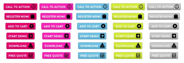
In the old times, buttons used to be grey or some other dull color. Moreover, there was no marketing mind working behind them. But gradually, the designers and businessmen understood the meaning behind particular types of design and concepts. So, you have to have a design that is bold and bright in its format. It is not necessary that every theme can have bold and bright colored buttons. But, it is necessary that it makes the user want to click the button.
The motive behind designing the bright buttons is that it makes it easier for the users to notice them. Bright colors tend to attract human eyes and make it easy for humans to spot brightly colored buttons. You should employ split-testing methods for designing your buttons. You can change, for instance, the saturation factor to change the color of the button. This may result in an increase or a decrease in the conversion and click-through rates.
2. Keep the Buttons Large:
Many designers ignore the common understanding of using large buttons. They fail to understand that large buttons attract a lot of attention from the users. In the old times, the designers didn’t understand all the marketing concepts. But nowadays, the designers are well equipped with the understanding of the marketing and their effect on their business. Hence, they design the controls and the rest of the website accordingly.
Moreover, when it comes to using the call to action buttons, they should always be larger enough to compel the user to take some action. So, if the button is large, it makes it more noticeable for more people. The trend of having huge buttons has long gone, but if you include a large button with a good design, it contributes towards the success of the firm.
3. Match the Buttons with the Theme:
When we talk about the color theme, it is not limited to the website layout and its colors. But the color theme also includes the buttons and other user interaction element and components. The older designs had colors of the UI elements, including buttons, similar to the other color of the elements. But nowadays, the buttons are always designed with a color contrast that would attract attention from the users and visitors of the website.
For instance, if you have blue colored theme all over the website, it would be impractical to have a black colored button throughout the website. Moreover, it would garner the wrong type of attention and may appear awkward. The design also tends to clash in its visual appeal in such cases.
To design buttons according to the theme of the website, you need to have an understanding of a common theme or the tone of the website. This helps you decide upon the color theme and the contrasting colors in the website and its UI elements. You can adopt the elements from the surroundings of the website to design your buttons. This can make your buttons visually appealing, strong and perfectly designed.
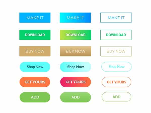
4. Use Color Contrast:
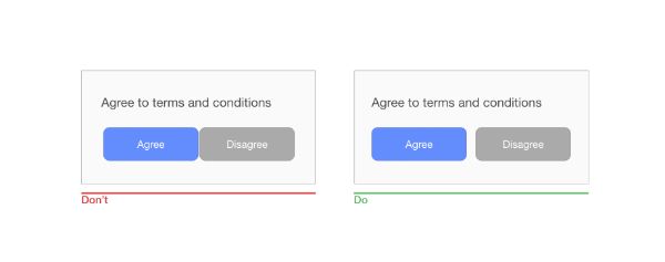
Another theory revolves around using the colors on the buttons that contrast with the website theme. Moreover, the same contrast may get you more or less click through rates depending on how the user perceives the color contrast and the button. If you are using white as a primary website background, then don’t opt for light grey or cream colored buttons. Instead, use bold colors like black or blue that stands out against the white.
Contrast is the most powerful factor to make the user take notice of wherever the contrast is applied. This is also applicable to the text that you put on the button. If your button color is grey, then you should take up the black colored button caption. But if you have blue colored button, use white colored button caption instead of black. This is perceived well by the users.
A user should never be made to just go through your buttons. Instead, make the buttons on your website stand out and the user feels compelled to click them.
5. Pay Attention to the Details:

While designing big things, it is always wise to pay attention to the tiny details. These tiny details make your designs great and well-responded. This also stands true for your website button. It is a small element, someone would say, but holds a lot of significance. Hence, you can make your button look interesting when you pay attention to detailing the button and its purpose. A small gradient factor introduced three-dimensional styling, and good lighting effect can change how a button appears on the website.
These tiny changes add a lot of depth to your elements and stand true for a button too. The factors like saturation, lighting and borders can make the buttons pop out of your website. Moreover, it compels the user to click the button when the button is intended for the call to action.
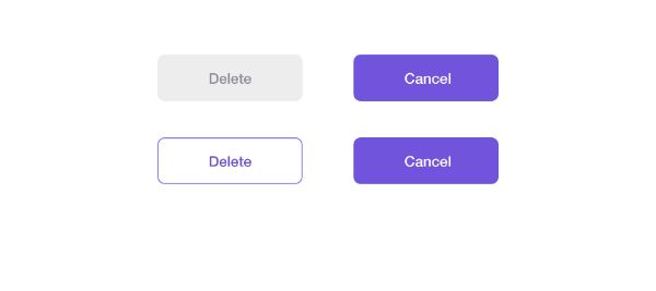
6. Don’t Forget about the Button States:
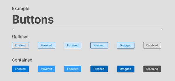
While designing the buttons, it is very obvious to forget or ignore the button states when different actions are performed with it. For instance, a button can have active, disabled, focused, hover, and selected states. Let us take a look at each state of the button and things to keep in mind while designing the button for each state:
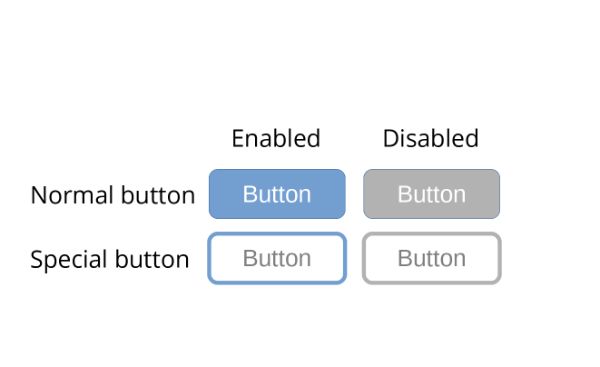
A button whether it is active or disabled both of them should look like buttons. This means that they should stand out different in the form of color and styling. They should be able to stand out from the surrounding text fields. The active buttons are supposed to match with the color theme of the website, easily visible, and easy to read. It is obvious that the active button should be clickable or easy to tap.
On the other hand, disabled buttons should be dull or should have gray color and should be less noticeable than the active button. Moreover, the disabled button should not be clickable.
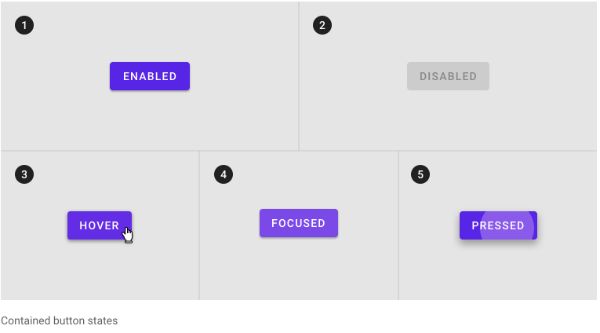
Focus buttons allow easy accessibility to them through keyboards and assistive devices. By default, browsers provide focused buttons and other UI controls, but the designers often remove this setting to accommodate the brand styling and other factors. To depict a focused button, it often glows or shows an outline on it. This lets the user know that the button is usable and clickable along with it being active as well.
When you remove the focus from the button, the users fail to understand the purpose of the button along with its function. Moreover, color contrast and borders also play an important role in offering the button its visibility including all the vision abilities and disabilities.
3. Hover state:
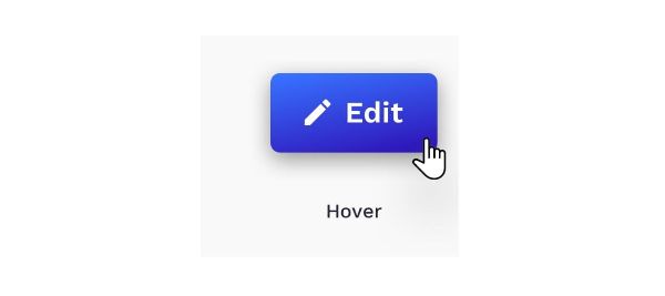
Hover state of a button is the state in which the button changes a little when the mouse cursor is moved over the button without the button being clicked. This tells the user that the button is usable, active, and clickable. When you design the hover states, factors like color change, animation or change in the text can be helpful.
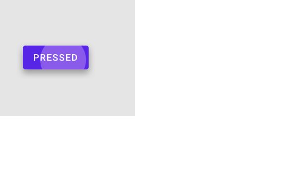
There is a huge difference between the selected button and the active button. An active button is one that tells user, that it is usable and clickable. But the selected button is one that is clicked or pressed. It changes its state when it is clicked. This change can be depicted using animation, color change or the change in the text.
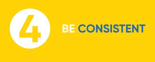
7. Have a Consistent Design and Document it:
When designing a website and talking about your brand, you should be consistent not only with the tone of the content or the website color theme. But you should also maintain consistency when you design the UI elements of the website including buttons. All the components of user interaction should be similar throughout the website along with their purpose. Moreover, as discussed above, all the button states should be taken care of on the entire website, not only on the home page of the website.
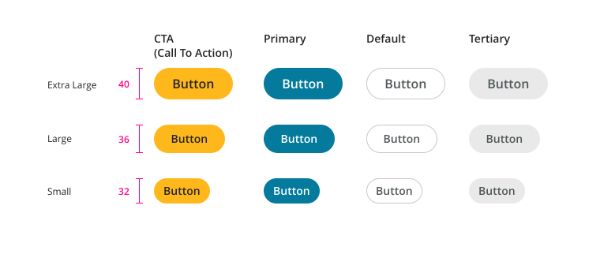
The buttons can also be categorized on the base of the purpose behind the button. For instance, the cancel, stop and confirm button should be in different colors. Like you can put cancel button with red color but confirm with green or blue. These colors indicate prominence.
On the other hand, the button shape also changes when it comes to their functions. For instance, a button on the form differs from the button on the navigation menu. Once you finalize all the buttons and their purposes with colors and functions, you should document them. This documentation can help the team to design the buttons accordingly and keep all the members on the same page. Moreover, it also removes the confusion as to how the buttons should have the design.
8. Maintain the Size and Reach of the Buttons:
The size and the dimensions of the button matters, which is irrelevant to whether the user browses your website through a mobile device or a laptop screen. And this changes how users derive the experience of browsing your website or your web app.
If a button is far from the reach of the thumb, while the user is browsing the website through a mobile device, then the thumb may not reach the button. For small buttons, it gets difficult to click or tap the button on the screen with a larger thumb or fingers. A badly defined contrast ratio can make the buttons tough to find for the user. This makes it difficult for the user to tap the button and give a command to the website.
There is a term called “Thumb Zone” which talks about the zone on the mobile screen which is generally browsed through the human thumb. This zone can consist of buttons, sliders, carousels, and more.
When you review the design and test it, make sure the buttons are effectively placed for both right and left-handed users. Moreover, testing the design makes it the best idea to understand how feasible the design is, considering all the users from all the fields.
9. Understand the Accessibility Factor:
Accessibility of the elements of your website is necessary. What is the point of designing something that is not accessible? Hence, when you design something that is going to be accessed by a larger group of people, accessibility is an important factor to consider. And you may never know, who is browsing your website. People with disabilities can also be one of the people who access your website on a daily basis.
So, you should pay a lot of attention to color contrast, size of the fonts, weight of the font, the spacing between the text and the UI elements of your website. Your website should never have fonts that are difficult to read, or bright colors that makes it invisible. This makes it difficult for visually impaired people to go through your website.
The white space between the UI controls also makes your website and UI elements less crowded and less overwhelming. Your website design should never be cluttered and the same thing is applicable to the buttons too. Well-spaced buttons can make a world of a difference, compared to the buttons that are sardined.
Website design is a very important aspect to consider while understanding the user experience on the website. And the UI elements like buttons, play an important role in enhancing or demeaning the experience of the user on the website. The buttons make the users reach their destination on any website. Hence, the UI elements on a website should be carefully designed, while taking all the users under consideration. And your audience includes people ranging from zero disability to disabilities of various kinds. Refer to this blog when you are designing, specifically the buttons, on the website. We have amassed all the tips on how you should design a button and how to make them look amazing.