Line25 is reader supported. At no cost to you a commission from sponsors may be earned when a purchase is made via links on the site. Learn more
Any brand requires a unique identity that people can recognize. And it is not easy to build a brand identity. Things like logo design, design of a visiting card, colors to represent the brand, and the fonts are some factors that require a thorough understanding of a unique brand identity. The process is not limited to this. Once the design is ready, you have to make sure that it resonates with your firm and the target audience.
This blog discusses the tips on how to design the right typeface for a brand. The selected fonts have to be distinct, easy to remember, legible, and platform-independent. Moreover, it should communicate the personality of your brand.
1. Understand the brand persona:
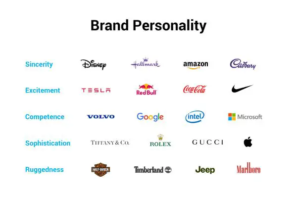
Each brand is recognized through its personality or its characteristics. A customer remembers a brand personality that is clear and easy to connect with. Looking at these factors can make you understand and increase awareness of your brands. Brand voice, color combination, logo, and fonts should work in tandem with the brand persona. The brand persona should also be such that it communicates the right message to the target audience. Hence, before looking for the fonts, think about the brand persona and check if it is well defined. If it is not, then check and understand how you would like people to perceive your brand.
If you are unsure how to understand and project the real brand personality, then try finding some adjectives that align with your brand persona. For instance, you can get your stakeholders involved and have them pick up some terms. These terms can be the words that define the brand personality partially or entirely. You can offer them terms like Bold, Calm, Flexible, Friendly, Functional, Serious, Reliable, Quirky, Sophisticated, and Warm.
Such words can help you define the understanding regarding the personality of your brand. Once the character is defined perfectly, you can look for the fonts that justify the underlying message.
2. Curate the personality of every font:
If you are not very well-versed with the concept of typography, then you may or may not have any idea about the categories of the fonts. But understanding the font categories is an excellent point to begin your research in the quest to find the right fonts for your brand. Font category is defined as a classification of typefaces that aid graphic designers when they are about to identify, select, and pair the fonts. Every group has specific unique characteristics, and understanding these can help you find the right font for the business. Sound knowledge about these font categories can save you a lot of time by helping you shortlist the choices between various fonts.
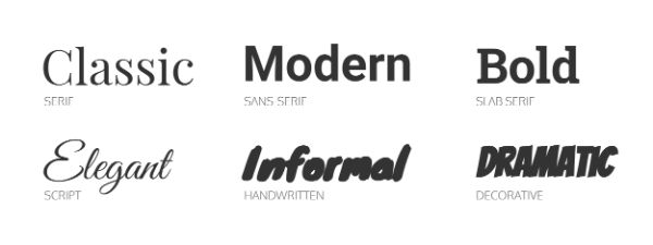
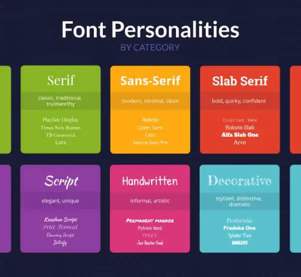
The fonts can be classified into six different types:
- Serif
- Slab-serif
- Sans-serif
- Handwritten
- Script
- Decorative
1. Serif Fonts:
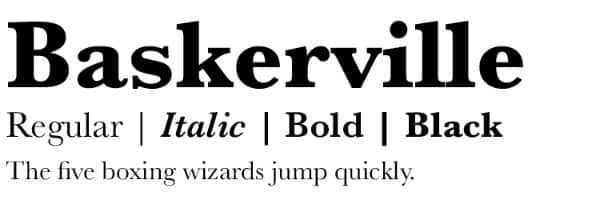
Being the oldest fonts, Serif fonts have been in existence since around 15th Century. The name originated from the feet of the fonts found at the head and feet of each character. Because of its original nature, the Serif fonts are generally looked upon as classy, traditional, and worth the trust. Brands that command respect yet want to look traditional, often employ these fonts for their brands. For instance, brands like Time, Vogue, Tiffany & Co., have used these fonts to represent their brand and brand personality.
Some of the popular fonts that fall under Serif fonts category are Times New Roman, EB Garamond, Playfair Display, Baskerville, and more.
2. Sans-serif:
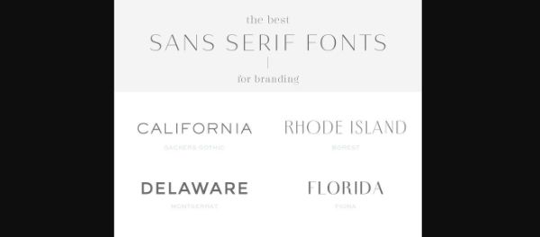
Sans-serif is understood to be contemporary, clean, and minimalistic in its design and form. As these fonts did not show up until around 19th Century, they are considered modern and new compared to Serif fonts. With an uncomplicated and clean appearance, Sans Serif often is looked at as honest and straightforward. Sans-Serif fonts are adopted by so many companies on the web recently with their bolder forms. Tech companies like Facebook, Google, Netflix, and Spotify have used these fonts in their logo design.
The standard Sans-serif fonts are Helvetica, Arial, Roboto, Source Sans Pro, and more.
3. Slab-Serif fonts:
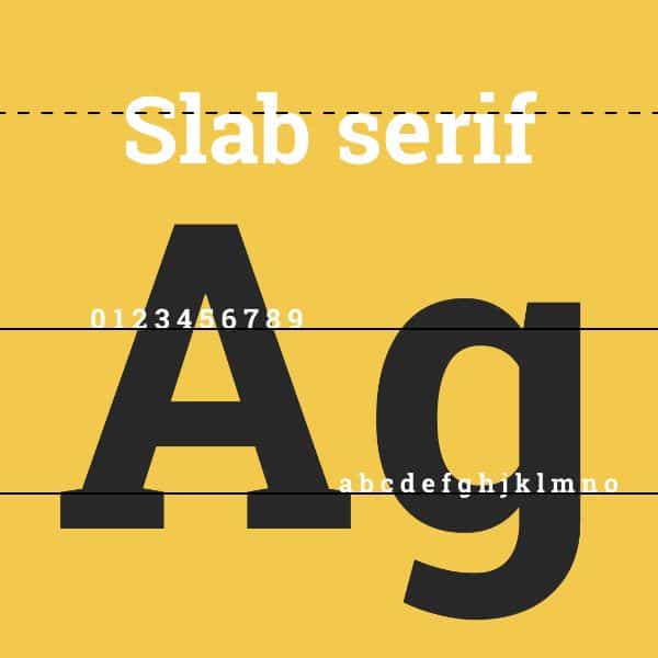
If you want your brand to project boldness, quirk, and radiate confidence, you should select Slab-Serif fonts. These fonts are known for their quirky form and spirit. And as a consequence, these fonts appear rugged and bold than the conventional serif typeface. When you want to merge the traditional and modern approach in your brand, then these fonts are perfect for your brand. The companies that have a long history of its existence but also want to be modern have taken up these fonts. Examples include Volvo, Sony, and Honda. The fonts that fall under the Slab-Serif category are Rockwell, Roboto Slab, and Courier New.
4. Script fonts:
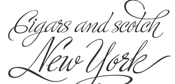
Script fonts talk elegance and have been designed to recreate the cursive handwriting where one character is connected to the succeeding one. You can see that everyone has a unique handwriting. Similarly, all the fonts under this category are unique in their appearance. Script fonts are used when you want to be in the trend, and hence they hold a risk that the brand font may drop out of the pattern once the trend is over. Certain brands have used these fonts that have taken the test of time successfully.
For instance, brands like Johnson and Johnson, Instagram, and Ford have chosen these fonts, yet you can identify the brand from afar. The popular fonts that fall under this category are Lucida Script, Pacifico, Allura, Dancing Script, and more.
5. Handwritten fonts:
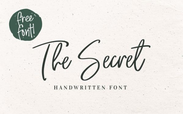
The name of the font explains the meaning of it. Fonts in this category appear as if human hands write them. These fonts have certain absurd letter forms and strokes, and they vary greatly when compared to the conventional serif typeface. If your brand is related to art or if you need to come across as approachable and warm, then these fonts are perfect.
The fonts that fall under the category of Handwritten fonts include Knewave, Permanent marker, Patrick Hand, and more.
6. Decorative fonts:
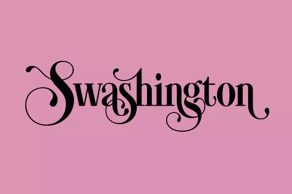
The most diversified category of the fonts is Decorative fonts. It includes any fonts that have different strokes, forms, and shapes that stylize the appearance of the brand logo. Brands like Disney, IBM, and Lego have taken up these fonts, which makes them memorable and easy to recognize.
These fonts are powerful and should be used minimally. They appear trendy. Hence, you should avoid them if you want the company brand to stick around for upcoming years. The fonts that fall under this category are Fredericka, Lobster Two, and more.
Hence, to sum it up all, the fonts’ categories give out the following messages to your brand:
Serif: Classic and traditional.
Sans-Serif: Modern, professional and minimal
Slab serif: bold and confident while being quirky.
Script: elegant and distinct.
Handwritten: Informal yet artistic.
Decorative: Dramatic and stylish.
3. Curate your budget for the fonts and understand its license requirements:

Now that you have understood the categories of the fonts and the fonts that fall into those categories, you can now move on to selecting the fonts for your brand. But before that, you have to find out where you can take up the fonts. You have to check whether the font style you are looking for is available for free. If not, you require the budget to decide which fonts are available in your budget and whether they fit your needs.
Specific font libraries provide fonts that you can use for free. These libraries include Google fonts, Font Squirrel, and Font library. Free fonts are often convenient and the correct choice to take up. But the font libraries offer only selected fonts for free, and that too, very few instances like bold and italics. It can get challenging to find the font family with varying weight and styles.
The font libraries that offer paid licenses include Adobe fonts, Linotype, and Fonts.com. Font libraries provide a vast range of options, but it can burn a big hole in your pocket. Moreover, these libraries charge fees individually for each font license. If you are looking for fonts for the web app, mobile app, and print media, you have to bear the cost for all three.
You have the choice to make the decision between selecting the paid fonts or free ones, but make sure it matches your brand personality and underlying message.
4. Select the font style that matches your brand persona:
Once you are accustomed to your brand persona and different categories of the fonts, you should start experimenting with your brand’s font selection. But the font categorization doesn’t provide you with the entire story when the font character is concerned. There is a lot of variation with each font style that affects the font’s vibe when used for a brand. Hence, how you combine the fonts play a vital role in conveying the brand’s understanding and message. Let us take a look at how fonts should be matched according to the changing brand personalities.
Pairing a bold Serif title and a non-descript Sans-Serif offers an approachable and trustworthy idea. The difference within Serif and Sans-Serif forms a pair naturally, and it lets you strike balance among the contemporary trait of Sans-Serif with the Serif’s rustworthiness.
Examples of such pairs are
- Abril FatFace with Montserrat
- Rozha one with Raleway
- Abril Fatface with Quicksand.
To incorporate modern yet a very professional appearance, take up simple Sans-serif fonts. You can pair a bold font style from Sans-Serif with a standard version from that font category. This can make your brand look professional and business-like. It is always safe to pair fonts that fall under the same category.
Examples of such pairs include:
- Economica Bold with Economica Regular.
- Montserrat Regular with Montserrat bold.
- Source Sans Pro Bold with Source Sans Pro Regular.
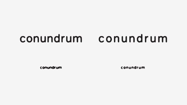
You can use thin Sans-Serif fonts to have the brand logo appear elegant and sophisticated. According to research, thin-looking fonts are perceived as extravagant compared to the ones that are heavier and rounded. Julius Sans One, Playfair Display, and Verdana are some of the elegant fonts that are light and thin in their forms. For a brand that talks about being amicable and friendly, they should take up curved Sans-Serif fonts. The compact and lightweight Sans-Serif fonts talk about being playful and youthful as opposed to bold and curved Sans Serif fonts.
5. Be sure that your brand font meets three essential requirements:
Surely by the time we reach here, you must have shortlisted a few fonts that appear aligned to your brand character. But there are some parameters that you need to test before you move ahead. Let us look at three fundamental parameters that need to be fulfilled before finalizing the fonts.
1. The flexibility of the Brand fonts:
Once you take up a font style, you have to stay consistent with the fonts for coming years. You have to ensure that the same fonts work perfectly on the web, print, and mobile representations of your brand. Here, you have to ensure that you acquire the licenses of the fonts that you use for every application. If you use the fonts on package, presentations, and social media posts, you will require mockup designs for every single representation.
2. Brand fonts should be available with various font weights:
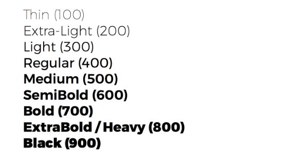
To build up a text hierarchy, you require various font weights like light, regular, semi bold, and bold, that should be mentioned in the guide to brand style. You need various font weights to change between various headers and sub headers.
3. Legibility of the brand fonts:
The fonts that are easy to make out and understand, irrelevant to their stylized form or regular, should qualify as your brand-specific fonts. The stylized form of the fonts can include bold, italics, uppercase, lowercase fonts, or fonts with various weights. You don’t require legibility as far as headers and subheaders are concerned. But the text in the body part of the content requires legible fonts.
Conclusion:
Picking out the right font size and style poses a considerable challenge to the designers, and it requires careful and thorough thinking before you finalize the fonts. The tips, as mentioned earlier, offer you an insight into how you can select the right font for your brand according to the brand persona.