Line25 is reader supported. At no cost to you a commission from sponsors may be earned when a purchase is made via links on the site. Learn more
Typography on the web comes in two formats; firstly there’s the classic image replacement technique which allows for beautiful typographic designs, but it lacks the technical wow factor. Then there are true examples of web typography where designers wrangle with browsers to manipulate HTML rendered type in impressive ways, but while browsers and web technologies are continuously improving, this method often lacks in the visual flair that is achieved when designing typography in Photoshop and exporting it as an image. Both techniques result in equally inspiring web designs, so today’s showcase features a huge collection of sites with all kinds of web typography.
As one of the core design principles, typography can really make or break a website design. Despite recent advances in web type technology, we’re still fairly limited when it comes to creative typography layouts, meaning image replacement techniques are still common, but these days we have a massive choice when it comes to selecting fonts for our designs.
This post showcases 50 website designs that all feature beautiful typography in a creative way, this might be through elegant typographic layouts or perfectly typeset combinations of styles to create visually pleasing pages.
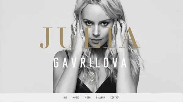
Julia Gavrilova
This website gives info on everything there is to know about Julia Gavrilova, a singer who was born and raised in Moscow. This website features beautiful typography and professional web design.
Playing Fashion
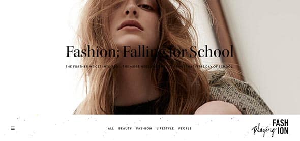
Playing Fashion’s website uses typography to give a sensitive aspect to their page and to mark articles as you hover your mouse over them.
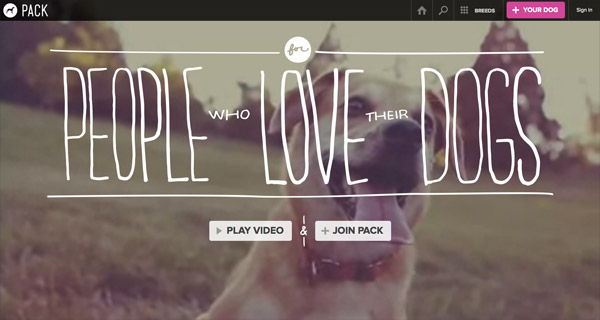
Pack
Pack uses different types of fonts to present a gallery of images for dog lovers. This is a nice example of using typography in a creative way.
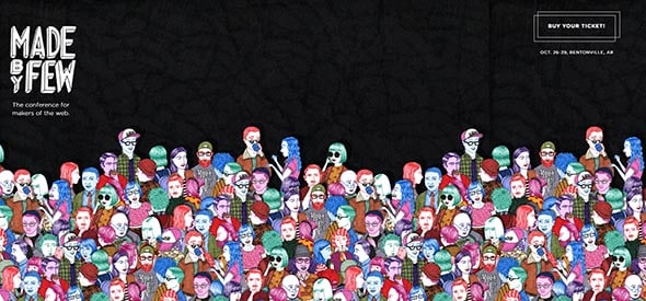
Made by Few Conference
This website combines typography with a good choice of colors, styles and web design. All in all, this site gives you a friendly vibe as you scroll through it.
Gladeye
This site uses huge white typography on a dark background to lay out important information to their readers. You’ll notice that this is also an interactive site that uses animations and gives you a white trail as you hover your mouse.
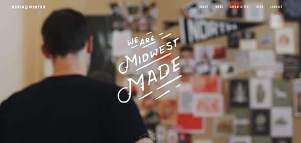
Grain & Mortar
Their good taste for typography resulted in a nice and minimalist web design that uses horizontal bands along the way. If you’ll keep scrolling you’ll find out they’re a very dedicated brand strategy and design studio.
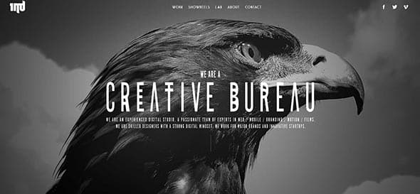
1MD
1MD uses huge white typography on a slideshow of animations to connect to their readers. They are a creative bureau that focuses on major brands and innovative startups.
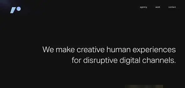
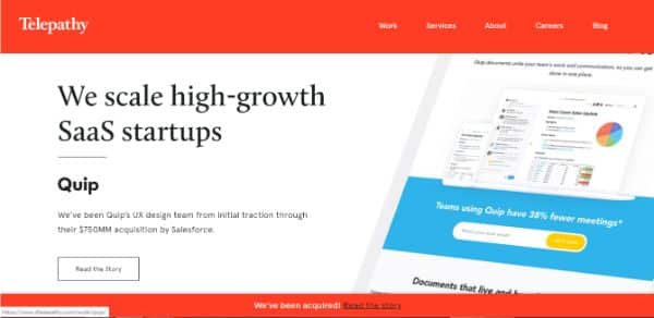
Telepathy
This website uses typography in different ways and images to showcase their services. It is a clean and modern website that uses minimalism in its design style.
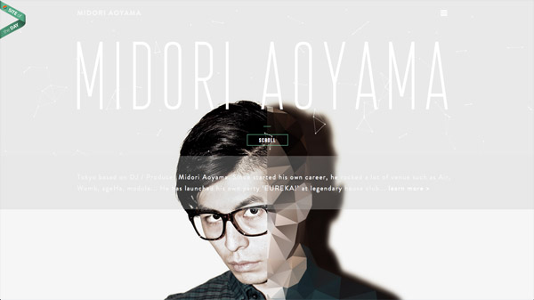
Midori Aoyama
This website belongs to a Tokyo Based DJ and producer, Midori Aoyama. His page mixes good taste in typography, color, and interesting web design.
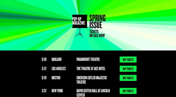
Pop-Up Magazine
This website uses both typography and illustrations in making an interactive site that shares a lot of tips and tricks about reaching your goals.
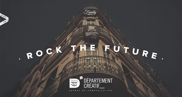
Département Créatif
This is yet another example of huge white typography as the first thing your readers see. This website combines colors, fonts, and images to lay out important information
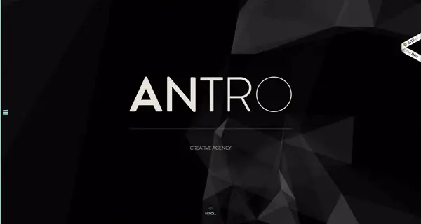
Antro
Antro is a creative agency’s website that uses typography in different ways. They’re very dedicated to their work and they do their best to meet today’s challenges in innovative ways.
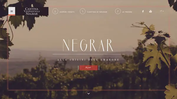
Cantina Valpolicella Negrar
This website uses typography as the missing ingredient in a nice and sensitive web design. You’ll notice many different ways of using colors, text, and images if you’ll keep scrolling this site.
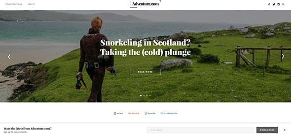
Adventure.com
This website aims at presenting emerging destinations for your next trips and combines monochrome typography with image galleries and articles.
evolve wealth
Evolvewealth uses huge white typography in their header to state out their motto and continues with horizontal bands of good pieces of information.
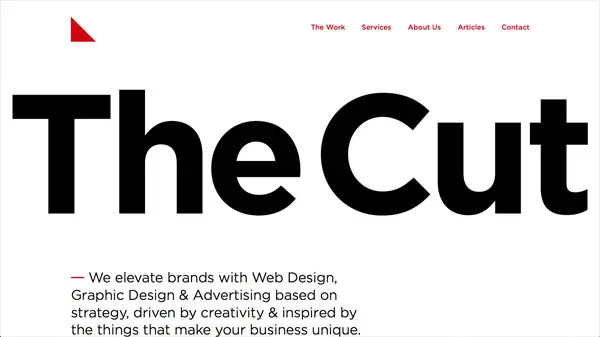
The Cut Creative
The Cut has their name as the first thing a reader sees and goes on with laying out important information about who they are and what they do. This is another way of using typography in your next project.
Giflan Design
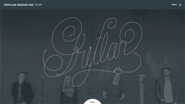
Giflan Design’s aim is to take your ideas and help you in making them big. You’ll notice that their page surely expresses their taste for innovation and good design through typography, slideshows, and web layout.
Curt’s Special Recipe
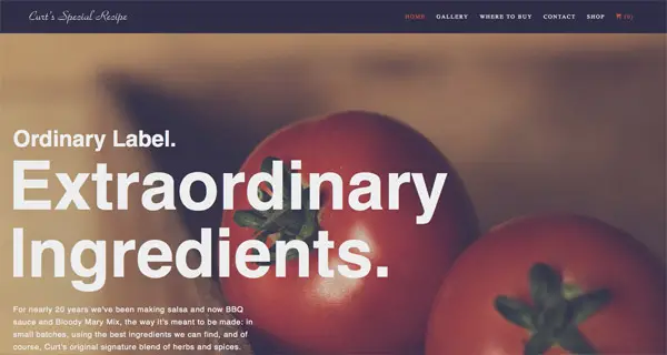
This is yet another example of making your design look sensitive and clean through simple images and typography. The large fonts are overlayed on the blurred, sepia-filtered images, and this makes the text easy to read and eye-catching.
Luke Stephenson
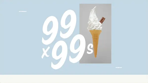
This website presents Luke Stephenson’s epic adventure and the world of 99 ice creams. This page has a clean and elegant design and it is a good example of choosing the right typography for your project.
The Status Bureau
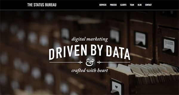
This website also uses huge typography in a horizontal layout as the first thing a reader sees. Scrolling you’ll notice that the style, font, and colors change making the page look even more interesting.
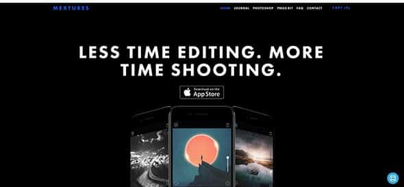
Mextures
This website is yet another good example of choosing the right typography for your project. It uses simple, bold, all caps fonts as a header, on a dark, black background.
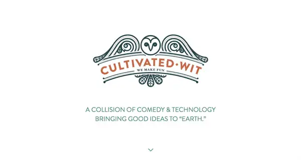
Cultivated Wit
They use combined different fonts, colours, shapes and sizes and even animations into making a nice, clean and smooth design for their page.
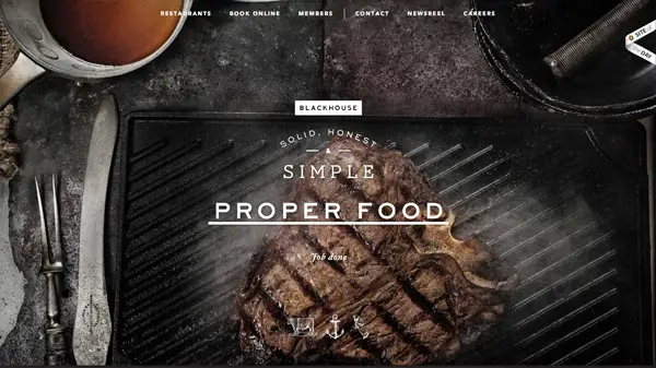
Blackhouse
This website is your go-to when you’re looking for a restaurant. Not only did they chose the right typography for their page but they also know all the good places you can eat.
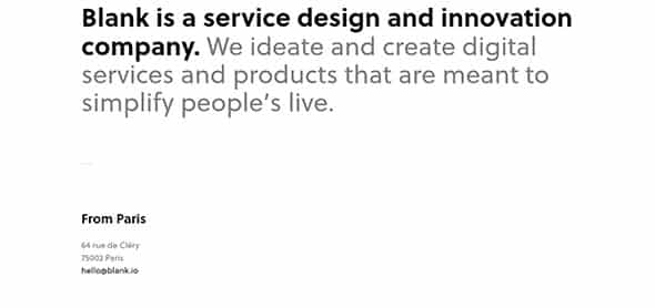
Blank
Blank’s aim is towards innovative and creative solutions that best suit their clients’ needs. This is a business card website that uses typography to lay out only the important information about their business.
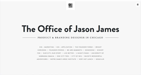
The Office of Jason James
With a minimalist design, Jason James’s website shows a great taste in typography. It’s not visually-oriented at all, but the well-chosen fonts and perfect typeface pairings make it a good example for this list.
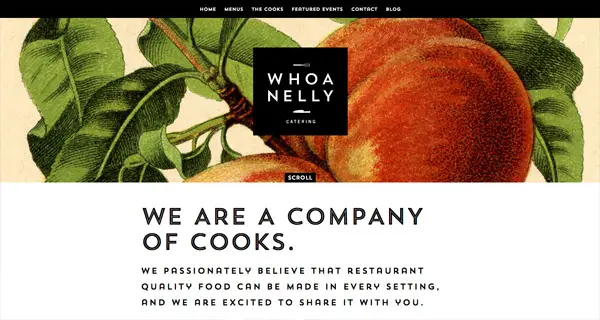
Whoa Nelly Catering
Whoa Nelly! is a catering company serving Los Angeles and Southern California and whose website shows not only a good taste for food but also for typography and web design.
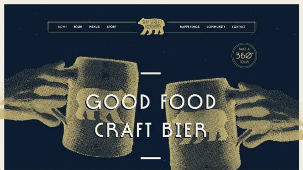
Bay Street Biergarten
They’re craft beer lovers and their website best shows their love for beer. They use a dark blue background with illustrations and white typography.
Electric Mainline
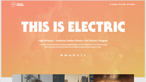
Electric Mainline also uses huge white typography in their header but this time on a pale pink background. The gradient background is a really nice touch and the large, bold font is definitely an eye-grabber!
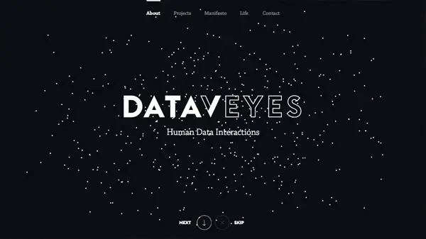
Dataveyes
This animated website uses typography in its header but this time in a creative way. Find out more about Dataeyes from their vertical slideshow.
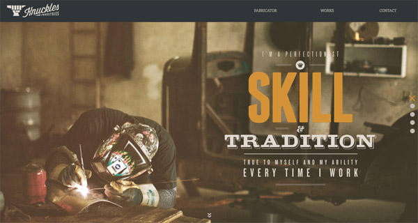
Knuckles Industries
This is yet another good example of choosing the right typography to express and connect to your readers. It has a vintage vibe and the fonts are very well chosen and paired together.
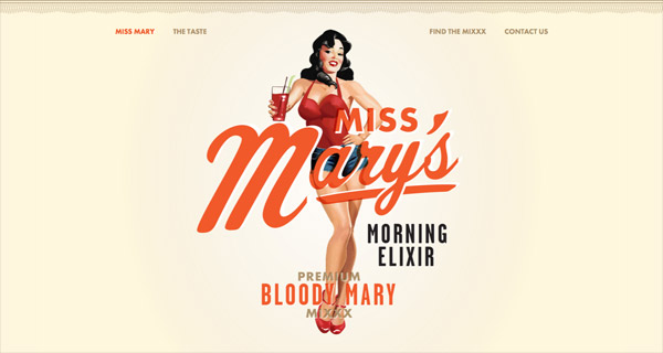
Miss Mary’s Morning Elixir
This website combines illustrations with typography to present this gluten free drink. It has a 60s vibe with a pinup girl theme. Check out more on their site!
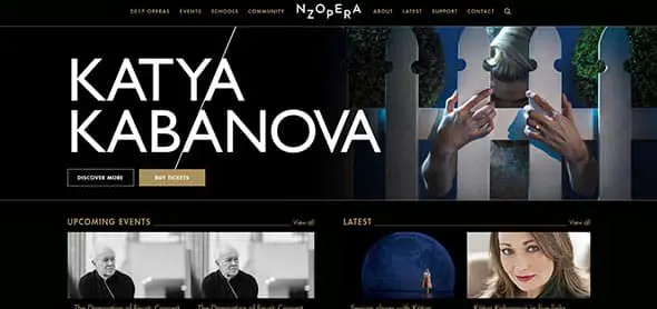
New Zealand Opera
On this website, you’ll find out everything you ever wanted to know about the opera. All in all, this website uses typography in a clean and elegant way.
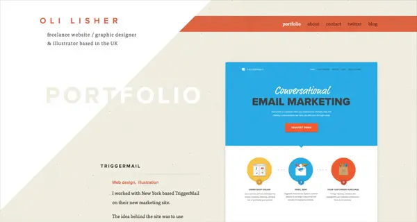
Oli Lisher
This is the portfolio of Oli Lisher, a freelance writer, graphic designer and illustrator. On his site, you’ll notice interesting ways of using typography in web design.
Planet Propaganda
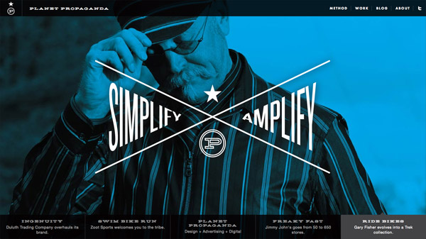
Planet Propaganda’s website gives typography a more creative look trough the way the menu is built. The great fonts are combined with interesting vector graphic elements and give cool distortions to create a dynamic concept.
RSQ
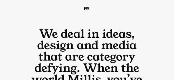
This website uses horizontal bands to lay out a vertical slideshow of typography that comes in different shapes and colours. The texts are the main attraction of this design, so the fonts are very well chosen.
Thobeck
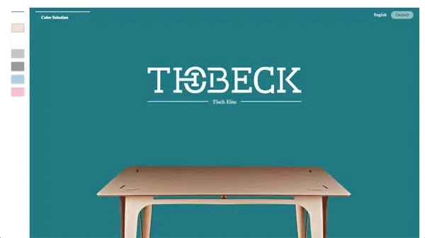
Thobeck presents laser cut furniture and items. This website has a simple and clean design and uses nice, unique typography.
Studio Otwarte Agencja Brandingowa
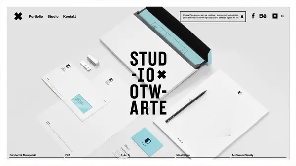
This website also uses huge typography on a horizontal band to emphasize on their team and their web design experience.
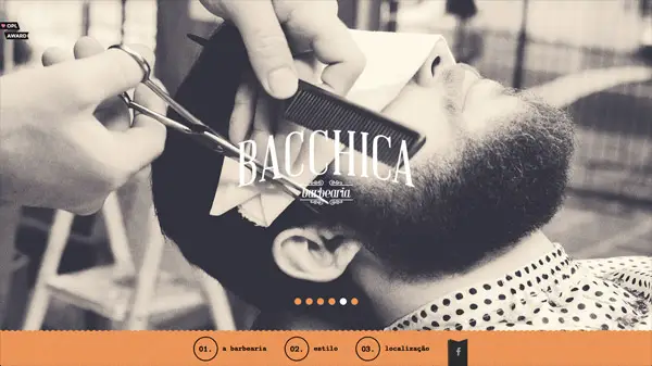
Bacchica Barbearia
This is yet another example of a clean design that uses the right typography and palette of colours. It has a hipster-vibe and a vintage color palette with a modern-aged look.
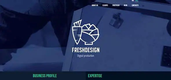
Fresh Design Studio
They use an animated horizontal band on which the logo and name are cutout. You’ll notice a clean design and a good choice in typography.
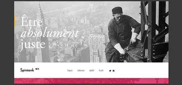
Spintank
They use image, colours and illustrations as horizontal bands to lay out important information through typography.
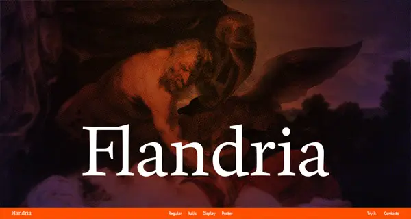
Flandria
Flandria is a website that focuses on confortable reading. They use white typography that shrinks as you continue reading their page.
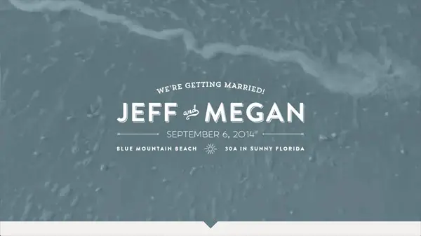
Jeff and Megan at the Beach
Jeff and Megan use typography on a light grey background with grey blue images which gives their website a calm and friendly look.
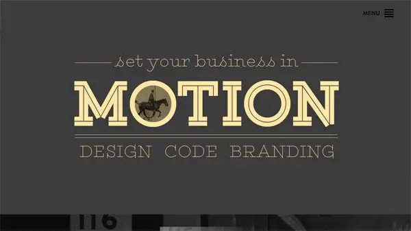
Ante Meridiem
Motion uses typography in different shapes and colours to give their website a dynamic look. The fonts are vintage-inspired and very well paired! The all caps fonts are perfectly paired with their regular, serif counterparts.
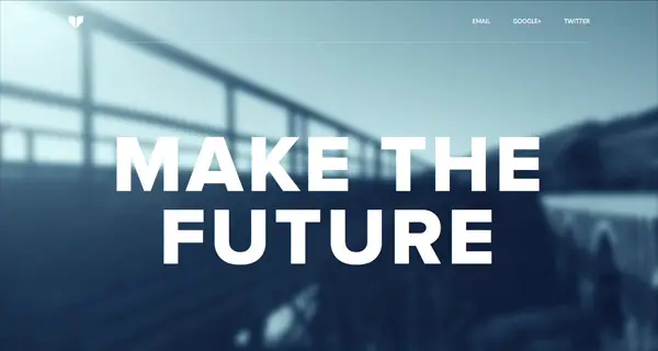
Dickson Fong
Dickson Fong combines typography with horizontal bands to give their website an unique touch. The blurred image background makes the statement text on the homepage stand out even more.
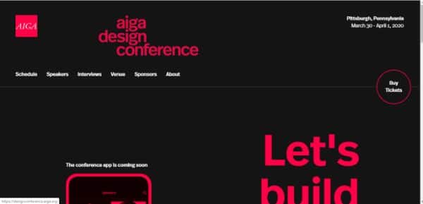
AIGA
AIGA shows a great taste for color contrast throughout their website. This website design has a very interesting concept and layout worth checking out.
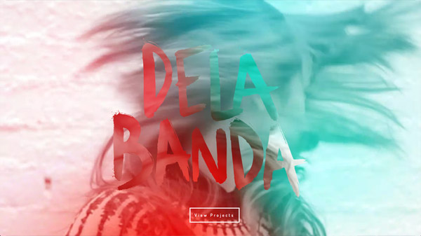
delaBanda
On this website, the use of typography is done in a creative and unique way. This website has a lot of cool projects you can check out. The graphics, colors and images are very well created and match the overall branding.
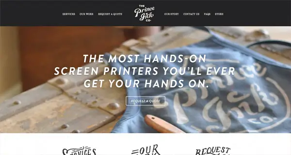
The Prince Ink Company
Thhis is the presentation website of a printing service and their website shows a good taste in web design and typography.
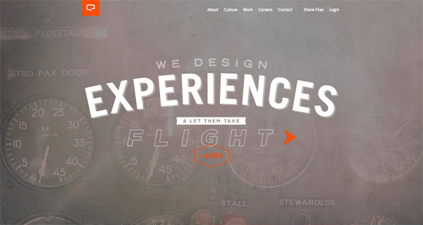
Wild Blue
Wild Blue has a cool way of presenting themselves. They have a dynamic and creative web design layout that uses typography in many different ways.
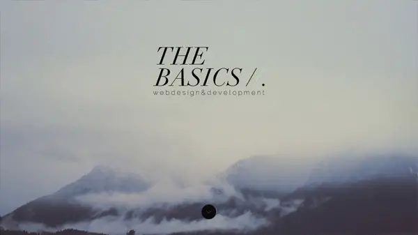
The Basics
Here’s another great website design with a smooth and clean layout that merges perfectly with their choice in typography.
Michael D’Ambrosio
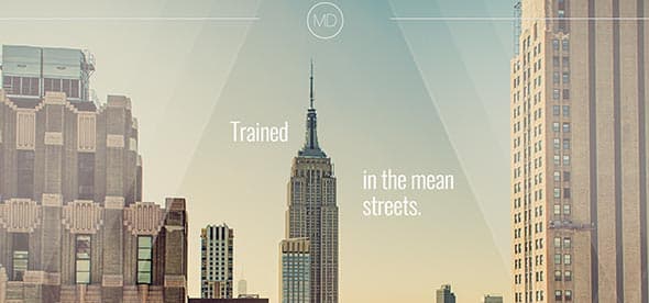
This website works as a digital portfolio that combines creativity with a good taste in webdesign and typography. Images and fonts blend perfectly together.
Brice
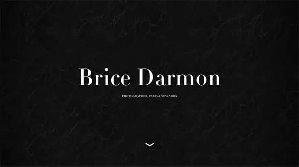
This website has a dynamic touch thanks to the typography they choose. They only lay out important information through key words and images.
Design for Good
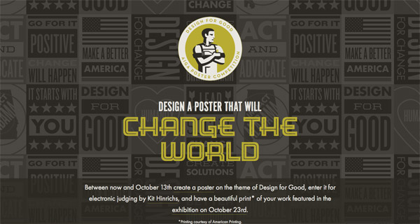
You can design a poster with the theme of Design for Good or you can simply have a look on this interesting page. This is yet another good example of creative ways of using typography in your next project.
American Advertising Awards
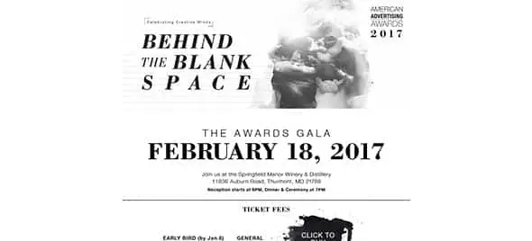
American Advertising Awards has a unique way of using typography on their website. This monochrome website design uses both images and fonts to deliver the information. Check out this nice example!
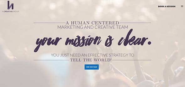
H. Creative Group
This website uses typography in different ways using a violet-toned palette of colours that give a sensitive touch to the design layout.
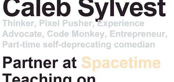
Caleb Sylvest
This is yet another good example of creative use of typography in your next project. You can get inspired to use different sizes of the same font or highlight some key words with a different colour.
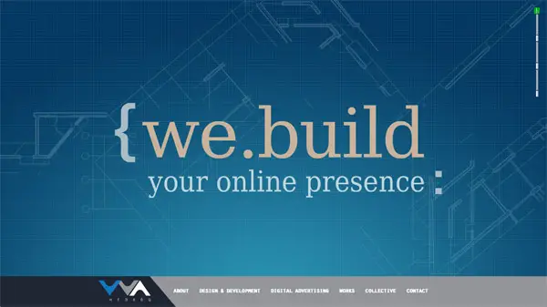
WEBARQ
Their website stands out through personality and a taste geometry that merges with a great choice of typography.


Awesome list of 50 web with beautiful typography. respect from Indonesia.
Great Job for the amazing list!
Really thanks for that!
And with using font tools in the internet, we can get the exact type of the fonts!
A lot of well executed web designs with beautiful typefaces. Thanks for sharing!
Very nice article. Got info regarding some of the new advancements in the designing. We also bestow the services.
Web designing plays a vital role in making the business successful in case of online branding and marketing. The web designing skilled professionals design using the different software tools like HTML, CSS etc. A quality site helps the viewers by providing necessary information in a compact and organized form.
Awesome list, some great typography and beautiful websites.
Nice list. Too many sites these day ignore the importance of good typography.
Hi Chris, Some of your picks were less than stellar when it comes to kerning–granted, it’s harder to control with webfonts than Photoshop. Some of the typeface combinations were a bit iffy too.
That certainly is a great example! I’ve saved it for a feature in the next Sites of the Week roundup
Wow! Some of these websites are really inspirational Chris.
I must say that is one hell of a font they’ve created. Lovely site to expose it as well.
Great find Mrs.Koch.
Great uses of typography overall! Most of the creative type is displayed in the top focus position as I’ve noted in other web designs but I, personally, have found it a little difficult to space out my type when I try to integrate it into the rest of the website pages.