Over time certain conventions and best practices have been developed to help improve the general usability of websites during their design and build. This roundup of ten usability crimes highlights some of the most common mistakes or overlooked areas in web design and provides an alternative solution to help enhance the usability of your website.
Crime 1: Form labels that aren’t associated to form input fields

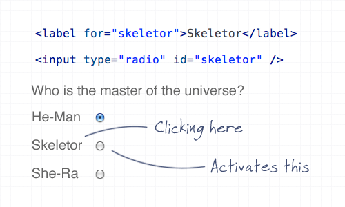
Using the ‘for’ attribute allows the user to click the label to select the appropriate input fields within a form. This is especially important for checkboxes and radio fields to give a larger clickable area, but it’s good practice all round.
Crime 2: A logo that doesn’t link to the homepage

Linking the logo of a website to the homepage has become common practice and is now second nature for (most) web surfers to expect the logo to head back home. It’s also worth mentioning the logo should appear in the top left.
Crime 3: Not specifying a visited link state

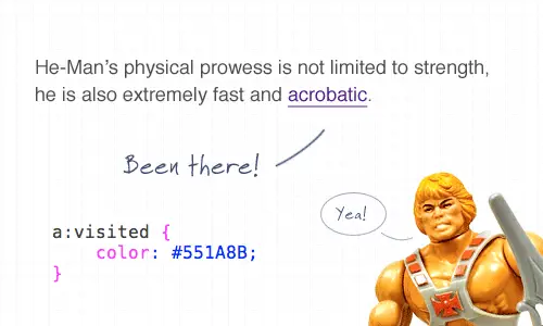
Visited link states do exactly as they say on the tin. It’s not the most advanced CSS selector, but it’s one that is often overlooked. Give users a visual clue as to which link has already been clicked.
Crime 4: Not indicating an active form field

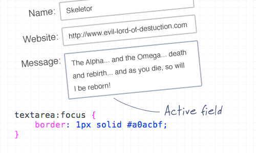
You can use the ‘:focus’ selector on lots of elements, but it’s super handy when used on inputs and textareas to indicate that the field is active. Add CSS styling such as a highlighted border, or a subtle change to the background color.
Crime 5: An image without an alt description

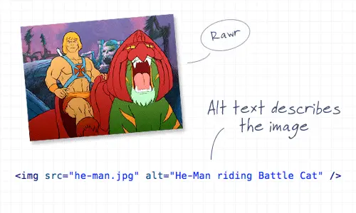
This is straying a little into the realm of accessibility, but it’s still an important consideration! Remember to always add a descriptive alt attribute to your images, unless of course they are used for decorative purposes, then the ALT attribute can be left empty (but should still exist!). When using an image as a link, enter a description of where the link goes.
Crime 6: A background image without a background color

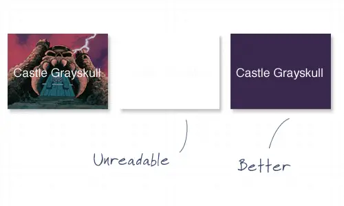
It’s common to use background images behind passages of text, but it’s worth remembering that if background images are disabled by the user, there needs to be a similar tone in the form of a background colour to avoid the text becoming unreadable.
Crime 7: Using long boring passages of content

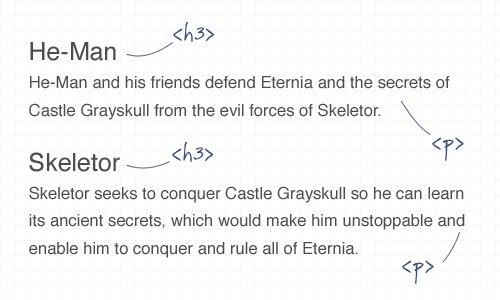
There’s nothing more off-putting than landing on a webpage that’s laid out as a continuous passage of text. Break up your content with images, headings and clear sections to make it easier to scan, read and digest.
Crime 8: Underlining stuff that isn’t a link

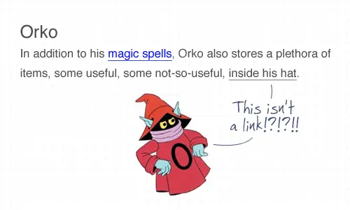
Everyone knows that text that’s underlined, or is a different colour is likely to be a link. Don’t go confusing people by throwing in underlined text elsewhere! To draw attention to a certain word, try using the strong or emphasize tags instead.
Crime 9: Telling people to click here

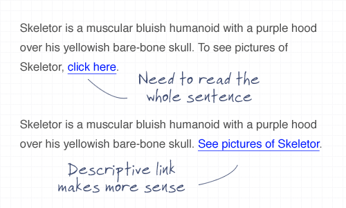
The words click here have been around since the dawn of the Internet, but have been shunned aside in favour of more usable options. Using the words click here requires the user to read the whole sentence to find out what’s going to happen. Instead, describe what’s going to happen in the actual anchor link text.
Crime 10: Using justified text

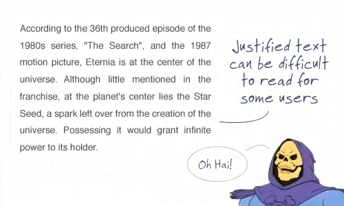
This is another tip that’s heading a little deeper into accessibility but is also an important point to consider. Justified text might look at neat and square to the eye, but it can generate some real readability problems, particularly for Dyslexic users who can find it troublesome to identify words due to the uneven spacing of justified paragraphs.

This was great. I commit one….but not anymore.
if I disable images in your template, I lost your rss feeds.
What I didn’t agree with:
The :visited state
The :focus use
Background colors
The :visited state, I believe, only really needs to be utilised on large websites, where you might be annoyed to find yourself at the same section again.
Although :focus is really helpful, and it looks great when it’s used effectively, I wouldn’t say it’s a crime not to. If you can’t remember which input you were last in, or can’t spot your text-cursor, then yes I suppose that might be annoying, but once again, I don’t believe a crime!
Also, this isn’t me having a go at the author Chris, I’d just like to hear some more ideas!
I agree about the "visited state", I hardly remember using it in 7 years of building websites… I don't think people are idiots :)
I thought ‘click here’ with a bit more description was a recommended practice for maximum clicks? ie ‘Click here to see pictures of he-man’ is the idea. Its a definate call to action then. There was quite a long post on it over at Smashing a while back.
Besides that though, its a real nice handy list.
Thanks
Not by any usability expert, it isn’t. For every article by an “expert” such as Smashing Mag, you will find a true expert such as Jakob Nielsen or Steve Krug telling you that you should never use “useless” words, like “click here”. They provide absolutely no value to the user; if the link looks like a link, he knows that he needs to click on it.
“click here” also implies a visual orientation and input method that some users might not have. Some users may not use a mouse so “click” doesn’t quite fit. Screen reader users may find “click here” to be useless because you don’t see where “here” is.
Good usability does not necessarily equal good marketing, and vice versa.
You all should read this regarding the whole “click here” ordeal.
http://dustincurtis.com/you_should_follow_me_on_twitter.html
Good post: this is a well-illustrated list. Nice work.
really nice article and good way to describe the problem and found solution of my common problems from here.
Nice post Chris. I like the use of He-man throughout.
I agree with Russell that the visited state only really becomes a major issue on larger sites, however it is obviously good practice to use it all the time.
What does the size of the site have to do with how f’ing infuriating it is to click on a link, expecting to see new info, only to see a page already visited?
Don’t waste your users’ time! It used to be browsers resolved this automagically, I wish that control was never taken away.
Worse are sites that include another link to a previously visited page with different text linked to it.
Add to that dynamic content so you don’t even realize it’s the same damn page you read through five minutes ago until you’ve gotten halfway through the first paragraph.
Although I replied to you because you made the point more succinctly, others have opined making a site more frustrating and time wasting to navigate is not horrible design as well.
Well put together line-up. Simple design points but all for good reason. I don’t tend to use link visited states in my designs but I can see why they are used.
Chris,
I love this post. Excellent idea. This is the type of post that you want to read.
The content and the points are all valid and great, but adding the He-Man element to it just adds the cherry on top. Great article! I just stumbled it and bumped it as well. Keep up the great work!
I agree with @Design Informer.
I actually read the entire article because it was (a) informative and (b) amusing. Great combination Chris.
hooray
someone else thinks text centre-justified is a piee of *klonk* for readability.
I wish more print people thought so too
Crime 11: Copyright theft. Using unauthorised images of he-man & friends
I’m inclined to agree – the use of the images in an article completely unrelated to ‘He-man’ is unlikely to count as ‘Fair Use’
The crime with ‘Click here’ is two-fold:
1) The text of the link does not describe what the link is pointing too – this is especially bad for blind users
2) How do you know they clicked? They might have pressed a keyboard button, touched the screen or spoken to their computer for all you know
very useful, thank you.
Nice Tips… Although I went off HTML and Web Scripting about a decade ago, this was a nice reminder of the basics… :-)
thanks for this cool article about usability
thanks for this post I really got benefits from it.
keep up the great stuff.
Very well writen, illustrated and explained. Thanks
Excellent little article, i do them all anyway, but its great for beginners.
Hi Chris, great roundup. You have some great point in here, but what’s wrong with justified text? Do you think this can be considered on a case by case basis?
Nice one. Did all of these apart from the background color on links with a background image – nice tip!
There are very few “crimes” in usability that apply to every situation. Usability is relative to your intended audience.
Having said that, these are some good tips for front-end developers. 4 and 7 are a bit dubious though… 4 might be helpful in some cases, but hardly constitutes a usability “crime” and 7 is very much dependent on context…
Gret article!
Nice article, but your images don’t have alt text =0
Thanks, I didn’t know about justified text and dyslexia.
If you have a small login area on a page, make sure that when someone does log in that they’re taken back to the page they were at, not the homepage – sxc.hu breaks this rule and it *really* annoys me!
Bless you for joining the chorus of voices proclaiming that using “click here” as link text is a crime against your users. The Smashing Magazine article claiming otherwise was a load of poorly researched crap. For more musings on the use of “click here” see my ironically titled blog post “Click here for more information.”
Could you point me to that Smashing Magazine article? I must have missed it. I’d like to read how wrong they are.
Charles, I don’t think there is such an article. The user seems to be repeating what you erroneously implied — that a Smashing Magazine author would say such a thing. Now we know how false rumors get started.
Thanks for an elegant case against justified text! I had to try and explain this to a client just last week. Next time, I’ll just point ‘em here!
You are giving usability tips using text in images without an alt text. Irony much? Usability tip #12? Come on…
Great list of tips. Very helpful indeed. Thanks!
I break these all the time. Thanks for Sharing. I appreciate this very much.
“Crime 2: A logo that doesn’t link to the homepage”
Unless you’re on the homepage.
If you’re already on a page, you shouldn’t have a link to that page on it, it’s confusing.
This doesn’t apply to content anchors of course.
I love the way you chose to illustrate these tips! Thanks! Yea! :P
Nice tips, I will implement this ideas.
Thanks from Argentina
Nice post Chris, Cheers :)
Nice post, i like this =)
Thanks for the comments everyone, and some great additions mentioned too.
Before the thread gets filled with the same responses:
> ‘Crimes’ – It’s a catchy title, there’s no scale on how much of a crime one point is against another. Consider it more a collection of tips I personally find handy.
> Yes, I’m a criminal, there’s some of these points that I don’t fully practice on this site. Maybe I’ll correct them on the next design refresh! If you disable background images there’s plenty of content here that become illegible, but the main content is there. Plus the images in this post I’d argue are more for presentational purposes, rewriting the image content in alt attributes would more likely confuse a reader not seeing the actual images.
Great post, thanks! (@BostonMarketer)
Great article. I know I’ve been guilty of using the click here crime especially when a client specifies that to be used and I can’t think of any alternatives.
Great article. I have to say I used to commit the “click here” all the time.
Love the He-Man theme for the post.
LOL I love your examples! I’m guilty of not specifying visited link colors. I always try not to use “click here” but sometimes I fail for lack of better words ;) I do, however, disagree with not putting alt descriptions on everything. For design elements, I’ll normally just put a few keywords in it for SEO purposes.
This was a great article! I’ve just added ‘:focus’ to my CSS – I have been wondering for a while what the code for that is! Thanks!
Great post chris, He-man is the poster boy for usability. I’m a Crime #5 violator
Very Good Article!!! I’m guilty of doing some of these things.
Great post Chris, and awesome way of presenting it.
However, on the note of the “click here”, I’ve seen a lot of REAL statistics that “click here” does in fact typically produce higher click thru rates than descriptive words of what the link will bring you to…. I’m sure there’s someone out there that has carried out this research recently.
Brian is right… but what about combining the two? "click here for pictures of skeletorrrrr", althoug "see" is also an action word, just probably not as effective…
Nice post Chris. Great job visually illustrating these points as well.
Most of this also is penalized by google in searches.
Awesome post Chris! Crime #10 was a surprise to me. I did not know that unevenly spaced paragraphs could make it difficult for Dyslexic users.
THANKS!
another crime I see often is having a link in a website that is not or no longer a valid link.
Great use of He-man visuals. I’m now going to dig out my Masters of The Universe video and reminisce about my childhood Castle Grey Scull toys.
I can’t believe that I never knew about the for attribute in the form label. Although I think that since this is an underused feature it may be good to highlight or underline the the label and input together on hover so users know it is clickable. I will be using that from now on. You learn something new every day. Thanks for the informative post.
Just stumbled onto this from a tweet. One thing to note about the "for" attribute is that when using JS to set or get it, you must use htmlFor as the Attribute name, if you want this to be compatible with Internet Explorer.
Great summary article, great points.