10 HTML Tag Crimes You Really Shouldn’t Commit

Home » Articles » 10 HTML Tag Crimes You Really Shouldn’t Commit

Line25 is reader supported. At no cost to you a commission from sponsors may be earned when a purchase is made via links on the site. Learn more

You better watch out, because the HTML police are about. They scour your code and pick out the most unspeakable crimes against HTML markup. This handy list of ten HTML tag crimes sheds some light on some of the most common coding mistakes and helps provide an alternate solution. Tips include writing valid markup, making semantic choices, avoiding deprecated tags and more!

Crime 1: Placing Block Elements Inside Inline Elements
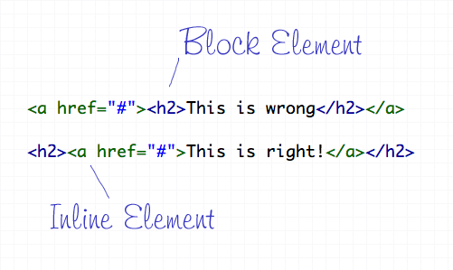
HTML elements can either be displayed in two ways, Block or Inline. Each tag by default is naturally either a block or inline element. Block elements include divs and paragraphs, that make up the structure of the document. Inline elements on the other hand should sit inside block elements and go with the flow of the document, examples include anchors and span tags. With this in mind, inline elements should always go inside block elements, and never the other way around.

Crime 2: Not Including an ALT Attribute on Images
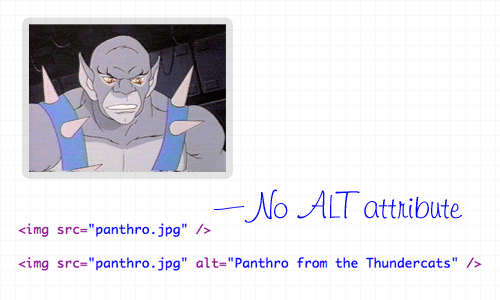
The ALT attribute is a required element on all images displayed on a web page. It helps users determine what the image is, should they be browsing on a screen reader, or simply on a slow connection. The ALT attribute should describe the image being shown, so an alt=”image” is bad practice. If the image is purely for decorative purposes, simply add an empty alt attribute, such as alt=””.

Crime 3: Not Using Lists When Necessary
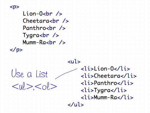
The handy UL (and OL) tags have a bunch of uses and are extremely versatile for the display of all kinds of page items. Unsurprisingly the Unordered List tag does a great job of displaying a list of information, so don’t even think about using a bunch of line breaks ever again!

Crime 4: Using <b> and <i> for Bolding and Italicizing
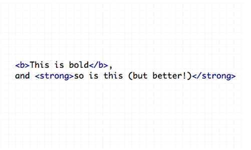
The <b> and <i> tags make the text appear bold and italic respectively, but semantically they are classed as presentational tags, therefore the effect would be best replicated with the CSS styles of font-weight and font-style. If the passage of text suggests areas of importance, they should be highlighted with the <strong> or <em> tags, which basically do the same job as <b> and <i>, but also make the world a nicer place.

Crime 5: Using Too Many Line Breaks
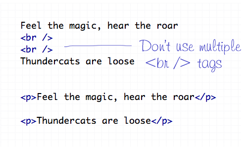
The line break tag of <br /> should only be used to insert is single line breaks in the flow of paragraph text to knock a particularly word down onto a new line. It shouldn’t be used to make gaps between elements, instead, split the text into separate paragraphs, or adjust the margin styled by CSS.

Crime 6: Using The Wrong Strikethrough Tags
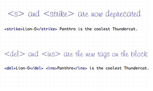
In the olden days, <s> and <strike> were around to allow edits and amends to web text. However they are now classed as deprecated tags, which means they still work fine (in Transitional), but there’s a set of new tags on the block – <del> and <ins>. These new tags are used together to show deleted, and the subsequently inserted text in a document.

Crime 7: Using Inline Styling
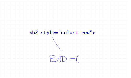
You’ve heard it a thousand times – Inline styling is bad. The whole point of semantic HTML and CSS is to separate document structure and styling, so it just doesn’t make sense to go placing styling directly in the HTML document. Remember to always keep your styles in your stylesheet where they belong.

Crime 8: Adding or Removing Borders in HTML
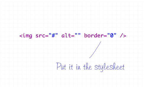
The border attribute is another presentational effect, so semantically it should be left to the CSS, even if it’s removing a default border from an element.

Crime 9: Not Using Header Tags
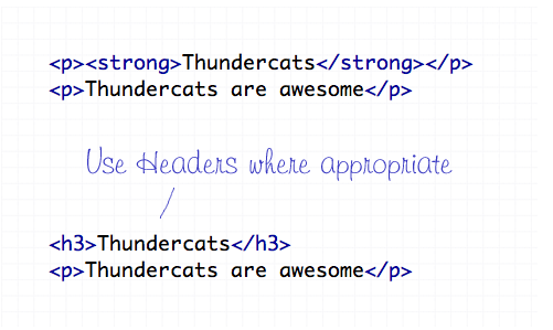
Header tags are available all the way from <h1> to <h6>, and make handy tags to separate your document into titled sections. If you have a selection of words indicating what content is due to appear next, chances are one of the header tags will fit right in. Your choice of header tag depends on the flow of your document, try to naturally insert them in order of 1-6 where appropriate.

Crime 10: The Unspeakable Use of <blink> or <marquee>
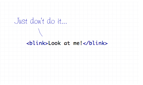
Apart from not even being part of the official collection of standard HTML endorsed by the W3 Consortium, the <blink> and <marquee> tags are just pure ugliness. If there’s something you need to draw attention to, I’m sure you can think of plenty of alternate ways to draw focus to that area of the page than to have it flash on and off or scroll across the page!

Author
The Line25 Team
This post was a combined effort from our team of writers here at Line25. Our understanding and experience of blogging, web design, graphic design, eCommerce, SEO, and online business, in general, is well over 20 years combined. We hope you enjoy this post.

262 thoughts on “10 HTML Tag Crimes You Really Shouldn’t Commit”

  1. On your number 9 crime, I want to point out that the order of the headings DOES matter. If it is not in order, devices such as screen readers will skip them, therefore, making your content not accessible or inclusive to all

    Reply
  2. Wonderful blog! Do you have any tips and hints for aspiring writers?
    I’m hoping to start my own blog soon but I’m a little lost on everything.

    Would you suggest starting with a free platform like WordPress
    or go for a paid option? There are so many choices out there that I’m totally confused ..

    Any suggestions? Appreciate it!

    Reply
  3. Well, I’ve committed almost all these “crimes” at one time or another, when I’ve been in a hurry – and I will happily continue to do so until I’m hunted down by the HTML police.

    Reply
  4. It was said already in the comments that with HTML5 you are allowed to wrap block elements with a anchor tag.

    Crime #1 is not really a crime anymore, and if it was I would be guilty as charged.

    Reply
  5. Great page of advice! – I have used many of those things in the past and some I still do *ashamed face* I know I’m really just too lazy. But I do go back and change my site with these kind of things in mind when i have time.

    Cheers for posting

    Reply
  6. I take most of these for granted but the online styling doesn’t sit very well with me. Obviously it’s best to put everything into CSS but sometimes it’s actually more convenient to add a width to an id/class-less div than to give that div an arbitrary id or class that will be hard to track down later – should I need to ammend it. What I am considering is a more modularised approach entirely:

    name and define classes iny CSS for widths and heights so I can add them into te HTML freely (
    .x100 { width: 100px; }
    .y100 { height: 100px; }
    ).

    This would negate the entire problem: I’d say heights and widths are the most frequent examples where the above usage could come in handy. I already use classes like the above to float or align elements and chain them on to the HTML.

    Reply
  7. Inline styling (Crime 7) is not a crim!! Many famous giants like google, yahoo, w3.org use it & recommends them.
    They come in handy when you do not wanna load a new stylesheet file for just few new lines of styling, Instead you can use inline style tag to achieve performance.

    Reply
  8. I’m in favor of the semantic-only approach, in theory, but it’s clear that most people don’t understand that just because something is visual doesn’t make it non-semantic.

    The term “strong” is especially funny I think. Whoever had referred to strong text or described bold-set words as “strong” before the invention of this misguided element? There is no such thing as “strong” text. As for emphasis, well, should we have a sarcasm tag too, depending on the particular (semantic) meaning of the italics?

    If this is the point — to break down semantic typographic attributes into abstract meanings (perhaps in the name of accessibility), why don’t we have a span around each and every word with a “dictionaryid” attribute indicating its specific meaning (assuming the meaning has been registered by some bureau of language standards — otherwise, should you really be using a non-standard word? It might not validate).

    Do whatever works unless there’s actually a reason not to. Consecutive line-breaks? There may be a more efficient way to do that (unless you only need the gap once), but it’s not like there’s any browser that won’t understand the br tag… I don’t like this dogmatic approach at all.

    Reply
  9. I disagree with rule #10, and I’m not the only one. I’m not saying you should use the ‘marquee’ and ‘blink’ tags, but the effect, at least for ‘marquee’, could be useful for a short headline. So it really isn’t ugly, if done right. In fact the effect is to be added in to CSS3, so someone finds it useful, other than me.

    Reply
  10. In HTML5 it is allowed to wrap block element with «a» (at least it’s correct!).

    Also, if image is for decorative purpose, isn”t better to use css background instead?

    Reply
  11. That is a nice perspective. I’m a software developer. (not gui) I have been trying to design my personal site also I could not :).

    I will check this rules on my personal site.

    Thanks.

    Reply
  12. Hey,
    That is nice for me. I’m a software developer (hard core not gui). That is why that article helped me about css and html.Because I have been trying to design my website also I couldn’t.

    Thanks

    Reply
  13. Liked: Use of Thundercats

    Disliked: That you pretty much summed up the fact that some tags are deprecated for no reason at all, and there is 0 penalty for using them.

    Just goes to show how badly we need HTML5 to be semantically un-retarded.

    Reply
  14. Nice. I made the mistake of putting block tags into inline tags awhile back. Didn’t realize why the editor was complaining. Thanks for explaining that to me.

    Instead of using a bunch of tags, I use a div with inline styles for margin or padding. I’d have to write innumerable classes for each possible scenario.

    Thanks

    Reply
  15. I didn’t know about the strikethroughs — but — inline CSS – is there any other way to get gmail to recognize CSS? That’s the only time I use inline CSS.

    Reply
  16. Cliff is correct; your crime number four was badly demonstrated, as the bold text doesn’t appear to need any emphasis, and the text in STRONG tags appears to need two levels of emphasis.

    There are plenty of occasions where text, such as a book reference, need a particular format, and for those cases B and I are perfect, and perfectly acceptable.

    Reply
  17. Cliff definitely makes some good points. Agreed across the board. As far as using titles in {a} tags, never done it but perhaps I should start. Thanks for the roundup. I spend most of my time focusing on database programming, but it’s always refreshing to find ways to improve my markup.

    Reply
  18. Cliff is right. The real crime is using {em} and {strong} when they aren’t appropriate.

    If we’re working toward a semantic web, we need to focus on using those tags correctly. The web is full of things like {em}The Grapes of Wrath{/em}. That can get very annoying to someone who uses a text-reader and has to hear book titles emphasized every time they are mentioned on a webpage.

    {em} and {strong} are usually lies. At least {i} and {b} give no information.

    Reply
  19. I find myself correcting crime #1 at times, nice to have an article that calls it a crime, makes it more urgent to change my behavior.

    Reply
  20. Nice article!
    There is only one place where inline CSS is unavoidable, and those are HTML-newsletters. Most e-mailclients don’t support external CSS and will strip any CSS that is placed in the header or body.

    Reply
  21. Glad to see I’m not a super-criminal. The only one I didn’t know about was the & but I’ve never really had occasion to use them anyways.
    The only time I use inline styling if there’s just the one bit on a single page that needs to be different. Do I need a lawyer? :-)

    Reply
  22. Excellent article. Shall we add to the list the naming conventions of sections like which i must admit it’s a personal thing but why not use names that make sense like ?

    Reply
  23. I’ve written a tutorial for an art Ning site, and had to space down from a photo. I hate to say it: I used the line break umpteen times to get the photos positioned where I wanted them. I am totally unused to html – what code should I have used instead?

    Reply
  24. Disagree (slightly) with and tags. They are *not* the same as and . For example, is used for emphasis, and the formatting is dependent upon CSS. Italics, on the other hand, are mandated for the titles of books, and have a different semantic meaning than emphasis. For example, the CSS may designate as using a bold face, but book titles still need to be in italics.

    Reply
  25. oh yes, absolutely correct. it’s really sad that most of us don’t really bother about these html tags but these are really important from SEO point of view as well.

    nice article. please write some more of articles focusing seo.

    thanks

    Reply
  26. Another thing you should have mentioned about header tags is not to skip levels. In other words, don’t do this:

    <h1>Lions</h1>
    <h3>Tigerss</h3>
    <h5>Bears</h5>

    Instead:

    <h1>Lions</h1>
    <h2>Tigerss</h2>
    <h3>Bears</h3>

    Reply
  27. I can only agree completely on #1 and #10, but I also use tables for layout occasionally, so maybe you should put me in jail ;-)

    Reply
  28. Do you really think that a “strong”a-tag is more important than a CSS-Strong-a-tag?

    A Link is not more or less than a Link, a Bold Link ist only a Style, if you have a Linklist with many Links then “strong” is the way to style the one more important Link Bold. If you have only strong Links – CSS is the better way.

    Reply
  29. Wow!! Its amazing. I’m not committing any of the crimes, may be just missing alt attributes for images sometimes. but, will fix that in page validation process.

    Reply
  30. An Excellent list and the Thundercats touch was great, although Transformers would have been better. :-) I’m adding this blog to my feed reader and going to fix my tags. I’m still working off my knowledge from 1996.

    Reply
  31. Great post Chris.I still have some of these terribly poor habits. I think most of it comes from us older guys that learned html before CSS even existed.

    Separating semantics from design using CSS is going to be more important than ever in the next few years.

    You should write a post on Microformats next and why they becoming more important every day.

    Reply
  32. Major props for showing love to the Thundercats… If you use GoBots in your next post, I’ll be a fan for life.

    Reply
  33. nice post.

    imho, a counter-crime on the b and i tags is overuse of strong and em. b and i are often actually the correct tags for bold and italic when the content is semantically bold or italic. i.e., a book title or a ship’s name that takes italic should actually get the i tag (since you’re not really emphasizing that bit, but italicizing it).

    Reply
  34. Alt tags should be empty unless the image contains information related to the text. That is, if the image is just some bling for the page and you add alt text your just spamming the poor visually impaired guy with useless noise. how often do you in a conversation stop and say ‘panthro from the thundercats’ then continue talking ?

    Reply
  35. @Ozh

    Wrong, it’s never appropriate to anything for the sake of SEO, not to mention that a header tag (ie, ) holds more weight than a tag does (semantically speaking).

    Reply
  36. Second Ozh on b/strong elements’ SEO usefulness. Also second Ken on usefulness of inline styles. And thanks for the reminder on del/ins over strike (guilty as charged).

    Reply
  37. Wicked article! especially for a someone like me who’s in the learning stage of webdesign and wishes to do things right from the start, as opposed to getting into bad habits (that’ll come later no doubt).
    Thanks.

    Reply
  38. inline style is really handy if there are used only once in somewhere of your document.

    put trivial styles all in external css file some times doesn’t make sense.

    Reply
  39. the only one i struggle with occasionally is number 1 – sometimes its cool to have a whole div be a link (and not just the text inside it). anyway around that? How naughty is it anyway?

    Reply
  40. I disagree with the point on inline styles. Inline styles are just find as long as you don’t abuse them. If you have a corner case here and there, inline styles are a lot cleaner than an overly bloated CSS file.

    Reply
  41. Nice round up, but I always have found the strong over bold tag ridiculous. The purpose of the bold tag is to bold the text, and it seems to be complying perfectly with its function.

    I respect web standards, but sometimes they can go to extremes that honestly make very little sense.

    Reply
  42. I miss I was hoping for a comeback with variations, such as, blink-time: 2 secs or what about blink-style: rainbow? :-(
    Great post, thank you.

    Reply
  43. I am so guilty of a lot of these crimes!!! But I guess that’s what happens when you are self-taught. In the last couple of years I have managed to get away from a lot of these crimes but I’m glad you posted this because now I can be more aware of my faults. Thanks for the reminder.

    BTW… Kudos on the Thundercat shout outs. That cartoon brings back great childhood memories.

    Reply
  44. Nice to know these :)

    Admittedly I do some of them (such as the occasional inline styling) but I know I’m doing wrong and feel dirty, but it’s so much quicker for a simple hack :)

    Reply
  45. How do you handle inline images in a way that a feedreader will properly display the image? Using classes and CSS with float:left/right will make the result look quite ugly in a feedreader, inline styles work better in that case. Any suggestions?

    Reply
    • Don’t use float if it will render ugly, instead use classes with rules defining positioning, padding, and margins for a left justified or right justified image.

      Reply
  46. I think you could have done better.
    I would say that this is a beginner’s article. No one does mistakes like does after a couple of years of experience.

    Thanks,
    Marcel

    Reply
  47. I didn’t realise the first one until I validated my code using the strict Doctype. Yay for validation! If you get the web developers toolbar and validate your XHTML, CSS and accessibility there’s less chance you’ll be committing those HTML tag crimes!

    Reply
  48. I disagree with people that want to split up everything endless much. You can’t found things at one place, you need to go to a chain of references/functions/whatever to get the big picture. Why not making something global when it need to be shared and not everytime? Use the tags that suit your needs, you are not going to be punished, but its good to think one step ahead and being aware of the risks. Read, test, expriment and make your own opinions, its not written in stone.

    Reply
  49. I probably made all the mistakes on the list (except blink of course) at least once during my rather short web career.
    But as I got more experienced with web standards by now, I totally agree with every point on the list. Its not like we have to code that way but “code is poetry” and I’d rather like to code nice stuff. Not to please others or customers but to please my conscience ;)

    good list!

    Reply
  50. While I would advocate doing it with CSS, there are certain very limited areas where blinking text is not only useful, but also can prevent end lusers from getting themselves into hot water.

    Don’t get me wrong, I’ve used blink exactly twice in my life, but for all things there is a time.

    Better rule would be “Don’t use blink just to use it. If the world would keep on spinning without the extra extreme emphasis that it imparts, you probably don’t need it.”

    Reply
  51. 1) Thanks! Great things to remember… tho, thankfully, I’ve only been guilty of 2 on this list… will work to avoid those. :)

    2) Thanks for referencing Thundercats. That totally rocks my day. :D

    Reply
  52. I’m ashamed to admit I’ve done all of this at one time or another. I also admit I love using blink to annoy my co-workers!

    Reply
  53. @kL bold and italic are only semantic for visual presentation – they hold no meaning for a screen-reader. How do you interpret “bold” if you are reading it allowed to some one else for example?

    Remember the whole point for the revised markup was to make the documents structure independent of presentation and B/I tags do not allow that as they inherently refer to presentation and not to the meaning of the document.

    Reply
    • Meah. I used to preach this stuff back a few years ago, but find myself caring less and less these days. Please don’t tell me that a screen reader really sees more value in ‘strong’ than ‘b’ tags. And if so, its the GD fault of the screen reader.

      And in-line styles are kind of necessary when you enter JavaScript development. Plus, if you truly need the style only once, then it seems easier to me to maintain if it’s right there in the markup. This coming from a guy who used to quote the whole “separation of markup and presentation” thing all the time.

      Which, btw, I have yet to see ANY real benefit from. Honestly, if you use a stylesheet for every single style rule on your page, it will become a bloated mess over time, with 1000 entries.

      Reply
  54. But {B} and {I} elements *are* the most semantic elements for bolding and italicizing!

    Maybe you’ve meant emphasis and strong emphasis? But these are not synonymous with bold and italic. Speaking of them as bold/italic is like “use h1 for big text!”.

    Reply
    • I completely agree.

      If you want a piece of text to be bold or italic, use the B or I tags. If you want to (strongly) emphasise a piece of text, use EM or STRONG. Don’t use EM to make your text italic or STRONG to make text bold.

      Reply
  55. If it shows up correctly on the 2-3 major browsers, who cares? Customers aren’t looking through my code saying, “Gee, I really wanted to buy a scooter from this site, but… they’ve got a {B} tag in the code. I’ll just buy from someplace else!”

    lmao.

    Reply
  56. The list of tag crimes is very apt and many people including myself fall into it. The next time when dealing with html I’ll be mindful of the 10 tag crimes.

    Reply
  57. I agree and most of those would be easily caught if you take the time to validate your code.

    I would also like to add a couple pet peeves like:

    Don’t use a bunch non-breaking spaces, apply some padding with CSS instead.

    Use a definition list instead of an unordered list if one is called for.

    And for God’s sake, use comments – that’s what they’re there for. A simple comment to say what div you’re closing can save you a ton of time and headache.

    Reply
  58. Well I don’t kow some things out there just make sense but also means a hell of extra work in the end.

    I mean, if a simple “i” will do the italic job, why should I type lots of extra characters and extra files (the css sheet)?

    Well, except when talking about deprecated tags, many of this “rules” just seem pointless and dictatorial to me. I mean, who said I can’t use five BR tags if I want to jump five lines? won’t it work fine in any browser? yes it will. isn’t the BR tag out there to be used? yes it is. So… I really don’t get the atual point of some of this rules some people put as “crimes”. BR are crimes now heh? Oh c’mon!

    I go for the easiest, specially if it means the same result at all.

    And what about the first tip: what if I want the whole block element to work as a hyperlink, and not just the text inside it? in this case I have to place the “a” tag outside the “div”, cause I want all the div to be a link (without java’s onclicks either).

    Reply
    • I’m going to make the assumption based on your post that you also use tables for layout. Web standards are like a toolbox full of tools. Your approach is essentially choosing to use the hammer to make a hole. Will it work? Sure. However, any professional will tell you that a drill is the right tool for that job.

      If you think using a style sheet is extra work and the “i” tag isn’t deprecated then I am curious where you have been for the last, I don’t know, 10 years or so?

      Reply
  59. Let’s try that again. Ahem.

    I often find that people use the del tag just to style text with a strikethough rather than using {text-decoration: line-through;}.

    Reply
      • No, they shouldn’t. The del tag has a specific semantic meaning, separate from how it looks. If people are using del just to give their text a decorative line-though, they are DOIN’ IT WRONG, as the kids say.

        Reply
  60. I often find that people use just to style text with a strikethough rather than using {text-decoration: line-through;}.

    Reply
  61. i’ve been developing for years, but still learned a couple things from this list, in particular about “no multiple ‘s” and the use of and .

    thanks for the article, dude.

    Reply
  62. Well written Chris, Very nice,

    Also most of this (If you are a good programmer/designer/developer) would come naturally however laziness plays a huge factor in it.

    Thanks for making me smile today lol :)

    Regards

    Craig
    Thanks for the

    Reply
  63. I would’ve thought most of these would be common sense. Crime 5 needs an explanation, whats wrong with extra tags? Well it’s like faking a new paragraph. Looks fine and causes no problems for sighted users but for screen reader users their software doesn’t know to “draw breath”.

    Reply
  64. Yeah, never commit these crimes, because they are deprecated manners and they, errr, like, humm, render totally OK in all browsers.

    Reply
  65. I think it’s important to note for beginners that there are times when it’s OK to break the “no inline styles” rule. There IS a time and place for them.

    For instance, let’s say I want my H2 tag to be a different color on each of the 20 pages of my website. Is it better to use an inline style for each one, or add 20 more lines to my stylesheet that have to be loaded for every page hit on my site? Sure, twenty lines isn’t bad but when you have a complicated website that’s NOT based on a cookie cutter template, that number can grow fast! There’s no good reason to bloat your external CSS with numerous styles that are only used once, other than trying to be technically correct.

    Other than that, I must say your article is very nicely written. Thanks.

    Reply
    • At that point, I believe you would use styles in the head with the appropriate classes/ids or just targeting the standard tags. I’m hard pressed to think of a reason inline styles would have to be used when I’m not just feeling lazy and don’t want to do it right. :P I’ve done it before.

      Reply
    • I agree with Dana also, but there is one specific instance where inline styles are appropriate: dynamically generated divs that are being affected by jquery’s (for example) animation functions. Sometimes a div needs display: none to begin with, and doing that with a class doesn’t always work.

      Reply
      • And, further down, the comments, someone mentioned CMS issues. That’s also true. So, we have specific JavaScript declarations and CMS workarounds. :)

        Reply
        • I love breaking the rules. Oh, I’m so cool. I smoke too.

          Really, though.. I’m kind of tired of seeing how Semantics can create cults in coding. So, this is how religions get perversed and forget their purpose. I’m glad to bear witness.

          Reply
    • I have to agree with Dana, the only time I’ve used inline styles is when I’m feeling lazy. Sometimes, yes, you may want to target classes/id’s specifically on that page, but it would be better to make a specific stylesheet for this, or as Dana mentioned, add it to the head of the document, and not within each particular element. I think most people have done it before, myself included, but it makes for messy code.

      Reply
      • Most secondary pages get the styles in the head. The index page almost always needs it’s own stylesheet. Multiple stylesheets helps clean things up, for sure!

        Reply
  66. I am loving this list, I am sure almost every one who has worked with HTML has made at least one of these mistakes at one point in their career.

    Excellent list!

    Reply
  67. It’s almost embarrassing to admit that I won an award for a site made with blink and marquee tags. In my defense, it was the first site I ever built, and was pretty hot stuff for 1995.

    I wonder about using align=”” on an img tag. It seems like it’d be better to put that in the stylesheet as a float, right?

    Reply
  68. What would you do in order to simulate the tag? I have only used it once but it did the job nicely. Anything I can do instead without resorting to javascript?

    Reply
  69. It would be good if you gave some specific reasons for not doing these things beyond simply saying “don’t do that, do this instead”.
    How would you handle a situation where you want to make an entire block of information clickable with a link to a detail page? For example, if you have a list of people with some basic information displaying for each, and you want to be able to click anywhere on that person’s “Block” to be directed to their entire bio.

    Reply
  70. For few outdated browsers, you still have to put border=”0″ on images, because border:0px; doesn’t quite do the trick.

    Reply
    • What outdated browsers are you referring to? We design for IE6 at my work, unfortunately. I use border:none; in the css and it takes off border’s on linked images just fine.

      Reply
  71. I take it your abit of a thundercats fan? :) It’s like a LSD trip :D

    Cannot belive anyone would use blink anymore haha.

    Reply
  72. Oups,

    From what I understand, crime 1 and 4 are allowed in HTML 5,«b» and «i» are there to mark stuff like company name that are not more meaningfull so they don’t require a «strong» of «em».
    Yes I know, another set of new rules again.

    Reply
  73. From what I understand, crime 1 and 4 are allowed in HTML 5, and are there to mark stuff like company name that are not more meaningfull so they don’t require a of .

    Yes I know, another set of new rules again.

    Reply
  74. Hey Chris,

    These are the simple and common mistakes that everyone done in html. Nice article, information organized well.

    Thanks
    Sankar

    Reply
  75. I think your bang on with everything other than the ‘b’ tag . The ‘strong’ tag is used when you want to add emphasis to particular words or phrase, but some screen readers may use a different inflection when they come across these tags to communicate the emphasis. if your aim is to make a work bold always use ‘b’ tag never ‘strong’ b’ tag works in almost very browser known!

    what to read more on this: https://www.think-ink.net/html/bold.htm

    Reply
    • On the other hand the ‘b’ tag is presentational, therefore semantically, should be left to the CSS.

      Plus, if something on the page that is being made bold, it would suggest that it’s an element that need emphasis – so here’s when the strong tag comes into play. If not, then chances are a simple span would fit better.

      I get your point though, during my research I read about screenreaders interpreting ‘b’ and ‘strong’ differently. But overall, if the BBC don’t use ‘b’, that’s good enough for me :-)

      Reply
    • I’d have to agree, in some way, with this. If you sole intention is to create bold text, without any other real meaning, then the “b” element might be the way to go—though a “span” with a class might be another solution.

      There are cases where you might want to use the “i” element too. For example, in Latin names of animals/plants you should italicise part of the name (the species bit) and to use the “em” element would be semantically incorrect. You could use an “i” element with a class of “species” for example, which would give semantic meaning to the element.

      All that said, cases where those two elements can correctly be used are few and far between, so it’s unlikely that you’ll ever need to use them.

      Reply
      • On the other hand, if your sole intention is to make some text heavier without adding emphasis then the “correct” tag would be a .

        You would then apply a visual style via CSS to that span (via a class or hierarchy).

        Reply
    • ‘b’ means ‘bold’. ’em’ means ’emphasis’. ‘strong’ means even more emphasis. ‘b’ is presentational, ’em’ & ‘strong’ are semantic. Period.

      Reply
    • STFU, Eric. Some people call all html tags tags, even when they’re elements or when they’re just things that manipulate elements. If they’re inside so a lot of people they’re tags. Whoopie fucking doo.

      Reply
  76. 1. Who gives a fuck about strong versus b. What the hell is the different? Use styles in the css if anything. If you’re going to use tags in the html…who fucking cares which?

    2. Who cares which strike through tag you use! You apparently are one of these blokes that insists on always using the latest and newest shit. I’d say older stuff is better if, like with all these tags, they all do the same fucking thing. The older ones are more likely to work because who doesn’t know of them? The newer ones have a higher chance of not working since some people may not have bought into them yet.

    3. Sometimes using a styleinside a tag is necessary to take maximum precedence. It’s rare – but it’s made possible for a reason.

    4. All these 10 “rules” are just opinions for people who buy into the strict methods and who think their farts don’t stick. Most of them actually don’t make a difference. The day they throw syntax errors is the day I’ll fully abide by them. Until then, I’ll take strict rules with C++ and Perl, but not HTML. This is all just OPINION.

    Reply
    • Before you want to get heard, learn how to respect differences.

      It’s okay that you live in the old era of Internet coding, but don’t stop others from moving on.

      Reply
  77. Great article, I completely agree with everything you just said, I just need to learn to put it into practise myself!

    Reply
    • Yes. I would need to have a personal assistant to do everything else in my life that I would no longer be able to do because I have to update all my code. I agree these are best practices but they are hard to implement retroactive on an established blog. I am slowly chugging along making these changes.

      Reply
    • Echo that, consider me a repeat offender :)
      I commit some of these coding crimes as i design pages then i go over the code afterward to remove them.

      Reply
  78. My knowledge of CSS is not brilliant, subsequently, things like doing borders in the style sheet generally leads to utter disaster and so I revert back to html to get the job done and move on (as well as saving my sanity)

    Thanks for the reminder

    Reply
  79. This is a great list, and I certainly wouldn’t argue any of these points. It’s great to be reminded of them.

    But, yeah, let’s be honest, when dealing with large CMS sites with frequently updated content, inline styles/css can be a useful tool/cheat. I’m not talking about your average wordpress blog, but multi-tiered sites with complex css structures controlling various elements. Not all of us have the support staff to have someone comb submitted content to make sure it is semantically pure.

    I think the most realistic thing we can do as developers/designers is build a semantically sound foundation that is able to support a certain degree of html slop from authors. And sometimes, indeed, you just need to style something quick.

    Now I’m off to look at cleaning up a few sites. ;-)

    Reply
  80. I struggle with the in-line styles. I’m concious of having large stylesheets shared across all pages, and just a little bit too dis-organised to split them in multiple files.

    One-off styles often end up in-line. But you’re right, that should stop…..

    Reply
  81. I guess one of the most prominent problems is designers and coders alike unintentionally wrapping a block element in an inline element – and the most prevalent examples are wrapping a block element with <a> … </a> tags. Although the codes are still rendered properly in most browsers, further perpetuating the wrong information that it’s okay to do so (eg – making whole link blocks clickable by wrapping them in <a> … </a>), there are valid ways to go about doing so.

    I second the very last crime – I’ve seen just too much of it. They make me all woozy, especially blink.

    Reply
  82. Thanks for this post! :-) I make one of those mistakes but I’ll never do it again after I’ve read it here. :-) Your post is a great reminder!

    Keep it up!

    Reply
  83. It’s a shame that some large email clients (inc Outlook, Gmail) don’t agree with Crime 7.
    They seem to ignore most HEAD content, inline styles seems the only compromise.
    Thunder… Thunder…. aaaaaarrgh!!

    Reply
    • I kind of agree, but they are “email clients” and not “web browsers”.

      An email client’s rendering of HTML is an added extra rather than its main purpose.

      Reply
  84. Great post! Especially love the hate toward the marquee tag. I actually have a new client that just came to me, and his website currently uses it. Worst part is he thought it looked cool. At least he avoided the blink tag.

    Reply
  85. Damn you Chris – I was written an article pretty similar to this one ;) . Will have to trash it now, otherwise you’ll sue me as a copycat.

    Still, very much enjoyed reading this article! Great/cute code examples.

    Also, don’t forget this crime:

    I want to have some space between some sentences       So I’ll do this!

    Reply

Leave a Comment

Verified by MonsterInsights