Line25 is reader supported. At no cost to you a commission from sponsors may be earned when a purchase is made via links on the site. Learn more
Back in the day, splash screens were a popular addition to websites. They were a frontal page that was displayed before the user accessed the main site, which typically featured a sparse layout incorporating just the website’s logo and guidance about which browsers and monitor resolutions were supported.
Today we’re seeing a revival of the splash screen, although they’re much more visitor friendly than their ancestors. Modern examples of splash screens are built right into the main page, filling the screen with eye catching imagery but still only containing a logo or statement as the main piece of content. They act as a welcoming message to set the scene and entice the user before presenting them with the rest of the page.
Check out these beautiful websites that follow this latest splash screen trend. Let us know in the comments below, which one is your favorite!
Labcase
This is the presentation website of a company that sells a unique selection of laboratory furniture, tables, and other work stations.
MOHAMED & ALI
This is an extremely minimalist website design that makes perfect use of white space. The splash screen consists of just the logo.
TWLVR
This is the presentation website of The Twelve creative studio. It has a dynamic splash screen with a video background.
Schmoll Creative
Schmoll Creative is a group of creatives working together to provide affordable graphic design, brand development, logo design, UI/UX, & web design. This is their presentation website.

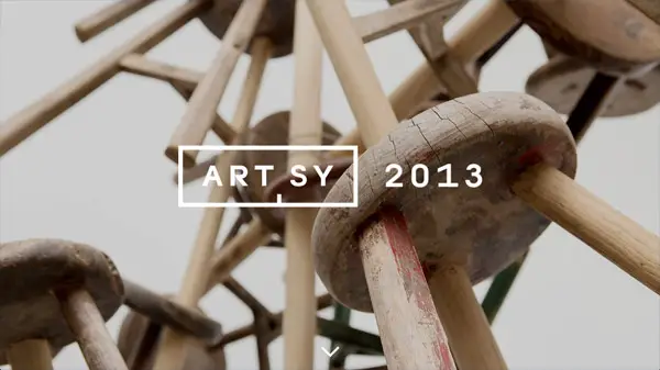
Artsy
Artsy is the online resource for art collecting and education. This is their 2013 subdomain for a specific campaign.
HARBR
This is the portfolio website of a creative digital agency, specialized in custom WordPress website design, website development, branding, and social.
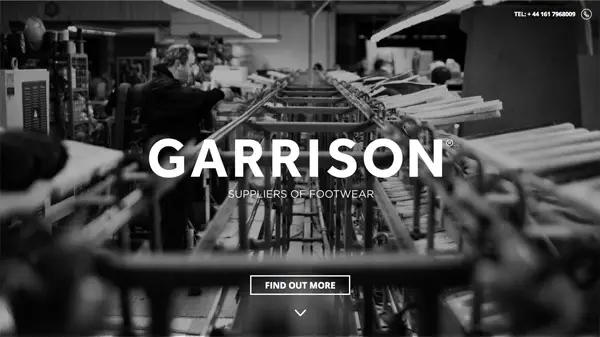
Garrison Footwear
This is the website of a UK based footwear design and source company from concept to delivery for branded footwear.
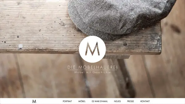
Die Möbelhauerei
This is a German website for a company specialized in furniture design. The splash screen consists of the logo overlayed on an image.
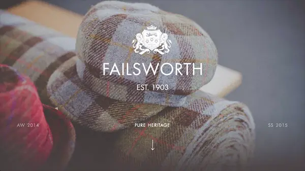
Failsworth 1903
This company is committed to the design, development, sourcing, merchandising and supply of high-quality headwear and accessories at competitive prices and their website design illustrates just that.
Sharyn Cairns
Sharyn is a commercial photography business in Australia, with a portfolio spanning interiors, food, travel, and lifestyle.
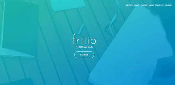
Friiio
This is the presentation website of a design studio based in Paris. Their splash screen is a high-quality image with a blue overlay and the logo in the middle.
Pollen
This is the website of an award winning digital branding agency. It has a dark design with an interactive video background on the splash page.
Sailing Collective
This is the presentation website for some sailing vacation specialists that organize one-week private and group book-by-the-cabin sailing journeys.
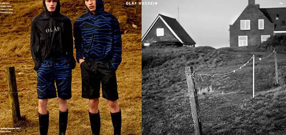
OLAF HUSSEIN
This is the presentation website of a clothing label based in Amsterdam. It has a divided splash screen with large images.
Elespacio
This is a cool presentation website of a digital creative agency focused on web experiences and advertising campaigns.
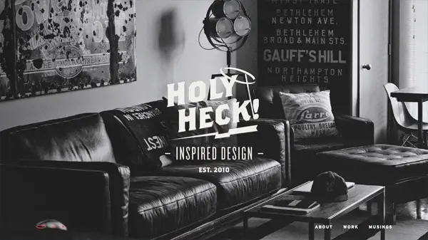
Heck House
. This is the portfolio of Bethany Heck, a designer of many types and creative lead. It has a modern website design with some vintage touches.
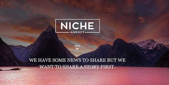
Niche Agency, LLC
This is the presentation website of an agency that was created by Mike Montes to help local businesses grow their marketing strategies. It has a simple yet effective splash screen design.
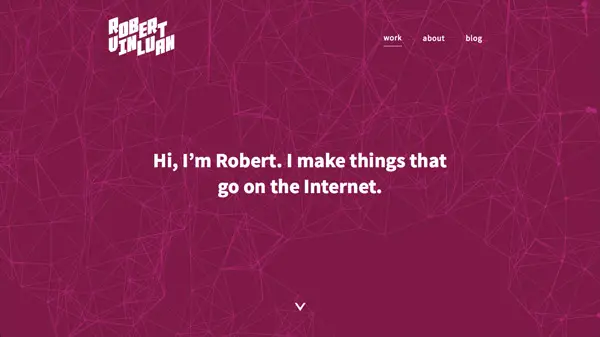
Robert Vinluan
This is the portfolio of a design/technology student at Parsons in NYC. Check it out! It has cool animations in the background.
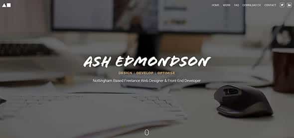
Ash Edmondson
This is another portfolio design that uses a splash screen. This belongs to an award winning freelance web designer and front-end developer.
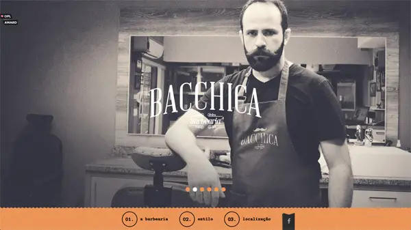
Bacchica Barbearia
This is a responsive one-page design for a barbershop featuring a vintage style modern CSS effects.
Shizuku Ramen
This is the presentation website of the most exciting Japanese restaurant in Melbourne. Its splash screen is minimalist and has a cool, dark, moving background.
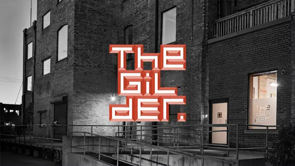
The Gilder
The Gilder was founded in 1991 with a focus on providing a high quality framing service to artists, art galleries and art collectors. This is their awesome presentation website with a splash homepage.
Jamie Delaney
This is a simple portfolio website of Jamie Delaney. It has a color block splash screen we love.
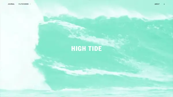
High Tide
Check out this website design to see how awesome this teal-overlayed, video splash screen looks like!
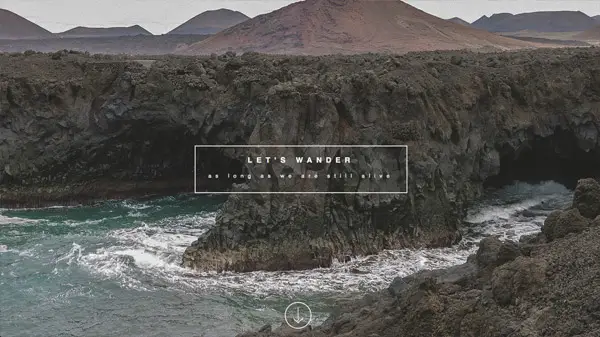
Let’s Wander
We love this beautiful and peaceful splash screen! It is simple, minimalist and very visual-effective!











Good designs, new trends
Nice and Wonderful Examples, I Liked the Simple and Clear Message in Jamie Delaney, High Tide and Cup Reporter Splash Screens.
Nice article. Loved the new trends towards web designs.
primesimple redirects to a dodgy site.
Amazing list of splash designs! Really thank you!
I have to say I’m not a big fan of it. Probably okay for a business website where the user needs some guidance first up. But in a news site or a blog it feels like hindrance more than anything. I’ve come across this few times in Forbes and was annoyed every time.
Is very good. I wish you success. Your site is very cool. Much thanks
Great examples..You’ve done some good research and that definitely reflects in this article!! Thanks for sharing it with us..
Great collection..nice work done.Thanks for this collection.
Thanks Chris, Your examples are good. Cheers :)
Really awesome collection! great inspiration!
Really awesome collection!
Content is King not a splash screen
Great article! I love that the splash page is making a comeback! Keep the inspiration coming!
Just to let you know though – you have a misspell in Schmoll Creative. There is an additional b in Creative!
Thanks for the heads up! Just made the fix
Wonderful examples of great design! Love Blue Dolphins site and those just one color designs – they look really reach and not annoying, taking in account too much graphics was popular recently
I like that examples.
Thanks
so so so nice thank u
Great article – lots of inspiration. The one thing that’s really starting to grind my gears at the moment though is – desktop versions of sites that hide their navigation in a collapsed menu. Stop that!
I understand why you would be mad about it, but as far as design, it is a lot better to hide the menu and have beautiful fullscreen imagery than a menu bar.
very good article thanks