Line25 is reader supported. At no cost to you a commission from sponsors may be earned when a purchase is made via links on the site. Learn more
In the early days of the web, designers made use of splash pages to introduce a website with a logo, a short description, and crucial supported browser information. We no longer dictate to our users which browsers they’re permitted to use, but splash pages are still fairly prominent in modern web design.
As layouts have expanded to take up the full screen, many sites now display just a logo or tagline to their users until they scroll to see the rest of the content. In today’s web design showcase, we round up 30 websites that make use of the modern splash pages. See how they reinforce their brand or introduce the company before taking the user to the main content.
Playtika
Playtika captivates audiences with beautifully produced, highly immersive social games. Their bright red presentation website starts with a simple splash screen.
Cultivated Wit
This is the presentation website of a creative agency/software company/storytelling company. It starts with a splash screen which consists only of the logo on a white background.
Urban Influence
This is another great example of a modern splash screen. It uses large, uppercase fonts and rounded CTA buttons to deliver the information right from the start.
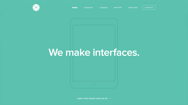
MetaLab
Here’s another cool splash page with a flat colored background and a simple, straightforward tagline.
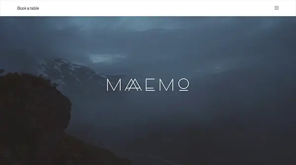
Maaemo
This company’s logo is beautiful, so why not showcase it on a splash screen with a mesmerizing background?
Logicart
Simple and straight to the point, this is how this company decided to deliver its message on the splash page.
Heck House
This splash screen has a somewhat vintage-inspired design, due to the font choice and desaturated photo background.
Apparatus
Combined with an animated/video background, you can create a really interactive and eye-catching splash page for your website, like in this example!
Oven Bits
The visitor should know what your site is about right from the first seconds! This website delivers its message loud and clear!
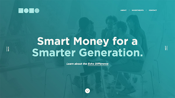
Echo Capital Group
This company’s tagline is written in bold on the homepage, followed by a subtle CTA link to find out more.
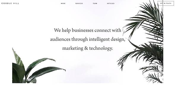
Cobble Hill
This is a great example on how to use video backgrounds on splash pages, alongside a block of text.
Linequality
Large, high quality photos, bold, uppercase fonts, subtle CTA buttons, all on a flat, blue background. These are the main characteristics of this splash page.
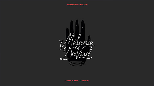
Melanie Daveid
Check out this beautiful, animated splash screen with a dark background and red color accents. Inspiring!
adaptable
This is a simple splash page for a digital studio. It has a dark background with some circular color accents and a bright orange gradient button.
BORN
This is another great example of combining video backgrounds with large fonts to construct a perfect splash page for a website.
CoLofts
Just the logo. This is all that you need to create a beautiful, minimalist splash screen for a website.
Make it perfect
The logo and tagline on a beautiful, high-quality image, this is the recipe for having a successful, engaging and inspiring splash screen.
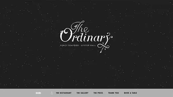
The Ordinary
This restaurant’s logo is truly beautiful so it deserved to be showcased properly. That is why the designer decided to use a splash page as the homepage of this site.
nGen Works
Simple! The customer will understand from the start what to expect when he/she visits this website.

Ape Unit
Black and white with red accents, this is a method we have seen before for creating awesome, simple splash screens.
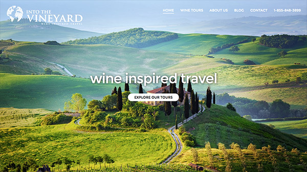
Into the Vineyard
This splash page describes the website’s purpose in just three words, followed by a simple call to action button.
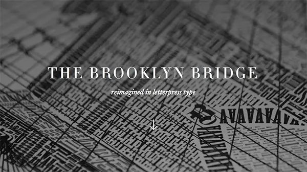
The Brooklyn Bridge
The font pairing choice, as well as the background, make this splash page really beautiful and creatively designed.











Comments are closed.