Line25 is reader supported. At no cost to you a commission from sponsors may be earned when a purchase is made via links on the site. Learn more
The term Ombre Design refers to the gradual blending of one hue of a color to another. Generally, the progression is from light tints and shades toward darker tints and shades. The effect has gained wide popularity in multiple platforms such as book cover design, book design, interior design, home décor as well as graphic design, and website design.
Understanding and mastering the art of ombre design opens up new possibilities for selling your art, as it adds depth, dimension, and visual intrigue to your creations, captivating a wider audience.
Such design practices are known for representing drama and mood swings. It has a French derivation from the word “ombre” which essentially means ‘to shade’.
Let’s first take a look at the various applications for using Ombre Designs:
1. Book Design
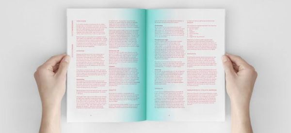
In the above-mentioned example, you can see how the book uses a subtle yet very attractive ombre design at the center of the page. The center of the book has a darker shade of teal, dispersing off to lighter shades outwards. This helps create an atmospheric vibe. It helps guide the reader to the center of the book, giving them a visual direction to follow when reading the book.
The design helps the reader’s eye gravitate towards the center. This helps in managing focus and keeping the reader engaged. The darker shade of ombre creates drama. Note that the use of such design elements doesn’t compromise the legibility of the print text. A good designer would always take care of such aspects when using such design practices.
2. Paintings
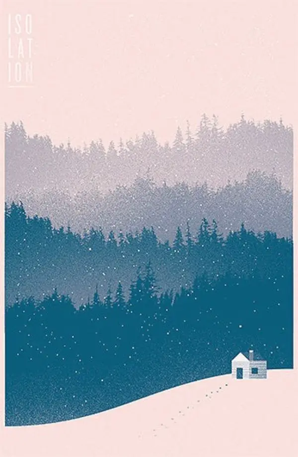
Ombre is often considered or used as an abstract element that is added to a design. However, many designers see the potential of inculcating Ombre principles to enhance the elements of their original design. If we talk about this painting, you can see the different gradient that is used throughout the painting for showing the depth of field and layering.
The forests are deep and saturated with blue that eventually graduates to lighter tones and distant light as we go up toward the sky. This shows how Ombre can be used to express distance and depth.
3. Interior Design
Using Ombre in interior design is a new trend, but it has caught on quickly to grab many interior designers’ attention. It is based on the color transition from the darker tones to the light tones. Even from one tint to another can be considered Ombre. This is also known as degradation or gradient. There are many ways you can use Ombre in designing office or home spaces.
- Ombre in wall decorations:
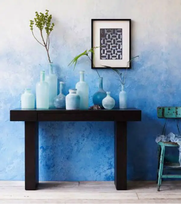
Walls are the most noticeable element of any room. You can use Ombre on any wall of any room. The key is to find the right tone. Executing such ideas requires a careful and knowledgeable approach. To bring the idea you have to reality, the painter/artist should know how exactly to give the right strokes and texture to create the Ombre effect.
Generally, it is difficult to make such art on such a big canvas as a wall. However, if done correctly, it would enhance the look of the room significantly.
- Interior walls:
However, when you’re applying Ombre to the interiors of a wall, one important thing to remember is that if the room is smaller and has low ceilings, you should use the darkest shades at the bottom. Then transition to lighter colors on your way up.
Doing so would help elevate the visual height of the space, psychologically. If you have a spacious room to play around with, you need not stick to this rule and could experiment with Ombre in any direction you want.
- Decoration of windows:
The textile industry didn’t miss out on the trend of Ombre Design. By using fabric that is suitable for ombre design, many manufacturers have implemented such design principles in designing window curtains of different materials such as silk, cotton, jute, and linen. Using gradient on such a platform creates a sense of lightness.
The designers generally go for handstrokes to give it a carefree feel that makes it look natural. However, the strokes are still picturesque and not bizarre. Such design practices work best when they complement the furniture of the room in subtle yet effective ways.
- Ombre Design in Furniture:
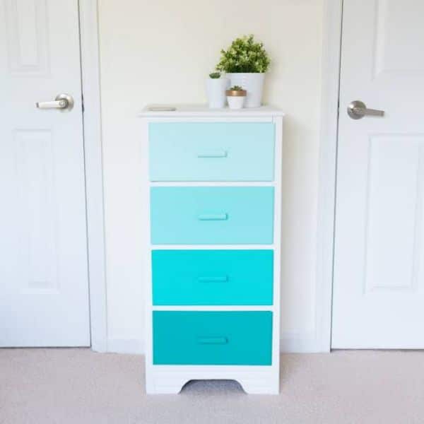
Using Ombre Design in furniture has led to some interesting dynamics in interiors. Ombre is generally used in frames a lot. For instance, you have cabinets, which have drawers and doors provided. You could color the cabinets yourself by simply taking one can of white color and another can of the color you want to paint.
Just by mixing and experimenting with the white and the desired color ratio, you can create shades with different saturation for the cabinets. This helps create an Ombre effect.
4. Cosmetics
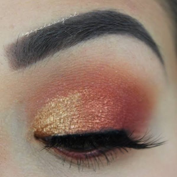
There are various options available as far as color range goes in the world of cosmetics. This opens up a big scope for experimenting with Ombre effects for makeup.
An ombre effect can be achieved by blending two or more shades and applying it on lips, eyes, or even cheeks. The concept of dark to light is similar to a concept that already exists in cosmetics which is contouring.
Contouring is a process where different shades and tints of natural skin tones are blended. However, the major difference between ombre and contouring is that contouring is used to sculpt a face to look a certain way artificially. In contrast, ombre is just a mixing of two shades or more in any format.
5. Baking
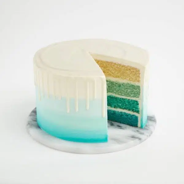
In the world of cooking and baking, the presentation plays an important role. It holds just as much value as the taste, the preparation, and the accuracy of the dish. Probably a bit more, as it is the first interaction the customers have with the dish that forms their first impression about it.
Hence a lot of professional bakers have realized the advantage of using Ombre design elements in the frosting of their cake, or individual baking layers in gradual tones from light to dark. They also use the dyeing and stacking method to achieve an ombre fade.
6. Hairstyles
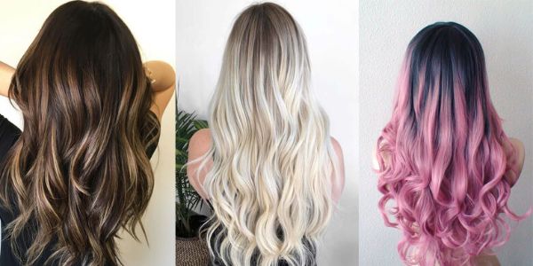
Hairstyle trends are quick to change and are constantly evolving. This also makes them most open to experimentation, and they readily accept any trend.
Ombre design is no exception to this rule. Many hairstylists have realized that Ombre texture while highlighting hair adds depth and layers to the hairstyle. Many consumers are also readily willing to experiment with Ombre shades of hair color. It looks ‘well thought of’ and beautiful compared to flat colors most of the time.
Generally, for hair color, the idea is to have a dramatic two-toned hair color effect. The hair is generally darker at the top and lighter at the bottom. Many color combinations work well, like natural blonde, brown or red, or even some unconventional colors if someone’s confident enough like pink, green, purple, and more.
7. Graphic Design
Ombre Design got popular for its tangible aesthetics initially in industries like interiors, textiles, and furniture. It has also made its way into graphic and website design. Whether it is for creating logos or using elements of Ombre designs in wallpaper, or any other such use, several designers are now seeing the value of using this type of design.
For the same reason, any designer must know how to create their own designs using aspects of the Ombre technique.
Let’s look at the 5 step process in relations to graphic design:
How to Create Ombre Designs
- Creating different layers:
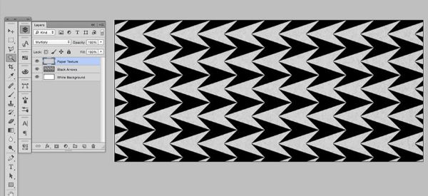
For this instance, we would use an image of an interlocking arrow pattern. For starting out, we create a white background layer. Later add a black arrows layer. Finally, add a paper texture layer so that the gradation blends and diffuses properly.
- Working on the individual layers:
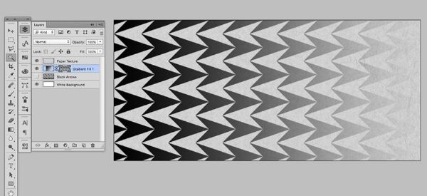
Now select the contents of the Black Arrows layer by pressing control and clicking its thumbnail. After this, select the arrow and highlight the new gradient fill layer. Now click on the layer, go to Layer Mask, and finally Reveal Selection. Doing so would blend the gradient fill layer in the shape of the arrows. Now you don’t need the Black Arrow layer.
Now go to the White background layer, and replace it with another gradient layer. You don’t need to create a mask for this layer. It is already masked by the arrows from the above layer. You can now control the changes in the right-facing arrows and left-facing arrows separately.
- Working with Gradients:
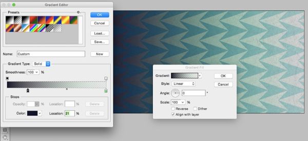
Open Gradient editor situated at the left. When you open it, you would see there are small swatches on the bottom and the top. Use the top swatches to control opacity. We leave the left side of this gradient to be 100 percent opaque (black) and the right side to be 100 percent transparent (white).
Now switch the swatches situated below. These can help choose the color of the gradient. For our understanding, we would use blue and green. They are complementary colors as per color theory. With the concept of dark to light, make necessary adjustments to both colors by creating subtle differences in the background arrows to that of foreground arrows.
- Add a Brightness/Contrast Layer:
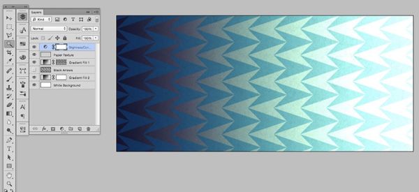
Now to further enhance our Ombre design, we can add a brightness and contrast layer. This would further distinguish the transition from light to dark. By doing this, we can refine the design without having to use all the functions of the gradient editor. This eases the process and gives you more control over the adjustments.
- Add a Hue/Saturation layer:
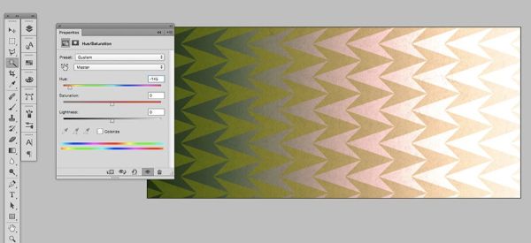
Now to wrap it up, we use a hue/saturation layer that allows us to try different color palettes. Drag the hue slider left and right to make the necessary adjustments until you find what works best for you.
8. Website Design
Many bloggers have been very inspired by the use of Ombre Designs in their blog pages for adding a sense of aesthetical value. It has become a popular trend. Ombre adds a subtle yet effective touch to a blog’s design.
The reason it works the best is it isn’t overwhelming to look at and is not as boring as a flat single solid color. For creating an Ombre Design on your website, you can take the help of a CSS Tool for the coding. Let’s understand how we can use Ombre Design on our website.
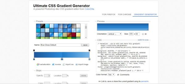
Firstly, visit any of the CSS Gradient resources like the Ultimate CSS Gradient Generator. Secondly, create your gradient by either selecting a preset from the top or creating your mix. Double-click the colored boxes that are situated below the gradient bar for changing the colors.
You can drag the colors left or right for increasing or decreasing the fade between them. If the two color boxes are close to each other, they create a hard line; however, if you pull them further apart, they start creating a fade. Chose the Orientation next, once satisfied with the gradient. The Orientation of your gradient can be vertical, horizontal, or diagonal.
Once you’re done tweaking all such modifications and are satisfied with the resulting Ombre design, copy the resulting CSS and paste it into your website’s CSS style sheet, inside the body tag:
Body{PASTE THE CSS HERE}.
Final Remarks
Now you have an overall understanding of Ombre Design and its various applications. It is used in many industries, and you can draw inspiration for your next website design or graphic design assignment from all the various available sources of inspiration. From home décor, furniture, interiors, paintings, or even book designs, you can practice your Ombre Design anywhere on any surface. In summary, this was an insight into understanding and mastering the art of Ombre Design. Please comment below.