Line25 is reader supported. At no cost to you a commission from sponsors may be earned when a purchase is made via links on the site. Learn more
Product packaging is an entirely different subject that has an essential correlation with the marketing, production, and sales department. The whole business is about that brand’s product, and when a brand is confident about its product, everything becomes easy for its business. But a good product needs good packaging to justify and complement the product and take it to the right place in the market. So if the packaging design is not correct or it has flaws, then it can block the customers from considering the product that it carries. And it can affect every area of the business, be it customers, production, marketing, or sales. Designing mistakes are very critical, and they can happen by any skilled or experienced designer as well. As a designer, you have to be careful to avoid such mistakes and issues. In this article, we have listed 14 mistakes you should not make during packaging design.
1. Lack Of Research:

One of the major mistakes you can make for such an important task is to have weak research. In order to create an attractive, informative, and convenient package design, you have to study all the related aspects of the industry, customers, and business goals. If you are starting to design with weak research data or no research at all, then the package design might not fulfill all the business and customer requirements. It has a high probability of disappointing the product and consumers as well.
Strong detailed research can give you a boost to start your design. It offers you a basic blueprint through which you can build your whole design successfully. So make sure you collect all the required data about your customers and market to deliver the fantastic package design.
2. Wasteful Packaging:

As per the dimension, area, and weight, you decided on the packaging material and elements. It is as essential as your package design because it forms the physical look of your design. Nowadays, people are more aware, and so as brands. Many brands only use eco-friendly package material to show a sense of responsibility and attract customers for the same. If your package design has too many unnecessary features, then it can be a little bit disappointing. Regardless of the proportion, if you are packing your product in 2-3 different plastic and other harmful material items, it can create a question in your customer’s mind. It can also cause inconvenience for them. Too much wasting is not something people like, and you better be serious about it.
3. Typography:
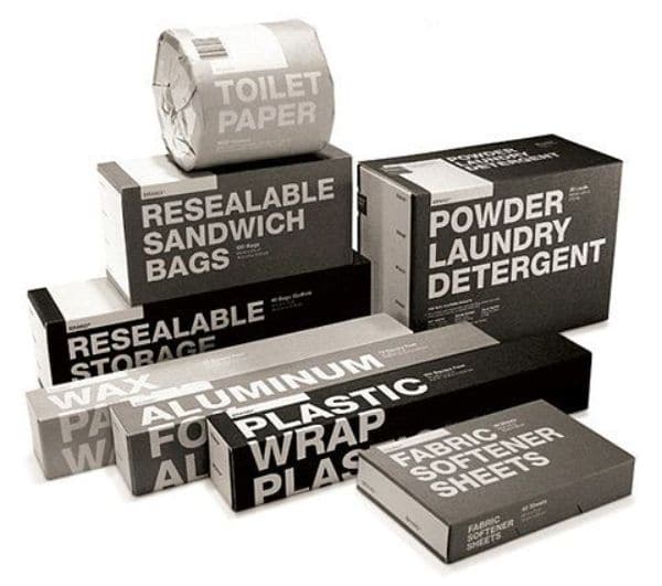
Typography mistakes are very common in any kind of designing. In package design, you must understand your product’s size, the size of its packaging, and the size of your design. The final product has the maximum visibility chances. So, everything written on it should be in alignment with all the other factors. Your whole content should have a significant typeface to get the correct placement in your customer’s mind. You can not use multiple font styles and font colors to make it attractive because that can look absurd in your customer’s hand. In some segments and on some products, it looks great, but you need to be fully aware of your target customers and your brand image.
4. White Space:
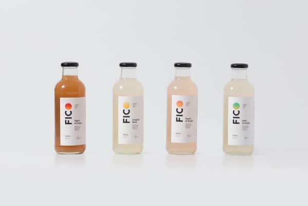
Experts suggest using appropriate white space in a design is a must. If you keep some white space along with all the other colors in your package design, it can give more dimension to those colors, and white color can highlight other colors more beautifully in a design. White space gives a better visual experience as well. Instead of making a compact design without any whitespace, try to include some whitespace to make your package design more appealing.
5. Keep It Less:
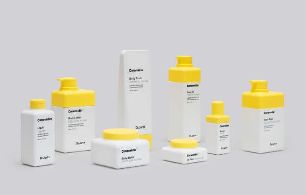
In packaging design, less is more. Companies providing package and product design solutions never suggest using multiple packaging elements. Because if it is not smartly planned, it can cause inconvenience for your business and customers as well. A complicated and time-consuming packaging can take a lot of time to open the package and get to the product. So this cannot be very pleasant for your customers. Try to keep it less; just use the minimum required material and features in your package design.
Many luxurious and fancy products become more impressive if they are packaged in a multi-layered package, but this is more of a marketing strategy subject. For generic packaging, straightforward and easy-to-follow package design is a great deal to win your customers.
6. Over Beautified Design:
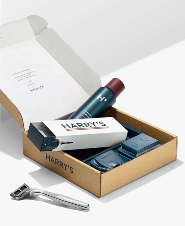
Sometimes, when designing a product package, you tend to focus more on the aesthetic rather than any other element. The packaging is the first thing customers notice before they see the actual inside product. So if your product and its packaging design are not on the same page, it can create huge issues. For instance, you are creating a beautiful package design with attractive colors and the best material. Still, if the product itself is not successfully fulfilling customer’s expectations, then your customers can feel betrayed and disappointed. You can not mislead them to increase your sales Intentionally or unintentionally. You have to make sure your package’s beauty is in an appropriate amount with the product inside. Do not let it overshadow the product and mislead your customers.
7. Too Generic Design:
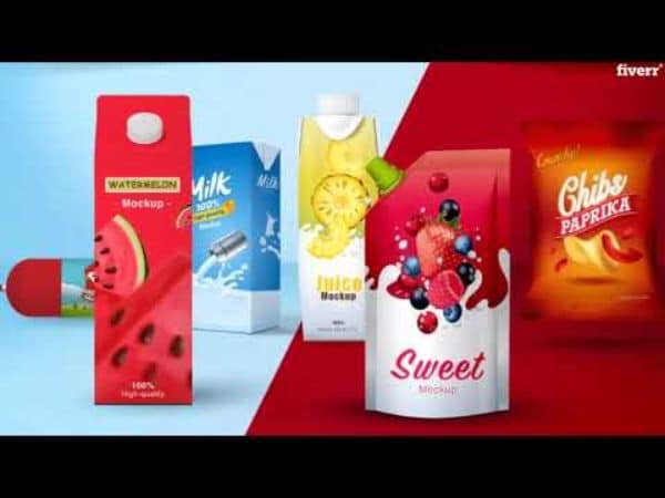
Another mistake of package design is a generic design. It is completely opposite to the over beautified design. Here you make the packaging look like any other packaging in the same industry. You are not making it unique or attractive you are most probably taking inspiration from the past trends, your own past designs, or your competitor’s design. Even if you are coming with your original design, but it is not unique, attractive, or trendy, then it would also fall under generic and outdated design; this is quite harmful to your product. Since it is common and outdated, it would fail to attract customers and increase sales.
No matter how good your product is but if the packaging is not good enough and is too generic in your industry, then your product may not a chance to shine.
8. Not a User-Friendly Packaging:
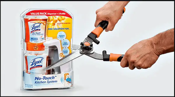
Not user-friendly packaging means a package that is not easy to access and can give a hard time to open. While designing a package, if you are not practical and not considering its feasibility, you may have to face huge sales and customer-related problems. Attractive packaging can make your customers buy your product, but if it is very hard to open and confusing, they may not consider buying again.
Even if your product category requires strong packaging like that, try to make it as easy as possible so that your customers do not have to invest a lot of time and energy accessing it.
9. Design Without the License:

Your package design is the identity of your product. It is just as crucial as your logo and other branding elements. So if you are using any designing element from some online source, you have to get that element’s proper license. If you are using any artwork, image, typeface, or tool of any person or online portal, you must first take the commercial license. Your package design can get into a huge legal issue without an appropriate license, which is trouble for any brand.
So in order to avoid such future problems, you should always use elements with appropriate licensing in your package design.
10. A Drastic Change In Design:
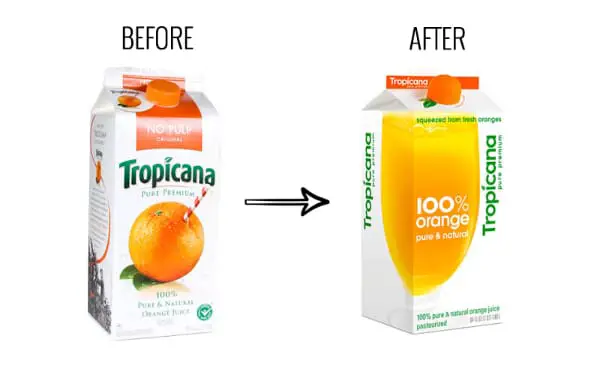
If you are working on a redesign of your product package, you have to be more careful about few things. Package redesigning is a susceptible task because an already established package design needs extra attention. Some designers take a considerable risk while changing the whole design to make it more attractive and impactful. But this can backfire the whole strategy. A well-established package design has a strong image in your customer’s mind; you can surely change the design but smartly and sincerely so that they do not get detached from your product.
Placing an entirely new brand design can take a lot of time and energy, so you must create your redesign on your old design foundation or the foundation of your whole branding while keeping your customers in mind.
11. No Proofreading:

After deciding the content of your package design, you must take your design for proofreading. A package design contains a lot of information regarding the product and brand, which is necessary for customers to know. So the whole content and placement of your content play a vital role in your whole package design. For any reason, if you avoid proofreading, you are taking a significant chance on the design itself.
There can be various types of mistakes related to spelling, words, formation, and grammar, which need to be corrected before you put the final seal on your design. So never skip proofreading your package design for any reason.
12. No Testing:

Package design is a crucial matter for the business, and therefore, management always prefers to test the design with a sample audience. This testing can help them to understand how overall target customers would perceive their design. If you are not testing your design on any ground-level scenario, then you may not get a chance to amend your design before actually putting it on the market.
It can be a little challenging to perform testing for each design, but you can always try to get some honest opinions and reactions to your design to learn and improvise before the final edit.
13. Not Following Trends:

Design trends are very necessary to observe in any industry. It helps designers to understand the market and customers well to keep up with the competition. An experienced designer or highly-skilled designer would always check the industry trends first before starting a package design. You want your package design to look fresh and attractive for a more extended period, So it must be impactful, eye-catchy, timeless, and sustainable through many years.
As per your product and industry, you have to decide the package design and its lifespan while keeping all the market trends and scenarios in mind. It is a bit tricky task, but regardless of any trends and patterns, your design may not be able to connect with your customers.
14. Selecting Wrong Material:
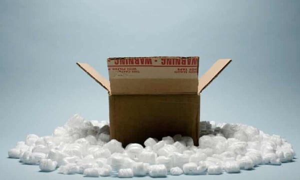
One of the easiest mistakes you can ever make is about the material of your package. Customers can predict product quality and product reliability based on its packaging. Your package design is a different matter, and if you have successfully created an amazing package design, then it must look great on the packaging material as well. Selection of the wrong material can turn down all the designing effort. It can make the design and product look bad.
Your logo, USP, colors, and all the other elements must look attractive and easy to read on the material. It may help if you take some time and expert advice to choose your package design’s suitable material. Customer convenience, wastage, production cost, competitor analysis, readability, and your business goals are some of the factors you should consider while selecting materials.
Package design is all about presenting your product in a way that can influence your customers to make a purchase. A failed packaging design can surely fail the product no matter how much potential that product possesses. If, as per your perspective, the design is entirely perfect and informative, but your customers are not responding to the way you want them to then, take it as an alert and check all the aspects from your customer’s perspective. Detailed research always helps before the design and after the design as well. Your experience and knowledge are always there to guide you about what you should include in your design and how you should create that design. Here we have mentioned some of the common and biggest mistakes in packaging design that people make in order to help all the designers learn and avoid such mistakes and post circumstances.
