Line25 is reader supported. At no cost to you a commission from sponsors may be earned when a purchase is made via links on the site. Learn more
Graphic Design comes in many forms. Some of the most interesting and successful designs can be found nowadays on a plethora of different products and services. New forms of producing art through design, which can be seen with beer packaging designs, are a valuable asset to businesses and could reflect how successful they are or potentially become. Without an eye-catching design, the product can be overlooked for a competitor’s packaging that appears more intriguing, as well as aesthetically pleasing and cohesive to the customers’ eye.
Attention to detail, skill level, colors used, and even the content of the design are all crucial to your packaging for beer, wine, and beverage products. It’s a game-changer when you have the power to stand out among the competition, and it starts with an impressionable design of your product. For your inspiration, we have compiled 25 of the most innovative beer packaging designs on the market today.
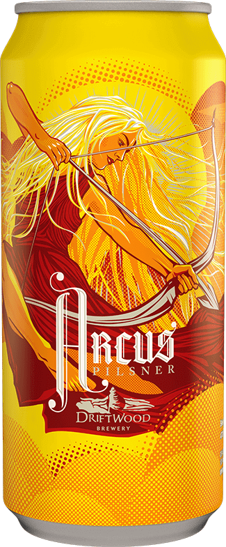
Arcus Pilsner for Driftwood Brewery
This pilsner was created with the intention of living up to the name “Arcus”, translating from the Latin word for an archer’s bow, as well as the arc of the sun, which is why they decided to create a sun goddess who is an archer. A truly visually enticing and beautiful beer packaging design that will grab any store-goers attention. A truly inspiring design.
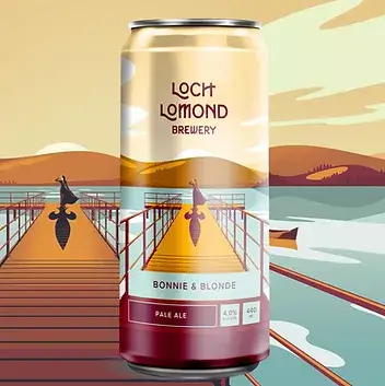
Glasgow agency Thirst Craft
Loch Lomond Brewery wanted to rebrand and create new modern and enticing packaging that reflects the beauty behind the beer itself, as well as the land it is brewed in. The overall brand and web design that this company possesses are both high-end and create a strong dialogue between web design, graphic design, and beer in a beautifully cohesive and successful campaign.
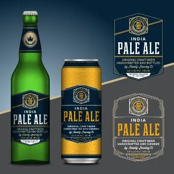
Free To Use: Adobe Beer Vector Image
Available for download is this excellent high-resolution vector beer label mockup from Adobe Stock. These mockups have precise lines and display an image of quality. If you’re looking for a design to use on your beer cans, bottles, or packaging, this would be a great choice. Another great packaging and label design by Vlad Klok. The free download comes with a standard license.
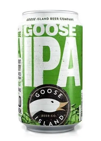
Goose Island Beer Co.
Goose Island Beer Co. along with a creative team was able to create old-fashioned and sleek yet simple packaging for this barrel-aged beer. Paired with the classic stout taste and a new and improved package design, this beer was able to appeal to the demographic that appreciates continuity in quality, as well as appeal to the ever-growing craft beer demand in the United States today with the design.
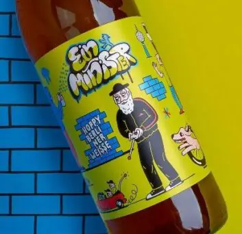
Minister Brewery
Minister Brewery worked with illustrator Kinga Offert-Plazej, who was given the artistic freedom to produce heavily illustrated designs for four different beers. Minister Brewery takes branding seriously and wanted to make sure its beer stood out from the others. Together, the illustrations took these unique beers to the next level.
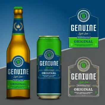
Free To Use: Beer Vector Mockup at Adobe Stock
Here’s another great concept or mockup of a beer label design provided by Adobe Stock and it’s free to use under Adobe’s Standard License agreement. If you’re redesigning a label or package for a brewery client this one is sure to stand out on the shelf and grab their customer’s attention. With this vector mockup created by Vlad Klok, you’ll probably be viewed as a hero among other designers and your client. This vector mockup speaks volumes of a beer that is brewed with the best ingredients and with the highest care. Just look at these brilliant green and blue colors with detailed lines. This choice is sure to make a captivating first impression.
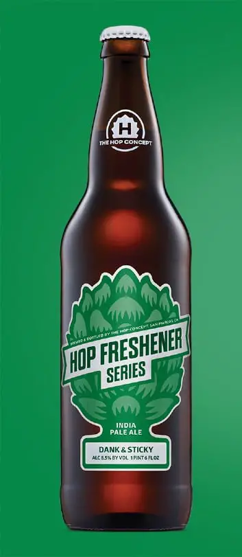
The Hop Concept
The Hop Concept was an idea that came about with the help of two breweries, Port Brewing Co., and The Lost Abbey. These two innovative companies took the idea of air fresheners for cars and translated this idea into four limited-edition flavors of beer. With playful names and aromas and flavors working together, this beer branding created an interesting and successful packaging that is sure to call out to customers’ attention.
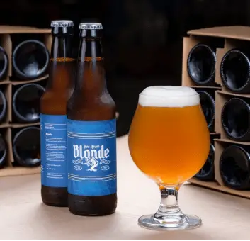
Tree House Brewing Company
This brewing company was able to take any customer on a trip to a place in their imagination when taking one look at any of the cans below. The illustrations convey vivid, bright colors of several places including the beach, mountains, and a serene boat scene on the lake. With these beautiful illustrations on each can, it can prove virtually impossible to throw away after it’s empty, but instead to keep it as a piece of art.
Commonwealth Brewing Co.
Commonwealth Brewing Company did something unique to what most other craft beers on the shelves have done to date. First, they came up with the names, then found the flavors for each by matching them to the creative names. Unlike the previous brewing companies, the visuals on the cans were created by photographing inks, oils, and other liquids interacting with various colors, ultimately creating a beautiful beer with even more interesting names.
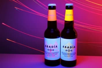
Abadía Beer Designed by TSMGO
TSMGO is a branding and marketing company that creates award-winning packaging and labels for several different products. For Abadía Beer, they created the first “glow in the dark” beer (you need a blacklight to see it, but still very cool).
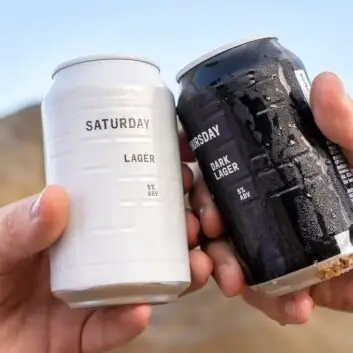
And Union Beer
An example of why less is more. Sleek, simple designs with attractive and bright colors will always be preferred by some. This is beer packaging simplicity at its best.
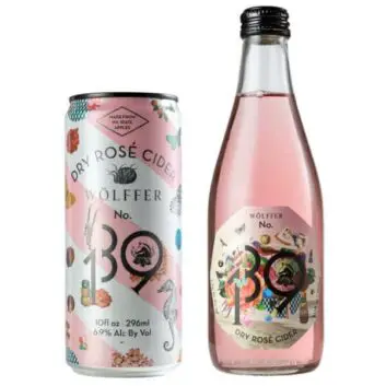
WÖlffer Cider 139
This is a packaging design, and a cider, for the ladies. With a sweet and delicate design reflecting the same traits as the taste of this cider, it will be sure to not disappoint visually or quality-wise.
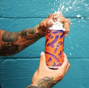
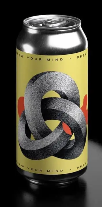
Brew Your Mind Brewery
This psychedelic play on words extends to the beer packaging. With the help of Classmate Studio as the illustrators, they were able to create a design that resembles 3D art and pop art combined, creating a crossbreed of interesting colors and shapes, allowing your mind to appreciate the abstract type art, and enjoy the design as a whole.
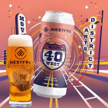
Westfax Brewing Co.
WestFax Brewing Company wanted to switch it up in terms of flavor, as well as branding. The gradients and graphic design work together with this beer to create a timeless piece of art, all in a beer packaging.
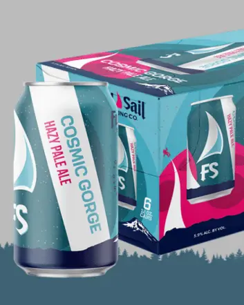
Full Sail Brewing Co.
Full Sail Brewing Company has a stunning design – kudos to their designers. With a colorful cap and packaging, this particular beer makes you feel like you’re right on the beach, with bright and bold greens, turquoise, and blue colors with a dash of magenta. It conjures up the desire and thought of having an ice-cold beer with your feet in the sand. That is how you know you’ve done your job with beer packaging when a person can picture themselves with the product in hand.
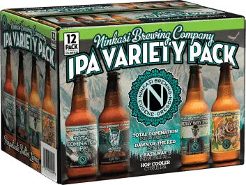
Ninkasi Brewing Co.
Coupled with fun names, these beers have illustrations on the packaging that are inspirational when creating any beer packaging ideas. Take a look at these artworks on beer.
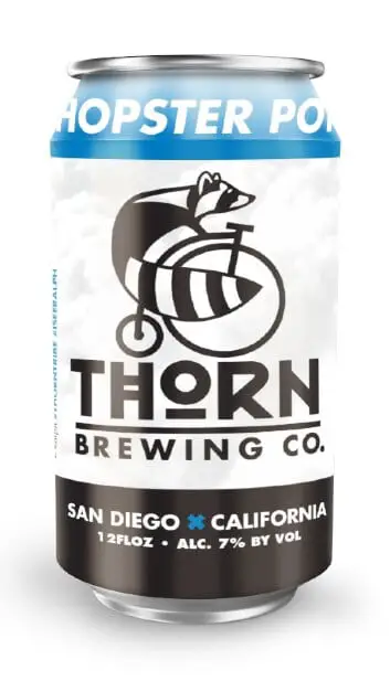
Thorn Brewing Co.
Who said plaid was out of style? This beer packaging design is light and simple, yet has an interesting all-around design that most consumers can appreciate.
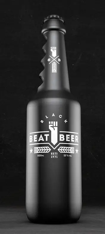
Beat Beer
This particular design was created by Kevin Harold Campean, and although it is just a concept, the concept is interesting and sure to appeal to many audiences. The grips on the neck of the bottle are supposed to help in self-defense, which is probably self-explanatory in why this beer isn’t actually on the market. Nonetheless, it is an interesting and creative approach to packaging design.
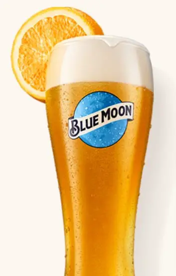
Blue Moon Brewing Co.
Everyone knows Blue Moon. It’s a classic, which is why sometimes, classic packaging designs work, due to the compatibility with the actual product. You can’t have a classic beer with a loud, colorful design, it just wouldn’t mesh. That is why Blue Moon still keeps their design clean, simple, yet modern and classy.
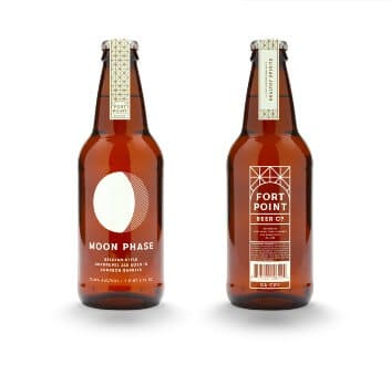
Fort Point Beer Co.
The design for Fort Point is an example of minimalist-inspired illustration, along with simplistic colors. This is yet another reason why there is a balance between intense illustration and bright colors, and on the opposite side of the spectrum, the need for simplicity.
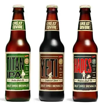
Great Divide Brewery
Heyday IPA is the center of the branding and marketing of this brewery. The main part is not just the packaging design, but the whole website. They made it fun, with funny videos and interactivity with the audience. Packaging goes a long way, but web design takes it a step further to create a successful campaign.
Summary
These are some of the most unique and creative packaging designs among breweries today along with some really cool beer packaging design concepts that are available for use. We hope you enjoyed this collection. If you’re also looking for some wine packaging and label ideas you can find those here. Let us know what you think and comment below. Cheers!
Comments are closed.