Line25 is reader supported. At no cost to you a commission from sponsors may be earned when a purchase is made via links on the site. Learn more
We’ve previously discovered twenty inspiring beer bottle packaging designs, so we of course had to venture out and show off the designers that make wine bottle packaging so incredibly appealing. As a graphic designer, you may be asked to create unique and aesthetically pleasing package designs, product designs, ranging from children’s toys, to cigarette boxes, to food packaging, like a bag of chips. People don’t even truly realize the extent of which design is implemented literally everywhere, in any and every product. Walking into a grocery store means that you are exposed to thousands of designs on packaging created by graphic designers in order to get your attention and buy that product, and the same goes for wine labels. Today, we will discover 20 inspiring wine label designs that are unique and can be inspiration for your future designs.
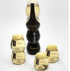
Capriccio Bubbly Sangria
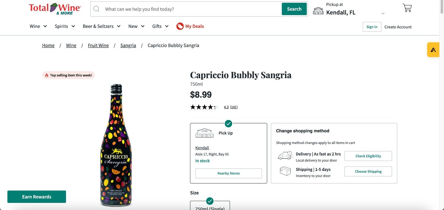
You may have heard of this fruity wine, and that is because it is has become so popular due to its potency, and it’s design that makes customers not want to put it down. Using a black background, the design emphasizes a variety of fruit illustrations that are bright and colorful, allowing for the eye to be more drawn to the fruit as well as the white text, juxtaposed with the dark background. Any wine bottle is more fun when you have a great design to view, too.
The Prisoner Red Blend
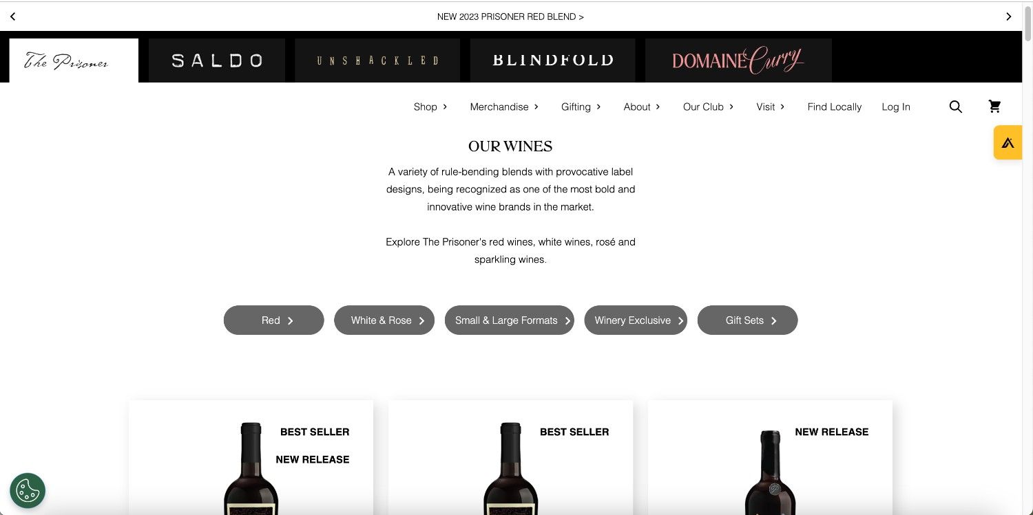
A more unconventional design that’s based on its name, “The Prisoner”, this red blend wine features a loose, sketched out illustration of a prisoner so as to use as a metaphor for a different approach to their recipe, yet still becoming well-renowned and praised. The design for this wine is classic, yet slightly minimalist, which can be appreciated by many, especially for a more expensive bottle.
Olema Rose Cotes De Provence
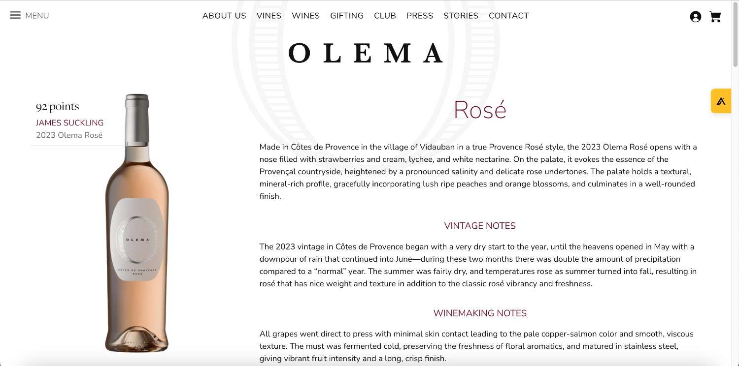
On a lighter note, this wine bottle packaging design uses the rose colored blush of the wine to its advantage by pairing the rose color with silver text and bottle top, which gives the entire look of the bottle an ethereal, light and bright look. They allowed the color of the wine itself to speak for the brand, which gives an authentic look and feel to the design.
Aperol Aperitivo
Aperol Apertivo is an Italian dessert wine, and the sweet and citrus flavors that make up the notes of the wine itself, this is reflected in the design. The entire design promotes the amber color, making the customer salivate before they even open the bottle. The text on the label design goes together extremely well, matching the color of the wine exquisitely. The design is settle, yet the text is able to stand out just enough to be memorable to anyone who sees it.
Inkwell Winery
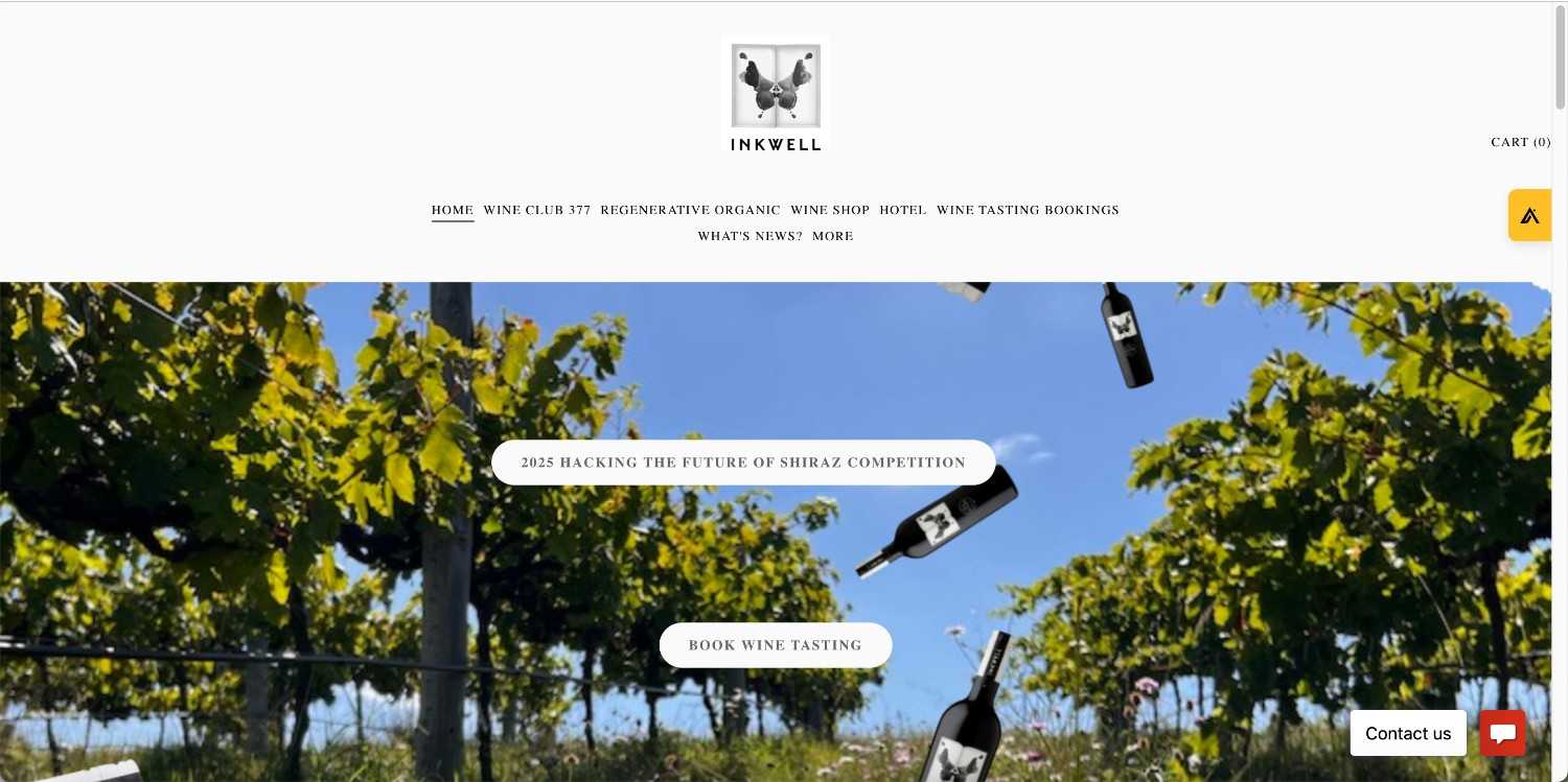
Inkwell is a sustainably sourced winery that has beautifully created ink stain art as their designs on their wine labels. Deriving from the Rorschach test, or inkblot test that is used by many psychiatrists to be able to get a glimpse into someone’s mind when they decipher what they think an ink block resembles, Inkwell uses this idea with the tagline “what do you see?” in order to intrigue customers when walking down the wine aisle.
Gut Oggau
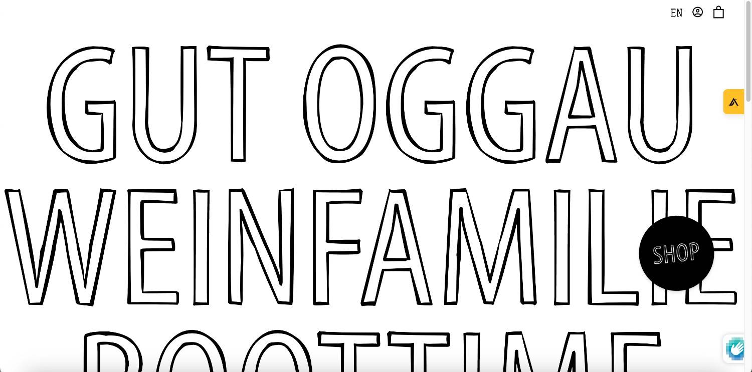
This winery uses fictional characters that are drawn as illustrations on the labels as a series, with imaginary lives and families that are talked about on each bottle. The designs on these bottles are obviously breathtaking, and definitely unique.
Mini Garage Winery
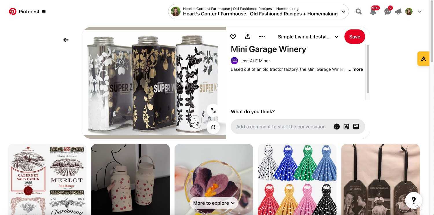
This wine bottle is unique because it doesn’t resemble a classic wine bottle. It actually doesn’t even resemble anything pertaining to an actual alcoholic drink-it is shaped like a fuel can. This is because the winery is based in what used to be a tractor repair shop, and the design on the wine is juxtaposed against the actual bottle, because the design is so intricate, delicate, and has a sophisticated color palette. I believe that this juxtaposition works in favor of the overall design.
Luna
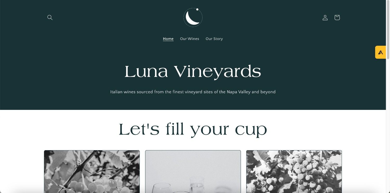
Going back to basics, there is always room to appreciate the classic designs that will never go out of style. Luna Vineyards has an exquisitely classic packaging design, which allows anyone who purchases it to feel like they are getting their moneys worth, because if the design illustrates excellence in quality, then so will the quality of the wine itself. Sometimes getting back to basics is important in order to keep customers happy.
The Logan Weemala Wine Collection
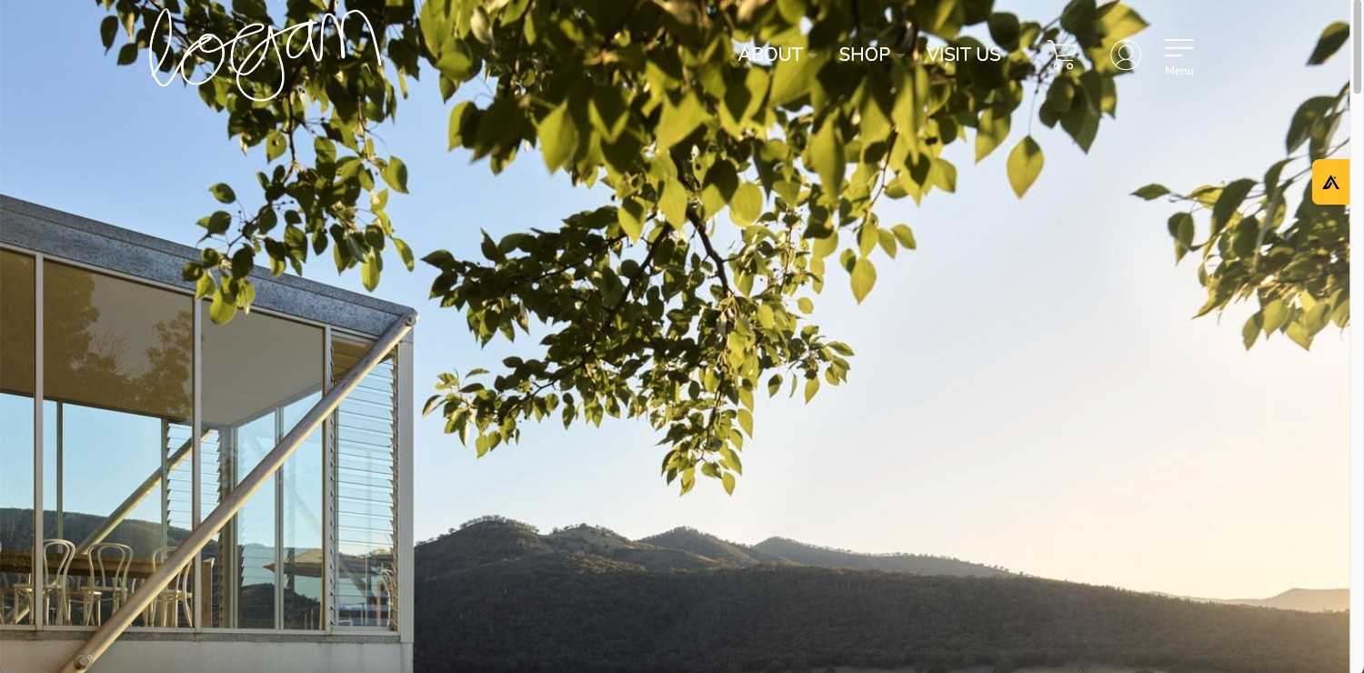
It is always great to see a series of cohesive designs that go together like bread and butter. That can be said for the Logan Weemala Wine Collection, whereas they used a similar design for six separate wine bottles, and this minimalistic design allows the eye to flow while viewing each bottle seamlessly and effortlessly, which is exactly what you want and need when creating a series of designs that are going to be viewed together.
Saddler’s Creek Winery
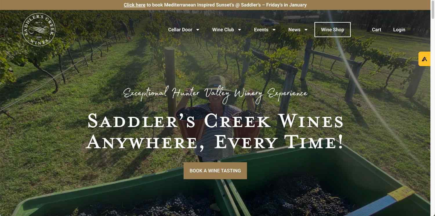
This set of wine bottle packaging designs are unique because they aren’t actual labels, but the design is printed right on the bottle,thus creating “naked wine bottles”. The overall design is simple, which allows the attention to be focused on the typography, and the wine itself, which the color of the typography is carefully chosen to compliment the color of the wine, successfully creating a symbiosis with design and product advertisement.
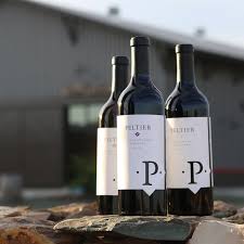
Peltier Winery
Better known as the “USB port Wine”, this wine bottle design uses USB inspired illustrations that give the impression that your wine has a unique quality of remaining futuristic in style and also has an interesting design that correlates with familiar technology that we use on a daily basis.
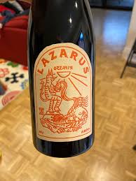
Lazarus Wine
Inclusivity is something that is important, especially in the design world. When a restaurant offers a braille menu, anyone who is legally blind can find a true appreciation for the restaurant that went above and beyond with their menu designs. The same can be said for Lazarus Wine, who used the growing trend of producing wine labels featuring braille, and created a fantastic design illuminating this concept, in the process creating an interesting and dynamic design that truly means something important, and sets an example for other designers to follow.
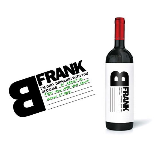
B Frank Wine
B Frank’s wine label design is both minimalistic in style, with a great addition of a red bottle top, along with the choice to allow the buyer to be interacting with the label itself, allowing for a space to write on it and add their own addition to the design. It’s small things like this that incorporate a sense of excitement to be able to write your own witty comment on the bottle to impress friends and family, which allows for the design to be successful, due to the engagement with the customer.
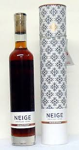
Neige Wine
Neige winery used this simple design on the back of the bottle to show through the wine, creating a sort of 3D and distorted view of the pattern design. Complementing the intricate pattern, the label with the necessary typography that describes the wine is small and by the bottom half of the bottle, demanding little attention from the pattern, which is the star of the show. The white space for the background of the typography allows for the name of the wine to be more prominent, yet still working with the pattern to create a balance of design overall.
Csetvei Pincészet
This interesting design is extremely unique from other brands we’ve seen. First, the label is a circle, and doesn’t cover the circumference of the wine bottle. Second, the design is simple yet has a deeper meaning, using a leaf that is shown in black and white, and a type of inverted design, including a location pin. This is to show that the veins of leaves can resemble streets, combining the idea of the location and leaves in nature in one design that will make any customer do a double take.
Stack Wine
A unique take on the traditional wine bottle design, Stack Wine uses a series of small, packaged wine cups stacked on top of one another, to promote a sharing experience of the wine, or to have each disposable glass to yourself. The packaging design is superb and well designed, with each different type of wine like Merlot or Chardonnay being a different, yet vibrant color, allowing for the intricate illustrations, fantastic and unique typography, and colors to stand out and become a new experience that is different from a normal wine bottle label design.
Root:1 Wine
Getting back to basics, this wine design is instead of traditionally on a label, it is printed directly onto the wine bottle. This allows for the design to be larger, and more intricate, which it is. There is a tree that, just like the name of the winery, “Roots”, the design features roots spiraling down the bottle, and in between are words that from afar appear as part of the design, yet it is a story of the wine itself and where it comes from.
Small Talk Vineyards
With the same concept of design used for different types of wine, this design uses typography and varying fonts to its advantage, and in the process creates an interesting overall design that can be appreciated, although it is very loud. Nonetheless, it is more interesting to read than to read small, normal fonts that are meant to be simplistic. It’s always refreshing to view a different type of font and typography when it works together to become a label design.
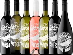
The Hidden Sea
This design is similar to the one above, because it uses typography as a design. However, in-between the text there is an illustration of a whale, which is interesting and allows the overall design of the bottle to appear rustic. By using white text straight onto the bottle instead of an actual label, this design becomes ten times more interesting and worthy of a great design.
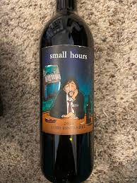
Small Hours Wine
Again using creative illustrations, Small Hours Wine uses a yellow background and black text and color to balance the design, which features a black cat and a skull, which suggests that it is invoking a witch vibe. This is interesting and can be eye-catching due to the bright yellow color, and the illustration can also make people want to pick up this bottle, due to it’s unique and gritty design.