Line25 is reader supported. At no cost to you a commission from sponsors may be earned when a purchase is made via links on the site. Learn more
Even the most proficient web designers can make mistakes. In addition, these mistakes are usually the ones their clients will spot in a split second. It’s not that hard to do.
You may be an outstanding example of a true professional at what you do. Or, you can be an example of a person who is quite capable of adapting to changing industry standards.
Nevertheless, you’re also quite capable of making the occasional unforgivable design mistakes.
How to avoid such an embarrassing situation? You need to have an understanding of consumer psychology. You should also have a thorough understanding of what UX is all about and be capable of thinking like a user.
You can also avoid this problem by using pre-built websites. BeTheme offers more than 340 representing 30 different industries. They are adapted to their respective business standards.
5 Design Mistakes You Want to (and Can) Avoid
#1 – Taking Your Eyes Off the Prize
It can be easy to be caught up in a website’s visual appeal and forget WHY you’re creating it in the first place. A mistake like this usually ranks at the top of a client’s hate list. This is because it suggests you created the product for yourself, and not for the client. In doing so, you could literally ruin that client’s business.
You simply forgot that the website’s goal and not its appearance is the #1 priority.
As you build the website you need to keep the goal in mind. Whether it’s to sell products online or build brand awareness. It can be to stand out from the competition or serve as the go-to place for the products or services offered.
Anytime you become distracted or lose sight of the goal, you’re doing your client a disservice. You are also doing a disservice to the client’s business as well.
What is an advantage of using a pre-built website? It is that it helps keep your focus on the goal of a website. At the same time, it allows you to make full use of your design creativity. Your design will incorporate the proper industry standards. Moreover, its users will be able to follow a pre-approved path to achieve their goal.
Take these two BeTheme examples:
BeApp3 follows a standard user journey for an app presentation. It is centered around features and pricing plans.

BeHome is designed to illustrate what differentiates a business from its competitors. It shows what makes its handmade products genuinely special.
#2 – Underrating Content Hierarchy
You’ve probably noticed that all content is NOT created equal. It’s frustrating to look for a specific bit of information only to find it in the nether regions of the home page.
That’s where a solid understanding of content hierarchy can come into play. You need to be able to identify the right type of architecture to use for every website you build. Then, you will be on your way to fame and fortune as a UX design guru.
The difficult part of it is that it will take you dozens of hours of research to get there. This includes more time than you may be willing or able to invest in a single website project.
Here again, pre-built websites can save the day.
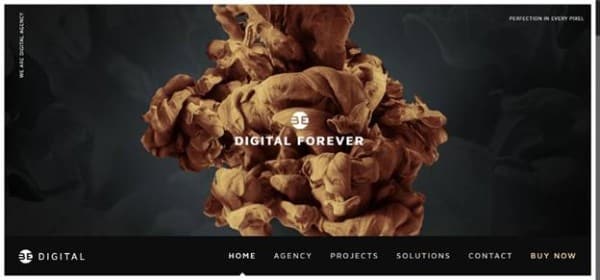
BeDigital is a good example. Visual content is an absolute must in this industry. Thus, this template uses huge, impressive visual content above the fold. The simple yet bold menu is positioned at the bottom.
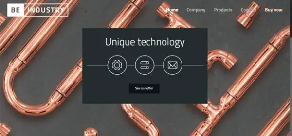
BeIndustry relies on a clever use of background visuals. At the same time, it allows the focus to rest on the main message in front-center. The mix of shapes and textures is purposefully eye-catching. Therefore, users are visibly directed to the call-to-action button.
#3 – Being Overly Familiar with Standard Practices
What can happen when you follow industry standards to the letter? You can end up with a website that wins a best-practices prize and can at the same time be unforgivably boring. This is one of the most common mistakes in web design.
Visitors like a website that has a familiar feel, but that doesn’t mean it has to be a carbon copy of a competitor’s. The challenge here is to surprise and delight users without being overly clever. You need to act in a way that doesn’t interrupt or distract them from their natural flow.
That isn’t the easiest of challenges to have to contend with. Why not use a pre-built website in this case? Use the one that allows creativity while adhering to a navigation structure?
Like either of these:

BeFantasy replicates the familiar feel of video games. It also surprises users with eye-popping special design elements. Texture and color mixes, stills, and animations are there, too.

Or BeChurch2 for example. Here, vintage imagery and cursive typography are highlighting the church’s beautiful history. The modern logo and menu bring the faith into the 21st century.
#4 – Being Overly Disruptive
This is an easy mistake to make, especially when you’re in the swing of things and having fun while designing. It’s easy to let the creative juices take over instead of focusing on controlling the flow.
This situation is sometimes the result of a client asking for something “innovative”. Naturally, without providing any details. We feel a need to demonstrate just how spectacular or innovative our designs can be. Often at the expense of taking users out of their comfort zones.
On the other hand, you can follow a familiar design structure. You can build a measure of innovation together with a few special effects into it. This way, it will still be easy for users to find what they’re looking for.

BeEco uses such a simple structure, yet it’s hard to believe how eye-catching the design actually is. All the information a user may need is at their fingertips. At the same time, the website remains clean and surprisingly fresh.
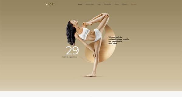
BeYoga2 makes clever use of metallic elements to give the website a glam look. The design structure itself is quite simple.
#5 – Failing to Meet Specific Expectations
Then there are those unfortunate instances when you have to build an “ugly” website. It’s not of your choosing of course. It’s what your client wants and expects. A client might be used to seeing a certain type of website and believes it’s what will serve him best.
That is what he will ask for, no matter how brutal it is or how cramped it is with adds. it even can feature bold-face messages that literally shout and colors that poke you in the eye.
If that’s the industry standard, at least from the client’s perspective, that’s the standard you follow. It’s your job.
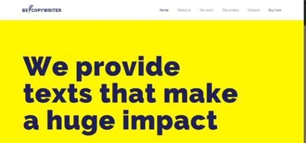
BeCopywriter is a good example of web design brutalism. It has bold colors, huge font size, and crazy-simple structure. When the message gets to the right audience, they’ll highly appreciate it (even if you might not).
Summary and Conclusion
Here’s a wrap-up of the 5 mistakes you’ll want to avoid, and how you can easily do so through the use of pre-built websites.
- Don’t stray away from the website’s goal
- Don’t make important content hard to find
- Don’t create a website that’s too familiar and looks like any other website
- Don’t build a website that tends to be disruptive or distractive
- Don’t ignore specific industry specifications – even if you disagree with them
Do use pre-built websites to build designs for your clients’ specific business.