Line25 is reader supported. At no cost to you a commission from sponsors may be earned when a purchase is made via links on the site. Learn more
Almost every industry and segment now has a website to provide information, sell products and interact with their customers. These websites are created highly functional and appealing, using several marketing strategies. However, there are several factors which often act as major turn-offs for anyone visiting the website, this can affect conversion and sales.
Below is a list of 10 website design turnoffs to avoid on your website.
1. Poor Loading Speed:

The consumers are now bombarded with information, and at the same time, the average attention span has reduced significantly. The fact that there are hundreds of options of websites of the exact thing available, the patience levels are at an all-time low. These factors are very crucial when testing the loading speed, and optimizing it accordingly. Test it and take the Search Engine Optimization into consideration as well. Check out this guide for creating websites with speed in mind.
2. PopUp Ads:
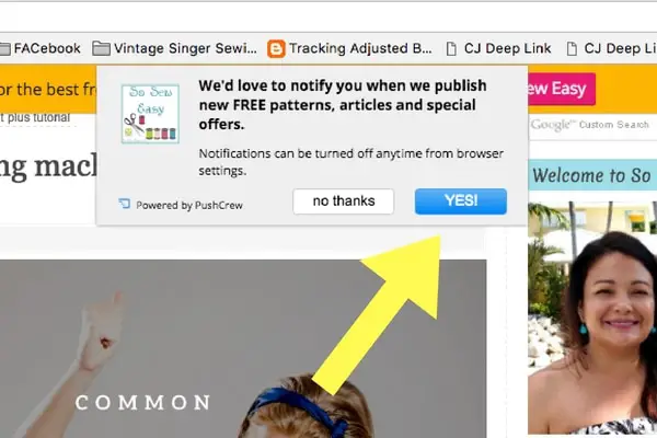
While this is surely a debatable issue, PopUp ads seldom do well. While it may seem like a reasonable option for attracting more visitors to your website, think before you implement it. They are highly irritating for the visitors since it interferes with their reading experience. Within the timeframe of a mere 2 seconds, the screen is full of PopUps, along with the GDPR and/or Cookie PopUp. Apart from this, you are also asked for notifications. One PopUp leads to another one, and the user is irritated enough to give up browsing on your website.
3. Autoplay Media:
This is another disadvantageous feature which drives visitors away from the website. Several websites display videos being played right next to the content- making it difficult to read through the content or browse through the website, which attracted you into visiting the website in the first place. Most of the times, the videos also come with automated advertisements, which are even more annoying. Apart from all this, the videos being played are not even relevant to what you wish to browse through. This just causes the visitors to never return to your website, no matter how interested they would be.
4. Cross-Platform Incompatibility:
With the world now on fingertips quite literally, mobiles and tablets are used by everyone across the globe, for browsing through the Internet. Despite this, it is quite surprising that the majority of the Website Designers do not take this into complete consideration. No matter how appealing your website may be, containing the perfect content and aesthetically appealing graphics, if the website is not compatible with the tablets or phones, it is a major killjoy for the visitors.
The thumb rule of the Website Design is to keep the navigation as simple as it can possibly be. Not only this is highly confusing for the visitors, but it is also frustrating and disappointing since the visitor would have to search and skim through the entire website practically, for what ought to be easily visible on the relevant page. After all the efforts taken in building the website, navigation, if poor, works against all of it.
6. Animation Overload:

As much as animation works towards making the website appealing and attractive for drawing maximum visitors, Website Designers need to know where to draw the line. Under ideal circumstances, the animation would be used to draw the attention of the visitors towards the content, and most importantly, the Call-to-Action button- and not away from it! Too much of flashiness can cause visitors to be distracted, and it also drives them away.
7. Weak Internal Linking:
It is not popularly known, but effective linking can be efficient towards giving a greater user experience. The seamless transition from one page to another augments the users, with whatever they would be reading at that moment. Broken links or linking with irrelevant pages are not much useful either. It is important to remember that it is best to implement Internal Linking only when it would be done by a professional.
8. Cluttered Layout:
While it may be a good idea to invest heavily in content while designing a website, it can also work against you. The website brimming with text and graphics would prove to be distracting for the visitors- the exact opposite of your actual motive. Apart from this, it also works against the retention of the information. White spaces, hence, are integral in highlighting the content and images on the website.
9. Stock Images:
This may seem very harmless to Web Designers. With the vast variety of stock images available, it is very easy to choose a few appealing images and use it in the Web Design. If you want to be involved in some serious marketing of your website, stock images are a strict no-no. The visitors are really well-aware and conscious, so they are bound to know about the images instantly. Try to use relevant and real images for the website.
10. Dead Links:
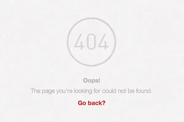
One of the most important points to consider while designing the website- dead links. Dead links only go out to convey the negligence and carelessness on your part. Not only it will ruin your Search Engine rankings, but it will also drive visitors away. Fortunately, there are several tools available to keep a tab on the links, so you don’t have to do it manually. Majority of these tools are free to use, so don’t let your website give the image of it being outdated.
The aforementioned factors contribute to bad UX and Website Design. However, these factors must be taken into account in its entirety, to enhance the function of each and every page of the website. Always remember to ask yourself- does the website distract the users, and act as a hindrance for the users, in their process of finding what they’re looking for? Attracting visitors is not an easy task- but you can always work continuously upon improving and optimizing the website, and servicing the visitors in the best manner possible. This is a sure-shot way of retaining the visitors, and turning them into your brand loyalists.
Comments are closed.