Line25 is reader supported. At no cost to you a commission from sponsors may be earned when a purchase is made via links on the site. Learn more
Beauty brands have been growing exponentially in the last couple of years. Last year, the industry was estimated to be worth $265 billion worldwide. The industry is defying gravity by growing at a skyrocketing rate. Use of the online sales and changes in lifestyles have steered growth in a speedy way. Timing as also played a major role as we’re living in a generation where everyone wants to look good. Diversification of brands has led to the rise of new brands that are steering the growth of the overall beauty brands. Social media has pushed the brands even higher by encouraging self-expression and an opening myriad of possibilities to young generation consumers who are tech-savvy. With the advent of influencer marketing, more and more people are buying makeup products to try their hand professionally or to follow along with the latest tutorial from a so-called “beauty guru” on Instagram or YouTube.
The growth has led to stiff completion in the market. Competition has led to technological advancements that are shaping all areas of the industry. The demand in the industry has seen your mothers’ and grandmothers’ cosmetics companies acquiring the newer & more popular companies that are preferred by the young generation. The wave in the beauty industry has also revolutionized how the products are packaged to entice new customers as well as retain the older ones. With advancement in social media, marketing has been made easier in one sense – but it’s easy for a brand to disappear when all of its competitors are fervently marketing on social channels. Brilliant and innovative packaging is paying off well to capture and keep attention. As could be expected in such a visual industry, the look is half of what denotes the quality of a product – before anyone has even swatched for pigment or tested for long-wear.
To come up with an exceptionally great design for beauty products, every company needs to consider an array of elements before settling on the package design. Packaging must be designed so that it will attract traditional retail AND online retail customers. Every package design has to look beautiful and eye-catching while matching the style of the brand – luxury makeup brands should use rich golds and marbles, edgy brands should use black and silver with heavy typography, and sweet, happy brands should use lots of color and movement. Below, we explore five elements of beauty packaging and what we, in the design community, can learn from this burgeoning industry.
Brand Style
A beauty company’s brand is the culmination of their back story, their growth in the industry, and how they attract the customers they serve. A brand’s style must speak to the ideal consumer’s age, interests, and aesthetic. However, many brands also want to adapt to whatever trends on Instagram or throughout the internet, too. For example, an edgy gothic brand, a peppy young brand, and even a luxury brand have probably all created a Unicorn-inspired line and a galactic or holographic line in the last two years because those motifs were so unavoidable. The way they express these trends, though, varies according to the specific style of their brand.
The best way for a consumer to know what a brand’s vibe will be like – and what kind of products they’ll likely put out – is the first impression of their packaging. Style sets the way for the rest of the package design elements and defines the package decisions that go hand in hand with overall design goals and the messaging of each brand and each brand’s latest roll-out. Style determines the success of the overall package design.
Color
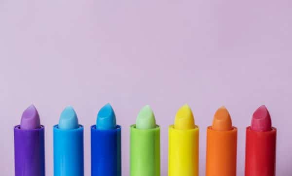
Color is the second modern element that is major in cosmetics brands. The color has to match the brand personality and style of the packaging. Every color choice should be integrated to the brand, but also has to be attractive and enticing to grab customer’s attention and outshine other cosmetics brands as much as possible. Color speaks a different language to different people. In beauty brand package design, choosing a color that goes well with customer’s preferences is a key. While the colors and shades of the products themselves – the lip or eyeshadow shades, etc. – will ultimately matter more, the packaging helps tell that story, too.
It is always wise to choose a color that is attractive but not so common among the competition. Years ago, nearly all makeup packaging was black or pink but now you’ll see greens, browns, greys and every sort of shade finding its way onto shelves. Some brands always express their latest products in the same color palette while others roll out new packaging color choices for every line they create.
Typography
After settling on the color, a font is a next element that plays a key role in keeping customer picking the beauty brand off the shelves. Once upon a time, all beauty-related fonts chose from a few classic and feminine-perceived fonts but now, brands are getting more playful. You’ll see bubbly, blocky, and even gory & mysterious fonts being used – which is fine, as long as the choices match the style and story being told.
A great brand packaging font for the beauty brands should be instantly recognizable to buyers and must be unique. The font has to be on brand, to identify fully with a brand – even if different fonts are used for different product lines within a product umbrella, the whole of them should still match the attitude of that brand. While fonts can be expressive and artistic, it still matters that they are clear and readable with ease.
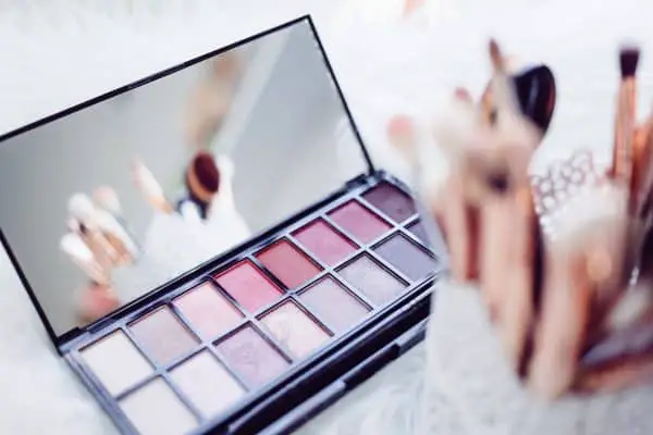
Silhouette
Modern packaging brands of beauty products have centered more on the shape of the product more than ever before. This element influences the decision of customer who is shopping in-store as they pick up and feel each package but because everything is so visual, even online buyers are motivated by a sleek or curious silhouette. More than ever, makeup buyers are using these products in their own digital content so the more interesting a package can be, the more it will be picked up just for expression. Some brands have also developed a familiar silhouette, such as the hexagonal packaging that we’ve come to expect from a popular brand, or the bubbly packaging that a cutesy brand always puts out. It builds familiarity.
Packaging designs of beauty products have been revolutionized to fit customers’ needs and specification. A great shape design of the container of the beauty products makes it attractive to the customer and makes it easy to use. Creative shape design for packaging a beauty product is a win for both the brand owner and the customer.
Size

The size of the beauty brand design packaging has to fit customers’ needs and specifications. Modern package design for beauty brands has to consider easiness to carry – but less than in years before. Customers like travel-friendly products but they’re still seen buying 5×7 shadow palettes, too. It depends on the motive of the consumer at time of purchase – so variable sizing is smart. The size of the package varies with a different beauty product. However, size has to be unique and beautiful to attract customer and making it convenient to carry around.
Ultimately, these five elements are important to consider for any packaging – or even any 2D project. Brand and styling matter. Color and font matter. Silhouette and sizing matter. When you put all of these elements into harmony, your design will come out sharp.