Line25 is reader supported. At no cost to you a commission from sponsors may be earned when a purchase is made via links on the site. Learn more
HTML5 is definitely the flavor of the month, with everyone in the design community getting excited about its release. In this tutorial, we’ll get a taste of what’s to come by building a cool iPhone app website using a HTML5 structure, and visual styling with some CSS3 effects.
HTML5 isn’t here just yet, but the Working Draft is complete enough for us to play around and get to grips with the exciting new elements we can use in our code. To learn how a few of these elements can be used, let’s put together a simple website for say, a fictional iPhone app. How about we use the recent tutorial I wrote over at Tutorial9 as a base for our app website? This tutorial covered the process of building an interface just like the awesome apps from Tapbots, so head over and check it out, then we’ll be ready to build an accompanying website for our PKE Meter application.
The PSD concept
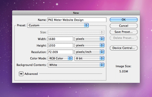
First, we’ll need to put together a concept for our app website. Create a new document in Photoshop. I use the dimensions of 1680×1050 to give a typical widescreen monitor resolution to work with.
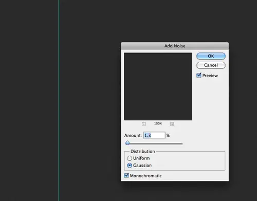
Fill the background with grey (#252525), then add some subtle texture by heading to Filter > Noise > Add Noise. Select the Gaussian and Monochromatic options and set the amount to 1.3%.
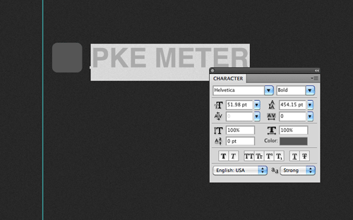
Draw a simple app icon with the rounded rectangle, and type out the name of our app in Helvetica Bold.
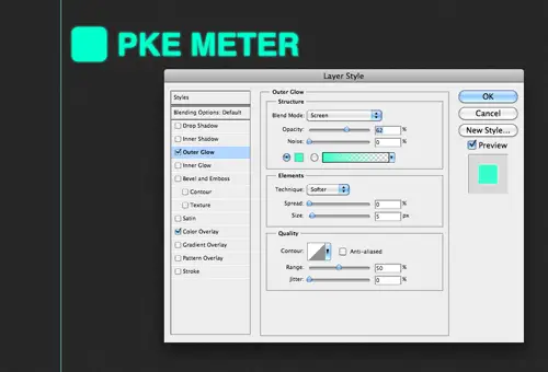
Double click the layer of each object to add some layer styling. Give each one a Color Overlay of #00ffcc and a soft Outer Glow to create an illuminated appearance.

CMD-Click the layer thumbnail of each object to load the selection, then fill a new layer with a horizontal scanlines pattern. Check out the original tutorial for more information on how to create custom patterns.

Change the blending mode of the scanlines to Multiply and drop the opacity to around 35%. Add a little logo and the usual highlight to the iPhone icon graphic.
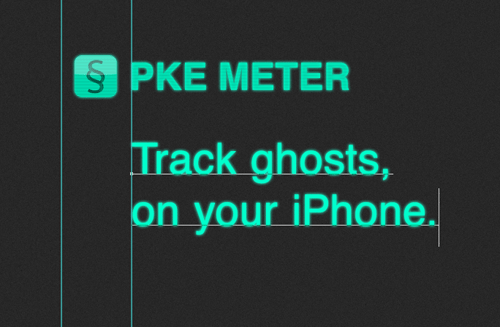
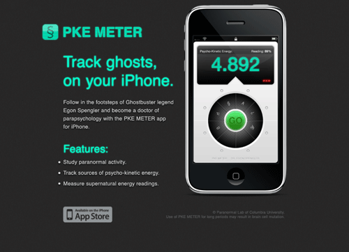
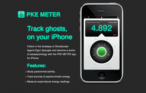
Type out an enticing introduction for the app with the type tool and add the same illuminated layer style. If you haven’t guessed already, the PKE Meter is the tool Egon Spengler uses in Ghostbusters. If Egon was busting ghosts in 2010, there’s no doubt he’d be using his iPhone to track psycho-kinetic energy.
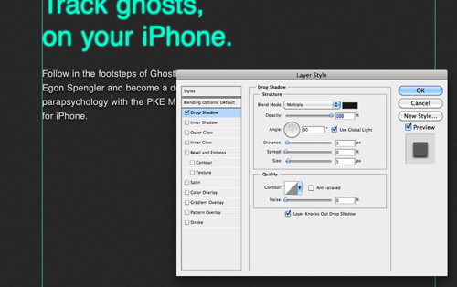
Fill out the design with a description of the app. To give the text a little extra pop, add a black drop shadow.
Take the time to line-up the elements of your design and finish off the description of the app with a list of features.
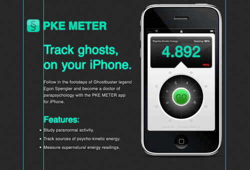
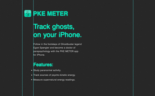
Download the handy iPhone UI kit from Teehan+Lax and paste in the custom app screenshot in place. Position the iPhone over to the right. Keeping the scale pretty large will help it act as a main focal point for the design and maintain the small details of the app interface.
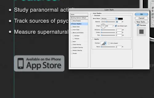
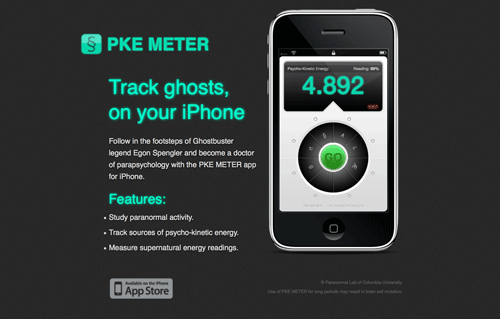
No iPhone app website would be complete without the ‘Available on the App Store’ badge. Paste in a copy of the badge and add some general styling with a subtle Inner Shadow.
With just some copyright and disclaimer information added to the footer area, the concept is ready to be sliced and exported. Save the logo, the large iPhone graphic, the app store badge and a clipping of the textured background as PNG graphics.
The HTML5 structure
<!DOCTYPE html>
<html>
<head>
	<title>PKE METER app for iPhone</title>
	<link href="style.css" rel="stylesheet" type="text/css" media="screen" />
</head>
<body>
	<div id="container">

	</div>
</body>
</html>
Next we’ll put together the basics for the HTML index page. The HTML5 doctype is pretty simple indeed. Just add <!DOCTYPE html>. This is followed by some familiar HTML that outlines the <head> and <body>. We’ll add a div with an id of container to enclose all the content in a fixed width.
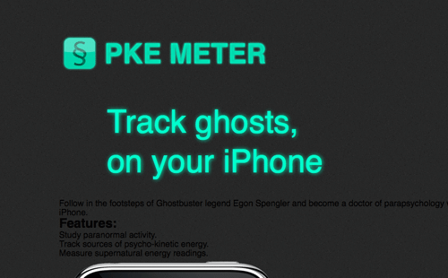
<header>
	<img src="images/logo.png" alt="PKE Meter" id="logo" />
	<h1>Track ghosts,<br> on your iPhone</h1>
</header>
Now the new HTML5 elements will come into play. The <header> element is used to enclose a group of introductory or navigational aids. The logo and intro title of our design would fit perfectly here. The logo itself is added as an image, and the intro, being the most descriptive element is coded in a <h1>.
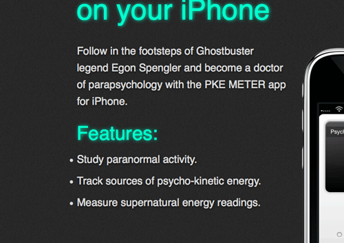
<section>
	<p>Follow in the footsteps of Ghostbuster legend Egon Spengler and become a doctor of parapsychology with the PKE METER app for iPhone.</p>

	<h2>Features:</h2>
	<ul>
		<li>Study paranormal activity.</li>
		<li>Track sources of psycho-kinetic energy.</li>
		<li>Measure supernatural energy readings.</li>
	</ul>
</section>
A <section> in HTML5 refers to a grouping of content, so all the information about the app in our design can be enclosed in the section element.
<aside>
	<a href="#"><img src="images/iphone.png" alt="iPhone showcasing a screenshot of the PKE METER app." /></a>
</aside>
An <aside> in HTML5 is pretty similar to a <section> as it also basically a grouping of content, but an aside is used specifically for separate content that has a connection to a nearby section. The large graphic of the iPhone and app screenshot is related to the information that’s within the adjacent <section> element in our design, so it would work well as an aside.
<footer> <a href="#" id="app-store">Available on the iPhone app store</a> <p><small>© Paranormal Lab of Columbia University.</small></p> <p><small>Use of PKE METER for long periods may result in brain cell mutation.</small></p> </footer>
The <footer> element is another handy structural HTML tag that replaces the old <div id="footer"> method with something more descriptive. Within the footer I’ve used <small> tags to surround the copyright and disclaimer. The <small> element is used to represent small print, and can be used for disclaimers, caveats, legal restrictions and copyrights (not small as in size, as the name suggests.)
<!DOCTYPE html> <html> <head> <title>PKE METER app for iPhone</title> <link href="style.css" rel="stylesheet" type="text/css" media="screen" /> </head> <body> <div id="container"> <header> <img src="images/logo.png" alt="PKE Meter" id="logo" /> <h1>Track ghosts,<br> on your iPhone</h1> </header> <section> <p>Follow in the footsteps of Ghostbuster legend Egon Spengler and become a doctor of parapsychology with the PKE METER app for iPhone.</p> <h2>Features:</h2> <ul> <li>Study paranormal activity.</li> <li>Track sources of psycho-kinetic energy.</li> <li>Measure supernatural energy readings.</li> </ul> </section> <aside> <a href="#"><img src="images/iphone.png" alt="iPhone showcasing a screenshot of the PKE METER app." /></a> </aside> <footer> <a href="#" id="app-store">Available on the iPhone app store</a> <p><small>© Paranormal Lab of Columbia University.</small></p> <p><small>Use of PKE METER for long periods may result in brain cell mutation.</small></p> </footer> </div> </body> </html>
So here’s our simple HTML5 page altogether. We’ve only used a couple of the new elements, but that’s all we needed for this particular design. It has however, enabled us to create a really clean markup and has seriously cut down on the number of <div> tags scattered around the HTML, making it much more easy to see where specific sections start and end.
The CSS styling
body, div, h1, h2, h3, h4, h5, h6, p, ul, li, img, header, section, aside, footer, button {
	margin: 0; padding: 0; border: 0;
}

body {
	font-family: Helvetica, Arial, Sans-Serif;
	background: #2b2b2b url(images/bg.png);
}

#container {
	width: 960px;
	margin: 0 auto;
	padding: 90px 0 100px 0;
	position: relative;
	overflow: hidden;
}
Now it’s time to get everything styled up according to the visual concept. To begin, the stylesheet is given a quick reset to strip out the browser default styling, the body is given the dark textured background and the containing div is positioned centrally.
header {}
	header img#logo {
		margin: 0 0 50px 0;
	}
	header h1 {
		margin: 0 0 30px 90px;
		font-size: 60px;
		font-weight: normal;
		line-height: 74px;
		color: #00ffcc;
		text-shadow: 0px 0px 10px #00ffcc;
	}
The logo and title can be moved into position by editing their margins, and the text for the intro title can be styled up the match the visual concept by adding the bright green color, and the illuminated effect with the CSS3 text-shadow property.
section {
	margin: 0 15px 30px 0;
	width: 530px;
	float: left;
}
	section p {
		margin: 0 0 30px 90px;
		font-size: 22px;
		line-height: 35px;
		color: #d9d9d9;
		text-shadow: 0px 1px 5px #000;
	}
	section h2 {
		margin: 0 0 10px 90px;
		font-size: 40px;
		font-weight: normal;
		color: #00ffcc;
		text-shadow: 0px 0px 10px #00ffcc;
	}
	section ul {
		margin: 0 0 30px 90px;
		font-size: 22px;
		line-height: 45px;
		color: #d9d9d9;
		text-shadow: 0px 1px 5px #000;
	}
The <section> that contains all the textual information is given a specific width and floated to the left, and all the subsequent content elements such as the header two, paragraphs and unordered list are all given the appropriate font-sizing, margin and coloring to match the PSD concept.
aside {
	position: absolute;
	top: 20px;
	right: 0;
}
The <aside> can then be moved into place with some absolute positioning. This ensures the iPhone graphic appears 20px from the top of the page, relative to the containing div.
footer {
	width: 960px;
	float: left;
	clear: both;
	overflow: hidden;
}
	footer a#app-store {
		display: block;
		width: 198px;
		height: 72px;
		background: url(images/app-store.png);
		text-indent: -9999px;
		margin: 0 0 0 84px;
		float: left;
	}
	footer p {
		float: right;
		clear: right;
		font-size: 16px;
		color: #5a5a5a;
		margin: 10px 0 0 0;
	}
The footer can then be cleared so that it sits underneath the previous content and given an overflow:hidden declaration to clear itself after the floats used on the anchor and paragraphs. Speaking of anchors and paragraphs, these elements are each given moved into place with floats to finish off the CSS.
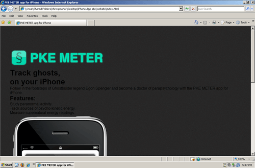
Previewing the site in Firefox, Chrome and Safari will show the site in all its coded glory. Unfortunately, Internet Explorer doesn’t share support for HTML5, so it needs a little extra work.
<script>
  document.createElement('header');
  document.createElement('footer');
  document.createElement('section');
  document.createElement('aside');
</script>
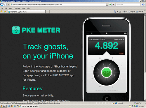
Because IE doesn’t support HTML5, it just doesn’t recognize those new fancy elements. The good news is it’s easy to tell IE to create them anyway by adding the above Javascript to your <head>. As soon as this code is added, everything looks perfect in IE, albeit with the cool illumination effects being gracefully degraded. It’s worth noting that if Javascript is turned off, IE will show the broken version of the site. Chances are with an iPhone app website like this, the majority of the visitors are going to be clued up on their browsers, so it’s a risk that we could take for this particular design.
Comments are closed.