Line25 is reader supported. At no cost to you a commission from sponsors may be earned when a purchase is made via links on the site. Learn more
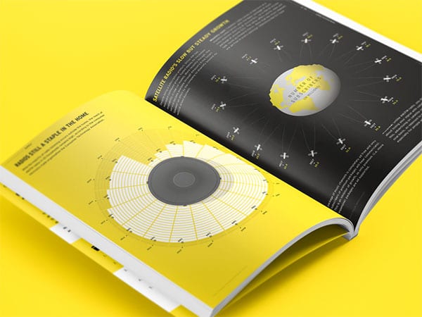
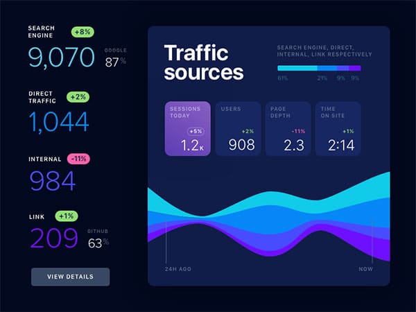
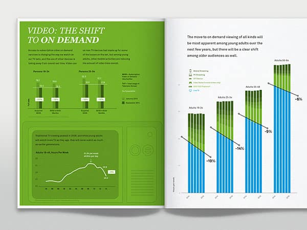
Infographics may be a bit tricky to create, but there is no better alternative for presenting complex data in a ‘digestible’ and eye-catchy way. Better yet, infographics are slowly becoming a critical element of visual marketing.
Of course – text was and remains a leading means of communicating important information, but we can’t undermine the fact that human brains process images way faster than words.
This is even truer when it comes to transforming complex data into manageable chops that people will both like and understand. The rising popularity of analytic web magazines is the best way to confirm that.
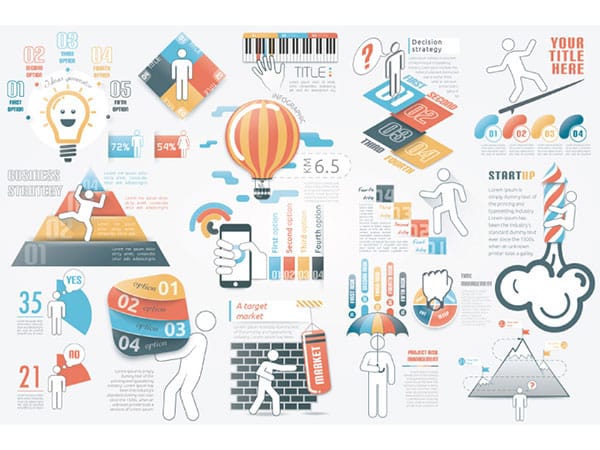
How to design amazing infographics – Tips & Tricks

Infographics designs are created primarily with the help of vector graphics software like Illustrator, Corel Draw, and lately, Canva Pro, where all charts, images, icons, fonts, illustrations, and visualizations can be edited separately.
You can move the resize them, rotate them, or overlap them upon need. Better yet, the system can arrange them within a functional unit regardless of how you created them or where you extracted them from.
In a nutshell, infographic designs make data both beautiful and functional, but only as long as you’ve presented it in the right way. This process also entails smooth navigation and guidance, because infographics that are difficult to understand stand no chance to become popular.
Collecting and assembling data

The first phase of the process is to sift and collect data. Most of the time, you’ll be getting messy and raw chunks: excel sheets imported from local databases, downloaded PDF reports and similar resources.
Rather than indicating to viewers that they should compare charts on different pages, you should give them a clue on why this is important, and gather additional resources for those who would like to know more.
To get the full picture, you will need multiple materials and hours of research, instead of simply pasting isolated charts that mean nothing to a less informed user.
Original infographics – why you should position numbers within different shapes

Unique shapes are easy to spot, and they can keep the viewer’s attention much longer than a plain number. Therefore, make sure that important numbers and statistics stand out.
Content rather than plain numbers
One can tell from personal experience that it is easier to focus on highlighted parts and skip the body text in a report, but this may have serious consequences on the long run.
Single chunks of numerical data can’t reveal the full picture without detailed explanations, so don’t try to skim on those.
The client will notice the incompleteness of your project sooner or later, and your report will be of no use since the dots are not really connected.
To avoid a similar scenario, hire an infographic designer who can spot the holes in your content, and help you support facts with a reliable and adept story.
How to present your information – Tips & Tricks
Let’s assume you’re pitching a hot business idea to interested investors, or preparing a weekly report at work – in both cases, you need to represent figures and facts, and make them as effective as possible. How can you do that?
Start with the narrative
Without a decent narrative, statistical data would be boring and difficult to understand. Your intent with each and every report should be unique and obvious, and that doesn’t only refer to clarifying your data.
Instead, you should also explain how you’ve collected and processed your materials, reveal the trends and patterns you can across, and support your arguments with a list of key findings. Once your audience is familiar with your sources, they will find it much easier to understand the information, and they will be much more interested to learn more.
Come up with a consistent visual index
A solid visual index will help viewers scan your designs quickly, and understand the hierarchy of your information. To do that, you should break complex data down, and come up with a great narrative, as we discussed before.
The visual index aims to connect different chunks of data and to ensure that they are consistent. A fast and efficient trick is to pick a focus element and make sure it appears everywhere in your design for a more cohesive experience.
Discover and face your problems
Sometimes, you won’t have to come up with a story to make data work in cohesion and harmony. You can always play it by ear and let facts speak for themselves, but keep in mind that this will also require multiple reality checks.
It may happen that the amazing data doesn’t comply with the story your client is looking for, which means you’ll have to twist it, or remove facts that don’t look right. What matters the most is to use accurate data that is easy to uncover, instead of misleading your client with useless details.
Colored infographics have a better impact

Color can help you boost the influence of tour infographic, and make sure that your information is being noticed.
Hierarchical arrangement
When is the last time you saw a report without a focus piece of information? The ‘wow’ moment that causes astonishment is compulsory in any research, and once you get grasp on it, you can arrange the rest of your data in any type of hierarchical structure you want.
The supportive elements will be arranged to tell the story, and readers will use them as an orienteering tool to locate the info they need. Once ready with it, you will see the final picture of the product ready.
Creating visual maps with lines
The same as shapes, icons, and illustrations, lines can help you map data wherever necessary. Stick to simple and straight lines that won’t distract attention from what is genuinely important – your information!
Preparing wireframes
With all data assembled and combined, the hierarchy established, and a focused fact exposed in plain sight. It will be time to create your first wireframe. The wireframes are in fact visual prototypes of how the information is about to look and designers share them with clients for an opinion before they’ve launched the final product.
More often than rare, wireframes raise discussions and suggest potential changes, and it is only after they’re approved that the designer can make a final decision.
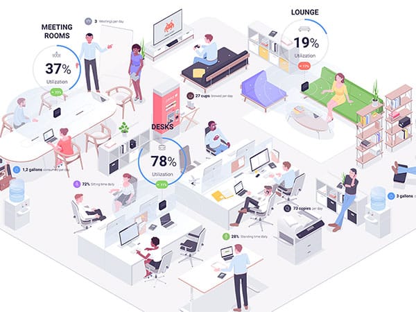
Despite the number of rules and guidelines in wireframing, many designers choose to deviate from the traditional path and choose a different way to tell their story. Charts and pies are, of course, still present, but so are illustrations, photos, and similar compelling elements.
Refining and testing your design
Once the visual form of your infographics is set to go, you need to refine it to perfection. At this stage, you may as well want to involve your clients and consult details with them, so that the final product matches exactly the intent and needs of their brand.
A separate testing process is launched within the design team to ensure that the information is correct and easy to read, usually by being offered to random users who didn’t have a similar experience before.
There is no strict rule to as how long the testing process should be, and it usually lasts until everyone on board confirms being comfortable with the simplicity and arrangement of the design. Once the clients approve it too – you’ve got yourself a winner!
Skip white backgrounds
Most infographic websites come with a plain white background, which will make it difficult for viewers to distinguish your work from the work of someone else. Plus, white is not the best color choice for viewers to decipher the starting and edging point of your content.
The hit off moment
Most infographics nowadays are created for online display, and sometimes released as printed illustrations as well. This is why you should prepare data foremost for digital utilization, and count in all the audiences that will have access to it.
One thing is for sure: as much as you’ve tested your work, there is no chance you’ve discovered all aspects of the story, so even once the piece is published, you may encounter problems and arguments you never knew existed.
In short, collective vetting will ensure your project is never quite finished, and you will have to perform occasional revisions each time new data appear on the scene.
We bet it sounds intimidating at this stage, but that’s what makes good infographics so rewarding. Stirring the minds of your audience with accurate and scrutinize design takes work!
What will you get from your infographic design?
Infographic assets are quite similar to any marketing tool, and can do miracles for a brand when used at the right time and place. This is what they will do for you:
- Drive traffic your way. Quality infographics improve your SEO and help attract new visitors.
- Boost brand awareness. Infographics are easy to share on other websites and social media, and will make your brand popular much sooner than you expect it.
- If arranged in the right way, they will put you within customers’ spotlight, and become your leading marketing campaign tools and sales assets.
- Improve internal and external communication. You can use infographics within your team to monitor progress and achievements for different periods of time. You can also share your data with interested audiences to compare your value on the market.
Once again – information is easier to understand when displayed visually and distributed online, which is how certain websites take literally seconds to capture worldwide attention.
Overwhelmed by clutter and useless content, readers are desperate to discover content they like, and won’t care who you are or what you do unless you provide it.
What to expect from infographics in the future?
Infographics are useful for as long as the data displayed in them is accurate, which means that they must evolve. Designers are continuously searching for new ways to make them interactive and playful, including HTML5-based visualizations that react depending on the viewers’ actions.
As it was so far, infographics will continue responding to the exact needs of the targeted audience, and combine interesting, accurate, timely, and foremost relevant information.
When compiled with care, infographics will help you succeed, thanks to the fact that readers understand and memorize the story you’re sharing with them.
Infographic designs are also great assets that help you reveal findings to stakeholders, or measure the progress of your team, and they’re thus welcomed and useful in every industry.
Comments are closed.