The Rising Trend of Bright Flat Colors in Web Design

Home » Articles » The Rising Trend of Bright Flat Colors in Web Design

Line25 is reader supported. At no cost to you a commission from sponsors may be earned when a purchase is made via links on the site. Learn more

We’ve seen the use of solid colors increase through the adoption of the flat design trend, but these hues are becoming increasingly vibrant following the release of iOS7 and the colorful iPhone 5C. Dazzling RGB colors are becoming more popular in the latest website designs, with saturation levels at an all-time high. This post rounds up a collection of over 20 great examples of the growing trend of supersaturated background colors in web design.

Apple

Apple

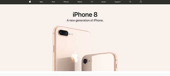
Apple has a nice design that can be your next source of inspiration thanks to the way it uses flat colors.

Mud

Mud

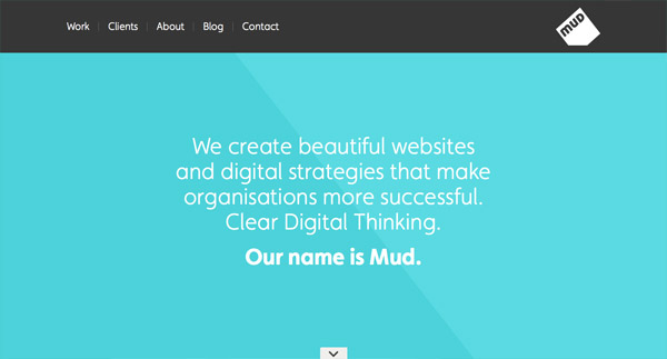
Check out this great example that uses flat colors in its design. Have a look at Mud’s website!

Connect Mania

Connect Mania

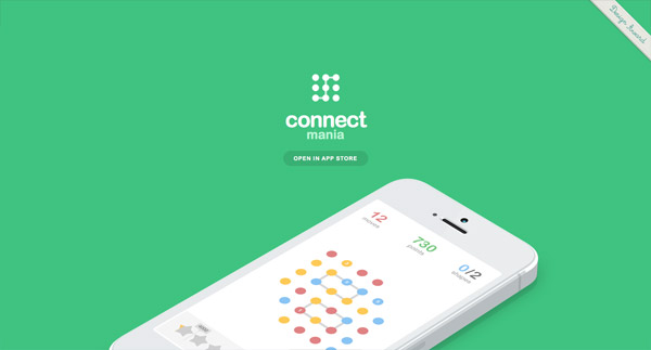
Connect Mania has a friendly interface design that uses flat colors and flat graphic elements in an eye-catching way.

Wrist

Wrist

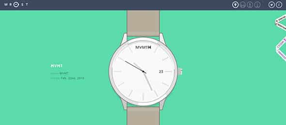
And if you liked the previous example you will definitely love this one. Check out this website’s flat design.

Design Week Portland

Design Week Portland

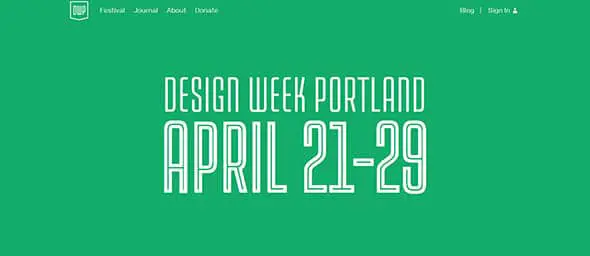
This website focuses on presenting an event which takes place in Portland every year through a flat and minimalist design.

BitLocation

BitLocation

If you like using shapes and mixing bold colors in flat design then you might want to have a look at this example. Have a look at this example and find your inspiration.

Transformation Projects

Transformation Projects

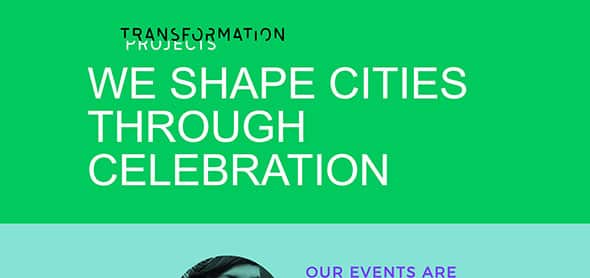
This is yet another good example of a website that uses flat design in a creative way. It mixes colors and typography to create a modern and functional web design. It is definitely an example worth following!

Andrew McCarthy

Andrew McCarthy

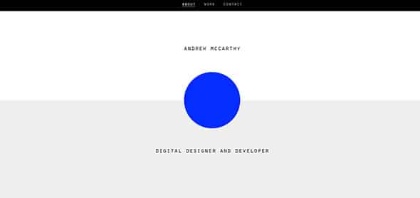
If you are looking for a nice way to mix flat design with minimalism, this website might be a great source of inspiration for you. Have a look and see if this is what you had in mind!

Mixd

Mixd

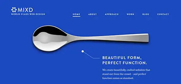
Let’s continue the series of good flat design in websites with MIXD. This company focuses on building beautiful websites and their’s proves their vast experience in this line of work.

Cyclemon

Cyclemon

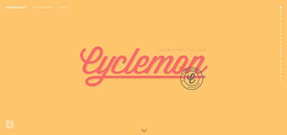
Cyclemon’s website uses flat colors in its web design layout. It is definitely an example worth following in future projects.

TWNSND CO

Portfolio of Cole

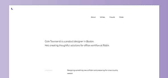
This is yet another good example of mixing flat colors with minimalist design. Have a look at this product designer’s website and find your inspiration.

Made Together

Made Together

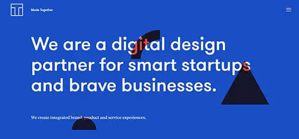
This is yet another good example that can be a great source of inspiration for future projects. It has a simple flat color as a background, a neutral typeface which presents some content about the company and mixes some simple shapes in its design.

Kick Point

Kick Point

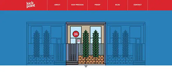
This is a much more detailed example of flat design. You might also want to check out the graphic elements it uses and that cool menu bar.

Freshly Roasted Coffee

Freshly Roasted Coffee

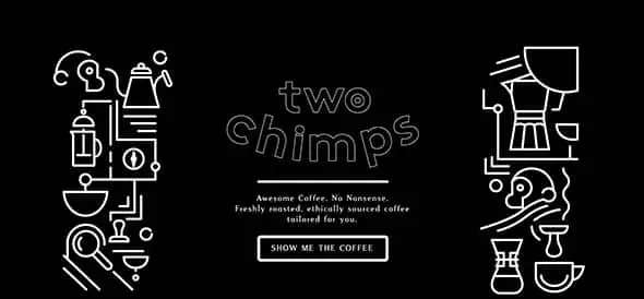
If you are a fan of coffee or you are simply looking for a good source of flat design inspiration, this might be the example you have been looking for. Have a look and see if this is what you had in mind.

Do a backflip

Do a backflip

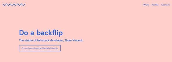
This is yet another good example that might become your next source of inspiration. Have a look at this example and see how this website’s design mixes flat colors in different ways.

SOLO

SOLO

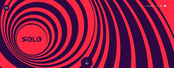
This example uses flat colors in a creative and animated way. It also has a cool preloader. Have a look at this example and find your inspiration.

PACE

PACE

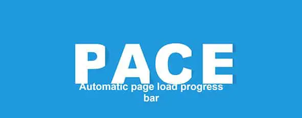
IF you liked the previous examples then you will definitely love this one, and the ones yet to be seen. Have a look at PACE and the way it combines graphic elements such as the huge typography in its header.Its amazing flat design is worth having a closer look at as it might be a great source of inspiration for your future projects.

HEIKOPAIKO

HEIKOPAIKO

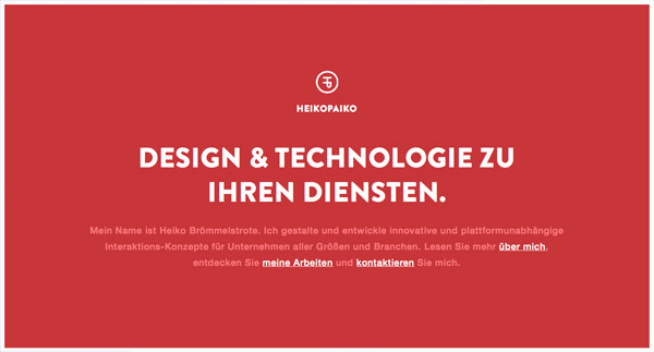
Heikopaiko is yet another good example of using flat colors in your design. A simple background might seem dull in some cases but when you combine it with the right graphic elements, you’ll definitely see improvements.

Fhoke Studio

Fhoke Studio

Fhoke Studio has an amazing flat design. This example mixes colors, typography and graphic elements and manages to make an eye-catching design.

Octave & Octave

Octave & Octave

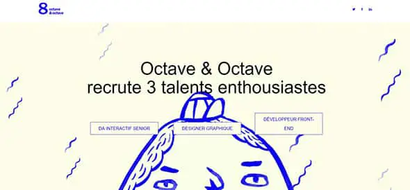
If you are looking for some more creative ideas of using flat design, then have a look at this example. See how this website mixes doodles with flat design and find inspiration for your project!

Bark PR

Bark PR

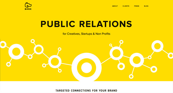
This website presents a public relations company and their website uses flat design to present their business. The website uses yellow as the main background color and the first thing a visitor sees when accessing the page. It also has so cut-out shapes that make you think about connections, relations etc. This is a great way of presenting a company.

Flat WordPress Theme

Flat WordPress Theme

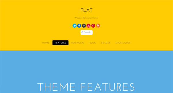
This example has a friendly web design layout that mixes different flat colors in its design. This is definitely an example worth following in future projects!

Petra Sell

Petra Sell

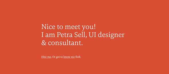
Last but not least, this an UI designer and consultant’s website and it uses flat colors in its design. Have a look!

Author
Iggy
Iggy is a designer who loves experimenting with new web design techniques, collating creative website designs, and writing about the latest design trends, inspiration, design freebies, and more. You can follow him on Twitter

33 thoughts on “The Rising Trend of Bright Flat Colors in Web Design”

  1. Getting soooooooo tired of flat design.

    Any time something that is easy to recreate/copy that looks good comes around it gets incredibly overused.

    Flat design is the web 2.0 style that got equally played out.

    Reply
  2. I love the flat, simplistic look. It can make a website really stand out as elegant.

    However, since this is becoming a trend, I imagine we’ll see an influx of it the likes of Flash websites.

    Reply
  3. You could say that the Apple company is a trend setter what with their top of the line operating systems and gadgets that make people go gaga. Anyway, these are fabulous designs. When better to have them than now when the holiday season is just around the corner.

    Reply
  4. I’m a front-end dev for the eCommerce company, AmeriCommerce, and to celebrate the launch of our new admin we threw together a fun landing page targeting web insiders that falls inline with a lot of the examples given here.

    Check it out: https://americommerce.com/responsive-admin-launch

    Reply
  5. Getting soooooooo tired of flat design.

    Any time something that is easy to recreate/copy that looks good comes around it gets incredibly overused.

    Flat design is the web 2.0 style that got equally played out.

    Reply
  6. This seems to be the new trend and I find myself incorporating these themes into most of my designs. It is simple and modern! Love it!

    Reply
  7. It is true that more and more designers are now using RGB colors with high saturation levels as opposed to the solid colors that were being used before. The websites featured in this post are great examples of how one can use these colors to achieve great results.

    Reply
  8. Nice information abut The Rising Trend of Bright Flat Colors in Web Design, thanks for sharing such a wonderful tip, it is so much helpful for me.

    Reply
  9. Wow, the bright colors are all wisely used. We all know that bright colors is a big “No” “No” in web design. However, since flat design became trends, it breaks the rules but resulted to more interesting designs. Thank you for sharing this.

    Reply
  10. They all look so alike. And I agree that Apple was very late to the game, but Apple’s brand is so strong that they can do nearly anything and fanbois will eat it like candy.

    My real question is…
    Was “flat” design initially created from lack of creativity from developers or did people really start to idolize simple Scandinavian designs..?

    Reply
  11. I agree with this, even i have started using the flat design concept now. It’s the latest ongoing trend. Microsoft, Google, Facebook, etc. name it, all are moving ahead with this idea of flat design and people love it.

    Reply
  12. I’ve been messing around with some flat design ideas for my portfolio, but I’ve been having trouble with the same thing: the colors. It’s hard to find the right color where it compliments the content well and doesn’t drown it out. Flatuicolors.com has some set ones that work alright, been trying to integrate some of those.

    Reply
  13. It really is a rising trend (thanks to Apple) but I guess it’s really difficult for a designer to use it right. It’s easy to “hurt” the viewers eye if one doesn’t use the correct colors.

    Most of the examples in your post look really beautiful and also use “easier on the eye” colors on the rest of their page to help the viewer read more comfortably.

    But a couple are too “rough” I think. Especially when you scroll their pages.

    Reply
    • i think they are visually beautiful and elegant ..but i dont think you can use it for more time, coz it really hurt your eyes…!!

      Reply
    • Not that it matters, but this has been happening way before apple decided to go flat. One could easily say, they are late in the game.

      Reply
    • This is one time that Apple hasn’t been on the forefront. I think Microsoft (This time LOL) really made this trend popular. Apple is just now catching up.

      You’re right about it being difficult to get just right… I’ve had some trouble with it, which amazed me – because it seems so simple (some people equate simple to easy…me included I guess)

      Then I just started thinking “Easter colors!” – nice soft pastels all over the place, and then it doesn’t hurt my eyeballs :P

      Reply
    • Actually you should thank Microsoft for popularizing it. Flat, content not chrome design was started with Microsoft’s Metro design language.

      Reply
  14. Hi,
    could you tell me how you collect and upload the Screenshorts to your blog? Do you have a specific workflow or a special program?

    Thanks,
    Michi

    Reply
    • do print screen (press print screen on the keyboard) for windows and paste in PhotoShop (create new doc ctrl + N and ctrl + V) or ms paint, save it.

      For mac do with ctrl +shift + 4. paste in photoshop.

      upload to your web.

      Reply

Leave a Comment

Verified by MonsterInsights