Line25 is reader supported. At no cost to you a commission from sponsors may be earned when a purchase is made via links on the site. Learn more
Figuring out the best design layout for a website is the first crucial step in building any website. This step will set the foundation for the rest of your work and will ultimately decide how the website will look and function. The site design layout is the website’s structure, and it determines how the website will display the content and engage users.
There are many different types of website layouts, and it can be challenging to decide which one is right for you and what your website users will need.
Web development agencies and design firms tend to use specific design layout strategies that are current and relevant in the industry which we will cover here. But first, there are some basic principles of website design that we should look at such as UI & UX Design as well as answer the question, what is considered web design layout?
What is a website design layout?
A web designer is like a building architect. The layout of a website consists of different design elements or overall visual structure. How the site layout is arranged will impact both function and usability. These design layout elements have different parts and are commonly based on current and effective website design trends.
How these elements are positioned or designed, will make all the difference as to whether a user’s experience will be a pleasant one or not. There are options, but the best option can be dependent on the main purpose of the website.
The purpose of your site:
When it comes to the design layout of a website there should be two important questions answered first:
- How should the users engage with the site? – In other words, what actions do you want them to take?
- What is the main offering of the website? – Is it a product, service, display advertising, or is it purely informational?
Because there are so many types of industry websites, it’s good to answer these questions first before settling on a specific design layout for your website. For example, an e-commerce design layout should be different than a news website layout. Additionally, the design layout of a school website would be very different than an industrial manufacturing website.
Web design layout should follow proven concepts known in the UI (user interface) design and UX (user experience) design world in order to stay relevant, mobile-friendly, and effective at keeping users engaged and happy.
“Good user experience (UX) by design will result in effective user engagement” – John Culotta
What is UI & UX Design?
Before covering website design layouts, let’s answer the above question first. These are interaction elements of design that focus on how to properly, efficiently, and effectively lead, or direct users of both physical and digital products, which ultimately impact usability and function. The physical and digital products mentioned can literally be anything such as electronics, appliances, mobile devices, applications, software, and websites.
Okay, here’s a brief definition of what both UI & UX mean and they are different even though they work together:
- UX (User Experience) Design – This is the seamless integration of all reasons behind the design for a product or website and centered around your user’s experience. As in architecture, UX involves the qualities of “Durability, Usefulness, and Aesthetics” – Virtuvius, a renowned Roman architect.
- UI (User Interface) Design – Primarily focused on the style and looks of interfaces (in this case your website) that are graphical and/or voice-controlled. UI is a subset of UX Design.
In relation to website design layouts, UI & UX design are the main 2 interaction design elements that you should keep in mind before completing your site layout. It’s important to have an understanding of the psychology behind the thought processes that users of your site will have before you complete the design layout.
You will need to decide how users will interact with the (UI) interface. The parts of the UI that users will interact with are the looks, style, or graphical items such as:
- White Space
- Grouping & Order
- Fonts & Colors
- Shading & Boxes
- Buttons
- The Decor
- Navigation
- Images & Galleries
- Shopping Carts
- Signup Forms
- Dropdown Menus
- Comparison Tables
If you want to learn more about how UI & UX Design impacts the layout and structure of a website, we highly recommend the Interaction Design Foundation. The world’s largest online certification program, taught by experts to help designers advance their careers and land fantastic jobs.
Now that we’ve covered the connection of interaction design in relation to the layout of a website, let’s focus a moment on the overall points to consider.
Points to consider while choosing the best design layout for your website:
Following are the points that you should keep in mind while finalizing your website design layout:
- Keep in mind the purpose of your website. Is it for business or personal use? Each type of website requires a different layout.
- Consider your target audience while selecting the layout. If you are targeting a global audience, then a multi-language-enabled website layout would be appropriate. However, if your target audience is limited to a specific region or country, it is best to select a layout compatible with that region/country.
- Your website content and graphics should be well-balanced and organized on the page. Too much content or graphics can make the page look cluttered and unprofessional. Too little content will make the page appear empty and dull.
- Select a layout that is easy to navigate. Users should be able to quickly find the information they are looking for on your website. A confusing or convoluted website layout will only frustrate your visitors, and they will most likely leave your website.
- The layout of your website should be visually appealing and reflect the personality of your business. It is essential to create a unique brand identity for your business, and the website should be an extension of that identity.
- Remember that users will access your website through various devices, and your website design layout should look good and be functional on all browsers and screen resolutions.
Custom Or Standard Website Layout
A website’s layout is fundamental as it determines how users will interact with the site. You can choose to create a custom layout or go with a standard website layout like many pre-existing website themes and templates.
A “standard website layout” is more user-friendly and easy to navigate than a custom layout. It also makes it easier for your website to be found by search engines. This is why it is always recommended to opt for a standard website design layout.
If you plan to create a new website or redesign your existing one, choosing a standard layout is usually the best option. Following are some of the standard design layouts for websites. Overall, if you’re looking for the best website design layout ideas to start with, here are the options:
1. Box-Based Layout
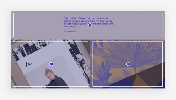
The box-based website layout is a new trend in website design, and the majority of new websites are opting for this style. It is a grid-based layout where all the content is placed inside boxes. This layout is trendy among web designers as it is easy to create, manage and scale. It also looks great on mobile devices without putting much extra effort into compatibility.
There are many benefits of using this layout for your website. First, it makes your website look very clean and organized. Second, it is effortless to navigate as all the content is placed inside boxes. Third, it is very responsive and looks great on mobile devices. Fourth, it is easy to scale and change as you can simply add or remove boxes to change the look of your website.
Recommended For: Box Based website design layout works well for a modern website that has a combination of images and graphics. It can be used for portfolios, E-Commerce and other websites that want to show more images.
2. Z Pattern Layout
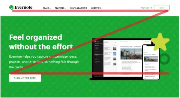
The Z pattern is a layout commonly used in website design, but very few can spot it. It is designed to take advantage of how our eyes naturally scan a webpage. It is scientifically proven that our eyes move from the top left corner to the top right corner. Then they eventually come down to the bottom left, and finally to the right again. This reading pattern forms the shape of the letter Z.
By placing important information across a Z shape, we are more likely to notice it. For example, a logo is usually placed in the upper left-hand corner of the homepage to register first. The same goes for call-to-action buttons; they are often placed in the lower right-hand corner, where our eyes naturally end up after scanning the page. It ensures that the essential elements of the page are seen first, and it creates a sense of symmetry and balance.
Recommended For: The Z pattern website design layout is efficient and visually appealing. You can use it for landing pages or for websites that want a higher conversion rate.
3. Fullscreen Image Layout
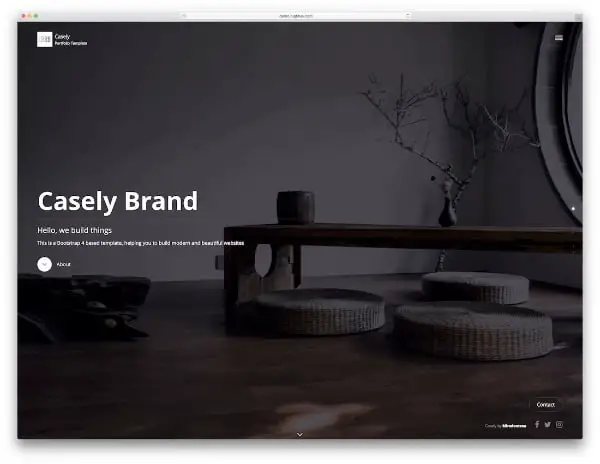
A fullscreen image layout is a website design in which the primary visual element on the page is a large, high-quality image. This layout can be used to create an eye-catching and immersive homepage design, and it looks great on mobile devices as well. The great thing about this layout is that it allows you to showcase your work or product in a visually appealing way.
You can use any type of image you want for this layout, but it should be high quality and relevant to your service or product. It is generally recommended that you use a human face in such hero images to establish a good connection with the audience. The image should also be accompanied by a catchy headline and a clear call to action. There is a rising trend of using fullscreen videos in place of images, but you need to ensure that the video or the image loads quickly and does not increase your website loading time.
Recommended For: Fullscreen image website design layout is a bold and visually appealing style. Hence you can use it for photography, architecture, and other sectors, along with product pages where you want to showcase the product in the best possible way.
4. Split Screen Layout
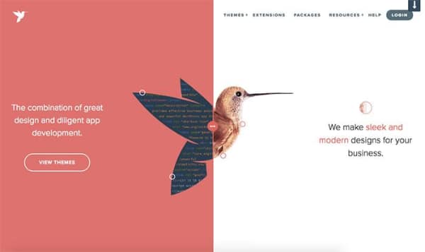
The split-screen website design layout is a type of layout where the content is divided into two or more columns, with each column containing its independent content. This type of layout is often used to showcase different pieces of content side-by-side, such as images, text, videos, etc.
One of the benefits of using a split-screen layout is that it can help to make your website more visually appealing and attention-grabbing. This can be especially helpful if you have a lot of content you want to showcase on your website. Another benefit of using a split-screen layout is that it can help to improve the user experience on your website.
But for using a split-screen layout for your website, there are a few things that you will need to keep in mind. First, it is vital to make sure that the layout of your website is consistent across all devices. Second, you will need to make sure that the content in each column is formatted correctly and easy to read. Finally, you will need to test the layout on different browsers and devices to ensure it is displaying correctly.
Recommended For: Split-screen website design layout allows you to initiate two different customer journeys. Hence you can use it for websites with multiple call-to-actions or storylines.
5. Magazine Layout
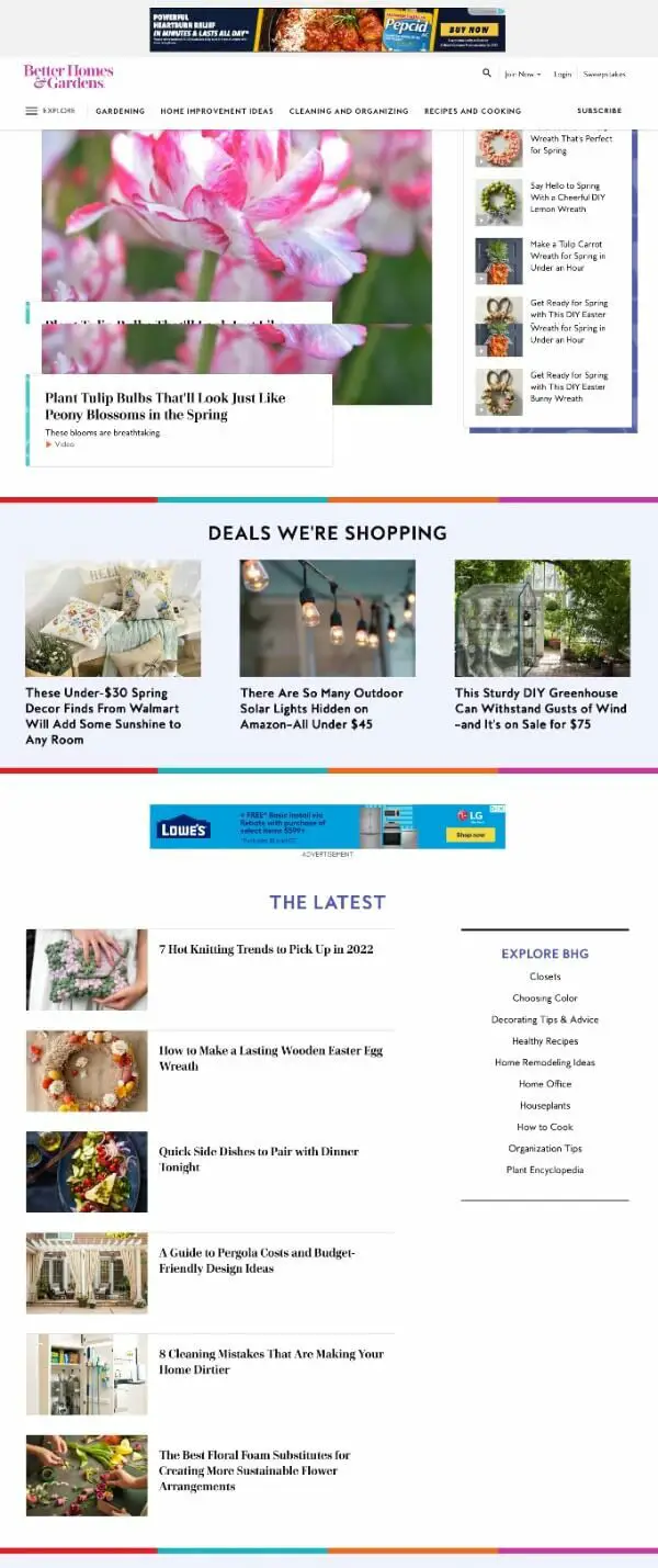
The magazine website design layout is different from the traditional website layout. The main difference is that the magazine website layout focuses more on the content than on the design. The layout is simple and easy to navigate so that users can find the information they are looking for quickly. A lot of focus goes on setting up the content in the right way and not cluttering the website.
The main sections of a magazine website are typically the home page, the latest articles, the archives, and the contact us page. The home page usually contains a slider displaying the latest articles, a list of recent articles, and a list of featured articles. The archives section contains all the articles published on the website. Finally, the contact us page includes information about contacting the magazine staff.
Recommended For: The magazine website design layout allows users to find the information they are looking for quickly. Hence, you can use it for digital newspapers, magazines, news portals, blogs, etc.
6. F Pattern Layout
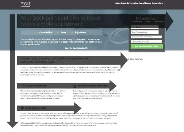
The F pattern website design layout is a layout similar to the magazine layout. It is widely used for organizing website content. The layout is named after the position of the main sections on the page – header, main content area, and footer. This pattern is particularly effective for pages with a lot of content, as it helps to keep everything organized and easy to navigate.
The header typically contains the site logo and navigation menus, while the main content area is where the bulk of the information is displayed. The footer usually contains copyright information, links to other pages on the site, and contact details. There is not much scope for creativity in this layout, but it can allow you to present a lot of content in a simplified manner.
Recommended For: The F Pattern website design layout is simple to create and nicely organizes content. Hence you may want to use it for the news page, blog landing page, or search results page.
7. Card Grid Layout
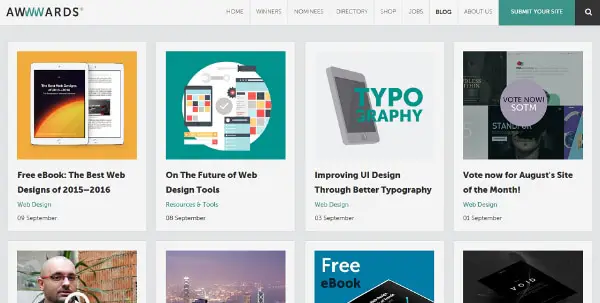
Card grid website design layout is a type of website layout that uses a grid of cards to display content. This type of layout is famous for displaying a lot of content in a clean, organized way. Cards are typically used to display information such as product details, blog posts, or image galleries. It helps strike a good balance between text and media.
Card grid layouts can be used for any type of website because it essentially breaks down the website content into card blocks. This type of layout makes it easy for visitors to quickly scan through a lot of information and find what they’re looking for. If you’re designing a website that will feature a lot of content, consider using a card grid layout.
Recommended For: Card Grid website layout design can help you organize your content clean and user-friendly. Hence they are well-suited for eCommerce websites and portfolios.
8. Single Column Layout
A single-column website layout is a type of website design that features one column of content. This type of layout is often used for minimalist or simplistic websites, as it allows for a clean and streamlined design. In addition, single-column layouts are easy to navigate, as the user only needs to scroll down the page to view all the content. This type of layout is also great for mobile devices, as it takes up less screen space and is easy to scroll through.
However, single-column layouts can be challenging to use for websites with a lot of content, as there is not much room for horizontal scrolling. Single-column layouts are also less flexible than other layouts, as they can be difficult to adapt to different screen sizes and shapes.
Recommended For: Given its minimal and straightforward nature, the single-column website design lets you display text content easily. Hence, you can use this layout for a blog or other pages with lengthy text content.
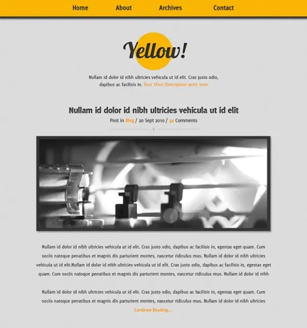
9. Fixed Sidebar Layout
A fixed sidebar website layout is a type of layout where the sidebar on the website is fixed in one position, regardless of where the user scrolls down. This can be achieved by using a combination of HTML and CSS code. One of the main benefits of this layout is that it makes it easy for users to navigate your website, as the sidebar will always be in the same place. This design can be especially useful on long websites with a lot of content.
Another benefit of using a fixed sidebar layout is making your website look more professional and organized. With the sidebar being fixed, it gives the impression that your website has been well-thought-out and planned. This can help increase trust in your brand and improve your chances of conversion.
If you’re considering using a fixed sidebar layout for your website, keep a few things in mind. First, make sure that the content in your sidebar is relevant to your website’s audience. Secondly, make sure that the sidebar is easy to navigate and includes all necessary information for users. Finally, test out fixed sidebar layouts to see what works best for your website.
Recommended For: Fixed sidebar website design layout has its pros and cons. It is best suited for smaller websites with limited navigation options or single-page brand websites.
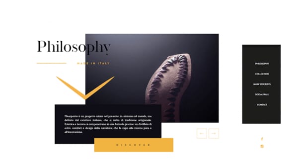
10. Asymmetrical Layout
If you do not want to follow any of the above set website layouts, then an asymmetrical layout is a good option. An asymmetrical website layout is one where the website’s design is not symmetrical. This layout is often used to create a more visually exciting website. Some common ways to create an asymmetrical website layout include using different fonts, colors, and images on different parts of the page.
Asymmetrical layouts can create a modern or vintage look, depending on the design elements used. When creating an asymmetrical website layout, it is essential to ensure that all elements are well-balanced. Otherwise, the page may look messy or unprofessional. It is also important to ensure that all text and images are legible and that no element takes up too much space on the page.
Recommended For: An asymmetrical website design layout is an excellent way to add interest and personality to a website. It is suited when you want to make a highly creative website with a good brand recall.
Your website layout is essential for a number of reasons. First, it can help to ensure that your visitors have a positive experience when they visit your site. A well-designed layout can make it easy for visitors to find the information they’re looking for and to navigate around your site. Second, your layout can also impact your SEO efforts. Finally, a good website layout can make your site more visually appealing. This can help make your site more engaging for visitors and help you stand out from the competition.
Web Design Resources
Here are some additional resources that can help make your life easier with regard to your web design projects. You can use a UX design tool, or website builder, or hire a designer.
All-In-One Website Builders:
If you want an easy route to the best web design layouts, you can always use a free website builder. These website builders (also known as page builders) have been developed to use themes and templates that already have the most modern web design layout features.
- Wix
- BigCommerce
- WebFlow
- Shopify
- Elementor – For WordPress
UI/UX Design Software:
Here’s a way of actually building and testing design elements of a site using a UX design tool online. This could be a good option before finalizing your layout.
Hire A Quality Designer:
Sometimes to avoid the headaches and frustrations of web design, we need to pass the project on to someone who is an expert. Here are some affordable options:
Conclusion
When choosing a layout for your website, be sure to consider the needs of your visitors and your own business goals. There are several different layout options available, so take the time to find one that will work best for your site keeping in mind how proper UI & UX design impacts your users.
