Line25 is reader supported. At no cost to you a commission from sponsors may be earned when a purchase is made via links on the site. Learn more
We’ve all grown up as web designers staying well away from table based layouts, but we don’t often brush up on our table building skills ready for when we will actually need them. Follow this step by step tutorial to create a slick looking data table to compare the features of various Harley Davidson motorcycles. We’ll build the table in clean HTML then polish it up with CSS to create a cool and easily readable HTML table.
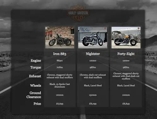
The table we’ll be building compares a bunch of features between three Harley Davidson Sportster motorcycle models. Other than the slick design we’re putting together for the sake of this demo, the table will be built with clean HTML then styled with CSS to make the data easily readable.
View the final HTML/CSS features table
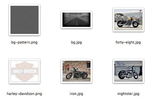
For the design of this particular demo there’s a few files we need from my original PSD concept. These include a patterned PNG graphic we’ll use as a background, the large black and white photo to fill up the demo background, the Harley Davidson logo and photos of the three bike models we’re comparing.
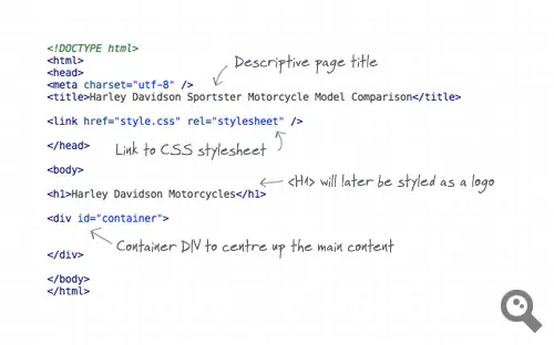
The demo file begins with a typical HTML structure including Doctype, page title and a link to the CSS stylesheet. The page content begins with a <h1>, which will later be converted to the HD logo, then a container div is added to help house and centre up the content.
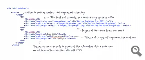
Next the <table> element is inserted, followed by a <thead> to outline the titles and headings in our table. The <thead> contains two rows, one with the bike photos and the second with titles of each model in <h2> tags. The overall table has three columns, but the first cells in the header are empty so a character is added. To help us style the table and aid the readability of the table data while in code view relevant classes are added to the cells.
After the closing of the <thead> the <tbody> begins. Where <th> elements are used in the <thead>, <td> elements are used in the <tbody>. Each series of cells is contained within a row, and our classes help identify the different columns. All the rows of data are added to finish off the HTML.
The complete HTML
<!DOCTYPE html> <html> <head> <meta charset="utf-8" /> <title>Harley Davidson Sportster Motorcycle Model Comparison</title> <link href="style.css" rel="stylesheet" /> </head> <body> <h1>Harley Davidson Motorcycles</h1> <div id="container"> <table> <thead> <tr> <th> </th> <th class="iron"><img src="images/iron.jpg" alt="Harley Davidson Iron 883" /></th> <th class="nightster"><img src="images/nightster.jpg" alt="Harley Davidson Nightster" /></th> <th class="fortyeight"><img src="images/forty-eight.jpg" alt="Harley Davidson Forty-Eight" /></th> </tr> <tr> <th> </th> <th class="iron"><h2>Iron 883</h2></th> <th class="nightster"><h2>Nightster</h2></th> <th class="fortyeight"><h2>Forty-Eight</h2></th> </tr> </thead> <tbody> <tr> <td class="feature">Engine</td> <td class="iron">883cc</td> <td class="nightster">1202cc</td> <td class="fortyeight">1202cc</td> </tr> <tr> <td class="feature">Torque</td> <td class="iron">70Nm</td> <td class="nightster">98Nm</td> <td class="fortyeight">98Nm</td> </tr> <tr> <td class="feature">Exhaust</td> <td class="iron">Chrome, staggered shorty exhaust with dual mufflers</td> <td class="nightster">Chrome, slash-cut exhaust with dual mufflers</td> <td class="fortyeight">Chrome, staggered shorty exhaust with dual slash-cut mufflers</td> </tr> <tr> <td class="feature">Wheels</td> <td class="iron">Black, 13-Spoke Cast Aluminum</td> <td class="nightster">Black, Laced Steel</td> <td class="fortyeight">Black, Laced Steel</td> </tr> <tr> <td class="feature">Ground Clearance</td> <td class="iron">120mm</td> <td class="nightster">130mm</td> <td class="fortyeight">100mm</td> </tr> <tr> <td class="feature">Price</td> <td class="iron">£6,699</td> <td class="nightster">£8,099</td> <td class="fortyeight">£8,849</td> </tr> </tbody> </table> </div> </body> </html>
The CSS begins with a simple CSS to remove any default browser styling, then the global styling for this particular demo file is set up. The large background image is added to the page body and overall font styling set up as 16px Georgia in grey.
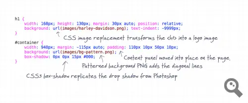
The <h1> element is then converted to the Harley Davidson logo using the image replacement technique, then the container div is styled to sit centrally on the page. The patterned background image is used as a fill and a CSS3 box-shadow is created to replicate the Photoshop drop shadow effect.
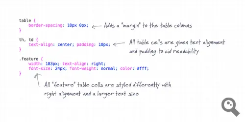
By default the table displays with small gaps between the table cells. Our design requires a kind of margin between the columns but no gaps between the rows. The border-spacing property allows us to designate an exact amount of spacing on both the Y and X axis. Padding is added and text centred on all <th> and <td> elements, then this is overwritten for the cells with the class “feature”, sending the text back to left alignment. These cells are also given an exact width to alter the proportions of the table, making this column the largest.
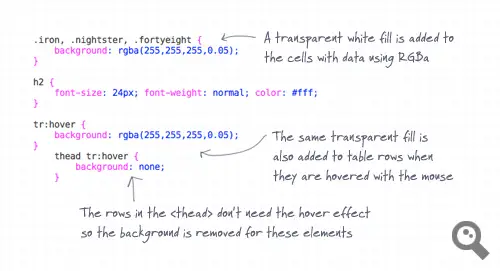
Our classes of “iron”, “nightster” and “fortyeight” are all given a background fill of transparent white using RGBa colour selection. We could have used a single class for all these cells, but the name specific classes help us navigate the table data while in code view. To add a finishing touch to the table, the same transparent fill is also added to table rows, but only when they’re hovered by the user’s mouse. This simple effect boosts the usability of the table, helping the user easily cross reference and compare the data.
The complete CSS
body, div, h1, h2, h3, h4, h5, h6, p, ul, ol, li, dl, dt, dd, img, form, fieldset, input, textarea, blockquote, table, tr, td, th {
	margin: 0; padding: 0; border: 0;
}

body {
	background: #000 url(images/bg.jpg) center top fixed no-repeat;
	font: 16px Georgia, Serif; color: #ccc;
}

h1 {
	width: 168px; height: 130px; margin: 30px auto; position: relative;
	background: url(images/harley-davidson.png); text-indent: -9999px;
}

#container {
	width: 940px; margin: -115px auto; padding: 110px 10px 50px 10px;
	background: url(images/bg-pattern.png);
	box-shadow: 0px 0px 15px #000;
}

table {
	border-spacing: 10px 0px;
}

th, td {
	text-align: center; padding: 10px;
}

.feature {
	width: 183px; text-align: right;
	font-size: 24px; font-weight: normal; color: #fff;
}

.iron, .nightster, .fortyeight {
	background: rgba(255,255,255,0.05);
}

h2 {
	font-size: 24px; font-weight: normal; color: #fff;
}

tr:hover {
	background: rgba(255,255,255,0.05);
}
	thead tr:hover {
		background: none;
	}
The final HTML/CSS feature table
Check out the complete demo file to see the feature table in action with its hover effect. The use of transparency from the PNG24 files and RGBa colouring really helps create a sleek design when combined with the large background image. Overall these simple table styling techniques can be used on any project to display your tabular data in a readable and easily digestible manner.



How did you make the bg-pattern.png be transparent? I mean, when I open my own file, it is not transparent, and it is PNG
very useful css tutorial keep sharing more it really a great assistance..
This is a great tutorial, very easy to follow! I work for a <a href="https://envirotechoffice.com">usedoffice furniture</a>company in Toronto, and I'll definitely be trying this out on our website. Thank You!
Thanks, Chris. This is exactly what tables were designed for. Good to see advocates of their proper use, rather than another cry to "never use tables, ever."
Great effort, would have loved more, if you can actually make that stuff cross browser and older version compatible.
Anyway, thanks for sharing
so can i ask questions! whera i am learning Php and Web disign!
Great work Chris…and great that you're not one of those "table-less" zealots.
Tremendous work,
Visitors will be beneficial for your effort.
Even a newbie will understand and have vast knowledge for your appropriate guidelines.
I will do follow your steps and trying to submit such guidelines in my website and the url is https://www.webstrome.com or <a href=https://www.webstrome.com> keyword </a>
Very nice… but how about a bit of accessibility?
TD.feature should really be TH.feature, and add "scope" attributes to all THs.
:)
i have a quick question, if you don't mind. it's only tangentially related to your post…
what is that font you use in the screenshots of your code (the one that looks like handwriting)? it's awesome.
test
Great tutorial. The result looks great!
Very nice Chris Spooner. Useful tutorial.
thank you for the post.
The css is nice
I wonder why have you made it in table and not in div, dose the current industry trend digest the table in the code ?
He made it in table because the content of the table is tabular data. This use is exactly what the table was designed for.
Hey…sweet!
very nice, but does not work with IE and Opera
Wow, this is super pretty!!
Yeah, colgroup FTW!
it's vey usefull information, thanks for this
Very useful tutorial, especially the css. Thanks!
Nice article Chris.
Can I ask why you didn't use the 'colgroup' and 'col' elements to help with styling, instead of adding individual classes to each column??
Really an awesome.
Really nice.