Line25 is reader supported. At no cost to you a commission from sponsors may be earned when a purchase is made via links on the site. Learn more
It is always fascinating to know that there is a lot of science involved in graphic designing. Though it is predominantly an art form, many aspects of it have roots in science. One of them is the optical illusions that can be found in graphic designing.
Time and again, we come across various illusions which seem nothing less than magic. From rotating circles to changing colors, many optical illusions have been studied in depth by many researchers to decode the illusion. As a designer, you can use such illusions to make your design more interesting and creative. Even if you do not wish to apply these illusions, it would be good to have knowledge about them. Below are some of the major optical illusion designs for your understanding and inspiration.
1. Simultaneous Contrast Illusion
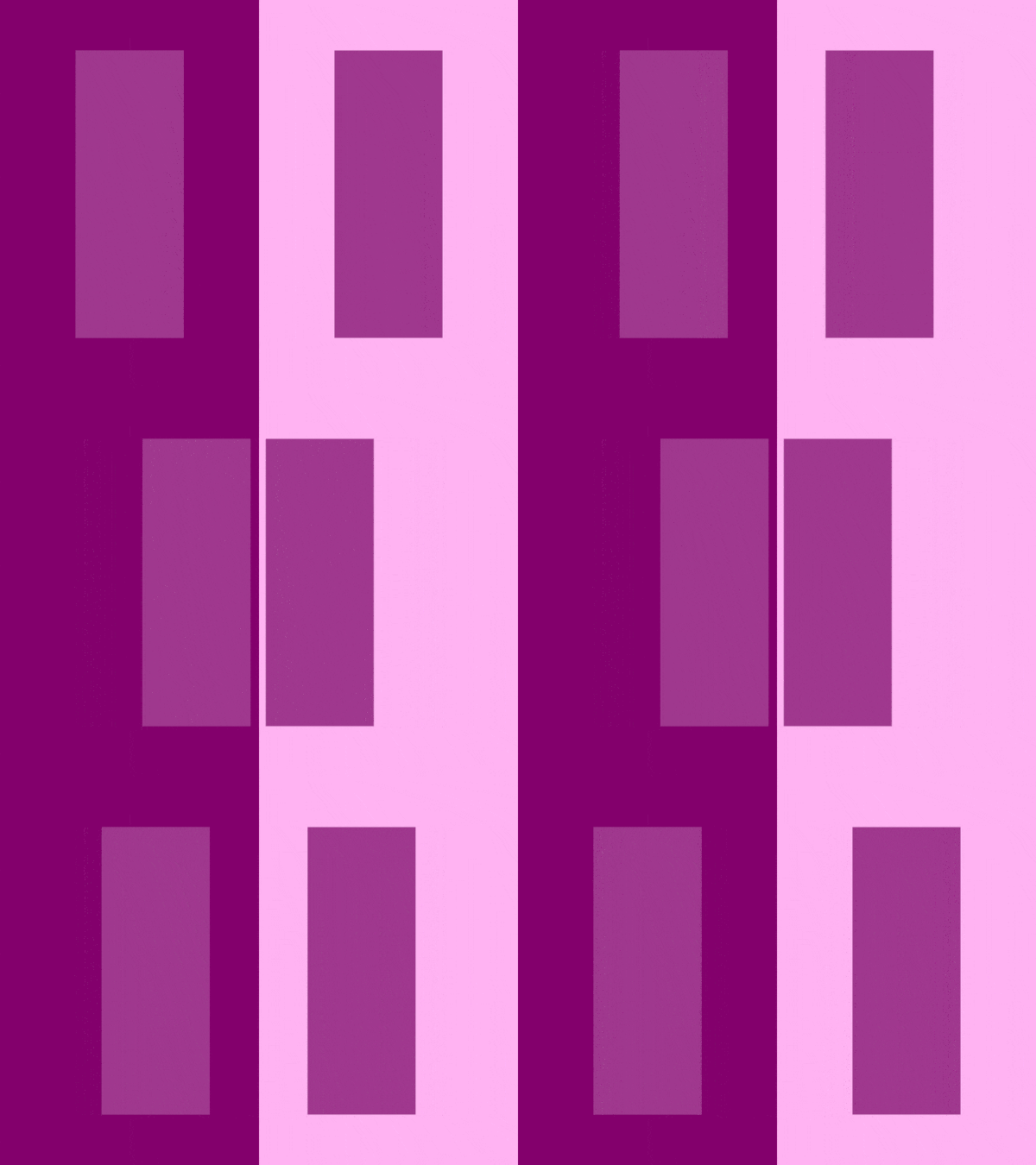
When two objects of the same colors are placed on backgrounds of different contrast colors, both seem to look as if they are of different colors. This amazing phenomenon is called Simultaneous Contrast Illusion. How we perceive objects and their properties are relative to the background they are in.
As shown in the above image, a purple rectangle is placed on two different backgrounds. The first is a darker shade, and the second is a lighter shade. When the rectangle is divided into two parts and moved in the center of the respective backgrounds, then we can observe that the colors of these two new blocks look different. The first block, which is over a darker background, seems to be a lighter shade of the original purple, while the second block, which is over a lighter background, seems to be a darker shade.
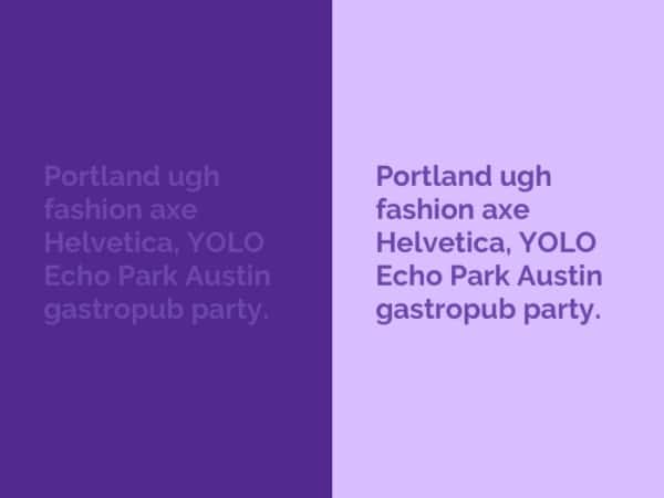
Designers come across this effect on a regular basis but are not able to comprehend it. This is where the contrasting background hack comes into play. If you want to make a text or object stand out, then always place it in a lighter shade of the color. It is believed that our literal inhibition makes us look at objects in comparison to their backgrounds.
2. Munker-White Illusion
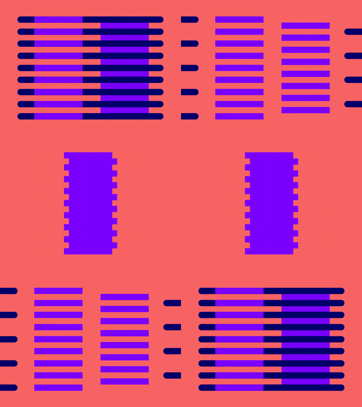
An extension to the above illusion, the Munder-White Illusion deals with smaller design elements and how they react to their surroundings. This optical illusion is also caused by lateral inhibition of what we see is relative to its surrounding. In the image shown above, we can see that when the same purple block is divided into strips and put across a common dark background, the strips look different colors. As a designer, you would have come across this many times when working on a table structure or other such repetitive patterns. Now you know why this happens; you need not keep checking the color codes. If you want the strips to look exactly the same, you may want to change the color shade of one of the columns.
3. Water Colour Illusion
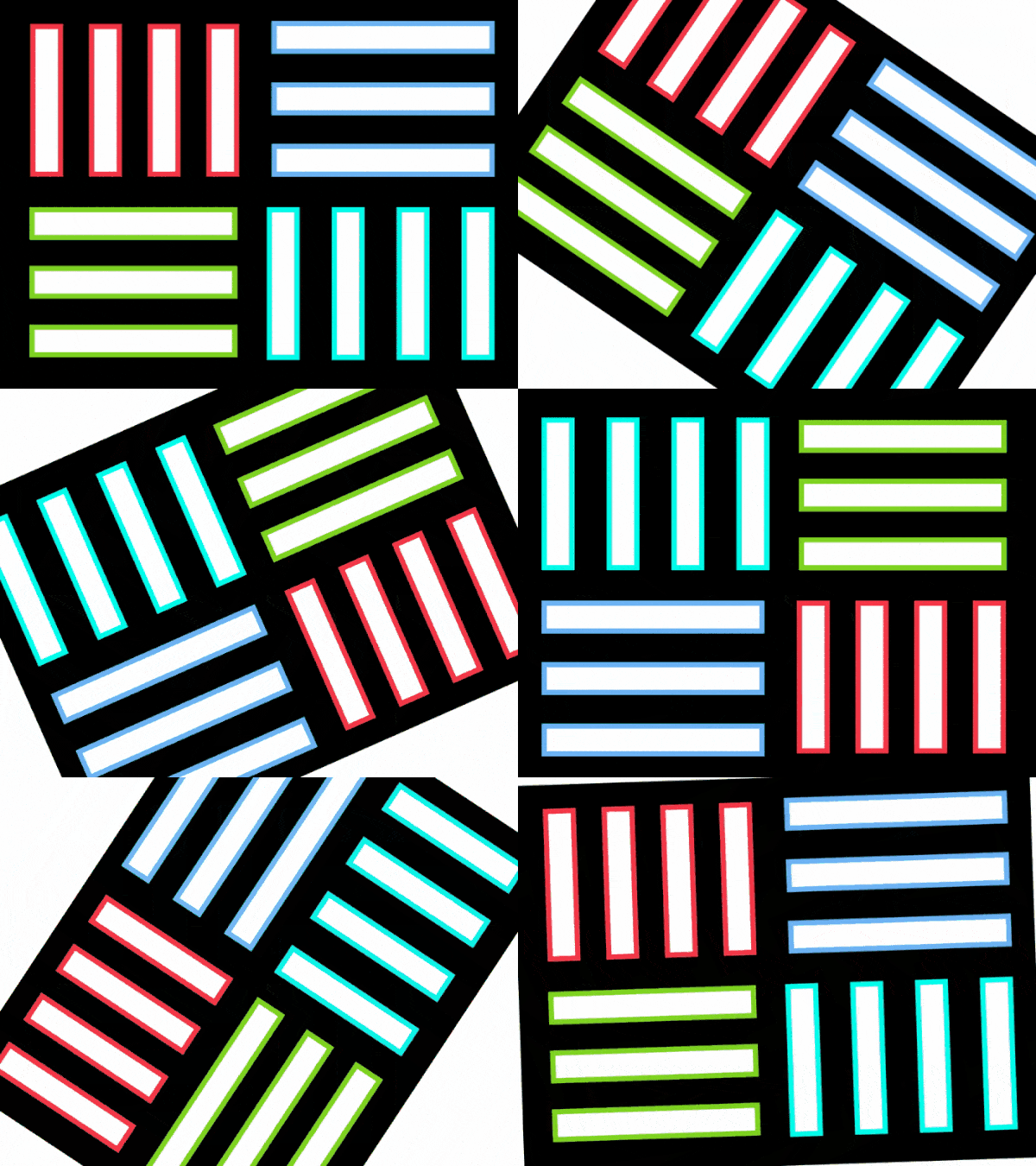
A lot of designers would have received feedback from their clients saying that the buttons on the website are tinted and not white, even when the designer has put no color inside the buttons. As you can observe in the image, when any white object has a strong outline, the shade of the outline provides a tint inside the object. This is another optical illusion that has troubled designers for ages and is known as the Watercolor illusion: the smaller the white object, the more dominant the tint effect.
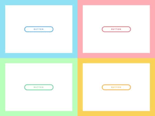
Often, if the outlines are of a lighter shade, the tint is there on the white object, but we can also see the outline color smudging inside the white object as shown in the image.
4. Jastrow Illusion
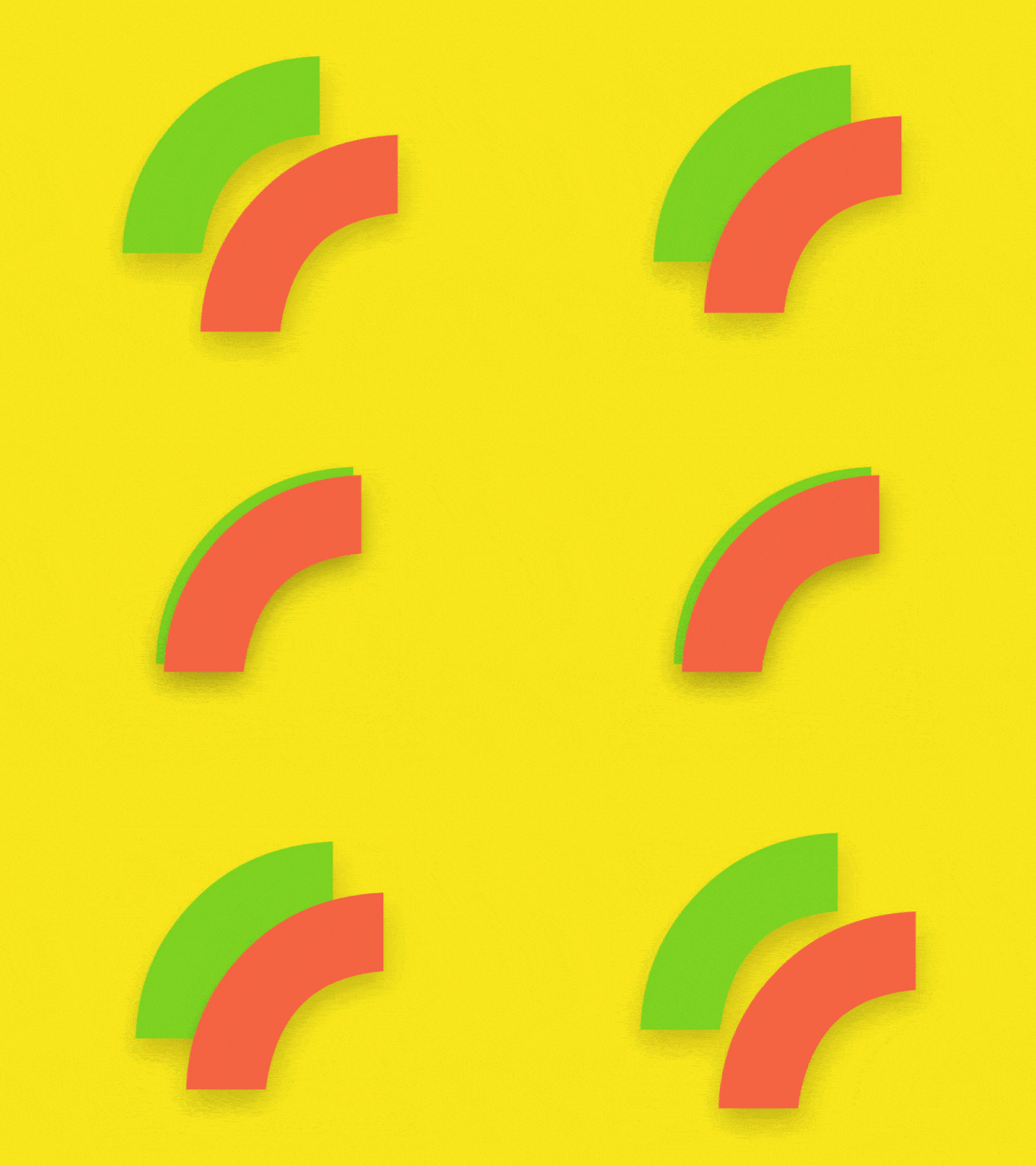
Curves are always difficult to handle in any design form. But when it comes to graphic designing, curves get trickier as they always reference their focal point. To add more complication to this design, we have the Jastrow Illusion. This optical illusion is about how the same sized segments appear different when put together. For example, the above image shows a small segment of a circle. They are of the same exact size. But because one is put above the other one, the one on top seems to be a smaller segment. This optical illusion occurs because the center of the segment has been changed. As a designer, you would come across this illusion when you are designing circular objects of segments. Remember that this illusion is bound to happen, and you need not keep rechecking the dimensions. Rather, you should create concentric circles if you want to make the segments look the same size.
5. Müller-Lyer Illusion

This optical illusion has been troubling designers who are working on logos or typographies. It’s a classic conflict of mathematics and visual clarity. If you design all your letters in the text to be of the same height, you will still end up with typography that looks uneven. Certain letters, especially the ones with curves, will look as if they are out of line even if they are of the same height. To mitigate this visual effect, designers have to deploy a method called overshooting. In this, each letter of the text is altered at different heights so as to ensure that visually all letters look in the same line.
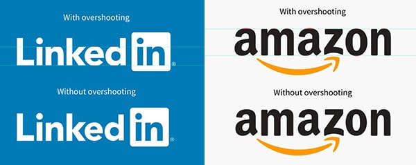
Logos of many major brands have to make use of this effect so as to make their logo look visually balanced.
6. Triangle-bisection Illusion

Ever tried to mathematical balance a triangle in a circle or a square and ended up making the design look skewed? Then you are a victim of the triangle-bisection optical illusion. This illusion deals with how a triangle is heavier on its base and therefore needs to be moved a little offset to make it look visually balanced. This illusion is true for all uneven objects that have one heavy side and one light side. Therefore, you will always have to move the object slightly towards the lighter side based on its center of gravity so that the viewer finds the object in the center of its background.

7. Vertical Horizontal Illusion
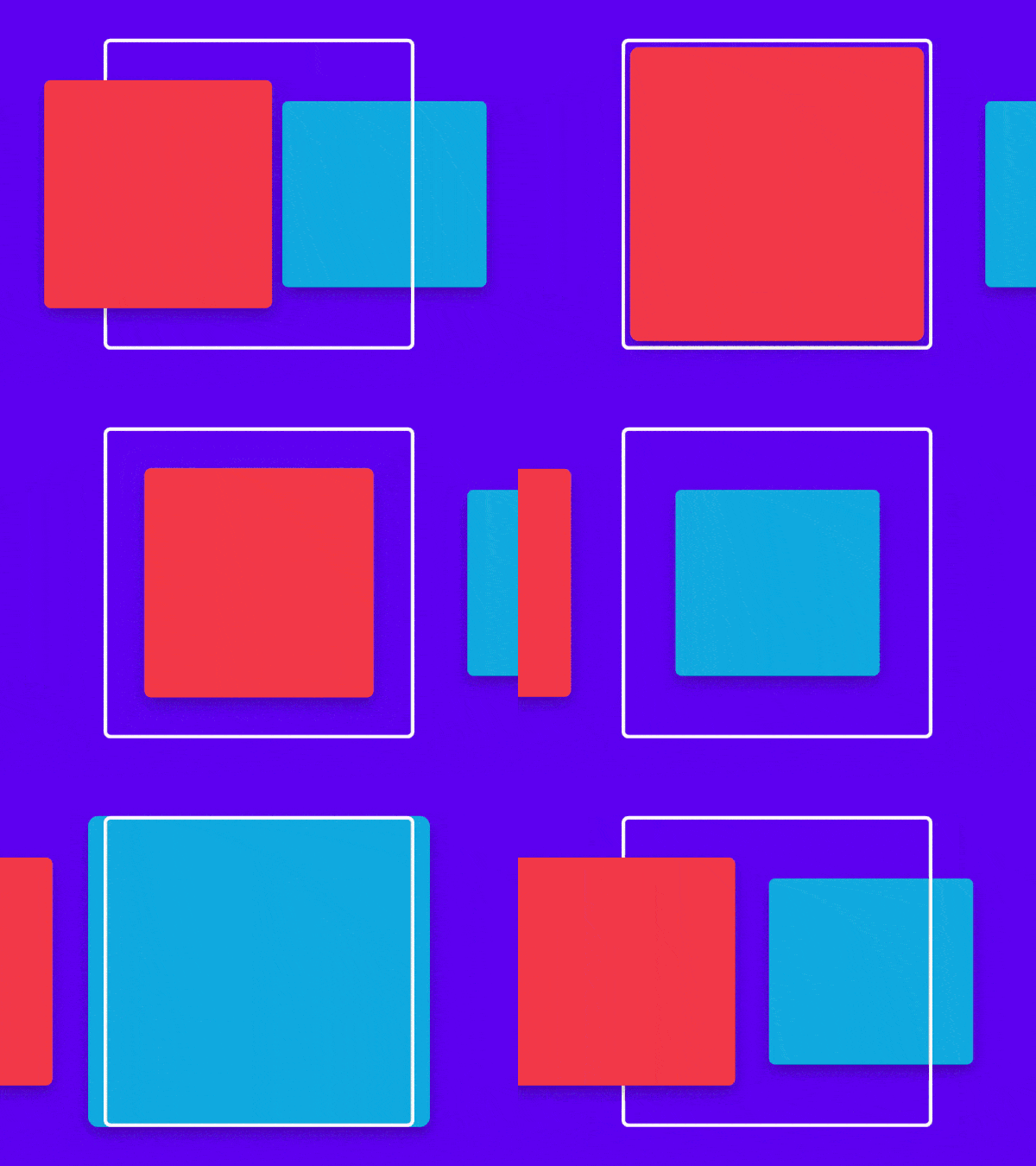
A square is a foundational design element that designers use generously throughout their creatives. But when used in certain designs, they start appearing more like a rectangle rather than a square. This optical illusion is termed the vertical-horizontal illusion. Even when we place a simple square on a solid background, it may appear that all four sides are not equal. Its height will look more than its width.
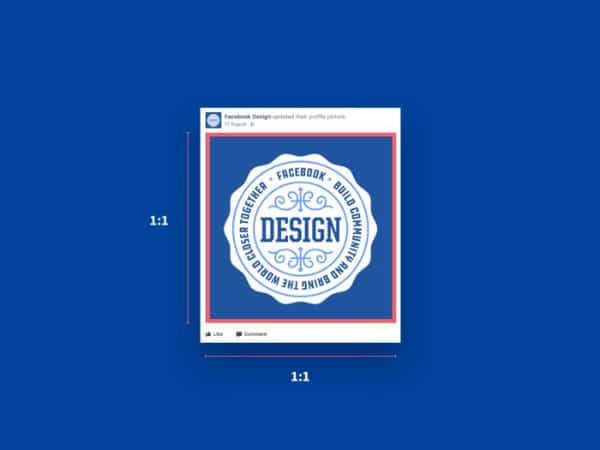
As a designer, you would have faced this many times and ended up checking the dimensions of the square only to find that all four sides are indeed equal.
8. Mach Bands
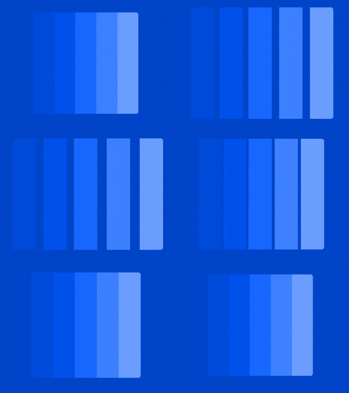
Mach Bands is an optical illusion that tries to explain the shadow effect generated when two similar shades are used side by side. As shown in the image, when we see bands of similar shades used together, a shadow effect is cast on this band. This is because the darker band appears to be darker and overpowers the lighter shade, resulting in a shadow effect even when no shadow effect is added. This is due to the literal inhibition phenomenon, and you should keep this in mind when using similar shade bands in design.
9. Hering Illusion
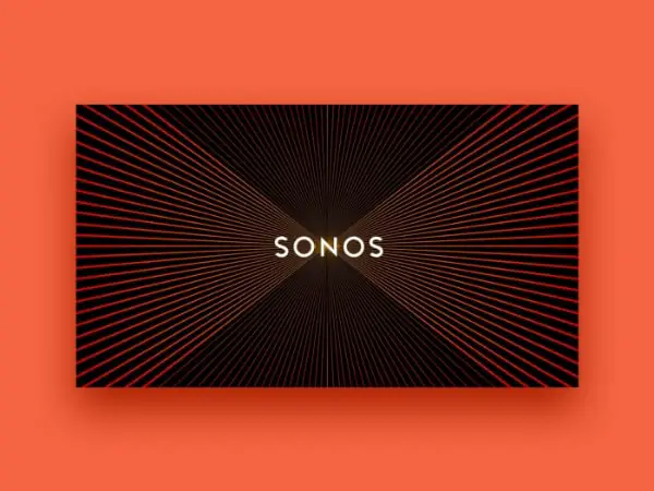
The Hering illusion provides a sense of movement to a design that is created through a set pattern. You would have come across logos or graphics that have set patterns, and upon scrolling up or down, it seems as if the image is moving. The Sonos logo is a classic example of this. When you scroll up and down, you will observe the lines of the background move. Such designs are more of interference pattern designs and less of optical illusions. You can add such patterns to your designs that will be used for digital media and thereby generate motion in them.
10. Hermann Grid
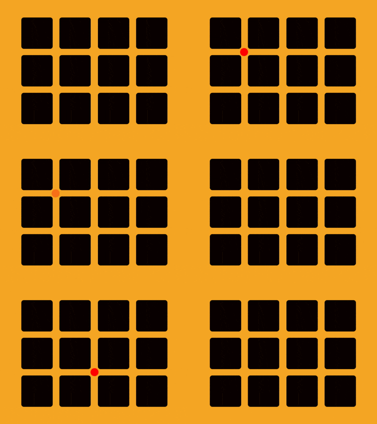
Seeing things that are not there is not a sign of insanity but can be a product of an optical illusion. For example, have you ever gazed at a grid of objects or photos set and observed a circle or square forming in the grid? This optical illusion is called Hermann Grid. This Instagram gird has made this illusion more popular. As you can observe in the image above, ghost blobs appear in the intersections of the grid. But when you focus your view on the blob, then it disappears.
11. Ebbinghaus Illusion

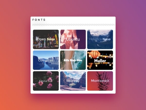
Another optical illusion originating from the concept of relativity, the Ebbinghaus illusion, makes one circle look smaller when placed against bigger circles. The same circle looks bigger when placed against smaller circles. As shown in the image, the circle used in both examples is the same, but how the viewer perceives it is very different. Designers fall victim to this illusion a lot of times and end up repeatedly checking the size of the circle. On the other hand, you can use this illusion when designing logos so as to make certain objects stand out.
12. Cafe Wall Illusion
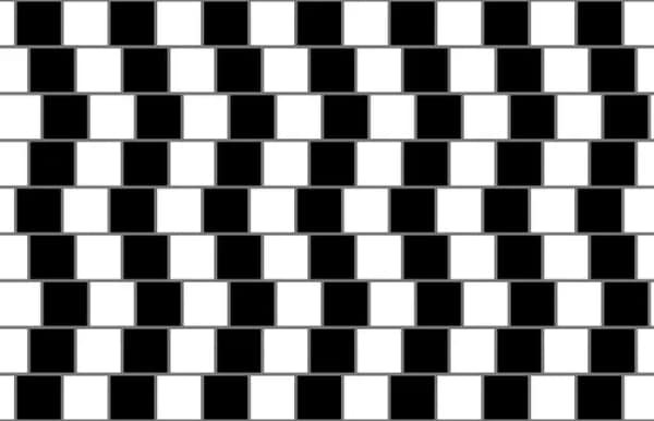
This illusion derives its name from the place where it was first seen. Richard Gregory made this image popular after he observed it outside a cafe wall in the 1970s. All the horizontal lines are parallel to each other, yet when we look at the image, it looks like crooked and intersecting lines. This is because of the black and white blocks behind the lines. When we look at the lines, our retina focuses and defocuses quickly to adjust to the black and white blocks, resulting in the lines looking crooked.
13. Kanizsa Triangle
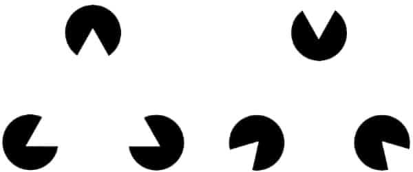
This optical illusion is named after Gaetano Kanisza, who decoded the illusion for the world. When we look at the above image, we see a triangle formed by the three circles even when there is no triangle. This is because our brain fills in the space between the circles and creates the perception of the triangle even when it is not there. If the circles are rotated, this vision of the triangle disappears. This optical illusion is also known as the phantom edge phenomenon. Designers can use this effect in creating smart designs, especially when they are working in the minimal genre.
14. Rotating Snake
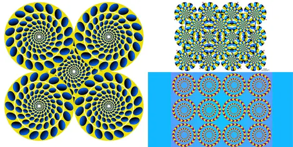
Time and again, we come across such images where we see the objects moving one way or the other. This optical illusion is called the rotating snake, as the circles in the images rotate like a snake. This optical illusion is easy to create as you need to set up circles on a set pattern and line them up. Using this illusion in your design can make it look really different and establish a strong recall for your design.
15. Impossible Cube
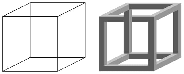
While science and art are a good confluence, there are times when art creates a design that cannot be explained by science. The image above shows one such optical illusion called ‘Impossible Cube.’ Logical thinking fails to comprehend this design as it is hard to say which is the cube’s front or backside. Apart from this cube, there are hundreds of such geometrical designs which use this principle. Using such impossible shapes is also a trend in logo designing as such designs provide the logo an extra edge.
16. Moving Up
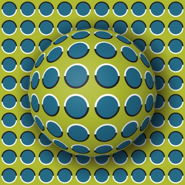
A simple yet effective optical illusion is shown in the above image. When we view the image, it appears as if the ball is moving upwards. This effect is so strong that users will think it is a video or a GIF, but in fact, it is just a static image that plays with your head. The pattern of circles in the background and on the ball makes our eyes look at the ball as if it is in motion. Such an illusion can be helpful in website design or other digital applications where you need to show motion.
Optical illusions are part and parcel of graphic designing, and whether you like them or not, they will keep popping up. The list of above optical illusions can help you in multiple ways. The first is the understanding of certain graphic illusions that all designers fall victim to regularly. Now you know that there is a science behind it, you will handle them better. The second help is that you can now deploy some of the illusions to make your design smart, creative, and with a strong recall as a designer.
