Line25 is reader supported. At no cost to you a commission from sponsors may be earned when a purchase is made via links on the site. Learn more
A wedding occasion is the most joyous moment of a person’s life. Nowadays, it is referred to as an individual industry that employs many other businesses. So whether you are into the venue, planning, catering, designing, photography, or any other wedding-related business, it’s very important to invest properly in a good website.
In the end, your every branding accessory must attract customers most reliably so that they can develop faith in your brand for their big day. Website is the primary area that decides every other branding object. When you want to pick the color pallet for your website, you must know that the decided color pallet would follow in every other design as well.
It should be thoughtful and confident so that it creates a firm impression and conveys your brand very well. And to make your task more convenient, we are discussing 14 perfect wedding website color combinations on this topic. So let’s go through the details.
1. Combination Of Outdoor And Subtle Colors:
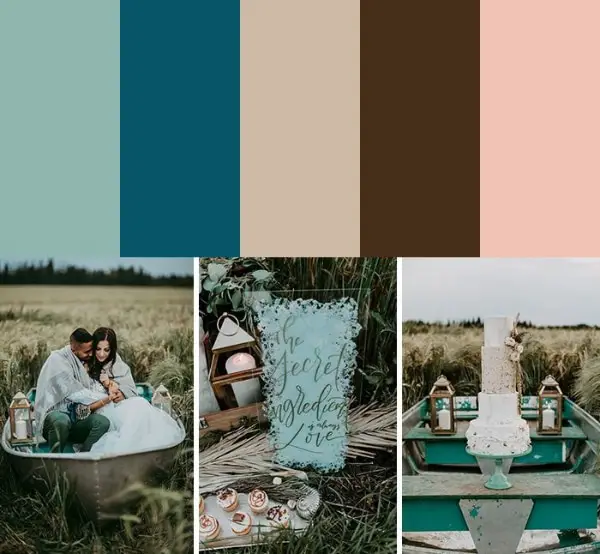
This color pallet is unique and subtle. Here colors are in the combination of some dark and neutral colors. Seaglass, peacock, sand, walnut, and shell pink are the colors of this pallet. You don’t have to for the exact colors if you don’t want to; you can always pick some similar shade or any color of your choice as well. But this combination is a complete package for a wholesome website. These colors can look fabulous on your website if you are into decor, designing, photography, or management business. They are deep and minimal, which gives elegance and confidence to your website.
2. Basic And Contemporary Colors:
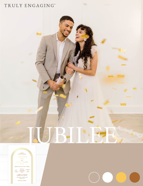
Here you can see a beautiful combination of greige, white, mustard, and matte copper colors for a wedding website. Usually, wedding websites have maximum soft colors and few saturated colors. With this color pallet, it becomes easier to showcase the modern approach of a brand with classy products. Greige and white can help your content outshine, and mustard and copper can really highlight the important titles. Indeed this is a very smart color combination for a wedding-related website. It is basic and romantic with balanced but attractive contrast colors.
3. Multipurpose Pastel Color Combination:
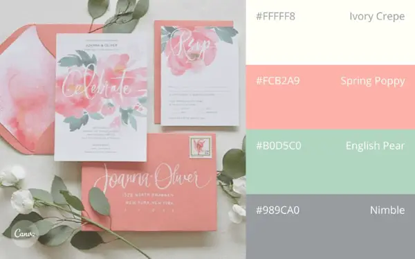
This color combination is cool and very much flexible. Your every branding accessory can look good with this color pallet. Here you can see pastels shades of white, grey, peach, and pear. With an appealing layout, these colors can make an excellent website for venue, photography, florist, and baking-based websites. Your exclusive products or services can sparkle with these colors if you smartly place them in the proper manner. Pastel colors have a significant impact on wedding websites, and therefore you can be completely secure with this color combination. Peach, beige, grey, and soft green are very much soothing colors for almost every wedding-based business.
4. Romantic Pink And Gold:
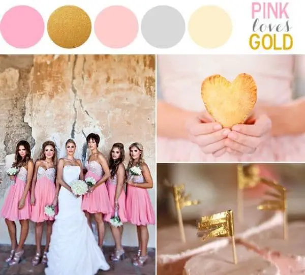
Pink and gold is the timeless combination for wedding occasions. Whether you take blush pink or rose pink, any elegant pink would make a great combination with metallic gold shade. You can include some other neutral hues as well, like white, grey, or beige, to complete your color pallet. Pastel shades of pink and shining gold create a solid combination of traditional and contemporary impressions. Gold or a similar hue of yellow can also work well if you don’t want to add glitter to your website. You might not have to take strong gold metallic color; just a yellow with minimum golden texture can also make the website look impressive.
5. Deep And Dark Colors:
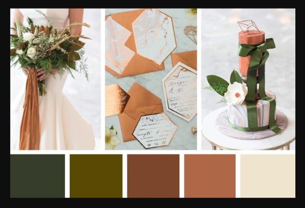
For a modern and experimental website, it’s a perfect color combination. Innovative use of dark colors like olive, black, violet, blue and brown can really give fantastic contrast to other subtle and natural colors like pink, white, peach, grey, and beige. If you really want to add some vibrance to your color pallet, then use this combination of olive, brown, maroon, copper, and ivory.
Dark colors can enhance your content, and bright colors can give a spotlight to your images, and as a result, you can get a perfect appealing website for wedding couples. Whether it’s for decoring, designs, or overall planning, this color pallete can work seamlessly in all websites and branding accessories as well.
6. Muted Yellow With Ceramic Grey:
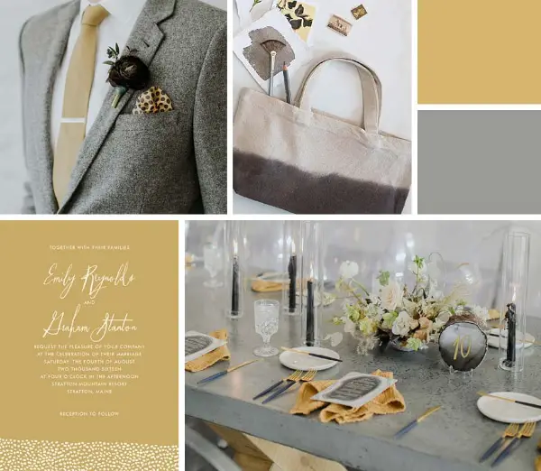
It’s a different combination that might not fit into every kind of business. With muted yellow shade and basic grey, this color combination looks natural and contrasting. It’s on the exciting line of minimal and vibrant. You can add some more neutral or bold colors to make this combination more interesting. If you are into the photography or the planning business, then this color pallet can really do magic for your website. Other than that, you need to take support of some other suitable colors to make a perfect fit for your business. This color combination is classic and modern, which is not very common to see around in the wedding business.
7. Classic Blue And Pink:
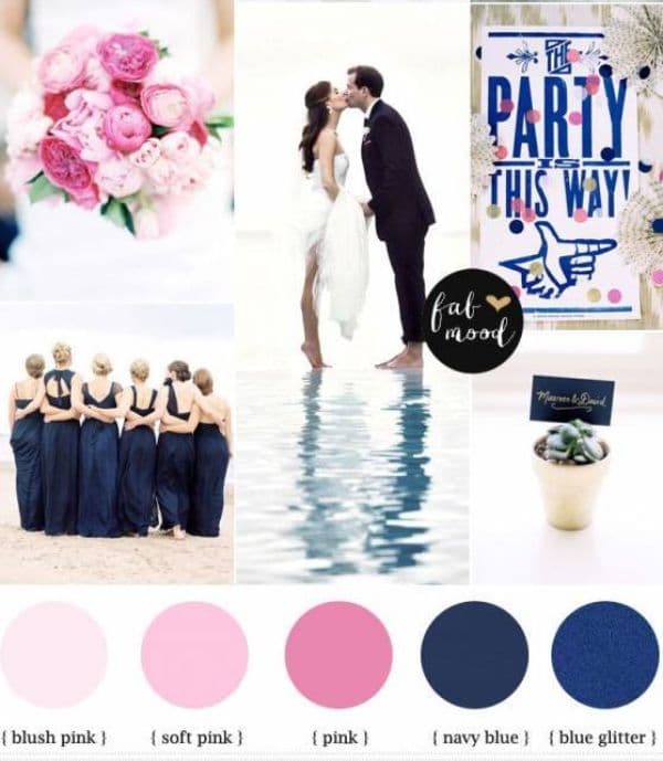
Blue and pink are the most loved colors on happy occasions. This combination can create a number of other combinations according to your need. Here this pink and blue combination has the perfect blend of pinks and blues. Blush pink, soft pink, and pink are three common shades of pink used in weddings, and they are fused with navy blue and glittery blue. A very beautiful contrast is here to make your website classic and contemporary. You can make the pink shades primary on the website and use blues in your highlights. This combination can seem overwhelming if not used correctly, so make sure you add some buffer color as well to break the typical pink and blue pair.
8. Pastel With Black:
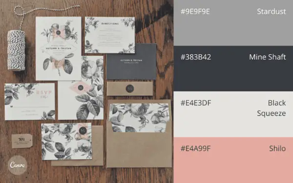
Pastel colors with some dark shades of black and brown can do magic if you are up for some contemporary combination. Here this combination has four colors that reflect striking contrast and minimalism. Peach, ivory, black, and grey are some of the prominent colors in the wedding business. You can have the youthful nature of peach and ivory and a sense of maturity with black and grey.
Your texts, images, and animation can shine through these colors, and your every other banding object can also get the most flexible color pallet. Modern weddings and audiences are very much receptive, so you might not have to worry about using blacks and some other darker shades in the primary color list.
9. Shades of Blue and Copper:
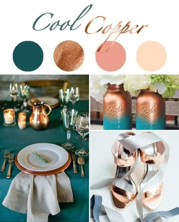
When it comes to including blue on the wedding website, people usually select some pastel and neutral shades of blue. But here, this combination has concentrated teel blue shade, which makes it very unique and appealing. With copper and pink, your website can look stunning and impactful. Header and footer in teel blue color can make an impression of your brand, and with a delicacy of base colors like peach, ivory, and copper, your every image and content can look perfect. This kind of color combination can work really well for venue and event planning websites, but they can also make photography and designing websites look creative.
10. Monochrome Green:
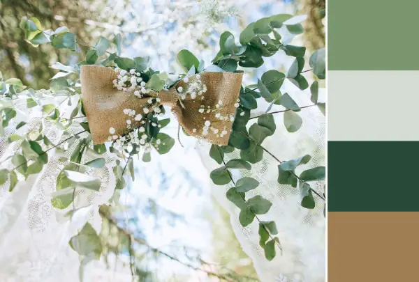
Green is a beautiful color that has a sense of responsibility and calmness within. So picking green color as the dominating color for your website can not be a wrong decision. This color combination is a monochromatic type. There are lighter and darker shades of green that give a fantastic combination together. With the addition of brown color, this color pallet is looking complete for any wedding website.
This combination can be a smart choice for your website, especially if you are into decore, outdoor venues, or exclusive services. Just keep the right balance of contrast and hue to avoid an overwhelming website look.
11. Off White And Off Green:
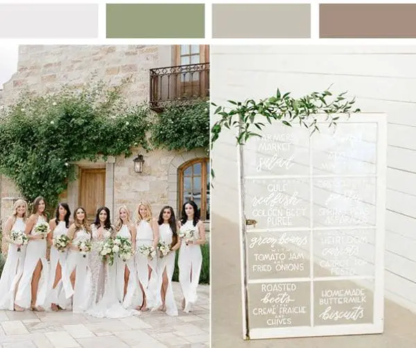
A combination of all soft colors is a classic idea for wedding websites. This combination has white, green, and brown, but they all are in light shades. It’s a timeless color combination that goes very well on all kinds of wedding websites. There is no unique or higher saturated color in the pallet, yet it looks attractive and elegant.
The vibrance is less, but the hues have a good range in this combination, and therefore, you get perfect colors for your different website sections. Whether you are a florist, planner, photographer, or any other unique service provider, this color combination can look amazing on your website.
12. Vintage Color Combination:
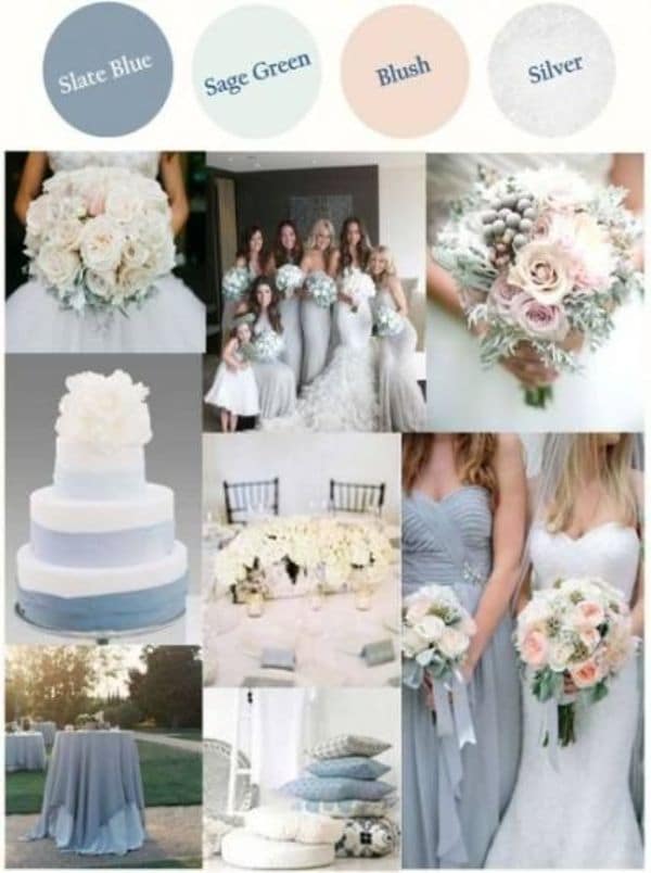
Some cool shades of classic colors can make a great combination effortlessly. Here, slate blue, sage green, and blush are complimented with the silver color, which is a pretty attractive yet straightforward idea. Blue and green are calm colors, and they are paired up with the ultimate wedding color blush. One metallic color can surely add some excitement to this combination, and silver seems the right choice in this matter.
The seamless collaboration of silver, slate blue, and sage green can work fantastically for any wedding website. If you are a blogger, planner, or photographer, this kind of minimal and fascinating color pallet can make your work brighter and impressive.
13. Dusty Rose and Lavender:
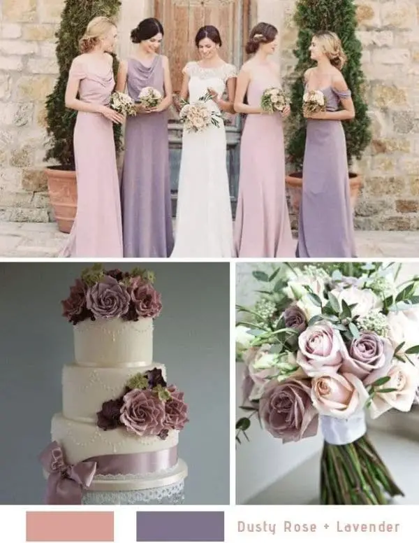
Romantic and natural colors like rose, lavender, yellow and green are always loved in the wedding segment. They are fresh and connecting colors, so if you are confused between various color combinations and just want to play the safe game, then going for such natural and romantic colors would be the best suggestion. Dusty rose is a deep color with a medium contrast level, and lavender is a subtle shade with the pastel category.
This color duo is a timeless color combination that can never go wrong with weddings. By adding some other base colors like white, ivory, grey, or green, you can complete your perfect color pallet for the website.
14. Bright Color Combination Of Yellow And Mint:
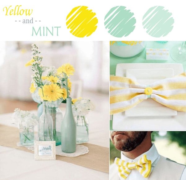
If you want something out of the box and unconventional type, then this yellow and mint combination is the one for you. Bright colors look amazing in wedding concepts, and your extraordinary colors can reflect your brand image to your audience. So this sharp yellow and mint color can do the job if you are smart enough to use them correctly on your website.
Add some whites, greys, and beige to make baseline colors and let your content highlight through the yellow and mint. There can be many fantastic color combinations possible with yellow and mint. So, according to your business and objective, you need to create a complete and attractive color pallet for your website.
If you are an experienced designer, you would probably know how color psychology works, and if you are starting with a fresh new mind, then you can understand it with some online resources. However, to make a website acceptable and impactful, it’s highly crucial to understand the audience first because, with the wedding website, you might not want to overdo the colors or miss the opportunity for business.
According to your business and audience type, you can go for different color combinations as described above. Your target audience is people who are taking a big step in life with all love and faith, therefore, no matter how ordinary it is for your business routine but for them it is a huge responsibility, and they do not want to take any chance for the d-day.
So regardless of any color pallet, your website should portray sincerity, emotions, maturity, and compassion with every element. And by keeping these things in mind, you can choose anyone from the above or create some innovative combination to make your website shine.
