Line25 is reader supported. At no cost to you a commission from sponsors may be earned when a purchase is made via links on the site. Learn more
Logo Redesigns for Inspiration have become increasingly relevant as the importance of a logo has grown dramatically over the last decade with the rise of digital media. Initially, a brand was visually represented in only limited ways mainly through print media like posters, pamphlets, hoardings, newspaper ads, and packaging.
Companies that were directly connected to the customers still used to spend money on marketing and pay heed to their visual identity. But for companies who were more in the B2B sector, branding or marketing was far more indirect. This has changed with the internet. Now companies, irrespective of their sector, want to be present in the best possible way. They want to put the best foot forward regarding their social media, website, and presence on other digital formats. Owing to this, the importance of their visual identity in the form of their logo has enhanced a lot.
To ensure strong brand recognition, companies are undergoing logo redesigning as part of their rebranding exercise. They are shunning their old designs and adopting modern, minimal, and more casual designs. Riding the present design trends, these companies have tried to develop visually stunning designs for their logo, which provide a modern look but retain their original identity. We have compiled 16 amazing logo redesigns for your inspiration.
1. Burger King:
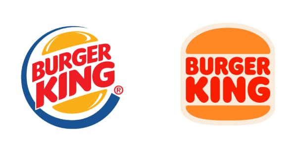
One of the biggest food chain brands has turned the clock and gone back to the 1990s regarding their logo design. Their present logo was one of bright colors with a shiny bun. Burger King has gone back to their old logo but with slight modifications. The colors are made very flat, and the logo is given a simpler feel to it. The idea for this logo was to make the brand look more natural and go far away from the synthetic and artificial feel that the present logo provided.
2. Pfizer:
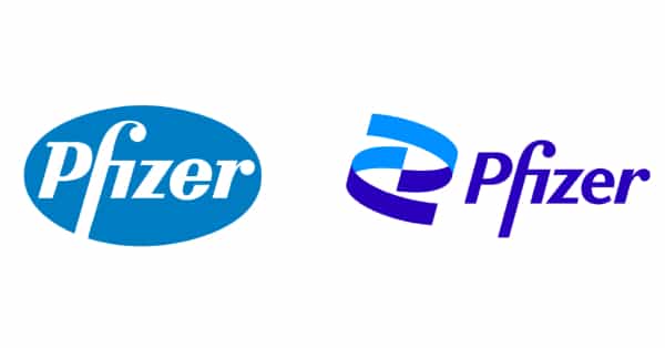
While most pharmaceutical companies are busy pumping their production in the pandemic, Pfizer has utilized the time in a rebranding exercise. The initial logo was enveloped in a blue oval with the name of the brand in good typography. The new logo has retained this typography but taken it out of the blue oval. Now the brand name is accompanied by imagery that looks like a capsule, thereby denoting the brand’s purpose. In addition, the colors have been revised to choose Indigo and Blue, which gives the logo a modern feel.
3. General Motors:
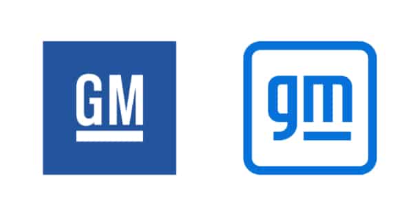
One of the major rebranding exercises in the automobile industry is that of General Motors. The company is undergoing a transformation not only in its visual identity but also in its overall business strategy. The new logo is minimal and carries a modern touch. According to the company, it symbolizes the clear blue skies that zero-emission vehicles aim to achieve. This makes the logo align well with the organization’s vision of being a future-ready brand. Among many logo redesigns for inspiration, General Motors stands out for combining aesthetic simplicity with a deeper environmental message.
4. Central Intelligence Agency:
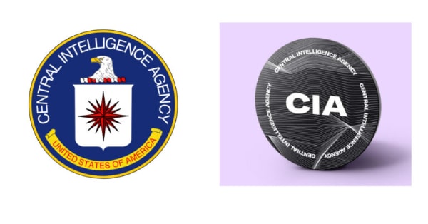
It is not every day that you see the world’s biggest and most powerful intelligence agency undergo a rebranding. But the logo redesigning of the CIA was due in decades. The old logo was just too typical and old to represent this ultra-modern intelligence unit. The new logo is a cool modern one with the right bold font. The dark grey color represents the wisdom of the unit. The overall concept of the logo is still baffling a lot of logo decoders, and some are even criticizing it, saying the new logo looks like that of a music festival. Either way, the redesign is bold and cool.
5. Peugeot:
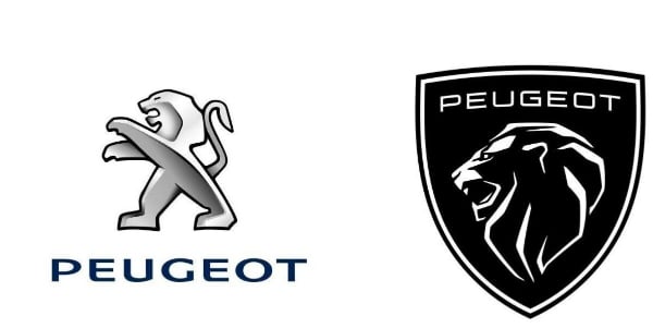
The French automobile company has gone for a complete overhaul of its visual identity. Initially, their logo was abstract imagery of an embossed lion along with the name of the brand. The company kept using the Lion because it was easy to apply on the car, even though it looked obsolete. The new logo is of a bold and fierce lion. The designers use the Lion’s outline inside a matte black shield, placing the brand’s name in a stylish typeface on top. Very new, bold, but a very good logo redesign that gives the company’s old identity a modern touch.
6. Discord:

Discord is gaining popularity as a good alternative to standard communication applications. Riding on this popularity wave, it decided to revisit its branding but ended up executing only a minor change. This is good as the brand recall is not affected, given how new the brand is. The new logo continues the old imagery and composition. However, the change is in the text. The brand name is written in the title case using a new fluid font, unlike the old logo, which had the brand name in the upper case. The brand color is also made brighter giving the logo a more modern look.
7. Renault:
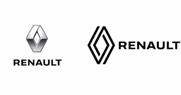
Yet another car manufacturer that underwent a logo rebranding is Renault. Unlike Peugeot, it did not make any major changes to its original brand elements. Instead, it transformed the brand symbol into a minimal design, giving it a neat and clean appearance. The brand name sits beside it in simple, strong fonts. All elements are rendered in black, adding a subtle sense of royalty. This transformation stands out among logo redesigns for inspiration, showing how classic brand elements can be modernized effectively without losing brand recall.
8. Paramount:
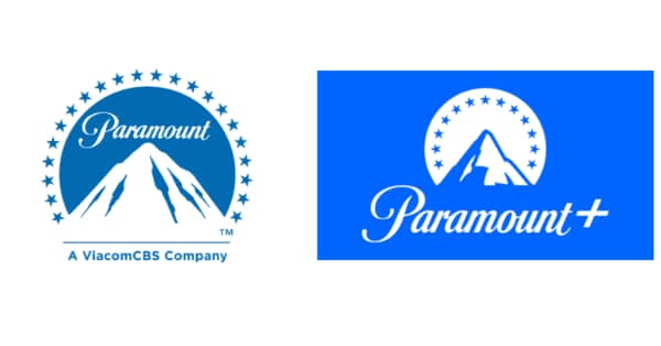
This movie studio conglomerate has also felt the need to tweaking its logo to make it look more relevant. They have achieved that by revising a few of the design elements and reordering them. The design places the stars inside the arc above the mountain and moves the brand name below the imagery, scaling it up for better visibility. The mountain is slightly redesigned to reinforce the idea of reaching the summit. While the font for the brand name remains the same, the color changes to a more neon blue, making the logo appear brighter and more vibrant.
9. Magnum:
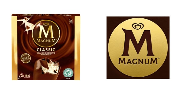
The UK-based firm known for its delicious ice creams had been holding on to an outdated visual identity for too long. Fortunately, it has now embraced a meaningful transformation. While the logo has evolved, it still retains its original essence. The letter M, the brand name, and the heart imagery remain, though with slight repositioning. The colors have been inverted, and a subtle texture effect has been added. The result is a logo that looks more golden, richer, cleaner, and more visually appealing. Its simplicity also makes it easy to apply across different platforms, making it one of the standout logo redesigns for inspiration in the food industry.
10. National Gallery of Art:
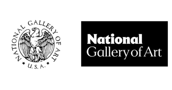
A majority of art institutes have undergone rebranding exercises in the last decade. Unfortunately, the results often lead to similar visual identities across the board. The National Gallery of Art is a prime example. Moving away from its iconic imagery of birds, it has adopted a modern wordmark logo. The fonts used are neat, clean, and visually appealing. The letter N symbolizes the two buildings of the Gallery. While the redesign is thoughtful, it ends up looking like just another example in the wave of logo redesigns for inspiration – modern, crisp, and polished, but lacking distinctiveness.
11. Slack:
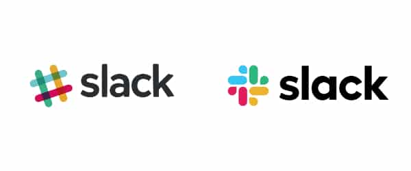
One of the super risers in the IT industry, Slack has seen rapid growth in its user base. Just like any other startup, it too had to go through the early jump rebranding exercise. But Slack was smart enough not to reinvent the wheel completely and go for something that was a bit similar to the old hashtag logo. In this process, they came up with a new octothorpe logo formed out of two geometric shapes – a speech bubble and a lozenge. The speech bubble aptly describes the core functionality of this app and thereby scores well in the logo. Slack uses four colors to represent inclusivity and show how it can connect and serve everyone.
12. National Instruments:
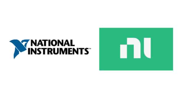
National Instruments is one of the most prominent test instrument and automation firms in the US. Serving the hardcore sectors, its initial logo had an abstract image of a bird with the formation of the letter N. But the new logo is perhaps one of the most radical logo redesigns in the sector. They have gone for a monogram logo that just uses the letters N and I. This logo change is part of their rebranding exercise under the motto ‘Engineer Ambitiously.’ The logo goes out to represent the fine transformation to the digital world and how the company is ready to serve the future needs of the businesses.
13. BMW:
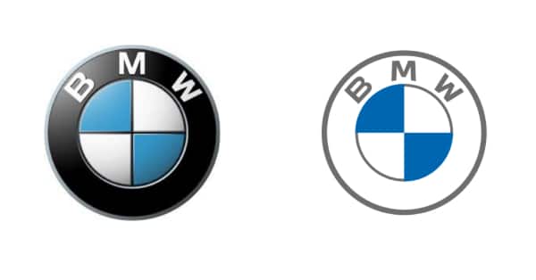
The list of automobile companies that underwent rebranding seems to be endless. This represents an ongoing disruption in this sector and the need for these companies to embrace the change and be future-ready. The new BMW logo is more like a 2D outline of the old logo. The main reason for the change could be to provide the logo more usability in the digital media. They have done away with the black background, and the brand name appears with its iconic blue and white sectors. According to the company, the new logo represents their dash towards being the future ready, and at the same time, the transparency will help customers relate more with the brand.
14. One Plus:
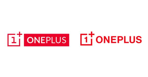
The flagship destroyer in mobile phones, One Plus, has made a slight modification in its logo. First, it has changed its font from an assorted one to a strong and bold typeface. Initially, the number 1, the word ‘One,’ and ‘Plus’ were all in different fonts. But the new logo has a consistent font for all of them, which goes out to represent the brand’s consistency. The second major change is eliminating the concept of negative space for the brand name. The brand now places its name beside the imagery, making the logo look more modern, stylish, and clean.
15. Dictionary & Thesaurus:

The project of Dictionary took off really well as it found a lot of users. With the increase in reach, the organization went for a brand change. They were using the same visual identity for both the brands that were of an abstract image of the sun. But the new logo is really cool and a good modern representation of their purpose. Both brands now have different logos but have a common element of an open book expressed through smart usage of negative space. The typeface is changed from italics to a simple, strong font. The brand colors are also changed to give a stronger and more engaging feel to the brands.
16. Tripadvisor:

The travel website has expanded its reach across the globe. When the brand decided to undergo rebranding, it ensured that a version of the iconic owl remained part of the identity. The original logo featured more color and used a lowercase brand name. In the redesigned version one of many logo redesigns for inspiration, the logo is now completely monochrome in black, with a simplified yet still prominent owl icon. The brand name is presented in title case using a strong font. The flattened color palette offers greater graphic flexibility, while the updated typography gives the logo a more energetic and trustworthy feel.
Going through the above recent brand redesigns, the following are the key takeaways for designers:
- The majority of redesigns have focused on making the brand name more prominent
- Designers flatten or simplify icons, images, and other graphical elements.
- Digital usage of the brand visual identity is an important aspect
- It is important to continue with the original visual identity while revisiting it to give it a modern touch.
- The new logos need to look futuristic and instill the confidence in people that the brand is future-ready
- The new colors used are brighter and symbolize the inclusivity of the brand
Logo redesigns are part and parcel of all branding exercises. The frequency of the redesign may depend on the sector and the brand growth. No matter big or small, firms need to undergo a brand redesign to stay relevant or recapture market attention. Historically, we have seen that companies of the sector that see a lot of disruption or transformation have to undergo a rebranding exercise to appeal to their target audience that they are agile and ready for change. Presently it is the automotive industry. Also, due to the wide usage of digital media, many firms have to redesign their visual identity to ensure ease of application and wider reach.