Line25 is reader supported. At no cost to you a commission from sponsors may be earned when a purchase is made via links on the site. Learn more
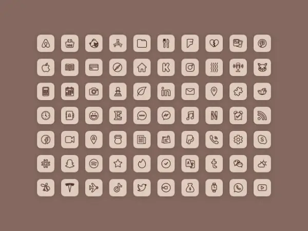
Designing an icon is very different from designing a graphic. In icons, you have certain limitations and rules which you can not avoid. On any platform and for any design, icons play the role of a communicator.
Icons are small designs that reduce the use of words and enhance the overall design. In websites and apps, showcasing a complete design or whole illustrating information is not possible for each step, and therefore, the use of icons becomes more feasible. When you are designing icons, you must not forget about some essential aspects that make them different from graphics. And to guide you with this, we have curated this list of things not to do when designing icons. In this list, we will discuss what simple but serious mistakes you are likely to make with icon design and how to avoid them.
1. Design Without Any Planning And Strategy:

Never start your design without any planning and strategy. You may do not find any need for strong planning and strategy discussion for icons, but it is crucial for a brand and user experience. And that’s what professionals and perfectionists do. So discuss with your client and team about the whole project, purpose, and requirement. It would be best if you thought about end goals before jumping into the designing part. If you follow a well-structured format, hierarchy, suitable placements, and planned outline for your icon designs, you can see the difference in the design’s look and user experience. Without any ground strategy and planning, your icons might create difficulty to fulfill the design motive and UX expectations.
2. Do Not Forget The Screen Size Factor:
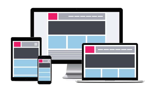
When you are designing an icon, you must consider the possible screen sizes where your icon would be visible. It can be visible on any size of the screen, so the icon design must be adaptable to those screens. In graphics, you can add multiple details to make your design stand out. But icons have limited size and space, so if you are making it complicated with multiple elements, not every screen would justify your design. Small screens might make your design dull and confused. So never make such mistakes in your icons. Always try to keep it short and simple. Think about different screen sizes and how your icon would look on those screens. And never compromise on the readability and appearance of your icons.
3. Do Not Choose Wrong Placements:

If you are in charge of the whole design or if you are working for your own design, then you would be deciding the placement of your icons. Placement means on the frontline where your icons would take place to convey the right message and help the user. But this is a question that you must ask yourself before designing the icons. Because after a confirmed place, you can design your icons effectively and with more clarity. It is one of the essential factors that can damage your design if not given enough importance. The correct placing of suitable icons gives convenience and help user to understand the design better. So keep a basic idea of the appropriate placement in your mind while designing an icon.
4. Not Designing With Grids:
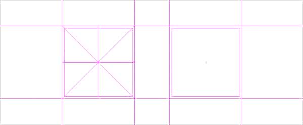
In icon designing grid method helps a lot. The grid is about squares of equal size and space. And the main purpose of using grids in icon design is to keep your pen in a set boundary. When you are designing icons, sometimes your hand can forget the size and area subject. And If your icons are not in equal size and area, they might not even look like icons. On the final design haphazard look of icons can really create a wrong impression. So to avoid these kinds of issues, you must use grids for your icons. It helps a lot to amateur designers, and through grid practice, they can design just fine without such help.
5. Too Many Elements:

Here, too many elements in icon design mean adding unnecessary elements for different reasons. If you are adding various elements just for the sake of appearance, then it can only make your design worse. Icons can not look great by adding multiple directionless elements. There should be some balance of core elements and complementary elements. For aesthetic purposes, you can smartly use perspective and shadow in your design, but unnecessary fillers of shapes, lines, and objects can not improve your design the way you want it to. So avoid adding too many elements just for the sole purpose of appearance.
6. Perspective And Shadow Mistakes:
Suppose you are making an icon set for a complex website or software, and you have to make creative and minimal icons to make it more unique if you are creating them with challenging perspectives, then you might have to struggle in the end. In the majority of the cases, an icon set should have a similar perspective; if you are changing it on every icon, then you have to face criticism on your designing skills. Similarly, shadows have a direct link with perspective, and if you are giving wrong or more than the required shadow effect to your icons, your design might lose professionalism. So it’s better to keep things simple if you don’t want to waste time creating unusual shadows and perspectives. And if you want to go for that, make sure it enhances the design with clarity and consistency.
7. Do Not Use Texts:

The next thing you should not do in your icons is the use of texts. It is a very subjective matter, and sometimes you have to use texts. Like, when you are designing an icon where you have to include the brand’s logo, and that logo contains texts, you are bound to use it in your icon. In that case, you have to take more care in designs. Because logos have small fonts and when you use them in your icons, they may look even smaller. So readability and aesthetics both might be compromised. Apart from this, whenever you want to create an icon, do not choose texts as any element. The reason behind this suggestion is, texts can make your icon cluttered and eliminate the definition of icon design. So, use that space to add some unique element and make your icon useful to represent the simple information for the audience.
8. Consistency Mistakes:

Do not make consistent mistakes in your icons. Consistency mistakes mean things you do that fail your icons to maintain consistency. An icon set should have a visual consistency which makes them from a similar family. If you take an unexpected turn in every icon, then you can not maintain the consistency level. To elaborate this, consistency mistake is when you make all of the icons different from each other in a way that they no longer contain the core visual connection with each other. So do not forget to keep the consistency in your icons along with creativity and aesthetics.
9. Do Not Forget About Scalability:
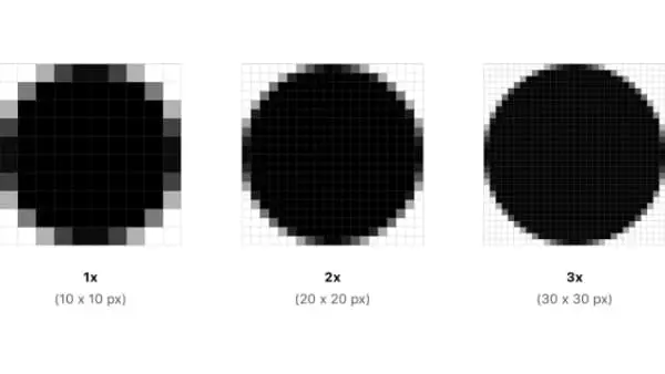
If you scale your raster designs, you get ruined and blurry versions of your icons. That is why many designers prefer to design icons in vector format. But on a professional line, that is also not a very useful way. Sometimes you do not have any clue where your designs would be used and how they would be amended. If your client is not sure about the end-use and placement, then your designs might have to go through some trouble. In those cases, it’s advisable that you prefer to create icons in different sizes. Scaling icons might not give a good look, so it’s better to design them in different required sizes.
10. Do Not Be Half Focused On The Target Audience:

As a designer, one of the worst mistakes you can make is not understanding your target audience. The final design would have some purpose, and if the end-users are not understanding or accepting the icons, then many things would come at a risk. The shape or design that you think is perfect might not be perfect for users. You have to consider age, traditional beliefs, social gestures, cultural meanings, etc., before designing icons. If they are not appropriate or acceptable to your intended users, then you would be responsible for the complete design loss. So it’s better that you take enough time and research to understand your target audience.
11. Inappropriate Color Pallet Decisions:
Colors in any design are an essential subject. A great color scheme can take your design to another level, and a wrong color scheme can ruin a perfect design. So with icons, you do not get much to play with colors, but that doesn’t make colors less important on any level. Your icon designs must stand out from others so that your audience can remember them easily. Try to avoid monochromatic colors and bland colors in icons. You should use attractive and impactful color schemes to get the right attention and stand out from your competitors. And also, one more thing, you should not change colors in every icon or icon set; this can again demolish the consistency factor.
12. Too Similar Designs:
It is a very tedious task for designers to maintain consistency in icon sets but also provide a unique touch to each one. Sometimes when you have to deliver a whole set of icons, you forget to keep the balance between consistency and creativity. If your icons are way too similar to each other, then the end-users would not be able to differentiate them and understand their different purposes. Similar designs can confuse the end-users, so try to keep the core consistent elements but at the same time make your designs unique from each other for easy understanding.
13. Over Cluttered Design:

Over cluttered designs means there is too much going on in the icons. A detailed icon set looks excellent on many inspirational sites, but they are practical on any actual professional project. When you are adding many small details to your design, you are making things complicated for the users. An over cluttered design would take more time to interpret and eventually a slightly off user experience. So you should design with details only for your satisfaction, but when you have to deliver to a client and fulfill some project purpose, do not make your icons over cluttered and hard to understand.
14. Lazy Designs From Scratch:

The easiest way you can find designing icons is from scratch. But if you are making designs from scratch, you are more likely to repeat the already used elements. There is a reason why designers create fresh designs. It is a very important matter for clients, and for users, it breaks the language barrier. So similar and outdated icon designs do not serve any definite meaning. It is not necessary that you use the most common elements for your common icon. You should try to walk a little more, do some experiments and come up with unique, fresh, and attractive icon sets. That way, you can expand your creativity and challenge your skills to create some common icons in a most unusual way.
At first glance, you can say icon designing is pretty simple. It is about showcasing a subject’s characteristics in a very straightforward and readable manner. But it is difficult for that very reason. With graphic designing, you can fuse your creativity with multiple elements to present a message. But here, with icons, you have to use your creativity with minimal elements. A successful icon set makes the design appealing and easy to understand. It is meant to help brands to gain a better user experience. So if there is any small mistake in icons, the most straightforward message can get tangled with misleading information leading your audience to a bad experience. In the list as mentioned above, we have included every minor and significant detail that you should be aware of as a designer. So, use this knowledge to prepare yourself to deliver the best icon designs.