Line25 is reader supported. At no cost to you a commission from sponsors may be earned when a purchase is made via links on the site. Learn more
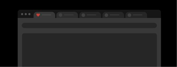
Favicons are iconic representations of your website. You would generally find them on the address bar. However, they are also visible on feed aggregators and list of bookmarks as well. Favicons are an essential element of your website, so designing a great favicon is a must. However, not many people pay attention to this element. Favicons are generally minimal; hence, they’re easy to miss out on when designing your website. However, when a user has multiple tabs open on his/her browser, they scroll through different tabs, making use of the favicons to identify the site. A favicon plays an important role in setting apart your website from the cluster of other websites a user may have open at the same time.
Favicon Design vs Logo Design:
Favicon designs might feel very similar to the idea of logos. They both are a pictorial representation of a company that helps people identify the brand much quicker and create a visual impact. Though they serve almost the same functionality, there are considerable differences between the two.
Favicon design has different requirements as compared to logo design. The background, size of the icon, and also browser variability are a few of the important considerations to be kept in mind for Favicons. Favicons work with straightforward designs, and logos generally have many elements as they need to be expressive. Hence for creating a favicon, you might have to shed off many elements of your logo and simplify it.
There are certain aspects to Favicon Design that you need to keep in mind:
1. Optimum Utilization of Space:
Talking about using your space wisely, there isn’t much, to begin with. The ideal size of a favicon across all web browsers is only 16px. This makes using the space wisely all the more important and designs a favicon in a way that it’s bright and attractive. Since you need to downsize your logo so much, you might need to make some significant changes to your logo. There can be various instances like:
Having a wordmark logo:
Typography or text-based logos have made their mark in recent times. They work well for logos as they are timeless and simple. However, when we talk about Favicon Design, word-based logos might be challenging to deal with. Favicons are small and limited on availability of space; hence, it is impossible to fit the entire name of a brand in the designated area. In such situations, it is ideal for sticking to using just the initial of your company’s name. Lesser the letters, the cleaner the design would look and hence you should try sticking to one. However, if your company has two important names or words, make an abbreviation of two letters. Anything more than that would look clustered.
The challenge comes in the fact that your favicon design needs to be true to the company’s logo design. Hence always make sure when you’re reducing down a logo to a favicon and reshaping it to fit as a favicon, include core elements of the design to make sure it still follows the same design language and look.
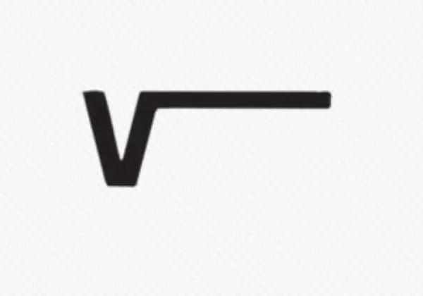
One good example to look at is Vans. The logo is a wordmark logo which spells out Vans. Now since we have to create a favicon, we can’t include all the characters in the limited space we have. If you notice the logo has a distinctive feature for it is initial V. It has a horizontal line where the letter ends which goes on top of the other letters. Notice how the favicon for Vans is designed. It retains the same horizontal line which marks the brand as Vans as it’s the brands signature letter. This way, the brand retains the brand identity and also creates a favicon that is true to the brand and the brand’s logo.
Having a brandmark logo:
A brandmark logo is any logo that uses symbols to represent the company. Such logos don’t have any text present. If you’re a successful brand, such logos work the best for instantly being recognizable. It also is the ideal logo design for turning it to a Favicon Design. Generally scaling down the logo to the desired dimensions for a favicon should do the trick. However, there might be times where you’d need to eliminate some aspects for making the favicon crisp and clear. Whenever you have such a situation, you should ideally have 3-4 variants at least to see what works out best.
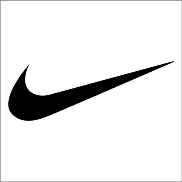
One good example of a brandmark logo is Nike. Even when you read the word Nike you can already picture the swoosh logo. The brand has successfully symbolized the swoosh logo to be related directly to Nike. The logo for Nike is just the Swoosh. Hence it is easy to make a favicon design for this brand. The company honestly uses a resized version of the same icon used in the logo for its favicon.
Having an iconic logo:
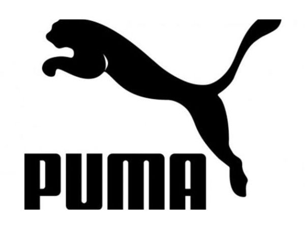
Iconic logos have a blend of both a brandmark and a wordmark logo. It combines the elements of both and thereby has the text and supporting symbol both in it. One good example of this can be Puma. Their logo includes a Puma leaping over the brand’s name PUMA. However, if you visit their site, you’ll notice the favicon for the site only makes use of the Puma. Since the pictorial representation holds more retention value among users, the brand decided to use just the image of the Puma and leave the text out. Hence it is essential to identify such essential elements of your logo design to successfully translate it into favicon design in a way that even if you get rid of some elements, the brand identity doesn’t get compromised.
2. Keeping in mind Browser Compatibility:
One essential factor most designers overlook or skip while designing a favicon is that each browser has different requirements it functions upon. The background of your tab could be black, white or even grey depending on what browser you are using. With the support of customizable themes, the background could be of any colour. Hence you need to be as prepared and thorough with your Favicon Design as you can. Carefully select the colours of your favicon and also ensure that any Favicon you design is stored as a PNG file. There are many other formats that can work, such as SVG, GIF, JPG. However, the outcomes cannot be determined. Hence using a PNG format is the safest option. You could be more cautious and opt for Microsoft ICO format, which is supposed to work great in all browsers.
3. A noticeable Favicon Design:
Favicons are visible all the time to a person as long as he/she is browsing the net. They might have multiple tabs open, and they might be working on another tab. However, if they have your website’s tab open, a well-designed Favicon would always hold their attention, increasing the chance of them switching back to your site. Since favicons are so visible and have such a strong presence, it is essential that your Favicon Design is noticeable.
Now there are various approaches to this; one method could be merely making use of a colour that is too bright that distinctly stands out from the rest of favicons. However, this idea might not work out best if you’re into a formal setup organization where using such bright colours might not sit well with your brand identity. Hence you always need to remember to design a favicon that complements the website layout and your brand aesthetics. Another method could be making use of various shapes or styles. Any irregularity from the standard shape is bond to catch people’s attention, in the right way.
4. Size Options for Favicon Design:
Though we discussed earlier that sticking to a 16 px size for Favicon Designs is the ideal way to go about it, having the favicon saved in other sizes is also crucial for other purposes. If you save your file in ICO format, you can create multiple favicons of different sizes under a single file. Hence you should always have a 16 by 16-pixel version, but also include a 32 by 32 and a 48 by 48-pixel version. This is helpful because there are chances that the users would drag the bookmark to their desktops. If your favicon is only 16 by 16 for the bookmark section when users do this, your favicon might look pixelated and not very crisp. However, if you have a 32 and a 48 px variant available it would still look neat and clear.
If you want to know about all the sizes, you can make your favicon in they are, 16,32,48,64 and 128.
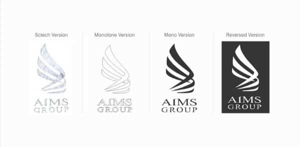
5. Experiment with Monochrome:
This is nothing new, but often many designers forget about this option. Small-scale designs often look great in the monochromatic colour scheme. One important factor worth considering before going down this route is considering the fact whether your favicon would convey the same message, with or without colour. If you realize that colours don’t add much or any value to your favicon design you can go ahead and try monochromatic favicon design.
Even if you are designing an icon that is going to have colours in it, it is an ideal method first to create the logo in monochrome and then start adding colour, as it lets you see how the colours are adding character and relevance to the icon.
6. Sketch before going digital:
Good designs practice whether you are creating a logo, icon or a favicon is to sketch out ideas on a piece of paper first initially. It doesn’t need to be the final polished version which is flawless. The purpose of sketching it out is as sketching out acts as a guide for creating your favicon. The freedom of curves and lines and erasing and editing is much more sketch compared to a computer. Hence once you have a basic outline of the favicon you want to create, it would be much easier to replicate or take inspiration from when you start working on it digitally. This would save time as well as the effort of creating shapes or elements that won’t work well with your favicon design.
7. Consistency is the key:
As you know, logos are often made in consideration of the brand’s aesthetics and design language. It needs to complement your brand identity and add more value to it. Doing so helps create a synergy in the customer’s mind that helps them relate to your brand and identify it better. This is no exception to Favicon Designing. Your favicon should complement your website and your brand, and vice versa. It has to be relevant to the industry that your company is in as well. Using a fork as a favicon for a statistical company won’t make sense. Hence there always needs to be a direct easy to derive a relation between the favicon and what the brand stands for.
Any visitor should be able to comprehend what sector your brand falls in, what services you offer, and if your approach to your niche. Consistency is the crucial element in designing favicons, icons and logos.
These were the 7 important considerations for mastering the art of Favicon Design. Favicons are often overlooked by many web developers and graphic designers alike. However, they are a crucial element of user experience when they browse various websites. It doesn’t just add value to your website; it also helps it stand out from the crowd. A favicon can add aesthetical and functional value to your website.