Line25 is reader supported. At no cost to you a commission from sponsors may be earned when a purchase is made via links on the site. Learn more
For any company belonging to any sector, a logo acts as the first identity that customers and clients base their initial opinion about the company on. It acts as a visual identity of any company’s products and services. A logo helps a customer or a client create a sense of trust, clarity and their initial perception about your brand. Since logos are visual, they also help the most with the retention of a brand association for your existing customer or client pool. It is especially true for architecture logo designs.
There are many elements of a logo that work towards evoking different emotions and sending different messages to the viewer. The successful and rightful blend of these elements helps a business stand apart from the rest of the competition. Different colours, for instance, invoke different emotions such as blue shows trust, confidence and wisdom, whereas red is more known for its passion and dynamic characteristics. Hence depending on what the brand wants to convey, they need to play with these elements carefully. Any architecture company is always seeking ways to gain an edge over their competitors. This is because there are many competitors, to begin with. The industry is proliferating with more and more businesses starting up in the field of architecture.
The importance of designing a smart logo:
Hence, designing a smart architecture logo becomes not only an added advantage to stand out from the rest but also a necessity to better portray your services to both clients and customers alike. Many considerations need to be thought of before designing a logo, for instance, the brand message should be reflected in the logo if the logo requirement is minimal or maximalist and many other such considerations.
Some designers have been practising in the business for a while. They have realized the trick and trips to create smart architecture logo designs. Here are 13 smart architecture logo designs you can take inspiration from:
1. Ferguson Works:
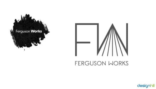
On the first look, the initials for the brand are instantly visible with the ‘F’ and ‘W’. As such, the name of the brand is well portrayed in the logo itself. On a closer look, you’ll notice that the letter W has strings hanging below it. These strings are an added element that can be perceived as one of many things, such as lines representing a road or also showing strings as a hint that the company is into the construction business.
Also, the style of the is substantial and bold, without the slightest slant. This is also intentional as it shows how firm and reliable the company’s architecture practices are. The use of monochrome with grey is carefully selected to reflect professionalism and high-end approach of the brand.
2. Cruz:
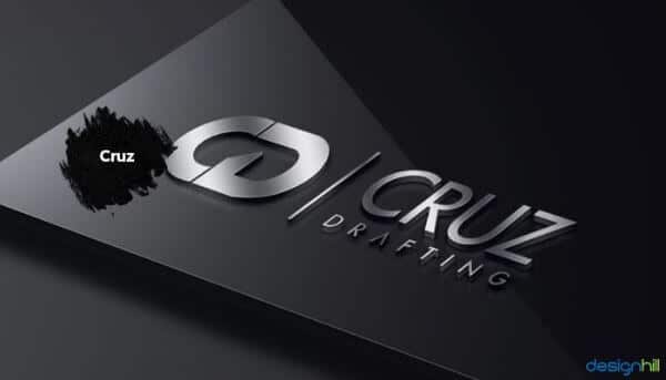
This logo uses embossing effect to give the logo a 3d texture. This portrays the brand that provides premium, sophisticated, luxurious architectural services. The use of grey and white creates a persona for the company. The logo is an excellent way of playing with the concept of symmetry by using the initial C from Cruz and D for drafting services. The letters are almost joined together and look identical with a bare minimum distinction. The tail for the letter D is the only distinctive factor.
3. Distinctive Design Studio:
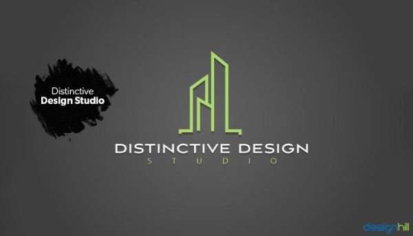
This is an abstract approach to logo design. It has made use of vertical lines which represents construction. They can also be visualized as true architectural illustrations. The name of the company is placed right below the abstract logo. As we know that colours describe certain emotions and message that the brand wants to convey, this logo uses green to write the brands name. This shows that the company is environment-friendly and wants to provide environment-friendly solutions. There is also a sense of minimalistic approach as the design isn’t clustered, and there’s good enough spacing between each character for the company name as well. The main advantage of creating such logos is that they can be easily replicated for other business stationery and give a very pleasing and aesthetic feel.
4. Design House LA:
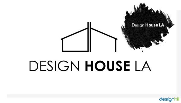
This logo is an excellent example of how focusing on just one element can give a logo an edge over its competitors. Provided it’s done correctly. Design House LA uses just lines as the main element for creating their logo. For the foundation, it uses the initials of the name of company D and H.
Any line based logo is generally easily retained in the memory of the viewer and also easy to replicate for other products of the company. The logo also creates a shape of a house that any child is first taught how to draw, so it also drives a nostalgic value that helps people connect better and relate more to the brand.
5. Priest Drafting:
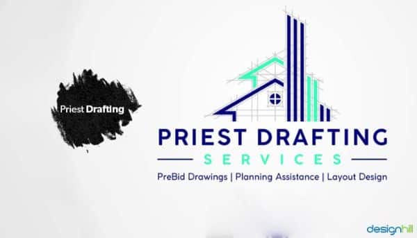
Priest Drafting is an ideal example of planning assistance, prebid drawings and layout designing company. When you see the logo, you can tell that the company deals with something to do with drawing and designing as the logo includes some light lines. These light lines show the process and progress of designing at the first or second draft phase. This also helps clarify that the company is dealing with drafting and architectural designs. Talking about the main element that stands out from the rest, the three bold strokes of blue represents skyscrapers. Again using the colour blue and green works well for the company as blue represents reliability and wisdom. In contrast, green shows comfort and eco-friendliness approach of the business.
6. A.C Gentry Inc.
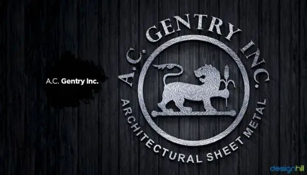
A.C Gentry is an architectural company that deals with metal sheets. There are a few characteristics of a suitable metal sheet such as durability and strength. If you can convince your audience that your brand provides the strongest and the most durable sheets, you’ll get an edge over the competition. The logo for A.C Gentry Inc. has been made by keeping this idea in mind as you can see, the centre of the logo has made use of a lion figure. Lions are known for their raw strength and power. Hence this logo uses a symbolic relationship and connects their audience by creating a perception of their product to be strong and durable as the lion.
7. Foutch:
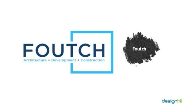
This logo primarily focuses on typography with a beautiful and bold font used to name the brand while using a single colour. Firstly, there is a minimal yet effective shape element. Secondly, it is used right on the bottom and top of the letter T to the rest of the name. The very idea that the entire name isn’t fixed inside the box represents the fact that the brand thinks out of the box to provide their clients with all the services. Right below the name in a much smaller font is mentioned the three sectors they target which are architecture, development and construction. They have made use of Sans Serif fonts for creating a perception of an accessible company. The overall approach to logo design is simple yet effective.
8. Metro Deck:
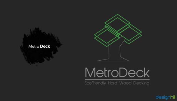
The name of the company itself is very well thought of. Metro Deck is an architectural company which works with designing eco-friendly hardwood decking. You would notice the entire logo follows a monochromatic colour palate except the decks. The decks are coloured green which is active use of colour theory. Green reemphasizes the fact that the brand is eco-friendly and nature-loving. The designer takes it a step further by illustrating a tree and putting the layers on top of that tree’s bark which looks aesthetically pleasing and further locks down the company’s message of it being nature-friendly.
9. Withee Malcolm Architects:
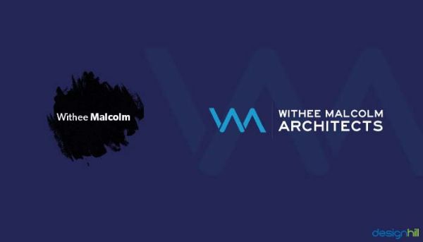
Withee Malcolm Architects is a true reflection of how using only text focused logos can also create some great logos. The challenge is to use the letters in a way that it creates a distinctive design. The initials of the company read out W and M which are letters that have reflective symmetry. The designer has made great use of this feature and combined both the letters which give it a deceptive look. The text that reads out the entire company’s name beside the logo is also spaced to keep the name on top and Architects comes below. Moreover, the alignment fits perfectly, which makes it an aesthetic easy to remember and pleasing design.
10. Philadelphia Metal Art:
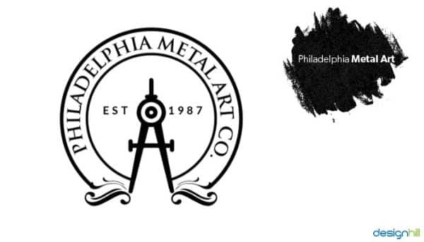
Philadelphia Metal Art’s logo is the perfect example for creating a logo for a brand which has been in the business for a long time. If you look at the logo, it has a familiar yet ancient instrument. The instrument is instantly recognizable at the centre of its design. This instrument used to be used earlier for architecture and geographical surveys. On either side of the apparatus is text that reads EST 1987, which reflects the establishing year of the company.
The designer has used significant retro elements to give the entire logo a retro feel. The use of curvy design and established lays the groundwork of showing a trusted brand. Also, circular-shaped logos were primarily more in use during the older designs.
11. Cityline:
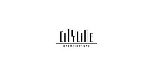
Cityline is a fantastic logo which makes use of typography uniquely and freshly. The logo is simply the name of the company but in varying length for each character. The font used is also very robotic that makes it look closer to skyscrapers. Since the name of the brand is Cityline, it makes perfect sense to use different sized letters with different cap-height that in itself represents a city which has skyscrapers of different heights and different shapes. The logo is very minimal yet very useful as it captures the true essence of what the brand is into. There is a flat underline below the name that gives the design a sense of balance and structure. Also, the text architecture below the line is written in a much smaller and simpler font that balances out the creativity on top.
12. Archouse:
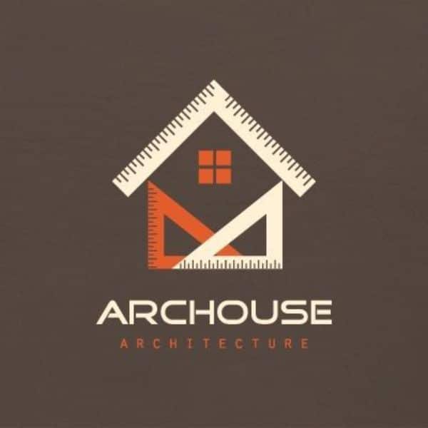
Archouse Architecture is a direct yet appealing approach to the logo making for an architectural company. The various geometric tools that are often used for designing drafts, sketches of the building or any constructions are placed in a composition. The composition shapes the overall logo like a house. This is an excellent idea as the name of the business itself is archouse, and the logo very well puts forward the perception and message that this business primarily deals with providing architectural solutions for homes.
13. Innerspace:
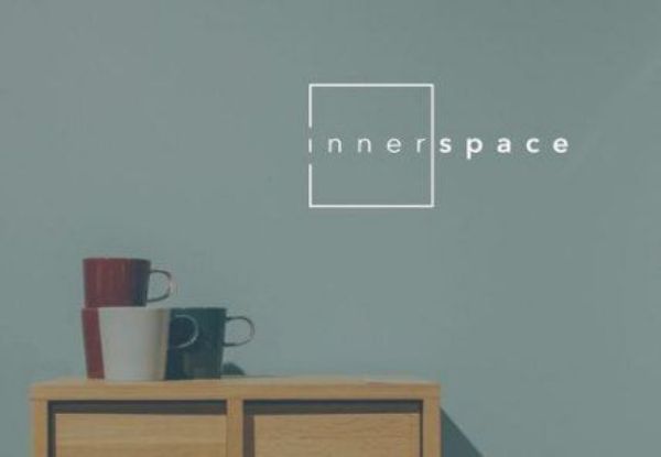
Innerspace is a minimalistic and yet effective logo what understands the underlying thought behind the name of the company. Firstly, the word inner is placed under a solid box but breaks in the first letter I on top and bottom. Secondly, the second half of the company’s name, space is placed outside the box. This represents the very need for more space solutions that the company claims to offer. Moreover the first half of the word inner has no formatting, whereas space is formatted to be bold. This also creates a nice contrast and makes people focus on the solution aspect of the name more, i.e. space.
These were the 13 smart architecture logo designs that you can take inspiration from. Design your next architectural brand logo design project. Consider a few aspects as to how to client wants their logo to be. Some of these can be what services they provide, and what is their approach to their work. Firstly, blend all such guidelines and create a logo that subtly covers most of these aspects moreover looks aesthetically pleasing. Secondly, keep practising, and exploring various logo ideas for creating the best logo that caters to your or your client’s needs.