Line25 is reader supported. At no cost to you a commission from sponsors may be earned when a purchase is made via links on the site. Learn more
‘Less is more” is a frequently used phrase these days across various industries such as interior design, fashion, art, website design, and even packaging design. When we talk about graphic design, many people have drawn influences and adapted the less is more approach in their design style. This is known as Minimalism. British Philosopher Richard Wollheim critiqued a group of artists for their minimal art content during 1965 and hence originated the term minimal. Since then, the word has evolved both in meaning and esteem. It has become a symbol more than a critique for people.
The minimalistic approach only uses the necessary elements for functionality, intending to produce a clear and sophisticated look that is easy to understand. Millennials often use this approach in their home designs, web page designs to offer better user experience, and more. The rising trend of Minimalism has made many brands turn to rebranding to take advantage of this popular style.
Maximalism is drastically opposite to Minimalism. It is an aesthetic of excess, and the philosophy in play here is that ‘more is more.” The practitioners of the Maximalism approach believe that it allows them to express their creativity and style by using bold colors, textures, and patterns to fill up all empty spaces. The idea is not always to be loud or overbearing but to grab the audience’s attention. Maximalism also has various implications such as interior designing, architecture, web design, as well as packing design, to name a few. Maximalism uses things to narrate a story.
It’s a widespread debate as to which works better, Minimalism, or Maximalism when it comes to modern design practices; however, there’s no binary judgment in design. Each has its strengths and limitations to be understood to figure out which approach works best for you.
The following are some of the aspects Minimalism and Maximalism can be used in, and how they both add value in the respected field.
Practices in Packaging Design:
Packaging design is the connection of structure, form, color, material, and typography and imagery along with regulatory information with ancillary design elements that make a product suitable for marketing. It is the tool that helps to store, protect, dispense, transport, and create an identity and distinguish a product in the marketplace. The ultimate goal of package design is to create and enhance the product’s personality and communicating it to the right target audience. There are thousands of products that fill up the shelf of supermarkets. Each product has immense competition and alternatives available. This makes package designing all the more important to be kind and stand out from the rest.
Minimalistic Approach
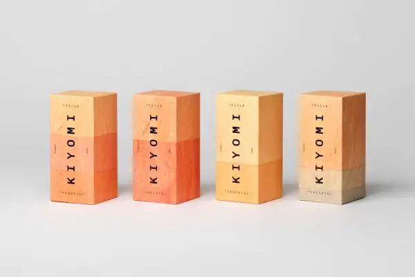
A minimalistic approach to the packaging benefits you in several ways. Minimalism works on the principle of less being more and believes that having a simple and to be the point design stands out from all the other packages that are clustered with heavy designs. They believe it is more appealing and easy to catch customers’ attention than maximalist design approaches. The approach displays a certain sense of confidence by using minimum elements that portray the product to be reliable and of quality.
Another advantage of the minimalistic approach is the clarity of information. There are no extra elements that can divert the audience’s mind or attention to, whatever is mentioned is of value and importance. This ensures that the information meant to be portrayed on the packaging won’t go amiss. It also makes your product seem to have clarity as to its purpose as its cluster free.
The minimalistic design style/trends are very refreshing. They never seem to be getting old. This is a crucial benefit to this approach is you won’t have to keep rebranding your packaging as per changing times as minimalistic would still look fresh despite the changing trends. It is also easy to incorporate along different lines of products and platforms.
The most crucial point that people often forsake or don’t think about is that minimal approach demands more creativity and hence can be a true testament of the designer’s capabilities to put forth important information with minimal elements. When a designer has the liberty of using as many elements as they want they can make use of everything at their disposal whereas a minimal designer need to stick to the design language of less is more, and the ideas that come out of this principle could be more impactful than the other approach.
There are also economic factors to factor in for taking a minimalistic approach for package design. You can save money on the packaging itself as you’ll be using lesser material. It is designed precisely to adhere to your product and hence won’t have any extra elements. Generally, putting too many elements or graphics on a package can require padding and other elements that can add to the cost. Since there is less material used, the charge for shipping also reduces significantly, as there are less weight and use of lesser space by using lighter materials. Using less ss material also includes the advantage of your product being more environmentally friendly as you have less material to dispose of. This can also give your business better credibility among the customers.
Maximalist Approach
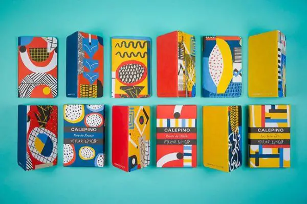
Now when we talk about the maximalist approach for package designing, certain advantages should be factored in as well. The concept behind this approach is ‘more is more”. The designers take aspirations from this line of thought and develop their packaging style around it. Many times customers prefer a sense of mystery rather than straightforwardness and hence are more inclined towards the Maximalistic approach as compared to minimalistic one.
By using a variety of patterns, designs, and elements ensure much visual information that makes missing the packaging impossible. This is why there’s a good possibility of having design elements that may not be directly associated with the brand. This allows creativity and creation of mystery among the customers to find out more or decide to purchase then and then. A vibrant, loud design undoubtedly stands out from the crowd. You can add characteristics and personality to your products it otherwise wouldn’t have. Your product may not be in a category that invokes excitement or mystery, but with the designing approach to packaging and including the maximalist design practices, you can add those emotions to your product it otherwise wouldn’t have.
Your design can have a better reach as the chances of your design getting viral on social media are higher with maximalist design approaches rather than minimal. Social media is an efficient platform for sharing and engaging with good quality content and a free and useful tool of gaining instant recognition and popularity if your design stands out and is appealing, the chances of it getting shared across multiple platforms increases which makes the brand more recognizable.
With the maximalist approach, you can depict a story for your customers; by using different elements and visual hierarchy, you can come with great design ideas. Stories are always a more engaging way of generating interest in the audience’s mind.
Practices in Website Design:
Website Designing refers to planning, creating, updating of websites with content structuring, website structuring, user interface, navigation ergonomics, website layout, contrasts, color, fonts, and imagery as well as icon designs. These elements are combined together to form websites. The basic ideology behind having a website is to provide valuable content to the right audience in the right setting and the most attractive and efficient manner possible. Though there are many aspects to building a website with the technical side that talks about coding, scripting, and other aspects, there is also another aspect to the same in terms of design. Design decides the style and approach of the website and how it might look and be to operate by the normal audience. The main two factors that website designers keep in mind while designing a website are the UI/UX, i.e., user interface, and user experience, respectively.
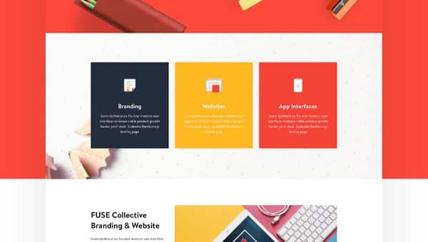
By using a minimalistic approach, you ensure that the main priority is given to the king of the website; content. The main goal of minimalist design is to bring attention to the content of the website. Minimalism makes it easier for the audience to comprehend the content without feeling overwhelmed or spending unnecessary time extracting or differentiating between essential and not as necessary information. The performance improves significantly as the website has less load of content to load and hence loads faster and is more responsive. This translates to smooth user experience while browsing the website.
The flexibility and diversity of being able to access the website across multiple platforms is one great advantage of minimal design. It is readily compatible across various platforms such as computers, tablets, and mobile screens. Minimalistic websites are also easy to maintain. This helps them last longer than content loaded websites since there are lesser elements to manage.
These websites are more comfortable to navigate as a well designed minimalistic website has strategically placed CTAs and a visual hierarchy, which allows the customers to know exactly where to go next. Minimalistic design isn’t pushy that makes people decide to buy or unpleasantly read more. This choice gives the customers a sense of value and respect, and if they end up clicking on the content, the chances of their conversion increase. The perception of your business as a prominent business works on the mind of the audience if you use minimal elements in your website. It’s an unusual psychological effect as it creates a perception for the audience that since you don’t have much clutter, your business is specific to its niche and confident in it too.
Maximalist Approach
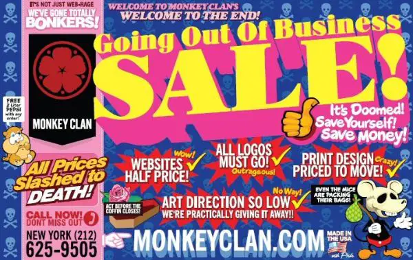
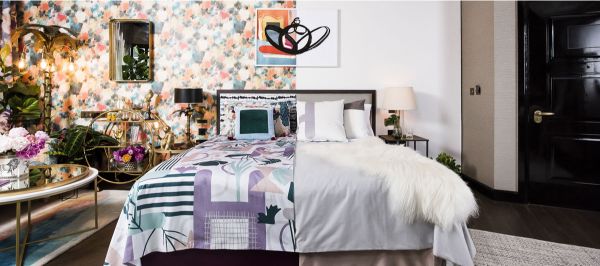
The maximalist approach helps retain the brand’s originality. For brands that have a lot to say, a minimalistic approach might not do justice to their potential and content. Following the principle of more is more, the maximalist approach holds no barriers in respect to the limit on the number of elements to be used. The maximalist approach encourages you to go loud with your design practices. Maximalist designs can convey specific ideas that less aggressive aesthetics might not be able to.
The point of web design is to showcase your brand’s identity, and though the minimalistic approach is considered to help stand out from the clutter, many maximalist approaches can achieve precisely that. Make sure your design serves a purpose. While Maximalism allows using design elements without any limitations and restrictions, it doesn’t mean throwing anything you want to at the page in the name of art. There are specific design principles that help Maximalism get out in its best essence. Adding a structured visual hierarchy that helps portray the essential information first, specific colors that complement each other and create a deliberate style, and using contrast to highlight and demarcate different sections of content are some practices that can help your maximalist design stand out.
Maximalist design can be on your face and away from the safer design options when it comes to different elements such as colors, texture, and more. There might include a website with bright neon colors that might come off as repulsive to many people when they think about it, and it is still a good experiment to do if you can do it justice with your brand’s theme and content. Using such bold statements would help more natural retention on the audience’s mind as it is visually strong.
Here we conclude the two concepts and styles of design: Minimalism and Maximalism. Both are contrasting design practices that work on principles opposing each other; however, instead of fighting over which is better than others, it is advisable to understand the core benefits of both and implementing either one based on their relevance to your product/website.
