Line25 is reader supported. At no cost to you a commission from sponsors may be earned when a purchase is made via links on the site. Learn more
Typography has always been a significant part of the branding and marketing process of a brand or service. Designing a particular type of graphic that has the potential to shout the brand’s identity is the primary function of typography. And as we can imagine, the most significant part that constitutes a type of graphics is the fonts. A single font can make your website/blog look monotonous and boring. It is always advisable to pair two or a maximum of three fonts together to create a secure and well-received identity. Often, people mistakenly combining two fonts that have entirely different personalities and end up reducing the value of their designs. To tackle this issue, we have rounded up a few things that you should not do while pairing different fonts.
The key to pairing different fonts together is to remember that they must look appealing to the eye and put forth your message. On the other hand, if the two fonts don’t look good together, then the graphic would only put off the look of your page.
Pairing fonts:
One aspect of font pairing that is often forgotten is that the fonts must not only look appealing to the eye but also work harmoniously with the copy. For example, if you are working on a wedding photography website, you cannot select grunge font styles for headings and simple, handwritten fonts for the copy. This would not only spoil the visual balance but also ruin the aesthetic of your page.
To pair fonts successfully, you need first to understand the various font styles that usually categorize the personality of text. The most common font styles that we shall be referring to in this blog are a serif font, sans serif, handwritten, script font, display font, and a novelty font. So here are a few things not to do while pairing two fonts together.
1. Do not pair two script or handwritten fonts together:
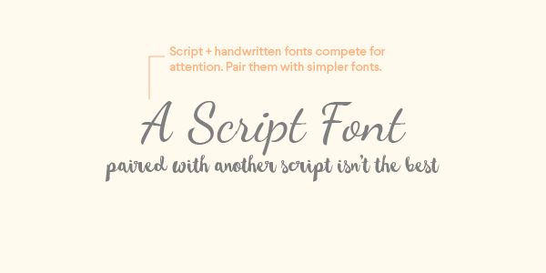
The script, as well as handwritten fonts, are really in trend these days. They give a personal touch to the graphics, but they also make it look elegant and sophisticated. However, pairing two of these together is a terrible idea. To support this with an example, imagine a classic script font like a prima ballerina on a stage. She would never share the space with another lead ballerina, but maybe a strong character or other background dancers who are not as important as her.
To put this concept in the font language, you must keep script and handwritten fonts on their own, or pair them with a different font altogether.
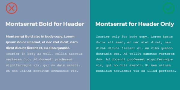
2. Do not pair two very similar fonts together:
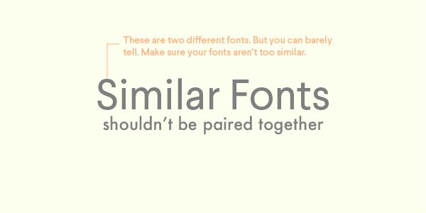
One of the most significant difficulties in pairing two fonts together is clubbing similar font styles; not everybody can nail this. To put it in easier words, if you match two very similar fonts, the difference would barely be noticeable. And in case the two fonts are very different, then it would end up looking wonky. Either way, it shall not satisfy your purpose of clubbing two fonts, and you can conveniently avoid this situation.
If you still wish to work on two fonts with a similar, you can go for the various versions of the same font. For example, you can club the italic and bold font style of the same font to make it look more dynamic and yet, a part of the same page. This would also satisfy your plan to put two similar fonts together, but also make sure they don’t look out of place.
3. Do not pair display and novelty fonts together:
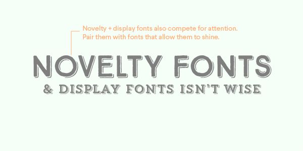
The main reason one picks a strong font is to emphasize a specific part of the page. If you chose two secure fonts to pair together, then the primary purpose of emphasis is lost, and you are left with a page covered in bold alphabets with no message to be focused on. If a display and a novelty font are clubbed together, they would clash against each other, and the graphic would look jarring.
The best way to use display and novelty fonts is either by letting them off on their own, or pairing them with much more straightforward, lightweight fonts so that all parts of the typography are well-balanced.
4. Do not use too many fonts:
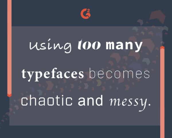
The image says it all!
If you use multiple fonts in one graphic/page, it would look cluttered and chaotic. There are thousands of fonts to chose from, but choosing the right one isn’t an easy job, and we know it. But being indecisive about the one you want is not like opening a gate to let all the fonts in at one time. So you must take your time to select the right fonts and make sure to keep it to a minimum of 2 and a maximum of 3.
However, sometimes, a piece of real art can come out of multiple fonts. However, make sure that it is the vibe you’re going for before committing to the multiple font layout.
5. Do not forget the Weight and Size:
The best way to experiment with fonts is to play with weight, size, and spacing between the characters. In case you wish to pair two fonts, you can always play with these aspects to make sure your design is not unique and well-balanced and well-thought-out. Instead of matching two very similar fonts, you can also play with the spacing and weight of one font and give a dynamic edge to your designs.
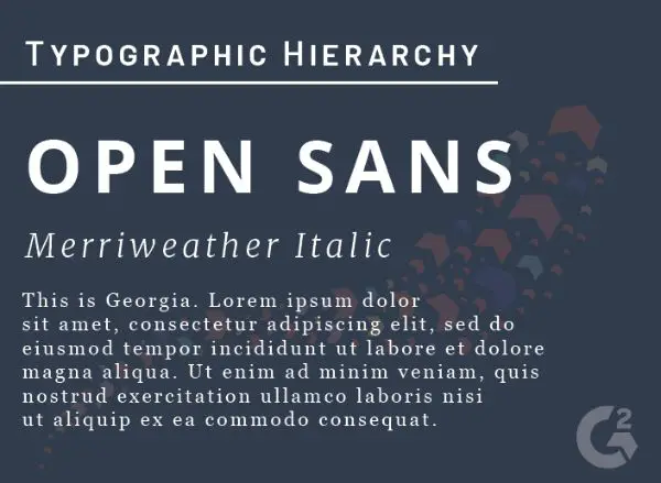
6. Do not forget about the hierarchy:
The essential tool of type graphics is the hierarchy of the text. We mainly chose different fonts to make sure that specific chunks of text are highlighted, while others are subdued for lesser attention. A convenient way to go about this is by pairing bold fonts, along with simpler fonts. You can experiment with styles and weights, or sizes as well as kerning, etc.
For example, you can combine Antique Regular for the body with Nista Grotesk for the headlines. You can pick from a range of font weights for the Nista Grotesk font, depending on the page’s mood and feel. Newer techniques also usually pair a serif font for headlines and sans serif font for body. This combination is best suited for newsprint resumes and a commercial blog.
7. Too many designer fonts must be avoided:
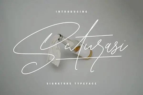
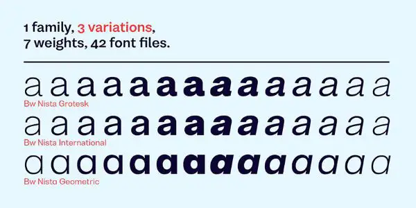
If you are a beginner in designing type graphics, it is a given that you would use designer fonts. Envato Elements has a wide range of designer fonts, which can be used to create beautiful typographic elements. Maulanacreative is a website that has an extensive collection of sands serif and handwritten fonts. For a high-energy spirit script, you can go for Saturasi, and it looks best when paired with Lostfield (as in the image). This font is a condensed sans serif family and comes in multiple weights. You can experiment with the thin lines of Saturasi.
8. Don’t shy away from using font duos:
Many website platforms now provide a well-curated list of font duos that are ready to be used directly in your designs. Designers have already gone through the whole intense process of narrowing down font styles and families that best suit each other. You can straightaway download these from various online platforms and view a segregated collection according to multiple moods – like for wedding cards, social media posts, etc.
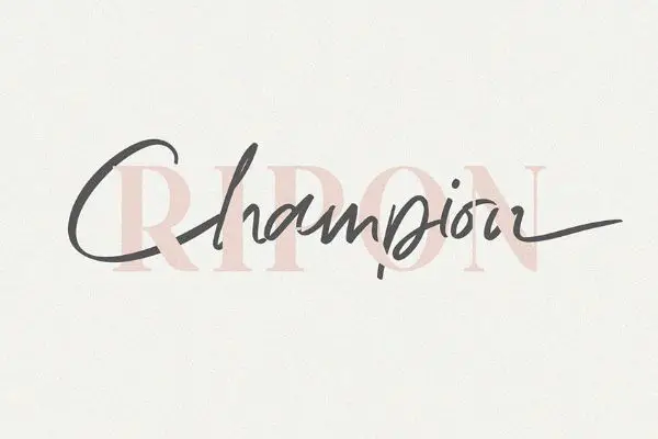
The image below showcases one such font duo called Ripon. It is an excellent combination of elegance and sophistication, very ideal for using on wedding cards or fashion related brand collaterals.
9. Don’t forget to assign roles to Fonts:
Often, assigning tasks to fonts could be a great way to create personalities through fonts. For example, you can use on a particular font for headers, a thinner font for the body, and an even thinner one for captions. Ensure that you follow this trend throughout the document so that the synergy is maintained and that every part looks like a part of a bigger one.
Often avoided as a step in pairing fonts, and newer fonts in the middle of the document/page contaminate the mood. This spoils the visual symphony and ends up looking like a bunch of random fonts put together for no good.
10. Avoid a mix of moods:
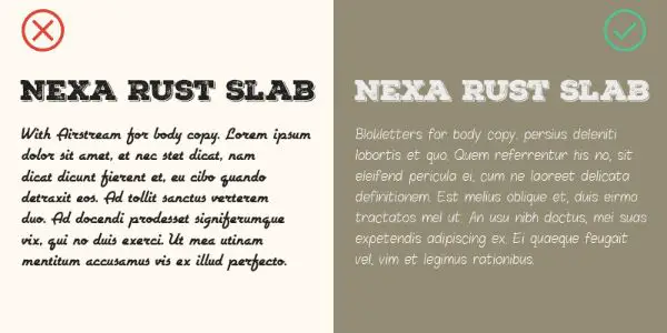
Another super important element is to realize that each font has its personality and mood. For example, do not make the mistake of pairing Impact and MTF Cool Kid. The Impact is a bold and heavy font, while MTF Cool Kid is a simple, playful font. These two have very different personalities and moods, which do not mix.
Two fonts that have different personalities should not be together. Like in the example given below, Nexa Rust Slab and Airstream are clubbed together. But both these fonts are very different and do not match the vibe. As a whole, they have nothing to give to the viewer except an essential text chunk. Hence, while picking the right combination, make sure that the two/three fonts have the same vibe and mood. Everything depends on how well the entire typography gives the message – and not just the font.
Thankfully, we live in the Internet world, and there is a solution to every problem. To make our lives easier, multiple platforms help you chose the perfect pair of fonts that complement each other. Most of these websites also have segregations, according to moods, vibes, events, and styles. You can browse through these online download font packages. We have listed a few here:
a. Font Pair:
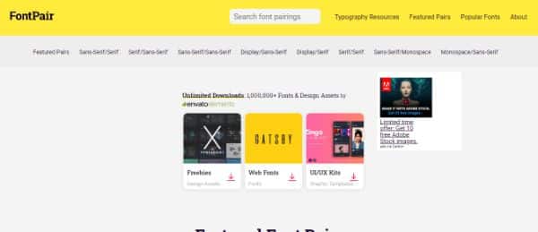
Assessed by Envato Elements, Font Pair is a great website that gives you the perfect font combinations that you could be looking for. Font pair lets you download the fonts right from their website, and you can easily browse through the various collections for free. You can select from their featured fonts, or if you have something specific in mind, you can also browse through the multiple categories and make selections accordingly.
b. Typespiration:
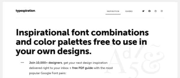
Typespiration is an excellent website in every aspect. It showcases excerpts from the designs of various designers. Every model has the fonts and colors mentioned at the bottom, which you can easily download and use. What’s more? Typespiration also provides you with a CSS code that you can quickly put on your website. It has beautiful combinations, based on almost every need according to your mood and concept.
c. Typ.io:
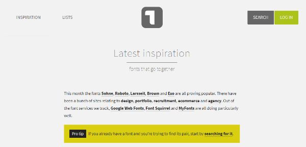
This website focuses on the concept of inspiration. You can view tons of web and landing pages that have been predesigned. You can also see the font choices that designers have made and how the designs implemented them. All in all, Typ.io can help you a lot with the visual language of your web or landing page.
The pairing of fonts is an art as well as a science. Not only does the aesthetic matter, but the precision is equally important. To be honest, there isn’t any right way to go about pairing fonts. Whatever looks visually appealing and conveys the message most appropriately has the power to reach out as intended. You should also be ready to get some help from people to get your combination right, rather than settling for something mediocre and basic. You must ensure that you take the proper time to come up with the right combinations, and you might also come up with something that no one has ever seen before!