Line25 is reader supported. At no cost to you a commission from sponsors may be earned when a purchase is made via links on the site. Learn more
Website designs for premium Mac application websites are amongst the most beautiful web designs on the net. Here’s an inspirational showcase of some of the best Mac app web design trends, along with a look at some common trends and features.
Kaleidoscope
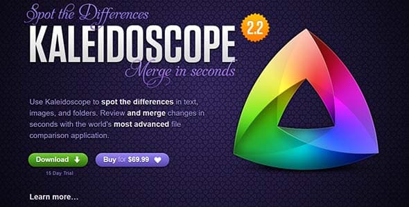
Check out Kaleidoscope, for example, it uses vibrant colors for their logo, typography in all shapes and sizes and a neutral purple texture for its background.
iMazing 2.3
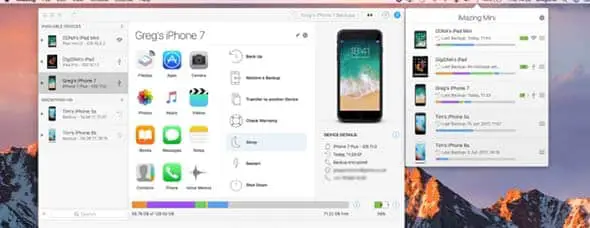
This new iMazing app version comes with a lot of cool features and improved backup. This website uses a minimalist design that keeps it simple and cool and uses lots of screenshots.
Transmit
Transmit’s website presents their app through a lot of content. They use huge animated icons and typography and if you’ll continue scrolling you will also notice many explanatory screenshots.
RapidWeaver
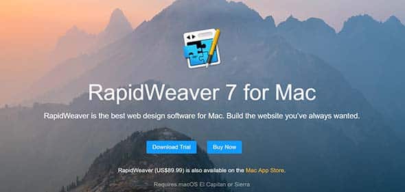
This app will help you build the website you’ve always dreamed of. RapidWeaver 7’s website uses a lot of good content to present their app’s features. They use videos, slideshows and so much more.
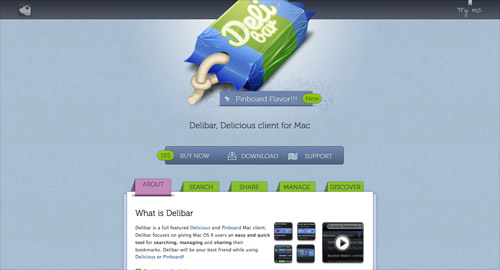
Delibar
Delibar focuses and on managing bookmarks and this app’s website has a friendly interface thanks to the oversized icon and buttons and its light blue textured background.
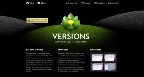
Versions
Versions’ website uses a black background on which their green logo and white typography stand out.
Silverback
Silverback also has a friendly interface that uses a light green background and has the perfect mix of typography and color.
Espionage 3
They have a sharp and neat web design layout that focuses on presenting the perks of using Espionage 3. You can even watch a video tour of their app.
Flume 2.7
Flume 2.7 is a photo editing and sharing app for Mac users that has plenty new features. Their app’s website uses a neat and elegant design layout.
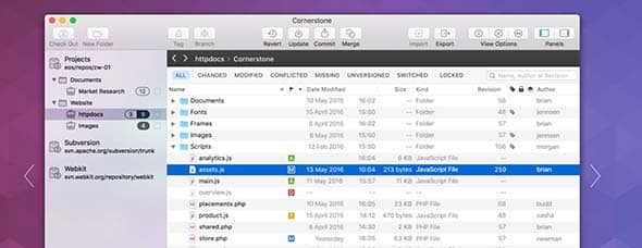
Cornerstone
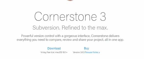
Cornerstone has a much more minimalist web design layout. The first thing you’ll see is their logo followed by horizontal bands of screenshots and other content.
Spark
Spark is your go-to email app for Mac with a very aesthetic interface and it is also easy to manage. Their website also uses a minimalist design with lots of typography and screenshots.
Postbox
This is yet another email app for Mac. Their website also uses horizontal bands and bright colours in the header followed by a minimalist design and good content.
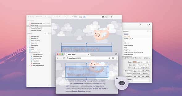
Espresso
Espresso focuses on delivering good content mainly through huge images, screenshots of their app. They use a light grey texture that turns white as you scroll and grey typography, giving the interface an elegant touch.
Capo
Gapo uses typography, images and a pink background for their web design layout followed by a horizontal picture that tells a motto. All this makes the website look more friendly and familiar.
Common features
There’s a hand full of design features that tend to appear time and time again in the designs of Mac app websites. Some of these design trends take inspiration directly from Apple, like the well-designed features layout – a common trait of an Apple.com web page – while others are commonly used techniques in the world of website design that is taken a step further, example being the use of icons to reinforce the text with a visual clue, but these icons are much larger in size and include much more detail.
Vibrant colours
Almost every site in the showcase features a mix of vibrant colors, either in the form of an illustration or from the large icons on the page. A dark background color helps these colors ‘pop’ with a super bright appearance.

Being downloadable applications means a prominent download or buy now the link is crucial. Large and chunky buttons have become popular elements across the web design industry, but Mac app websites often feature oversized button graphics with a tactile feel created with subtle shading and highlights.
Features icons
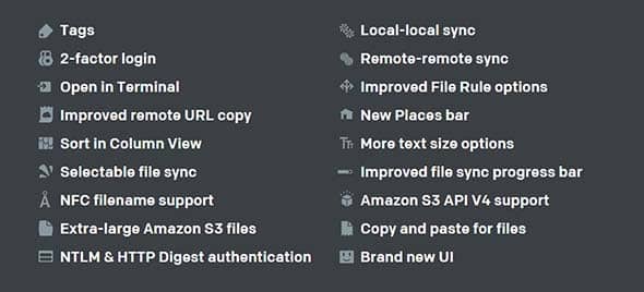
The use of icons to reinforce nearby text is nothing new in web design, but Apple’s own use of large and more detailed icons has led to icon designs becoming bigger in size; more detailed and vibrant, and generally more unique in the type of imagery they depict.
Oversized icons

The icons in OSX are designed at extra large proportions, so the icons for the apps themselves also need to be oversized and therefore include plenty of detail. These icons act as the app’s logo and branding – It’s what people will recognize the app by when it’s sat in their dock, so it makes sense to use the supersized icon as part of the website design.
Designed layouts
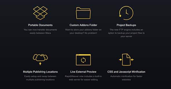
Usually, the surrounding interface of a website is designed, then the content is simply inserted and forgotten about. However, the Apple website is a great example of how the content itself is designed, as well as the surrounding page. The Mac app websites often take inspiration from this, combining imagery and text into flowing layouts.
Modal windows
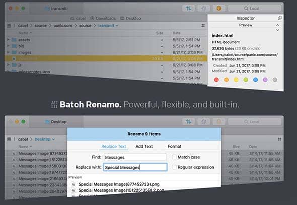
Javascript Lightboxes and modal windows have become pretty much standard in today’s web, but this particular style of the window appears time and time again in Apple-related site designs. These lightbox windows are great for showing off screenshots of the app, or an introductory video.
Crisp & sharp interface design
The OSX interface is razor-sharp with tiny pixel levels and highlights giving a really crisp appearance. This design style has emerged onto the web, particularly in Mac, iPhone, and iPad related websites. Soft and subtle shadows, inset text and 1px highlighting lines all add to the theme.






Comments are closed.