Line25 is reader supported. At no cost to you a commission from sponsors may be earned when a purchase is made via links on the site. Learn more
The use of texture is one of the important principles of good design, and the use of subtle textures is becoming more and more popular in the world of web design. These textures help give a tactile and realistic feel to the interface, which can help a website seem more familiar with things we come across in the real world. Here’s an inspirational showcase of 30 websites that are perfect examples of texture use in web design.
Giftrocket
Giftrocket is an online gift card web site that uses a light brown subtle texture and gives a tactile feeling to its readers. This website design is a great example of how to combine cool illustrations with subtle textures in web design.
Wearableprint
Wearableprint uses a light grey paper texture to point out 3 columns linked to their catalogs. Using a subtle paper texture throughout their website was an obvious choice, considering this is a printing company.
Retin Art
Retin Art has a background made out of horizontal bands in blue tones. Some of them are clear backgrounds while the middle one has a texture added to it.
Besupercharged
This website successfully combines typography with texture into a nice web design layout. It uses subtle textures all over the design, from logo to other web elements on the page.
Simon Collison
Simon Collison’s website uses a math paper texture as background. Furthermore, he uses a grid-like gallery to showcase his articles.
AmazeeLabs
AmazeeLabs combines background texture and typography in a creative way to give a nice touch to their website’s layout. What seems to be a wall texture turns into a photo. The same texture is used again as background for a slideshow.
Intellisult
Intellisult uses texture to give the website a more familiar look for its users. This is an interactive website where you can play with your friends in an intelligent way.
Headlampcreative
Headlampcreative uses horizontal bands of concrete texture as its background which gives a realistic feel to the interface. Subtle textures are present throughout the design.
Vestfrost
Vestfrost uses a series of ‘icy’ textures to give the impression of an animated site as you scroll. It is winter-themed and the chosen textures match the branding perfectly.
The Box
The Box uses a simple dark blue texture with vertical lines as the background to present their episodes on.
Wheres-lolly
This interactive website uses different textures to create a background for an exploration game. All you have to do is guess where the plane is taking you.
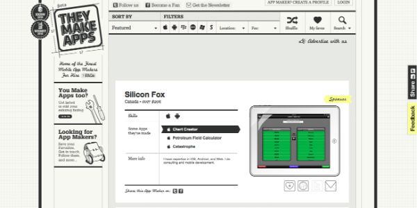
They Make Apps
They Make App’s website uses textures to give readers a friendly and familiar vibe. It has used two monochrome patterns to give effect of technical drawing on their website.
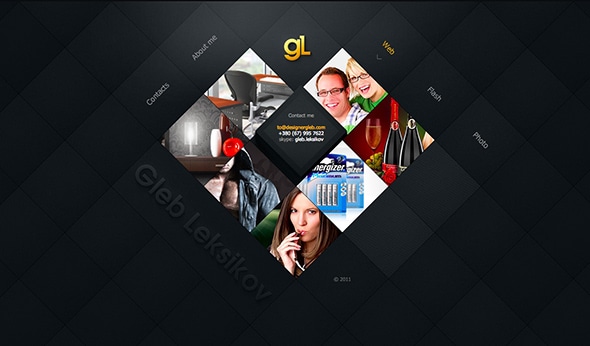
Gleb Leksikov
Lucasbigot
This is an example of using texture and animations to make your website look more dynamic. It uses different types of textures with vibrant color and cool transition effects.
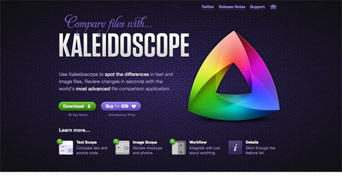
Kaleidoscope
This website uses a large range of textures in its layout design. Its purpose is to present a very useful app that sports differences on sight.
Deconstructing first families
This is yet another good example of a website that uses paper texture in its background. The font style is also really well chosen and matches the design.
Chord Surfer
Chord Surfer is also an interactive website that lets you play a really cool game. All in all, this website has a friendly and familiar touch thanks to the pink texture.
Studiokraftwerk
Their background texture changes as you move your mouse. It can get a white trail or it can get blurry, either way, they found a creative and cool way to use it.
La Piece
La Piece uses a series of textures that either has a repetitive geometric motif to either turn into an illustration or a faded map. This is yet another cool example of using texture in a creative way.
Revelation Concept
Their website uses textures with warm colors like light ochres and red to give offer their readers a more tactile and familiar experience with the interface.
Designeers
Designeers’s website uses a slideshow of textures and images with a powerful background and meaning to present themselves as a design agency. This web design has a grungy look.
Daveruizdesign
Dave Ruiz’s website is another example of using horizontal bands with different textures or colors. They make the page look friendly and joyful.
Moritzwelker
This site uses a dark grungy texture that makes every project done by Moritz Welker stand out in his online gallery. It combines cool vector illustrations with unique typefaces.
Creative Soapbox
With a simple design and some warm coloured textures, you can go a long way like Creative Soapbox’s website which focuses on designing user experiences.
Jacob Joins
This website represents Jacob Joins’ project regarding different eating habits and cultures all over the world. It uses textures and warm colours that gives the site a sensitive touch.
Lorena Orraca
Lorena Orraca is a film director as her business card website points out. This site combines texture and typography in a very creative way. It uses paper textures as well, as the background.
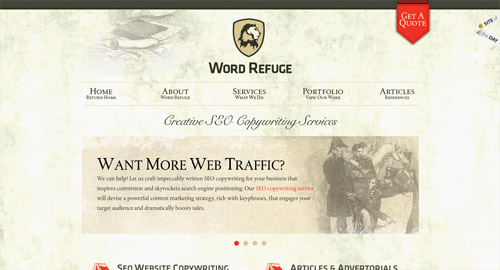
Word Refuge
Word Refuge is based on a creative and experienced team whose aim is to find the best solutions for their clients. Their website uses different types of texture but the main one is light grey and grungy.
Fringe Development
With their elegant design, Fringe Development uses a light ochre texture with grey typography to offer a warm and tactile feeling to their readers.
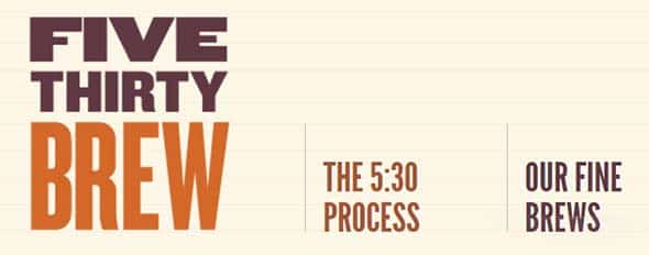
Five Thirty Brew
Five Thirty Brew will give you the impression that you’re reading someone’s journal thanks to the paper texture that they used. The colors, the illustrations, and the beer bottles also give this website a friendly vibe.
In Motion
The last but not least, this website uses textures for almost everything there is on their page. Starting with the background and illustration and ending with the nice typography, this site is a really good example of using textures in a creative way.














great stuff to get some inspiration,
thanks
Great designs
Very inspiring article! Thanks.
Nice article. I love the realism and creative use of these textures. Great inspiration!
Thanks for featuring us, given the company of the other sites you've noted it's a great compliment. We enjoy your site as well.
Vielen Dank!
Its surprising how a little noise in the background can make a big difference.
I will have to come back to see if you found more.
This blog is really great. This is my first comment. I will keep visiting.
great sites there, im a big fan of textures in web design myself, always gives me good feelings when browsing sites like these, I think neutral color schemes are getting used to much.
I love subtle textures of bright colors like Worry Free Labs and solid giant.
Oh man, nice roundup. Other collections have been showing same ol' but popular sites from well-known designers. This is really something new and fresh. Kudos!
Nice collection Chris, there are some gems. Does anyone know who did the first website, Spring? It's gorgeous… great texture and really nice typography.
I love Mr Simon Collier's site. Great post.
nice collection….
coll collection of texture design site. i like the little cake parlour design in this every thing manage properly. we are also web designers and this collection give us idea of new creativity. thanks for this…..
Really cool collection. You just love those textures don't you Chris. Awesome stuff
Very nice collection, I'm going to try some of them
Nice collection. I've noticed a few of these in the site of the week collections.
I think that even a really simple minimal texture makes a website more visually interesting.
I like the feed Stitch website most on the list, because the textures work really well for the theme of website.
Thanks for the collection Chris
great website! mike
I second that! ;)
Hadn't seen the AFD-Folio site before, and it's very impressive! Great typography work. I wish I could design sites like that, heh!
Some really nice websites here. My favorite has to be Foundation Six's. Using textures in web design is a really nice touch, but sometimes it just doesn't fit what you are trying to get across.
Thanks for the mention among so many great examples.
I can not choose my favorite!
YAY for AmazeeLabs!
Not really sure how you forgot to include my site in this. :(
Love the Ecoki site.
Beautiful examples!
nice post, lots of great examples I have never come across.
Very cool lineup. I love websites with textures, but have to stop myself from overdoing it :)
Cool examples, yet I can't help but notice that the vast majority fo them look incredibly similar, specially when it comes to the color palette they use.
Hi Chris,
nice roundup of websites using textures in their design, love it!
Maybe a nice extra? I just published the redesign of my portfolio yesterday, and yes, .. loads of textures in it!
https://www.gonzographic.com
I'ld love to hear what you think of it? Thanks for sharing, Cheers & Ciao ..
really useful texture backgrounds for website designs as well. thanks