Line25 is reader supported. At no cost to you a commission from sponsors may be earned when a purchase is made via links on the site. Learn more
While minimal flat style designs are the current hot trend, some designers are eliminating solid blocks of color from their designs with the use of subtle textures. The use of grainy textures really helps give a design a tactile appearance and fits perfectly with designs using an old school or retro style. This post showcases some great websites which are perfect examples of grain texture use. These sites don’t take texturing to the extreme, but the grainy backgrounds really help add subtle details to the design.
Textures are used in web design to avoid the cold/fake/digital appearance of flat solid colours, to instead add an element of realism and that sense of something real. You don’t have to go full-on with concrete, paper or wood textures to achieve this though, just adding a subtle overlay of dust or noise can really enhance your design to give that tactile appearance. This post showcases 20+ inspiring examples of website designs that perfectly achieve that realistic feeling with the help of subtle grain textures.
Do you need some texture freebies? Check out these free brick wall textures, free pixel patterns for Photoshop, and learn how to make them yourself, from scratch, with these free texture tutorials.
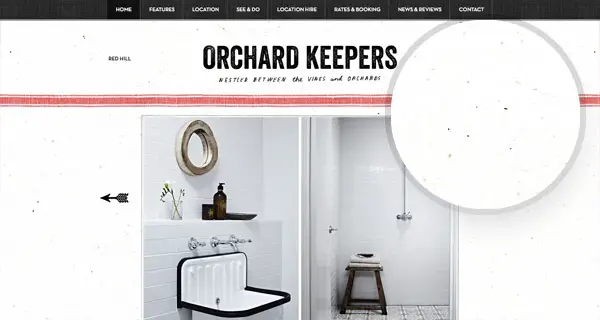
Orchard Keepers
Orchard Keepers is a really nice website that uses not one, but plenty textures and graphic elements in its design layout. The website presents 3 beautiful cottages which you can rent and spent your holidays in an amazing location.
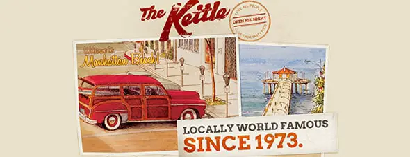
The Kettle
The Kettle website is another great example of a website that uses a grain texture as background. This website was designed for a restaurant. The menu bar is made out or large round buttons that will guide you to their menu and other useful information.
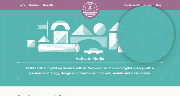
Activate Media
Activate Media has a really friendly interface design. This website uses a blue grain texture and a geometric illustration. This website presents a digital agency in an elegant and creative way.
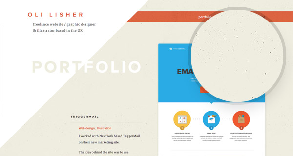
Oli Lisher
You might also want to have a look at Oli Lisher’s portfolio website. He is a freelance website and graphic designer based in U.K. His website uses grain textures, angled graphics, typography and large thumbnail photos.
Supercharged
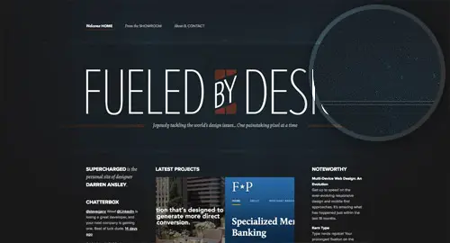
Even if it’s just for visual decoration a texture can really help transform a website design. The Supercharged website is a perfect example of subtle texture use with a mix of a grungy style background texture with a delicate scattering of splatters. This website uses many textures and graphic elements to present a business in a creative and eye-catching way.
Jarritos
Jarritos focuses on making delicious sodas and this is their website. They use cool hand-drawn elements in their website’s header. The background uses a light nude gray texture with transparent hand-drawn illustration. They use many graphics and video elements to present content to the website’s visitors.
Richard Photo Lab
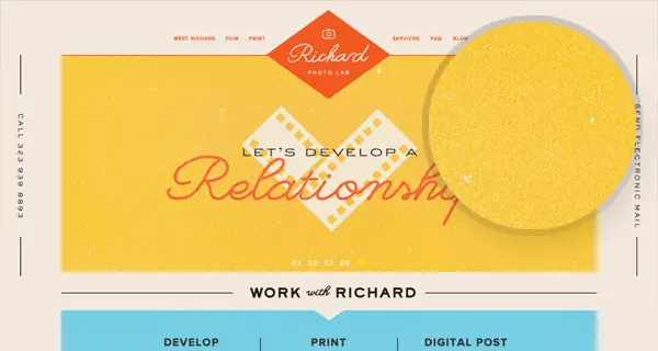
Richard Photo Lab is a website that presents a filmmaking company. The website has a friendly interface design that uses textures and bright colors in a creative way.
The Prince Ink Company
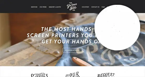
This website presents high-quality printing solutions in a creative and representative way. The website has a large black and white menu bar with a centered hand-drawn logo, followed by a horizontal image of their work. If you’ll continue scrolling you’ll notice that you can learn more about their services, have a look at their portfolio or request a screen test.
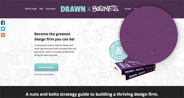
Drawn to Business
If you want your design firm to become one of the greatest then you might want to have a look at what Drawn to Business has to offer. They offer the best strategies and solutions for your company and they also have a really nice website. The website uses textures and many graphic elements such as the unique logo and illustrations.
Resumebaking
A grainy paper texture can be seen on the Resumebaking website, which is a great link to the website’s topic of resumes. Despite now being completely digital the texture helps relate to the old paper based resumes everyone knows. This design keeps it simple yet also manages to present content to their website’s visitors in a creative way. This website uses a grain textured image in its header as the first thing a visitor sees and manages to add an elegant and professional touch to the website’s design.
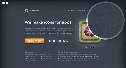
iPhone Icon Design
Even if it’s just for visual decoration a texture can really help transform a website design. Without the pattern/texture background file the iPhone Icon Design website would be sat on a plain background.
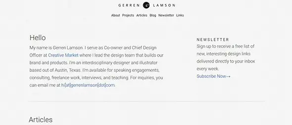
Gerren Lamson
Gerren Lamson is the head of a design team that focuses on building brands and products. This is his business card website that uses a grain texture with a gray color overlay.
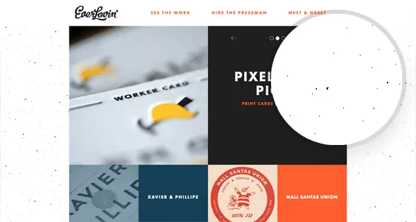
Everlovin’ Press
Everlovin’ Press focuses on designing and printing fine letterpress goods and stationery. Their aim is to offer the best services to all their customers. This company has a really nice website that uses a modular grid layout, a grain texture and mixes different colors and typography in a creative way.
96-elephants
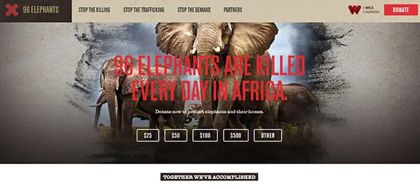
This website focuses on raising awareness on how many elephants are killed daily in Africa. You can donate to the cause or get inspired by their website’s use of grain textures and graphic elements.
Paolo Cavanna
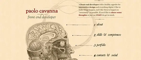
Paolo Cavanna chose an elegant design layout for his business card and portfolio website. The texture has a light nude color overlay and the chosen typography gets its inspiration from hand lettering. The website also uses some detailed illustrations of the human brain and eye.
Maquina Kryptos
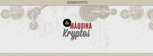
Machina Kryptos website works as a word encrypting machine and app. You can think of a word and then follow the instructions to encrypt it. The website has a really nice design layout that uses plenty grain textures and detailed illustrations.
Solopine
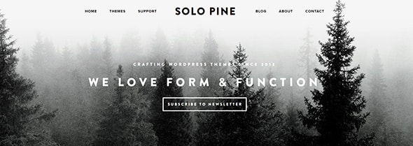
Solopine is a nice website where you can find WordPress themes. The website looks nice and uses a black and white image with a grain texture overlay to make it look more elegant. The website continues with a minimalist design.
Chichester Design
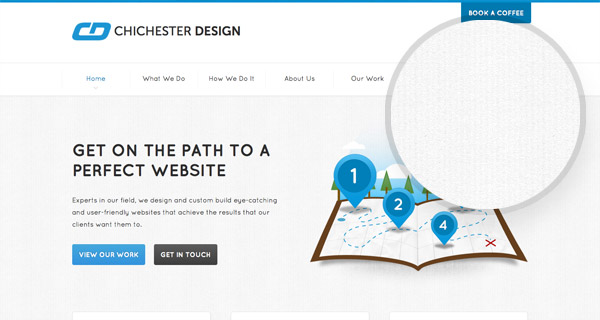
If you want the perfect website then Chichester Design might be the one to help you get what you want. You can check out what they do and how they do it or get inspired by their awesome website. The website uses a gray grain texture and a minimalist design which is quite trendy nowadays.
This is Teixido
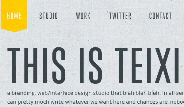
This is Teixido’s website is yet another example of website with a grainy texture which is crafted very well. It enhances the look of the website and looks very well customized with the font.
Cheese Survival Kit
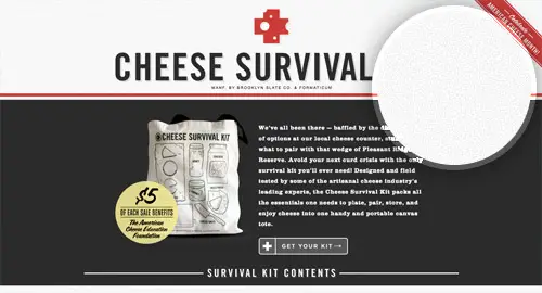
Even the smoothest of surfaces in real life have some kind of grain or texture, this is why adding a film of noise to your flat colours in your digital designs helps add that touch of realism. The Cheese Survival Kit website showcases this with subtle noise on both the black and white backgrounds.
GiftRocket
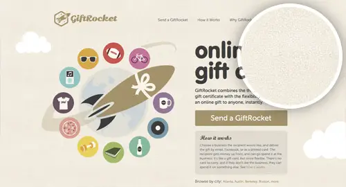
GiftRocket is a website blessed with the textural/illustrative talent of Mike Kus. Check out Mike’s portfolio for more examples of his trademark style.
Great American Whiskey Fair
Last but not least, The Great American Whiskey fair website presents one of the largest celebration of American whiskey in the Southeast. This website has a dark layout and the first thing visitors see is a large full-screen picture of barrels with a grain texture overlay and their impressive logo.



Hey Iggy,
Nice article, I like to add grains to my website header, do you think adding it will make the site slower? I inspected many sites you shared, for example: Richardphotolab, they used a png mask to get the grains. Can we get the same effect by html or css?
Thanks
The 20 web designs given was very excellent and the designs very fantastic awesome designs are included that the post and the this is very useful in my studies.
Very Nice Backgrounds. Excellent
Awesome and colorful web designs with amazing backgrounds!!
Beautiful List:) Thanks For Sharing this List Chris
Great list, Chris! That slight grainy texture does add a bit of character to an otherwise simple design.
I lost a lot of faith in using textures when the whole flat thing started, but this shows that both can work together as well.
I enjoyed Hum Creative!
Thanks Chris! Lovely collection as always :0) Great to learn about new (to me) creative designers and services too :0)
Mine is really simple. I try not to clutter the whole page and let the reader choose what he/she wants. Seems to work out but marketing has been the most difficult for me.
We put a subtle grain effect in our logo we’re pretty proud of, including a subtle grid pattern in the rest of the background. It’s the little things.
Chris! thanks for the inspirational post. I am big fan of yours :)
Thanks for sharing this list. I was in a bit of uncertain territory regarding my website’s background. I want it as clean as possible, but the simple white background just don’t work as it should. Maybe I will try a texture background from this list. Everlovin’ Press for example looks astonishing…
Few really eye catching designs, thanks for inspiring, really inspiring one.
yes definitely you are right!
This is one of the most useful articles, I really appreciate having the examples of ways to achieve the effect discussed in the article.
Thank you! I believe this is a very valuable contribution to the web design community!