Line25 is reader supported. At no cost to you a commission from sponsors may be earned when a purchase is made via links on the site. Learn more
Your new web design application is ready to go after months of hard work. You and your team of collaborators are happy with the result and the users that tested it for you love it; especially the additional building features. You have every reason to believe this application is a winner. What happens when it’s not a winner?
So why, you wonder, has your site or app stagnated. There was a nice flurry of activity just after the launch and now few people are using the app. What mystifies you is the sudden lack of interest for what you know is a good application.
Solving the mystery may be as simple as redesigning the sign-up and login forms. If a user has trouble accessing the site, they won’t keep coming back and word gets around.
The old methods for sign-up and login are familiar. However, consider applying new techniques, now available, that simplify filling out forms. This alone could solve your mystery if the change makes sense for your context.
Logging into websites is, for most of us, so routine we give it little thought; until we can’t. The website’s security policy insists on a new password and we can’t remember our old one.
It’s easy to forget login information for sites we use infrequently. We don’t even know which email address we signed up with and find out later we never did sign up. Besides, who can remember 100 login and sign-up usernames and passwords? Login frustration is bad for business. Such experiences frustrate us to the point we abandon the attempt to access the website. That’s bad for businesses depending on internet sales. In fact, one analysis found that out of 160,000 people who requested their password, 75% abandon their purchase without completing it. Filling out a sign-up form and sending it can be tedious if it’s long and complicated. The user’s enthusiasm for shopping can wane during the process. If a visitor loses interest before logging on or quits in frustration, they never see the websites products and promotions. The result for the business is a missed opportunity to convert a visitor into a buyer. The login is more than routine; it’s critical enough to start utilizing new designs to solve a growing problem for users and businesses.
Consider this:
On the surface, an interactive login design is simple. Many don’t realize the many different design considerations that contribute to the login page. Once combined, complications leading to frustration is often the result.
- Which audience platform is being used?
- What are the internal business processes?
- What are the procedures for site legacy?
- The design of the page interface.
- Don’t forget about security.
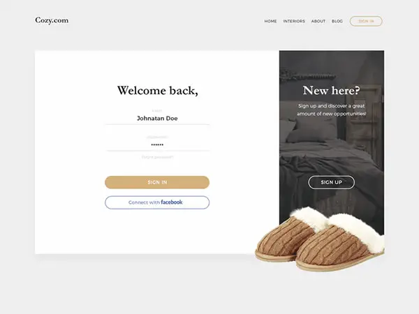
It should be clear where to login
When a website user prepares to login, the location should be clearly defined on the website and show the input form directly on the page.
Many websites only provide a link to the login page which is an extra step and moves the user from the home page.
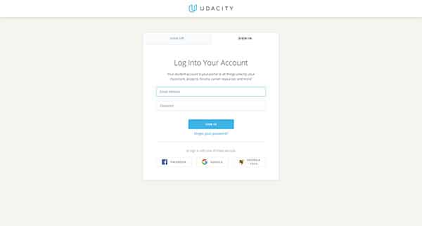
Preferred logins
Website users love logging in through their social network. If there is an easier way nobody has brought it to light. All that is required is the click of a button and you’re in.
Websites that accept this kind of login don’t require you to create an account. The other way to login is, of course, with a username and password or your email address and a password.
There is room for improvement with this traditional method.
It’s all about security
Security is important and that’s why we can’t use the same username and password for all our website accounts.
Sometimes our security is so protective we can’t access a website we know is safe. So, we tell security to open it anyway and that can weaken our security. There must be a better way. We need security and ease of use.
When attempting to log into a website for which you don’t remember your username or password, you could often recall them if the website would provide you with leading information.
Unfortunately, this could lead to identity theft. If you keep guessing the website locks you out and you must call customer service. That’s so frustrating you may not even care anymore.
Here are some workable solutions to the problem:
- When the login fails to tell the user whether it was due to the username or password
- Allow three tries because we all make typos.
- Instead of locking people out so they must call customer service, set a time limit. They could try again in fifteen minutes and maybe by then, they’ll remember.
Use the email as username
Most websites require a username to login and some let you use your email address as your username. Both should be options and be labeled so users know they’re both options. People usually can remember their email address and that’s half the battle.
No guessing games please
The fields on login screens often look like after-thoughts, tagged on at the end. That practice can cause confusion where simplicity should be.
Other times the username is assigned to you without you having a clue what it could be or where you can find it.
For Instance:
- You want to pay your utility bill on their website, but you can’t login because you don’t know your account number. You need that for use as your username. Clearly, label information directing the user where they can find their account number.
- When the username is an email address don’t label the input box as Username. Label it Email Address.
- For this website, you have a pin instead of a password. Don’t label it Password. Label it Pin Number.
These solutions help eliminate frustration, assist with login and are still secure.
Use a picture as confirmation
Using a profile picture or other graphic is a wonderful safety tool to visually confirm a website account is yours even though you can’t remember your password. If there is no photo of a dog, then that’s not my account.
Sign-in instantly
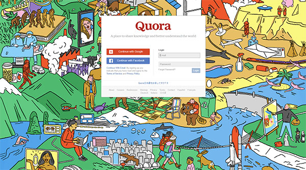
An easy and secure is possible as proven by the login form used by Quora. You have the option to login with your social media accounts.
After sign-up, every time you log back in all that’s required is a click on your picture or name.
Is it login or register?
On many websites, the fields for login and registration input look the same or similar. It would help the user to clearly label each to avoid confusion.
We all need a little help when we make mistakes:
- Everybody hits the wrong key sometimes without knowing it. When it happens while inputting your login information it would be helpful for the user to be given a clue to his or her mistake. For instance, you forgot the dot in .com. That would be good to know as a user who knows for sure they typed the right email and password. Now, it’s a quick fix.
- Website users appreciate the simple act of being notified their caps lock is on.
- After a few attempts to login without success, the user is locked out of his or her account for security reasons. Notification to the user would be helpful so they know that after two more try’s they will be locked out for twenty minutes. It will relieve them of wondering what to do next.
- Accurate labeling makes the users’ website experience easy. Make sure a button or label specifies its exact purpose. You are either logging in or submitting a form so careful labeling will avoid confusion.
Simplify
Let’s go back to the mystery of the terrific app that didn’t live up to expectations. Perhaps the solution is as simple as tweaking the login process so it’s easier for the user.
It is understood that will require more work for your design and development team that likely will go unacknowledged. It’s okay though because you know how good you are. You want to keep it simple for the customers because without them you might be designing cereal boxes.
Top startups know about these issues when they design their websites. Take a closer looks at some of the most popular startups nowadays and you’ll see that their login process is impeccable.