Line25 is reader supported. At no cost to you a commission from sponsors may be earned when a purchase is made via links on the site. Learn more
Even though in the new website designs today web designers don’t pay that much attention to the contact forms designs, some websites still want to offer a completely customized and personalized experience from top to bottom!
These 20 website examples have some of the most interesting form designs we’re sure you’ll want to see! This is something like a list that showcases the history of form designs, from the past to the present! These form designs have so many different styles and each one of them is unique in its own way.
Most form designs are created with the help of jQuery. jQuery makes it easy to spice up our search bars and form input fields with simple touches that really enhance the user’s experience. Why not use CSS, you may ask yourself. Well, similar effects could be created purely with CSS. There’s the pseudo :focus selector which allows us to add special styling to elements when they have the user’s attention. Plus, the default input value could be added as a background image, which is then removed also using the :focus selector. But there are two small problems; firstly the :focus selector isn’t supported by Internet Explorer, and secondly, there’s no way of ensuring the default value doesn’t reappear once the user has entered their own information within the input field. This is where jQuery takes over to provide a complete solution that’s compatible with all browsers.
Some form designs in this list are more complex, while others have simple, clean lines. What do you think about their designs?
Here they are!
Contact form Eddie Lobanovskiy
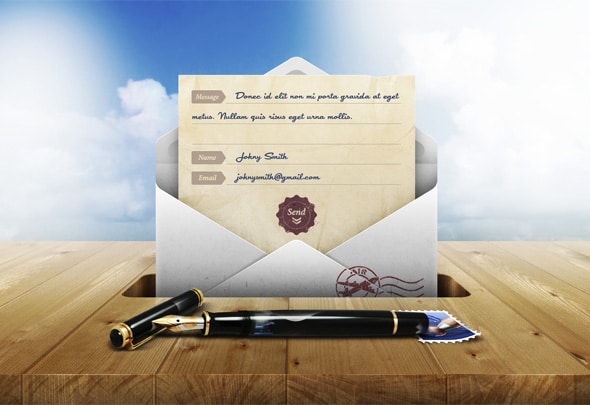
This contact form was designed by Eddie Lobanovskiy and it has an elegant envelope design which will definitely make your website’s visitors want to fill it out immediately.
Indofolio
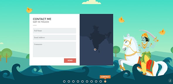
Indofolio has a really friendly interface design. It uses a flat design for both the contact form and the background illustration which is part of a portfolio.
Cabedge
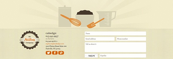
Cabedge has an elegant contact form which uses textured backgrounds, retro badges, orange social media icons that blend in perfectly with the website’s color palette and much more. It is definitely an example worth following and having in mind when designing contact forms.
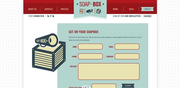
Soap Box
Soap Box might be your next source of inspiration in regards to contact forms. This website has a really cute and friendly form. It has a blue background, red details, flat illustrations and a nice flat design.
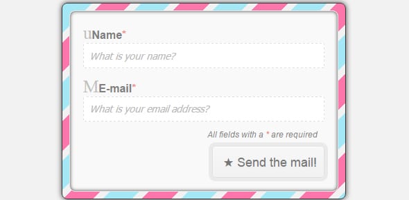
Simple contact form
And if you want more friendly contact forms then have a look at this simple contact form and find your inspiration. It keeps things simple but also stands out thanks to the colorful frame.
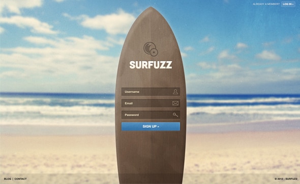
Surfuzz – Sign Up Page Template
Surfuzz is perfect for beach lovers and it will make them want to sign up immediately. This template can come in really handy and it will make your sign up page look nice.
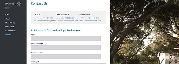
Lionways
Lionways has a neat and modern contact form. The website uses a vertical menu bar. If you’ll click on “Contact” you’ll see the contact form but also a part of the background’s full-screen picture.
CreateOne Contact v2
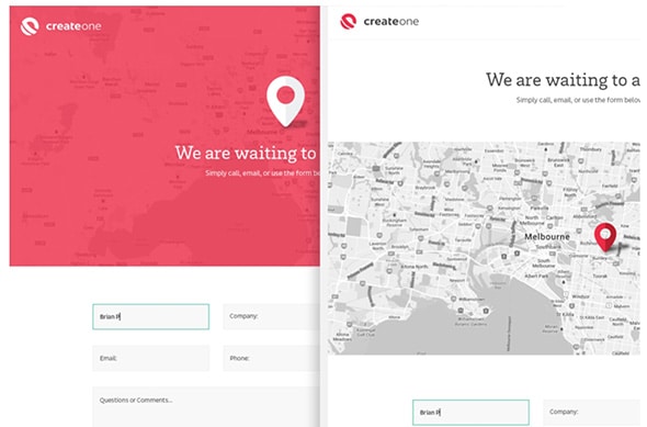
CreateOne Contact Form V2 is a really nice and modern-looking contact form. It has a friendly interface design which will definitely grab your website’s visitors’ attention.
Reverend Danger
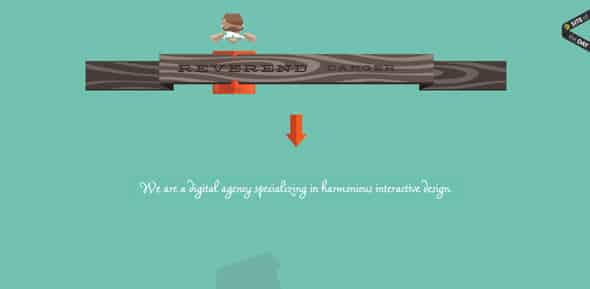
Reverend Danger is a digital agency focusing on interactive design and from the moment you’ll enter their website you’ll want to have a look at both their website’s amazing design and contact form.
Contact form
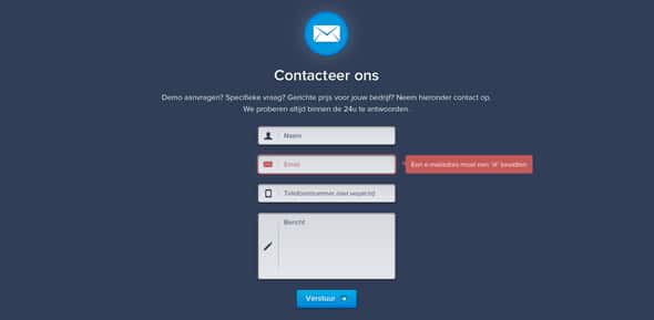
This is a simple and clean contact form which can be a great source of inspiration for future projects. It comes with simple but effective required field alerts and simple and descriptive icons.
Flat Responsive Contact Form
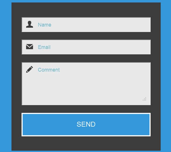
If you’re looking for a flat and responsive contact form example then you have come to the right place. Have a look at this example and get inspired to make the best contact form for you and your website.
Transparent Contact Form
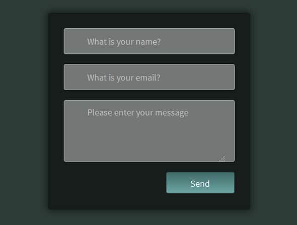
If you liked the previous example then you will definitely love this one. It has a dark design, basic layout with the usual fields and a gradient ‘Send’ button.
Simple Contact Form Validation
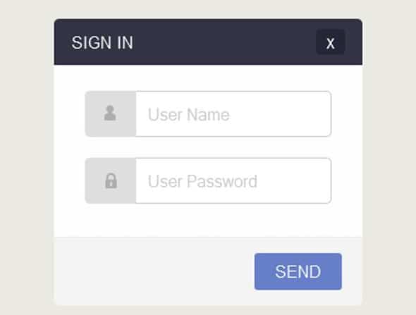
If you’re looking for more Sign In forms examples then you might want to have a look at this design. It is effective and it looks modern and has only two fields, the username and the password.
Clean Contact Form
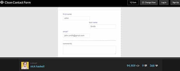
The Clean Contact Form keeps things simple. It has a minimalist design with tabs positioned on different sides of the contact form.
Contact modal
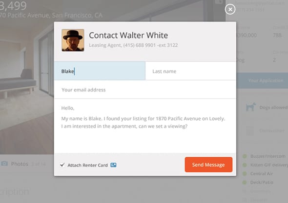
Contact modal can also be a great starting point for future projects. It has a compact and compelling design which will make communication between you and your website’s visitors much easier.
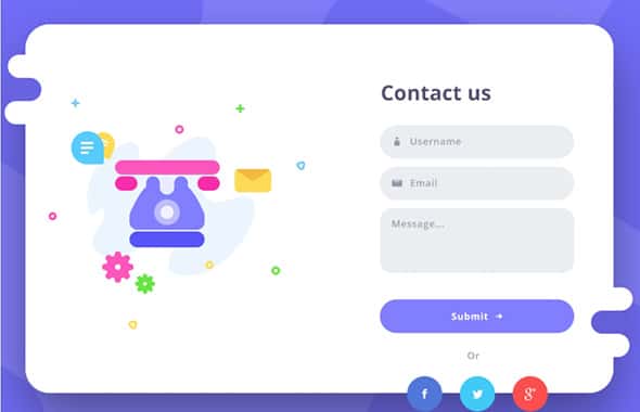
Contact us form
This is a really nice and friendly contact form which will definitely grab your attention. It has a unique and colorful flat design and uses a large palette of colors. The flat illustration is a great addition to this contact form, the round button and social media icons blend in perfectly with the contact form’s organic shape. All in all, this example can be a great source of inspiration thanks to its unique and friendly design.
Contact Page
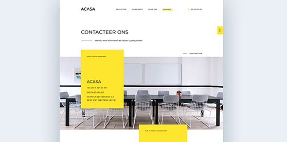
This contact page looks modern and functional and it can be a great example if you’re working on a similar project. It has a minimalist design with a large horizontal image and some yellow text boxes.
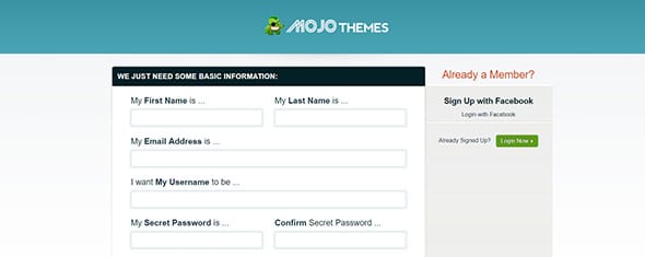
Mojo Themes Sign Up
Mojo Themes Sign Up form can be a great starting point for your website. It only needs some basic information about users and they’re good to go. All in all, this example keeps things simple and follows a clean design.
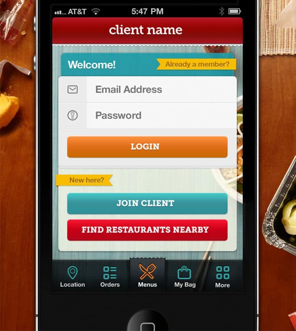
iPhone App Login Form
This is an iPhone app login form which has a friendly interface design. The buttons have different colors and they look great on the grey background.

Most of these look very dated in their design, and half of them I would wonder how they would work on a mobile device…these are not the kind of forms I would want to fill out. Don’t think users generally want to fill out forms, it’s about making the experience of filling it out easier and less painful.
I like the PLACEHOLDER attribute but almost every project I work on has to be IE9 compatable so since I have to use a fallback anyway, I never use it. Ditto, placeholders don’t work for password boxes so again, the fallback is the better all-around choice.
If I submitted half of these forms, they would be handed-back to redo.