Line25 is reader supported. At no cost to you a commission from sponsors may be earned when a purchase is made via links on the site. Learn more
Ever since Google announced mobile-first indexing, having a well-optimized mobile website has become a necessity. However, it makes perfect sense because global mobile traffic keeps increasing. Customers are getting more comfortable with buying goods and services via their phones.
This change is particularly significant for local businesses and agencies. The growing importance of mobile interface changes the game, and everyone needs to adapt.
Thus, here are some tips on how you can improve your mobile landing pages.
1. Improve your landing page loading speed
Let’s be real here: Who doesn’t love fast loading websites?
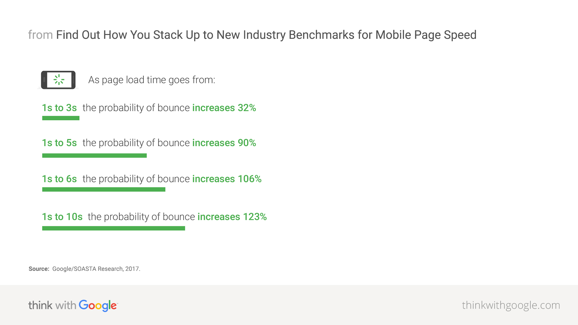
Speed was always a positive element of the browsing experience. Now it also affects your mobile search ranking. Earlier in July, Google rolled out the Speed Update which makes website speed a ranking factor for mobile search. Before, it only influenced desktop search.
Smartphone users love it too. According to Google, a whopping “53% of people will leave a page if it takes longer than 3 seconds to load.” However, the embarrassing thing is that in 2017, the average mobile landing page loading speed was 22 seconds.
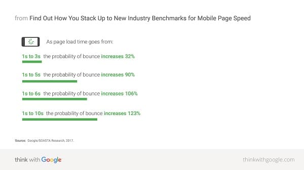
Source: Think With Google.
Slow page loading speeds are the biggest frustration for modern mobile users. In contrast, pages that load in 2 seconds or fewer experience 27% higher conversion rates. As Google puts it “speed equals revenue.”
Here’s what you can do to improve your page loading speed:
- Remove unnecessary page elements.
- Trim the size of your images.
- Optimize JavaScript, HTML & CSS requests with Google AMP.
- Enable HTTP caching.
- Turn your desktop website into a mobile-first site.
2. Take advantage of mobile-only features
Call intelligence agency Invoca states that “92% calls to businesses are driven by digital marketing”.
What is the leading source of those calls?
Mobile search! In 2015, mobile search accounted for 48% of total call volume. This percentage is probably even higher today.
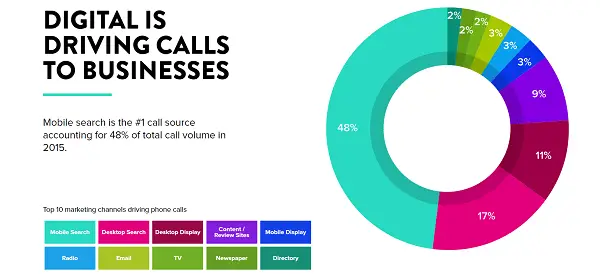
Source: Invoca Call Intelligence Index 2016.
What does it mean for your mobile landing pages?
People are more likely to contact you when they are on their phones. They want to find you and call you. Thus, when designing mobile websites, there are specific mobile-only features to have in mind for the most success.
For example, Duda is an award-winning platform that agencies can use for building lightning-fast mobile websites. You can place a mobile map button. It gives users directions to a business location, so they can find it using their smartphone’s GPS. It’s a win-win for both users and companies.
Make it easy to find and reach you. Your visitors will love it.
3. The power of great, action-oriented headlines
Most of your website visitors don’t read your texts. They scan only the headline. That’s why it is the most critical copy on your landing page. It makes the difference between bouncing and conversion.
Mobile interface pushes you to communicate value in a clear, engaging, and uncomplicated way. According to CopyBlogger, 8 out of 10 people read only your headline and subheadings. That’s why 80% of your copywriting time should be spent polishing them.
Don’t let excess verbiage stand between you and your customers.
4. Write a short & smart landing page body copy
What about the rest 2 out of 10 people who read your body copy?
The rest 20% of copywriting time should be dedicated to them. After all, they must be interested if they took the time to read it.
Write a killer copy but don’t overdo it. In the case of CaringBridge, a more straightforward text had helped them to increase conversions by 21%. At least, your body copy should:
- Enable customers to feel the value of your offer in a few seconds.
- Be readable, clean and aesthetic with enough breathing space.
- Tap into the customers’ pain point.
People who land on your mobile page are trying to find you. That makes it a great time to push for sign-up or sale.
The biggest mistake here is designing mobile CTA’s based on desktop data. You need to consider the fact that the mobile environment is different.
Make your CTA a big tappable button with short and compelling text. Start your call with a verb and communicate value.
Don’t leave it as a plain text, too. Make it click-worthy. If necessary, incorporate it in a picture or make a logo for more compelling visual appearance. Also, place it in a “thumb zone” to make it clickable.
Most importantly, avoid pop-up CTA’s. Instead, try to implement a sticky CTA and see how your customers respond.
Unnecessary navigation links take up space, and friction and confuse customers.
After all, you don’t want them to deal with choice paralysis.
Limit your mobile navigation options. In some cases, four to eight options are enough. Other times, one or two buttons will do it. The goal is to keep only the most relevant navigation links.
Google Consumer Barometer shows that visitors who land on mobile business pages are mainly interested in product prices, opening hours, promotions, location, reviews, and availability.
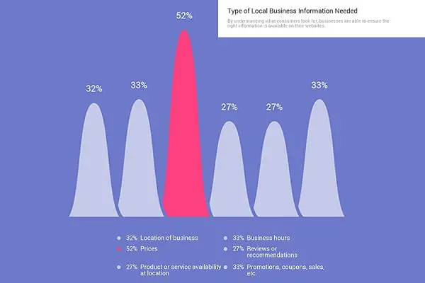
Source: Consumer Barometer With Google.
Therefore, make this information easy to find. It will be good for business. Some case studies show that almost 4 out of 5 local mobile searches lead to an offline sale.
7. Ask for minimal information on forms
Most users generally dislike forms. Especially if you ask them to fill-in 6-8 fields.
Try to keep it simple. Mobile is a medium of distraction, so don’t force visitors to perform complex tasks. Reduce your fields to a minimum and ask for only the essential information.
Get creative to make your forms more exciting. For instance, with Duda, you can integrate an online scheduling tool. It will enable your customers to set appointments from their phone. It reduces friction and is convenient both for your business and clients.
Figure out where you stand
If you’re unsure where your website stands in terms of mobile user experience, test it with these free tools:
- Google’s Mobile-Friendly Test.
- Mobile SEO tool by Varvy.
Crafting a great mobile landing page is about understanding and reducing perceived and physical friction. Hopefully, this article has opened new mobile optimization possibilities for you.
What do you think? Leave your opinion in the comments below.