Line25 is reader supported. At no cost to you a commission from sponsors may be earned when a purchase is made via links on the site. Learn more
Table of contents:
show
Grids give a website design structure and balance, but some grid layouts are more obvious than others. The most basic of grids is the square block, where the page is divided up horizontally and vertical with equally spaced gridlines. The content then fills the grid like a chequerboard pattern, or elements can span multiple blocks to form larger content areas. Today’s showcase features 30 perfectly balanced sites that are all based on a blocky square grid.
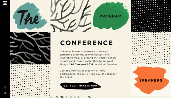
The Conference
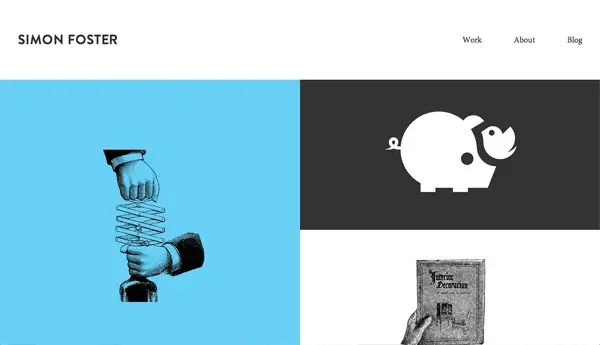
Simon Foster
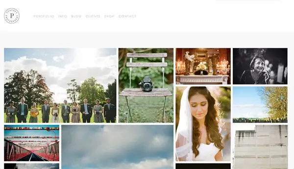
Peachey Photography
ELI
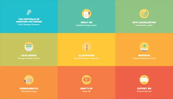
Jonathan Patterson
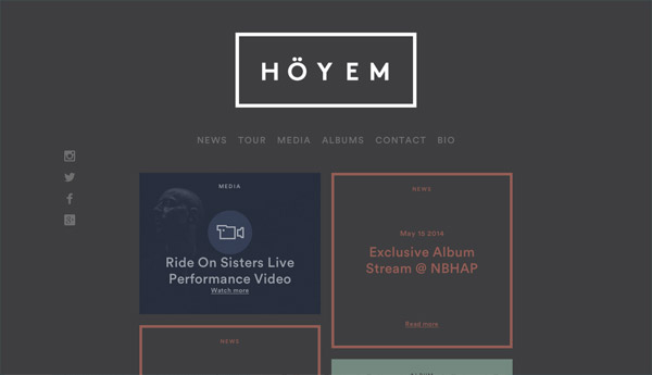
Sivert Høyem
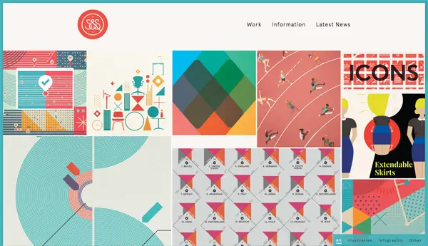
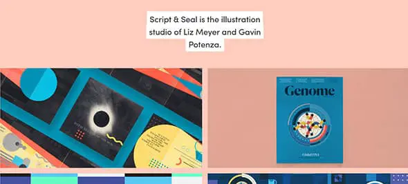
Script & Seal
Guy Moorhouse
PFD
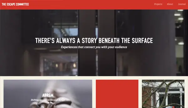
The Escape Committee
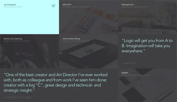
Jan Finnesand
Sebastian Sejer & Co
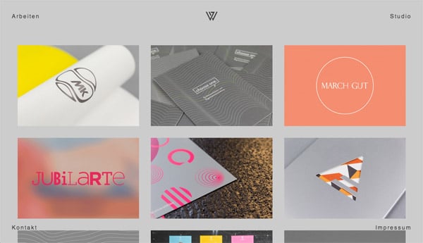
Julian Weidenthaler
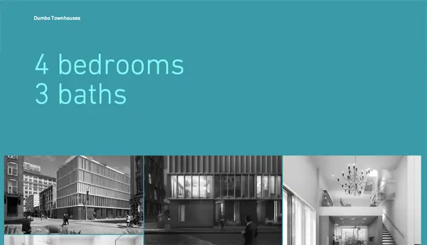
Dumbo Townhouses
WeLoveNoise
Float
Incredible Types
Etch
Hommard
adaptable
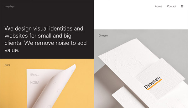
Heydays
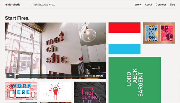
Matchstic
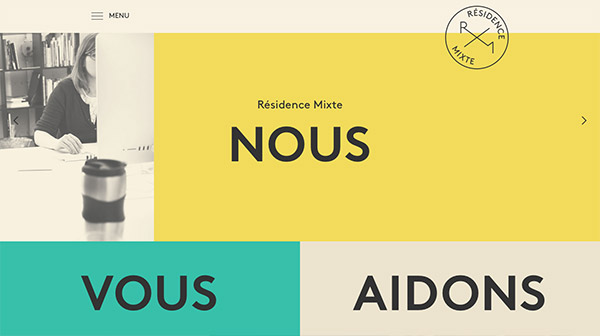
Résidence Mixte
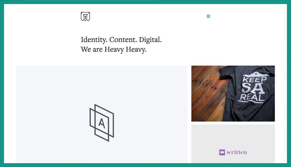
Heavy Heavy
Jonathan Da Costa
MAP
















its nice post.
yashasin azerbaycan
chox sagolun
These are so beautiful! Thanks for the share! Been looking for some inspiration for a new project fromBibble Studio and think I have certainly found a good collection
This is great! Love your roundups.
There some really good designs in this list. TFS!
Nice collection, Thanks for sharing!!!!
Inspirational designs, thanks for sharing!
https://k125.point-and-click.biz/
https://parsianmusic.eu/
https://golbarghosting.org/
This is really nice! thanks
Thanks for your good content. I hope good luck
Excellent collection. There is one mistake though: Arbeiten is German and means simply “works”. The site is called julianweidenthaler.com
Well spotted, “Arbeiten” is now the first German word I know!
Just updated the title of the link.