Line25 is reader supported. At no cost to you a commission from sponsors may be earned when a purchase is made via links on the site. Learn more
Slideshows are a great way of displaying your featured content in a compact space. The use of Javascript has enabled designers to enhance these slideshows with cool animations and effects. This post rounds up a collection of the most creative slideshows in web design, each one takes the core idea of the slideshow and adds extra elements and features to make it stand out as an inspirational design feature.
Mighty
This website belongs to a team of experts in strategy, digital content and technology and their website presents a vast series of slideshows which showcase their portfolio. As you scroll down the page, each content section has its own mini-slideshow which starts playing automatically. Each slideshow shows specific projects related to that section category.
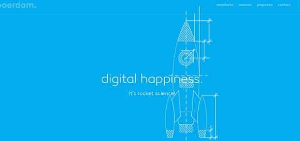
Boerdam
Boerdam comprises a slideshow made of both static images and animations which give it a more dynamic and professional look. The slideshow uses images and videos as well, plus as you scroll down the page you can see some modern, image galleries with a grid layout and other cool web elements. Check out the link above to see this slideshow in action!
Idioplatform
This is a platform for an artificial intelligence company. They also have a slideshow on their website that explains that Idio, the AI is able to do. The design has a simple layout and uses blurred images as backgrounds, combined with high-quality computer mockups to show a preview of what the tool does.
Fuzzco
Fuzzco uses a more sensitive approach in their slideshow. They’ve found a more creative way of presenting images and pieces of information to their readers through a vertical floating gallery. The website has a dynamic look, due to the subtle moving effect which the designer has added to the vertical gallery.
Archidirectors
This entire website is a slideshow that showcases the work of Frederico Babina, one of the most impressive contemporary illustrators. It takes a while to load the website, but it’s worth it! Beware, it has music integrated into it, but in this case, it is a really nice touch, adding a soundtrack to the cool illustrated story in the slideshow.
Hwo-architects
Hwo-architects website design uses a slideshow on their home page as a way of introducing themselves to their readers and future clients. The format of the slideshow is quite simple, but what makes it unique is the content! The photos are fun and have a GIF-vibe added to them.
Fantasy
Fantasy has a series of horizontal bands that combine animation with typography and simple, but effective call to action buttons. The background is simple, minimalist and the whole site is like a one-page slideshow which reveals itself as you scroll down the page.
Printmor
Printmor’s slideshow presents banners which offer available information about their services as a printing solution office. This slideshow is not as creative as the others from this list but shows another way you can use the slider for.
Thesearethings
This website’s slideshow shows some of their newest products such as key chains and enamel pins. What’s cool about this example is the subtle and cute glitter effect which is overlayed on the images in the slideshow. Did you notice it?
One Mighty Roar
One Mighty Roar uses a large horizontal background with white typography as a base for their slideshow. The images used in the slideshow are simple and follow the same theme. Also, they have a dark filter added to them which helps emphasize the white, bold font and the purple CTA button.
Team Excellence
This website’s slideshow is right under their menu bar and they use it to point out some important questions to their readers. It has a similar style to the slideshow presented above, but this one is not fullscreen and has a different format for the CTA button.
Designroyale
Designroyale’s slideshow presents projects they’ve work on over the time. It takes a while to load, but the loader icon has a unique design. You can also click the images to find out more about them.
Kellianderson
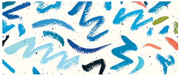
Kelli Anderson’s slideshow shows images from her latest articles such as experiments alive! This slideshow is very colorful and has a simple arrow navigation system. The website is filled with patterns, unique fonts, and cool hover effects.
Ecoforms
On this website, you’ll find a lot of information about sustainability. They also have a slideshow that present concepts of a healthy life. The slideshow has a simple arrow type navigation system.
COFA Media
COFA Media uses a vertical slider to present information to their readers. As you scroll, another piece of information slides up, covering the other. They also use very blurred images as the backgrounds, on which the designer also added some subtle textures, to make the texts pop out even more!
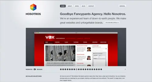
Nosotros
Nosotros also has a slideshow that presents some of the projects they’ve worked over the time. This slideshow has bullet navigation and a lot of different slides on which the company showcases their best projects and clients.
Jaxvineyards
This website’s slideshow presents images of Jax Wine community along with other information about the wine. It is a simple slideshow with fade transitions between each slide, plus a button-type navigation system.
Paper-leaf
This website’s slideshow is smaller and positioned somewhere at the middle of the homepage but lays out important information about Paper Leaf. Check it out!
Icon Designer
This website showcases the work of an icon designer in a vertical gallery of his latest pictograms. This is a vertical slideshow in which the designer showcases his best pictograms and icon sets.
Milky
Milky website has a nice slideshow of illustrations which give a friendly touch to their website. All in all, they’re a creative agency that focuses on innovative solutions which make their clients grow.

















complacent design but need of simple design because simple design these days accept .i agree this design article from .keep it up.thanks for sharing…
I couldn't get past the list because I'm now addicted to playing SPENT. :P
Thx for this amazing webdesign collection! But it's a little bit overloaded, dude!
Fuzzco really does it for me.. Nice!! Where do you find stuff like this..
Good blog
really useful resources. thanks for sharing
We are currently used one of left to right jQuery slide show. its best for stylish design. but mostly the slide has consume the page loading time.
I liked sliders but these should not be given more impotance than the overall design.
Really good list of new types of sliders in use. Always looking for the newest use of galleries
Awesome sliders!
Does someone knows a slider with a pause button ???
?
wow…really impress me….you just like have infinity inspiration…thanks for sharing this…
I couldnt see any slideshow on design by human website. or my browser does not support its script?
Loving the one mighty roar example. It's different from the usual slider transitions you see. JQuery is definitely the way forward!
I love these sliders, I use something similar on most of my sites. Long live JQuery, the heck with flash
Great collection Chris, gonna be using this as a source of inspiration.
Thanks for sharing- great collection.. keep it up :D
looks like i need to learn jquerry hah
Very nice selection, definitely get some ideas here, thanks for sharing.
Some great examples of jQuery Sliders, I love the one-mighty-roar slider!
BTW: would like to know what you think of my jQuery Slider:
https://www.gonzodesign.nl
Yep, I love jQuery and especially the photo-sliders. Thanks for sharing .., Cheers & Ciao ..
grt one awesome
Thank you for this very useful round-up – bookmarked! It's great to see examples in real working contexts.
very nice collection… hope we can see some tutorials based on these also… cheers!
Some really nice examples, my favourite is https://adifferentdesign.be/ where the background moves as well. Looks very effective.
The only one I like is Cofa Media the other ones not really sure why you find them so creative
Hi man, I think its a matter of personal taste…
I really like One Mighty Roar.
I think they made great use of the slider there.
Chris, if you dont mind, I'd suggest also adding the new nike LP to this collection – https://www.nikebetterworld.com/en
Where the whole page is one big slider.
You're just sad. :)