Line25 is reader supported. At no cost to you a commission from sponsors may be earned when a purchase is made via links on the site. Learn more
Remember when websites used to feature Flash intro videos as part of a splash page? These days video use in Web Design is much more creative (and UX friendly!) with many sites using video to provide an introduction or a tour of their product or service.
Following on from our recent showcase of websites featuring full-screen videos, today’s post looks at the sub-trend of intro videos in web design. HTML5 and jQuery make it easy to add dynamic video content to your site without bogging down the browser with Flash. This means designers can start to play with video as part of a website design as well as its content.
The websites below are varied. We selected portfolio websites for video producers, official presentation websites for popular movies, websites for TV shows, websites showcasing TV ads for popular products, or simply websites that use videos in an interactive, unique way.
This post is a round-up of some great examples of video intro use in modern web design, with these designs using video as embedded objects or as lightbox-style popups with the help of Javascript.
Intro Video Web Design – Creative Examples
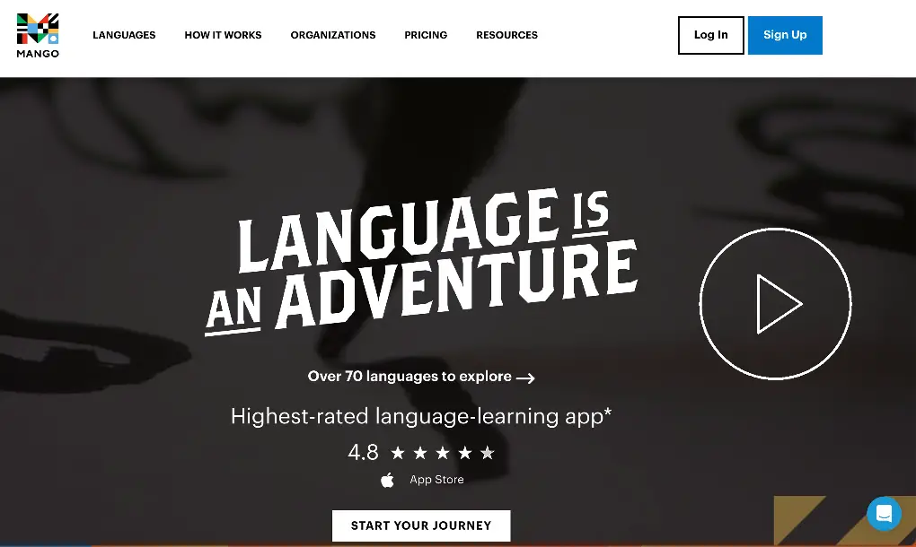
Mango

This is a lovely app landing page with a user-friendly design. It includes neat features and a beautiful layout that you can use as inspiration for your next projects. Click on the play button to watch the presentation video which will guide you through the most important aspects of this awesome app.
Purple.com
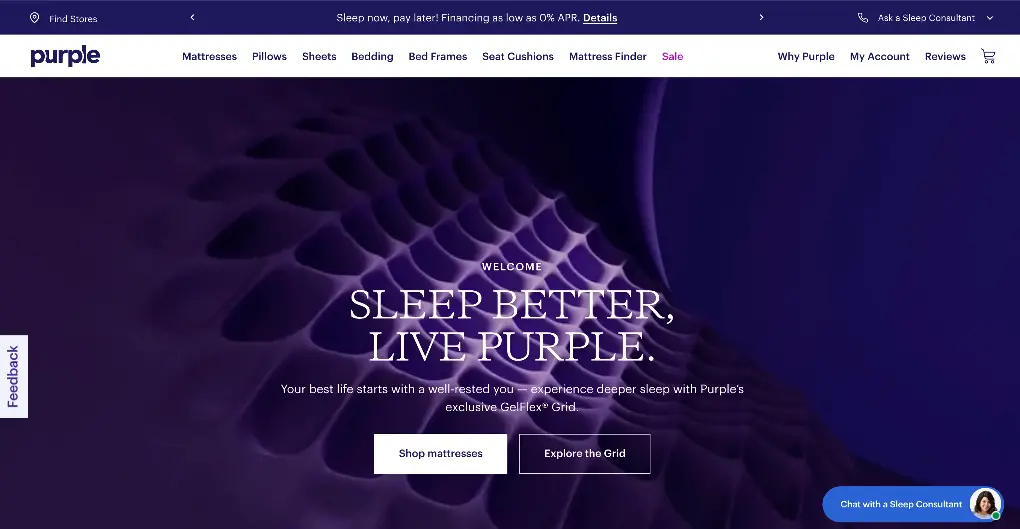
The popular bed manufacturer Purple.com has an outstanding example of an intro video. Instead of a hero image that occupies the main top portion of the homepage, Purple uses a high-quality video to introduce it’s visitors to their brand and products.
Nest
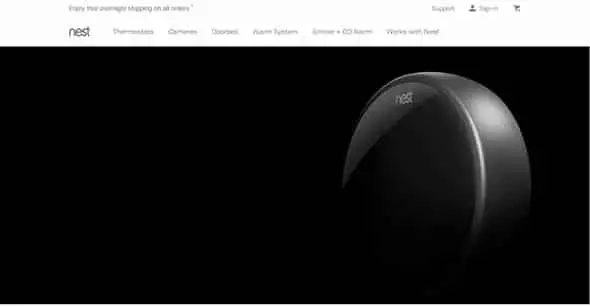
This is the presentation website of a hi-tech company that offers smart thermostats, smoke & carbon monoxide alarms, and security cameras. The presentation video is perfectly embedded into the homepage design.
Paper
Paper is the easiest and most beautiful way to create on the iPad and iPhone. This awesome app was created by the FiftyThree team that builds tools for mobile creation.
REUTERS TV

This is a simple website with a fullscreen video. It’s clear, effective, and exactly what the visitor is looking for. The video starts automatically and guides the user through the content of the site.
Control Films

Control Films is a commercial and music video boutique production company based in Paris. You should check out the awesome way videos were integrated into this website’s design.
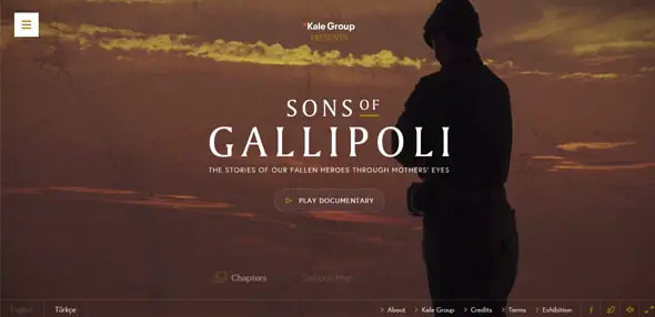
Sons of Gallipoli
This is the official website for an interactive documentary that follows the stories of two mothers – one Turkish and one Australian – as they contemplate the World War One Battle of Gallipoli on the 100-year anniversary.
Inspiro
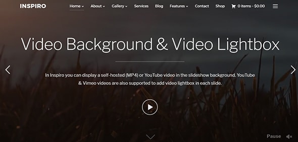
Here you have a professional WordPress theme that includes the following features: a lovely fullscreen slideshow, many widgets, and more. You can click on the large video play icon to see the whole presentation video.
Divi
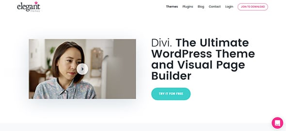
Divi is a wonderful WordPress theme that comes with 18 pre-designed layouts that you can customize until they meet your requirements. Divi 3.0 is the latest version of this popular high-performance WordPress theme.
Popular from its initial launch because of its modern and innovative features, Divi’s sales increased dramatically with the introduction of Divi Builder in version 2.0. This frontend Divi Builder’s interface has been significantly upgraded in Divi 3.0 with the ability to produce live responsive previews anytime during the design process. Divi 3.0 is a high-quality, premium theme, in all respects.
Animoto
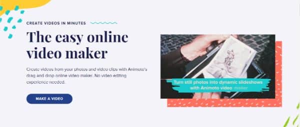
This is a wonderful website for creating videos. On its homepage, it creatively displays the features it provides for creating videos.
iA Writer

This is a tool that helps writers get focused and get started, by removing all distractions and creating a calm, focused, writing space. On the homepage, there is a simple and straightforward CTA to watch the presentation video for this app.
Sir John A Day
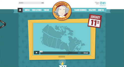
This is a bilingual educational website to teach Canadians about their first Prime Minister, Sir John A. Macdonald. The website invites Canadian students and educators to explore the legacy of the Fathers of Confederation and Sir John A.. The video player has a custom design which is in theme with the whole website.
Hackery, Maths & Design

The fun 3D animation appears while the website is loading. It has a fluid design with lots of creative effects and animations. Click on the video play icon to see the whole presentation video. Also, make sure you notice the cool effect that appears when you move your mouse on the Play icon. The whole website design is animated and interactive.
Starved for Attention
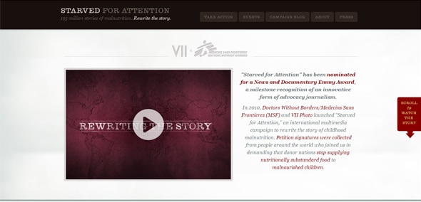
Worldwide, there are over 195 million stories of malnutrition. Starved for Attention underlines how increased childhood sickness and early death can be prevented with effective nutritional interventions. Their website is straightforward and effective.
Union Station Neighborhood Co.
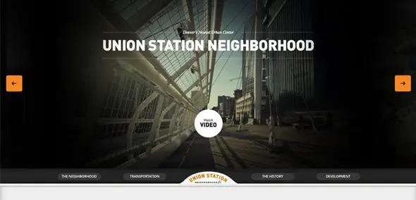
This is Denver’s Union Station site, a station that accommodates nine types of pedestrian traffic, RTD regional buses, intercity buses, light rail, etc. Their presentation website uses a large video slider on the homepage.
Social Design House

This is the presentation website of a full-service design studio located in Rock Hill, SC. It has a cool video right on the homepage and lots of bright, vibrant colors.
The | Marmalade

This is the presentation website of an internationally acclaimed commercial film production company and a highly experienced post-production house. Scroll down and you’ll see their intro video.


I want to make educational tutorial for mobile, what will be the best solution?
It's amazing. Where did they take these ideas?
Thanks for sharing.
Cool intro videos and the interface makes it more interactive.
for a single portofiio, its good idea to attract your audience, but i dont think so , you can adapted this for blogs or websites
Thanks for this post, nice to see something a bit different in an example-based article than another "isn't this website pretty!" post. We'll definitely be visiting your blog again!
Nice collection! Thanks for sharing :)
Very true as Videos are considered as one of the best methods for communicating with audiences.The visual impact created by videos can often be creatively used to reach out and capture the imagination of a wide audience.
Bolstering your business website with videos can help draw traffic from different platforms, like YouTube and Tumblr, as opposed to search engine query results. I say, if you have the content budget and something interesting to share, absolutely go for it!
Thanks for the inspirational examples,
Sarah Bauer
Navigator Multimedia
Very inspirational post! There are pros and cons of video that I see many others already commented on, but I say video is more interesting than anything else on the Internet, so why not throw it on a homepage?
Hey excellent post. Really helpful in designing a web site having intro videos. These looks very attractive and interesting. Thanks for sharing it.
This is a great list. Makes me wounder how we might be able to better integrate video into our homepage.
Personally my two favorite examples are the St Johns and Union Station. Very Nice sites.
The thing about splash/intro pages is that they often drove away traffic. Putting these videos somewhere on the side of the content can actually help the site gain traffic.
I love the Social Design House one, really makes me want a donut. Great list.
My thoughts exactly, great video on the SDH website :)
I think videos are good but some are over used you have to consider when and where they are being used. If they are viewed in a office with mute on the impact can be less. So they are good for a first impression but shouldnt take away from the rest of the site
Yes- videos are much more UX friendly but since it is easier to use some sites overused it- Your samples are very nice
I wish I could see the videos. I'm currently behind a firewall, and so the videos won't load. However, if the content of those videos is as amazing as the websites they're on, then they're probably pretty awesome.
Those websites are gorgeous. (Never thought I'd say that about a website).
ditto on the sites…
A very unique aspect of website designing has been featured in this article.Great job Chris!!!
I agree, it's all about choice. Just because we can push HD video with ease due to increasing broadband speed and the near event of 4G, it doesn't mean we should neglect the users preference. Choice is important.
Some great videos though!
CHOP CHOP CHOP in important rural areas.
Videos are not even worth the effort here.
I can't help but cry discrimination and Bahhh humbug.
I guess these are great for the city, where the chances are greater you can be tracked, no matter what you do, because of unbridled, nonprivate technology.
Great display here.
Jees…sorry so glum.
I just wish I could watch without constant streaming interruption….
Great list of sites and nice videos! Really inspirational. Thanks for sharing.
I thought that the FiftyThree video was going to play on the iPad, that would have been cool, especially with the 100% image background.
I've bookmarked this page!
Yeh video has certainly moved on from the wait and load days. Giving people the option to watch or not is the key for sure. Quite liked the pocket film.
Awesome list of collections.