Line25 is reader supported. At no cost to you a commission from sponsors may be earned when a purchase is made via links on the site. Learn more
Websites have maximum opportunities on the homepages. So while designing a homepage, the first thing you work on is the hero image. Now, what is a hero image? The hero image is a specific type of website banner that is usually larger than any other image and placed on the website’s topmost part. So right under the header section or behind the header section, the image you see is the hero image of a website.
The hero image is the first visual of a website that your visitors are going to see. And therefore, it is responsible for the visitor’s attention and engagement. When it comes to designing a hero image, there can be multiple factors and aspects a designer needs to follow. If he or she fails to deliver the optimum hero image, the whole website may suffer. And that’s the last thing any brand wants.
So, to make sure you design the most competent hero image, we will discuss 12 things not to do while designing a hero image. These tips are highly important for those who want to avoid any disaster and are determined to create the best of their work. So let’s get into the details.
1. Too Generic Design:
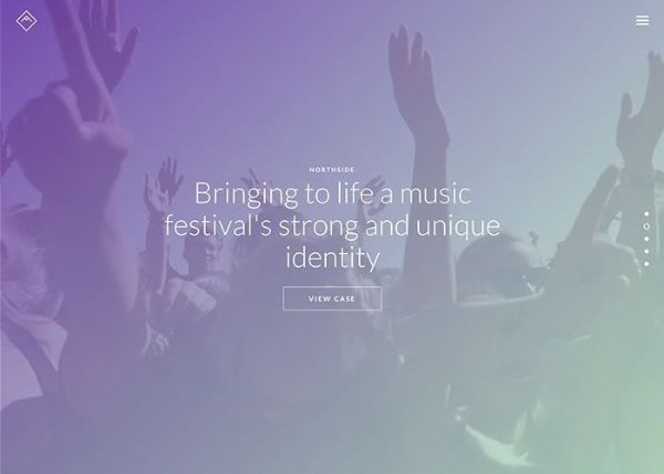
The most common mistake you can make is come up with too much generic design. Unique and captivating design is expected from you as a designer. Still, for any reason, if your hero image is not different and eye-catchy, then brand and audience both would be very disappointed. If you are making something similar to the competition or using common layouts, trends, and colors, then your hero image can not create a prominent impact as it should.
So do not overuse some designing dynamics and work smarter with your design. Even if you are designing a hero image by taking some other image as an inspiration, try to be very careful and create something of your own instead of following that inspiration blindly.
2. Overcluttered Image:
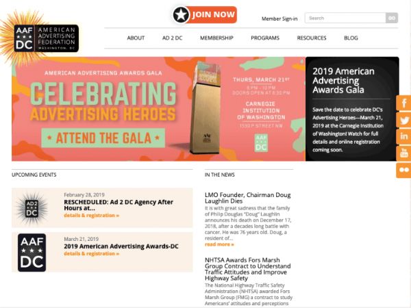
A hero image has a lot of pressure to execute multiple elements, and therefore it is more likely to get overburden sometimes. With colors, images, content, CTA, animation, and many other designing elements, designers have to be completely balanced and aware of every decision.
Considering all the parameters, you need to focus only on the most crucial elements. For example, a clean and striking hero image can benefit the website on a grander scale, but an overcluttered design can make the visitors uncomfortable and unfaithful towards the website.
When the audience observes a complex hero image where the purpose and message are not clear to them in the initial few seconds, then they most probably consider switching to another site. This can be the most expensive mistake for a brand and designer as well, so keep it balanced, straightforward, and attainable for your audience.
3. No Clarity On CTA:
CTA is the most crucial part of a hero image. A hero image must have an appropriate CTA button along with the brand, product or service, and unconventional tagline. After checking the brand and products, you have to denote what your customers are supposed to do.
They should have a clear message from the website about what you want them to do for further steps. If your CTA section is not there or it is confusing and not making the audience clear then, you can lose potential leads and engagement from your visitors.
CTA has a vital purpose, and to reminds your visitor about their input, it should be very well inculcated in a hero image to complete the process. So never make your CTA button unreachable, misplaced, wrongly designed, or neglectable.
4. Misleading Content:
Hero image can not lie or misguide the audience about anything. It’s the first impression of your website, and that’s why it has to be completely unique, honest, and valuable. If you are using wrong links or vague content on the hero image, your visitor can get wrong information and a bad impression about your website. For ideal audience behavior and action, you have to study every factor thoroughly.
You need to understand your audience and their understanding level very well so that you can build a perfect hero image. On the other hand, a lethargic hero image with half information, confusing design, and misleading links can take the whole website performance down. So try to avoid such mistakes and strictly analyze your hero image before making it live.
5. Use Of Templates and Stock Image:
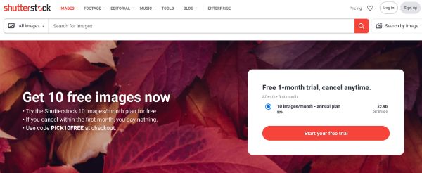
Online sites are packed with beautiful and creative stock images and templates that can make designer’s work a lot easier and better. They are the quickest solution for creative needs and ideas; therefore, designers use them mainly in their projects. But if you are making your hero image solely on the basis of templates and stock images, then that would be the case of the distasteful design of a lazy designer.
Abrupt and weak concepts on the irrelevant templates, low-quality stock images, or chaotic combinations can not make a great hero image. Your designing skills and brand’s image can both be in danger, and that’s something you should take care of smartly. So take the help of stock images and templates but with proper research, correct licensing, and creative ideas of your own.
6. Too Loud Colors:

For a hero image, color contrast, brightness, and hue combinations matter the most. A perfect color pallet and proper contrast can change the entire look of a hero image, and therefore having the proper knowledge of color theory is necessary for designing. In the process of creating an attractive hero image, sometimes you tend to use too many colors, harsh colors, or unacceptable colors in your design which can distract the audience instead of attracting them.
High contrast levels and loud color combinations can drain value from other designing elements as well, and without solid attention, this is a very easy mistake to make. So take different color choices into consideration, take other’s opinions, and check the same color ratios from different screens to make sure your design doesn’t cross the ideal color contrast level.
7. Not Thinking About Website Performance:
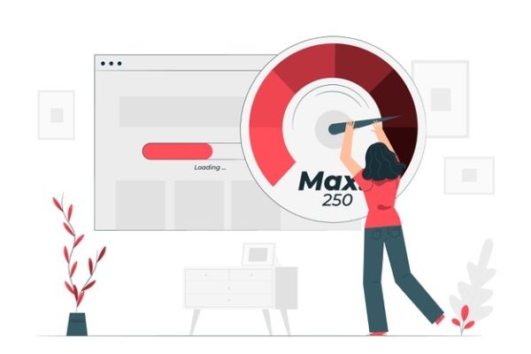
If you are using heavy images, large files, and complicated structure, some way or the other website performance can also be affected. Because due to large-sized hero image website might take a longer time to load than usual, and if it’s happening, then for the bounce rate, your hero image can be a crucial reason. That is why it’s better to get perfect technical data before designing and making different-sized images is also suggested.
Try to make sure your image is complying with the technical website requirements and it’s not affecting website performance on any level. For a great design, you as a designer should also keep concerned with the website performance to contribute the most.
8. Outdated Elements:
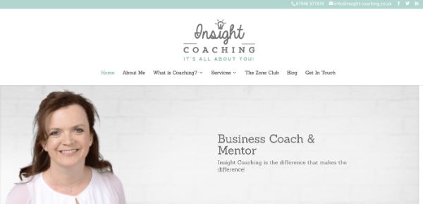
Every element should be carefully designed and placed to make a compelling and impactful hero page. And for that, you have to invest sufficient time and energy into research, planning, procuring, designing, testing, and finalizing. When you are deciding on the various designing element and not justifying the latest marketing trends and futuristic concepts, your design can start looking outdated very quickly.
It shows half-cooked knowledge and weak designing skills, which can not bring any profit to a designer. So take in-depth research and collect the most beneficial and latest elements that can help you to design your own designing elements for a brilliant hero image. And do not avoid any small to large market trends for any reason.
9. Not Creating Multiple Options:

The design you have created can be the most satisfying design, and it can surely fulfill the objectives but not creating other options can be a bad idea. How do options help? They expand the creative horizons and make the selection process even better. Giving more than one option can help your client to pick the best one without expecting much and giving unnecessary changes.
It is a simple psychological trick and very much beneficial as well. You also get different perspectives about your design and give the best of your work. At the same time, your client and the brand get the most prominent design by trying and checking all the hero image options.
10. Not Considering Tests:

Testing is an essential part of designing. When you are working with a brand on the highest professional level, you have to deliver the most optimum output. And for that, you should get real-time results from the audience by testing them on different designs. A/B test always helps in this kind of scenario, and most designers use this only to finalize the ultimate design.
Getting down to two significant designs and letting the target audience pick the final one is a fantastic solution for design confusion. And it is a common practice as well among designers because its a feasible and creative way.
Without tests, you can never know for sure about your audience’s behavior before making it live. This can sometimes be risky for the website and the design, which can be avoided easily with tests.
11. Not A Responsive Design:
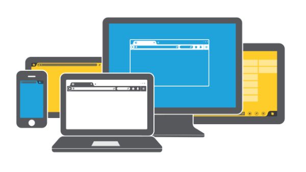
The website has a presence on every type of device. And that is why website designers always tend to make a responsive layout that can serve consistency on every type of device screen. So if your hero image is not a part of that policy, then it would not be the same on every device. There can be some glitch or usability issue on every device screen.
The designer has to keep in mind all the device’s screen sizes before creating a hero image because, just like a website, it has to serve the audience the best experience. And if you are not considering this factor or unable to provide consistency on every screen, then the website and your design can suffer a lot with the loss of audience.
12. Without Potential Keywords:

SEO practices support websites to achieve maximum leads and engagement, and that includes well-researched keywords in the content part. So everything you design for a website should help the website in achieving great SEO results. However, there is only a small section where the content takes place when it comes to hero images.
And if that primary impression of your website doesn’t have any potential keywords, then that would weigh down your design. But, in the end, the brand wants results, and because a hero image carries a huge responsibility, it is one of the crucial elements that should have smart technicalities.
Apart from the creative designing contribution, you need to add some knowledgeable efforts as well to ensure the end results. So make sure you get the correct keyword data and add it to your design smartly to make your design SEO friendly.
Hero images are the first impression that tells everything about your brand in a single image. Creativity and intelligence both have to be present in the hero image to fulfill the objective successfully. You can take suggestions and contributions as much as you want, but your design should be unique and well organized to represent the brand in the end.
Website design, branding design, marketing strategy, and every other small creative element should have their flavor in your hero design. Because it is that preliminary design representing everything about your brand, products, quality, customers, and approaches on the online platform, which is why it calls a hero image. So believe your instincts and try to follow all the tips mentioned above to create the best hero image for your client.
