Line25 is reader supported. At no cost to you a commission from sponsors may be earned when a purchase is made via links on the site. Learn more
You need attendees if you want a successful event. Nowadays, it’s easy to create an event on Facebook and invite people there. Yet, if people click ‘yes’, ‘no’, or ‘maybe’, that doesn’t show the actual attendance.
Even websites are willing to provide users with general information, give them event education, and the reason for actually having the event. Plus, an even website piques the potential attendees’ curiosity. If the website is great, it will make all these things possible and even convince people to register.
Your site has a large role when optimizing the conversion rate. A conversion rate is the % of visitors’ actions on the website. For example, Conversion rate % = (Registered people / Website visitors) * 100. Some people visit the website: some of them take some action, some don’t. Some of them become subscribers, customers, and registrants. However, big percentages of them don’t.
It is easier to increase the event conversion rate instead of increasing your website traffic. That’s the reason why event organizers must make sure they create great pages about event registration. If they don’t, they’ll just be wasting their time.
Although your website is well-designed and maybe has an event booking plugin installed, you shouldn’t focus only on the design. Make sure you use the various tips and tricks to convert your visitors. We provide you with some tips to create an engaging website and get your potential visitors.
Do not forget the 8 seconds rule.
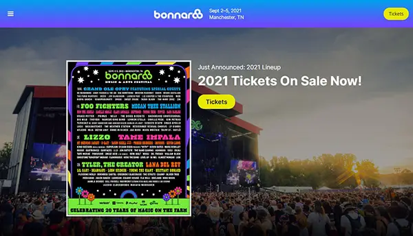
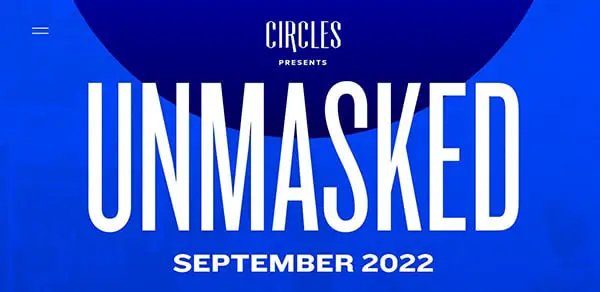
Keep in mind the rule where you have 8 quick seconds to get a visitor’s attention. A study has proven that users bounce from one website to another quickly. So that, it’s essential to keep your event’s preliminary information visible, clear, and in the center. Ensure your website’s landing page is easy to read and important info to be found fast. There is a tiny opportunity window to engage users when they visit your site, making those seconds worth it!
Here’s what you need to display and allow users to find what they are looking for on the website in just 8 seconds:
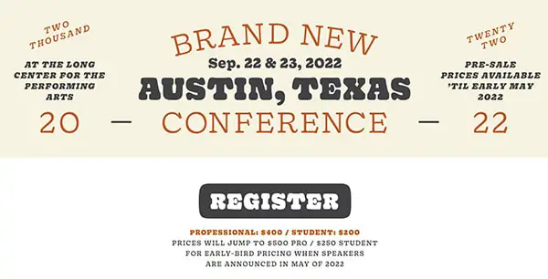
- Descriptions, Event Name, and agenda
- Sign up buttons should be clear, simple, and large
- Make sure the cost is visible and registration types
- Make sure you use great images and a call to action.
- Time, Location, and Date
- Put audio, video, or other content that visitors can interact with
- Include exit-popups animated to bring visitors who already lost interest in your website
Make it exciting and creative.
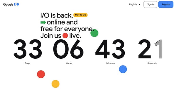
If there is a proper visual hierarchy on the website, it will guide your visitors’ thought patterns quickly and make them find the info they need.
Low-quality images can make a blog post or a page look bad. Make sure you don’t use bland photos or stock images. Studies found that 60% of online consumers like search results that include pictures, and 23% are more likely to get in touch with a business if there is an image of a human being. Plus, including 3D elements on websites, offering entertainment, presenting products better, and giving overall better UX.
If you want to have a great website and get more users to register, then adding video is great for doing it. According to a study, adding a video to your website landing page can increase by 80% the conversions.
Utilize Whitespace
Whitespace is a negative space in web design. A positive space is a place that contains all the site elements. It’s not good if your website visitors need to look for your website’s call-to-action button, they won’t be thrilled. Here is quite a good example: When visiting a website to buy tickets, you cannot find the “Buy tickets” button. You will immediately leave the website, won’t you?
Whitespace is an essential element in web design, but too much can create a disconnect between the actionable and supporting content. You should pay attention to using whitespace on your website because they need to keep everything there scannable, easy to read, and legible. Plus, it will lead to generating more conversions.
CTA or call to action
A well-designed site should have a call to action. When visiting your website, visitors have to know what to do to register for the upcoming event. Include a call to action button to provide users with explicit instruction. Now, to make CTA different, there are some options that you should consider using when adding a button on your website:
- “Sign up Today”
- “Get Tickets”
- “Register Now”
- “Get a 10% discount on our events.”
- “Start Your Free Trial Today”
Use Different Colors
Combinations of different colors evoke various reactions and emotions. Make sure you choose a color scheme combination that will provoke emotions in visitors. When speaking of website colors, they are pretty often an underrated aspect in web designing. Yet, it plays quite an essential role in the overall website mood.
Applying powerful colors to your website will bring you event registrations. Keep in mind the use of soft tones ( if women are the target audience) and bright colors (if your audience is represented by men). It would be best to use dark text should be on a light color background because it is easier to read. Also, avoid cool fonts just for the sake of being cool. Use readable fonts adapted for your audience.
Mobile Friendly
Today, most people use mobile devices, and 80% of people are using them. What does this mean? It means that visitors will see your event’s website from their smartphones. Each website must be able to view from a smartphone or tablet. In that way, users can see and get the info they want at the moment. Also, security is essential for consumers.
It is up to us if some website gets a maximum conversion rate. We are the visitors. That’s why an event website provides users with the info they want to know.