Line25 is reader supported. At no cost to you a commission from sponsors may be earned when a purchase is made via links on the site. Learn more
Follow this step by step process to create your own stylish contact form completely out of HTML5 and CSS3. We’ll be using a couple of the handy new features in HTML5 to add cool functionality to our form, while making use of cool CSS3 properties to recreate our Photoshop concept purely in code.
The design we’ll be building features all the things that make a rich interface; gradients, highlights and shadows! We’ll create a visual concept in Photoshop first of all, but when it comes to building the form we’ll recreate every effect with HTML5 and CSS3.
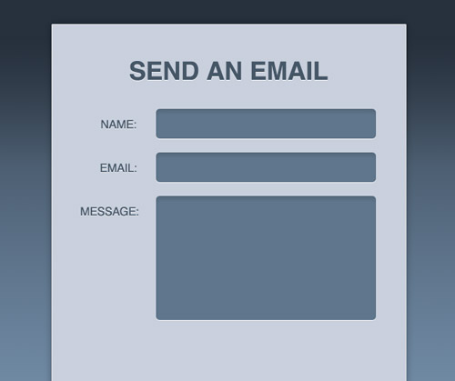
The PSD Concept
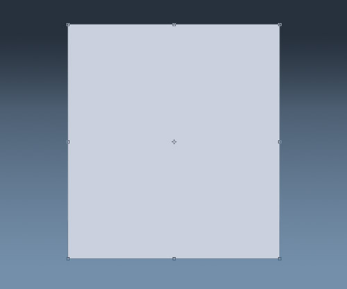
Open up Photoshop and create a new document. Add a dark to light blue gradient to the background, then draw a rectangle in the centre to contain the form.
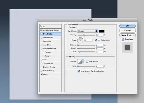
Use Photoshop layer styles to add a subtle drop shadow at around 30% opacity and a thin 1px stroke using a very light grey.
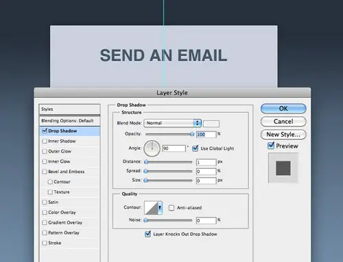
Add a title to the design using the darker blue colour swatch. Spruce up this text with a inset effect by tweaking the Drop Shadow settings to create a 1px light grey outline along the bottom edge of the text.
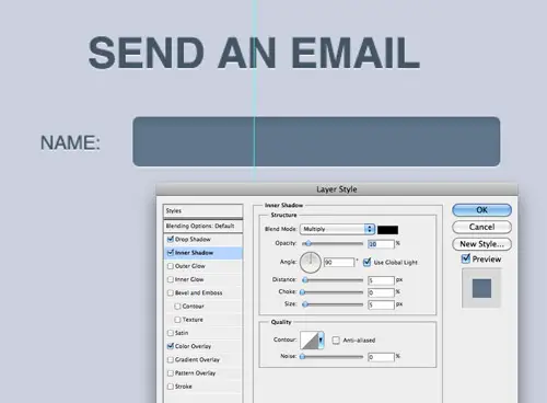
Use the same font styling on each of the labels, then draw a rounded rectangle with 5px corner radius to create an input field. Add a soft Inner Shadow to add depth to the design.
Copy the elements to lay out the form with a series of input fields, then a slightly larger text area.
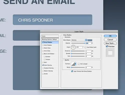
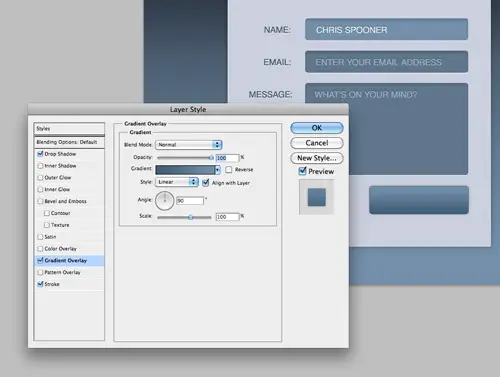
Modify one of the input fields to visualise how the field would look when in use. Give it a lighter blue colour overlay and style up the text with an inset shadow. Use the Drop Shadow feature so the shadow appears on the outside of the text (not the inside as Inner Shadow does). Remember to uncheck the Use Global Light option so the -90 degree angle doesn’t also affect all the other gradients.
Add lines of text inside the other fields to represent the placeholders, but give them a darker blue fill to lower their contrast against the input fields.
Draw a smaller button shape with the rounded rectangle tool and style it up with a gradient, thin 1px stroke and a subtle shadow.
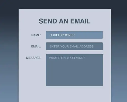
The visual concept is now complete. We won’t be using any of the graphics as background images, but the PSD will be handy to refer back to for Hex colour codes when recreating the design in CSS.
The HTML5 Structure
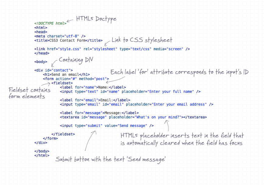
Every web project starts with the HTML structure. Here we’ll be using some fancy HTML5 features to spice up the design. Lay out a basic document structure with Doctype and CSS stylesheet link. House the contact form inside a contaning div so we can centre it up in the demo. Each label element should have a for attribute that relates to an ID of each input field – This boosts the accessibility of the form and allows the user to click the label to activate the correct field.
One new HTML5 feature we’re making use of is the placeholder attribute. Simply enter your desired message and it will appear in each field, when the user has focus on that field the text is automatically cleared. This feature is currently only supported in Safari and Chrome, but is soon to appear in Firefox4.
The CSS Styling
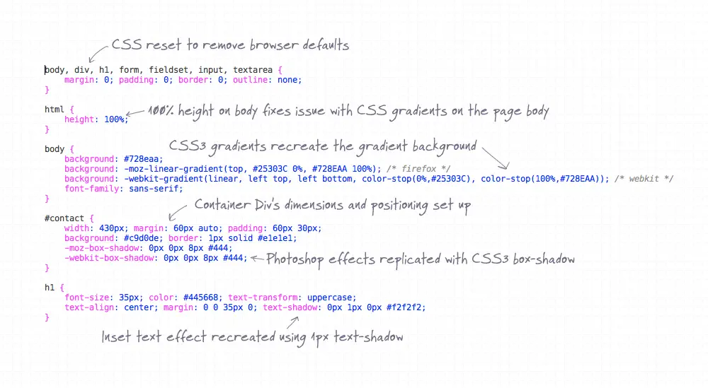
The CSS stylesheet first sets up the basic document with a reset to remove any browser defaults, then the body is given the blue gradient using CSS3. Currently different code is required for Webkit and Mozilla, but the handy CSS3 Gradient Generator website helps save time.
The containing div is given specific dimensions and centred up using margin: 0 auto;, then the shadow and stroke from Photoshop is replicated using box-shadow and a border.
Basic CSS font styling matches up the text to the concept, then the CSS3 text-shadow property replicates the inset text effect by adding a 1px highlight to the bottom edge.
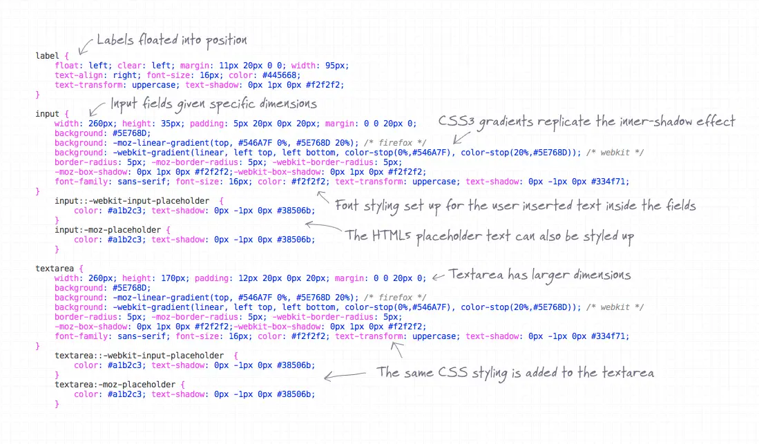
Continuing on, the label elements are given similar styling to the h1, then the input elements are styled up with dimensions and padding to match the Photoshop concept. CSS3 gradients come into play once again to recreate the inner shadow effect, simply adjusting the location of the gradient handles can create the impression of subtle shading.
The HTML5 placeholders can also be targeted using vendor specific CSS for both Webkit and Mozilla. The colours for these placeholders are colour picked from the PSD concept.
The CSS used on the input elements can be copied directly onto the textarea, the only difference being the larger height dimensions.

To give the user visual feedback when the input elements are active, the :focus pseudo selector can be used to give the fields different CSS styling. Here the CSS3 gradients are adjusted using lighter blue colours.
The submit button will currently be styled with the generic CSS used on the input fields, so to target this field in particular the [type=submit] advanced selector is used to attach unique styling to this element in particular. Such styling includes a different width and height, a new gradient background, a subtle box-shadow and a thin 1px border. cursor: pointer; is then added to make the button seem clickable by displaying the ‘pointer’ style of cursor when the element is hovered.
The Complete Code
HTML
<!DOCTYPE html>
<html>
<head>
<meta charset="utf-8" />
<title>CSS3 Contact Form</title>

<link href="style.css" rel="stylesheet" type="text/css" media="screen" />
</head>

<body>

<div id="contact">
	<h1>Send an email</h1>
	<form action="#" method="post">
		<fieldset>
			<label for="name">Name:</label>
			<input type="text" id="name" placeholder="Enter your full name" />

			<label for="email">Email:</label>
			<input type="email" id="email" placeholder="Enter your email address" />

			<label for="message">Message:</label>
			<textarea id="message" placeholder="What's on your mind?"></textarea>

			<input type="submit" value="Send message" />

		</fieldset>
	</form>
</div>

</body>
</html>
CSS
body, div, h1, form, fieldset, input, textarea {
	margin: 0; padding: 0; border: 0; outline: none;
}

html {
	height: 100%;
}

body {
	background: #728eaa;
	background: -moz-linear-gradient(top, #25303C 0%, #728EAA 100%); /* firefox */
	background: -webkit-gradient(linear, left top, left bottom, color-stop(0%,#25303C), color-stop(100%,#728EAA)); /* webkit */
	font-family: sans-serif;
}

#contact {
	width: 430px; margin: 60px auto; padding: 60px 30px;
	background: #c9d0de; border: 1px solid #e1e1e1;
	-moz-box-shadow: 0px 0px 8px #444;
	-webkit-box-shadow: 0px 0px 8px #444;
}

h1 {
	font-size: 35px; color: #445668; text-transform: uppercase;
	text-align: center; margin: 0 0 35px 0; text-shadow: 0px 1px 0px #f2f2f2;
}

label {
	float: left; clear: left; margin: 11px 20px 0 0; width: 95px;
	text-align: right; font-size: 16px; color: #445668;
	text-transform: uppercase; text-shadow: 0px 1px 0px #f2f2f2;
}

input {
	width: 260px; height: 35px; padding: 5px 20px 0px 20px; margin: 0 0 20px 0;
	background: #5E768D;
	background: -moz-linear-gradient(top, #546A7F 0%, #5E768D 20%); /* firefox */
	background: -webkit-gradient(linear, left top, left bottom, color-stop(0%,#546A7F), color-stop(20%,#5E768D)); /* webkit */
	border-radius: 5px; -moz-border-radius: 5px; -webkit-border-radius: 5px;
	-moz-box-shadow: 0px 1px 0px #f2f2f2;-webkit-box-shadow: 0px 1px 0px #f2f2f2;
	font-family: sans-serif; font-size: 16px; color: #f2f2f2; text-transform: uppercase; text-shadow: 0px -1px 0px #334f71;
}
	input::-webkit-input-placeholder  {
    	color: #a1b2c3; text-shadow: 0px -1px 0px #38506b;
	}
	input:-moz-placeholder {
	    color: #a1b2c3; text-shadow: 0px -1px 0px #38506b;
	}

textarea {
	width: 260px; height: 170px; padding: 12px 20px 0px 20px; margin: 0 0 20px 0;
	background: #5E768D;
	background: -moz-linear-gradient(top, #546A7F 0%, #5E768D 20%); /* firefox */
	background: -webkit-gradient(linear, left top, left bottom, color-stop(0%,#546A7F), color-stop(20%,#5E768D)); /* webkit */
	border-radius: 5px; -moz-border-radius: 5px; -webkit-border-radius: 5px;
	-moz-box-shadow: 0px 1px 0px #f2f2f2;-webkit-box-shadow: 0px 1px 0px #f2f2f2;
	font-family: sans-serif; font-size: 16px; color: #f2f2f2; text-transform: uppercase; text-shadow: 0px -1px 0px #334f71;
}
	textarea::-webkit-input-placeholder  {
    	color: #a1b2c3; text-shadow: 0px -1px 0px #38506b;
	}
	textarea:-moz-placeholder {
	    color: #a1b2c3; text-shadow: 0px -1px 0px #38506b;
	}

input:focus, textarea:focus {
	background: #728eaa;
	background: -moz-linear-gradient(top, #668099 0%, #728eaa 20%); /* firefox */
	background: -webkit-gradient(linear, left top, left bottom, color-stop(0%,#668099), color-stop(20%,#728eaa)); /* webkit */
}

input[type=submit] {
	width: 185px; height: 52px; float: right; padding: 10px 15px; margin: 0 15px 0 0;
	-moz-box-shadow: 0px 0px 5px #999;-webkit-box-shadow: 0px 0px 5px #999;
	border: 1px solid #556f8c;
	background: -moz-linear-gradient(top, #718DA9 0%, #415D79 100%); /* firefox */
	background: -webkit-gradient(linear, left top, left bottom, color-stop(0%,#718DA9), color-stop(100%,#415D79)); /* webkit */
	cursor: pointer;
}
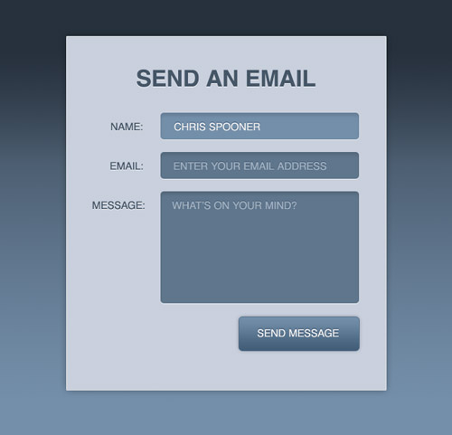
The Final HTML5/CSS3 Form
Preview the final web page in your browser to see the form completely rendered in HTML and CSS. Browsers such as Safari and Chrome will see every detail, whereas Firefox won’t see the placeholders until the release of Firefox 4. The styling will slowly degrade as we go through Internet Explorer until we see a basic and flat form, but the overall functionality is still usable and accessible.
Comments are closed.