Line25 is reader supported. At no cost to you a commission from sponsors may be earned when a purchase is made via links on the site. Learn more
If you’ve yet to get your hands dirty with media queries, now is your chance to create your first responsive website design. In this tutorial we’ll look at converting one of my previous WordPress theme designs into a responsive layout, while taking into consideration the design’s original grid structure.
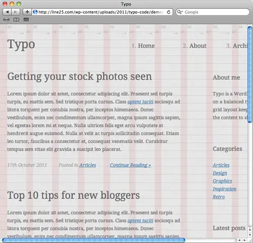
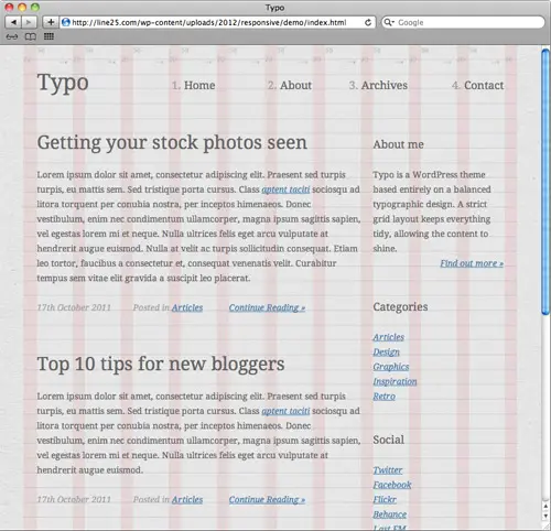
If you cast your mind back to late 2011, we went through the process of designing, coding and building ‘Typo’ into a complete WordPress theme. The design lends itself quite well to a responsive layout, so we’ll use the HTML and CSS as a base to transform the static layout into a responsive layout that will adapt to various viewport sizes.
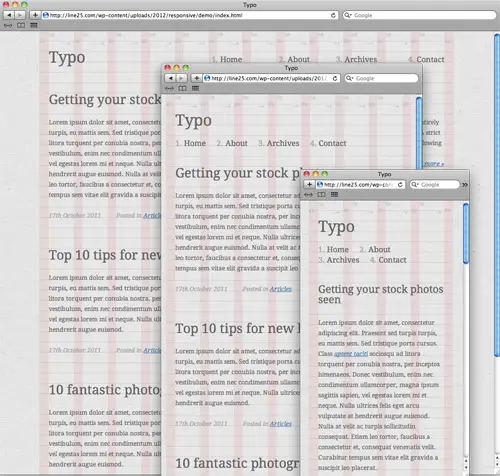
When the viewport size of our browser is reduced on the original demo file we’ll see the site is cut off and ugly horizontal scrollbars are added. The idea of a responsive layout is to adapt to these various viewport sizes so the design remains legible. Smartphones and tablets will automatically scale the original website to fit, but creating specific layouts for those smaller resolutions will allow the site to be read easily without the need for zooming.
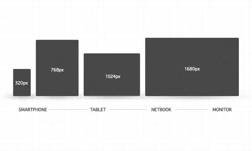
The first step to creating our responsive layouts is to plan out what resolutions we’re going to cater for. Common resolutions include the 320px portrait width of smartphones, 768px portrait width of tablets, 1024px landscape width of tablets (and typical netbook resolutions) as well as various desktop monitor resolutions. It’s worth mentioning that a layout that only caters for preset resolutions is often referred to as being ‘adaptive’, whereas a truly ‘responsive’ layout will be built using ems or percentages, allowing an infinite level of scaling.
<link href="mediaqueries.css" rel="stylesheet" />
We can then get started with CSS media queries to add the responsive functionality to our design. I’m adding the media queries and additional declarations to a separate CSS file, but they could be added to your main stylesheet.
<meta name="viewport" content="width=device-width; initial-scale=1.0">
We’ll also need to prevent the iPhone from automatically scaling the website to fit its screen, so this handy meta tag will tell Safari on the iPhone to set the device width to the size of its viewport.
@media screen and (max-width: 960px) {

}
The width of the original layout is 960px, so any resolution below this value will generate horizontal scrollbars and cut-off the content. Therefore the first of our media queries will target screens with a width of less than 960px;.
@media screen and (max-width: 960px) {
	#container, footer {
		width: 758px;
	}

	#content {
		margin: 0 20px 0 0;
	}

	#sidebar {
		width: 212px;
	}
		#sidebar section {
			clear: left;
		}
		#sidebar #search #searchbar {
			width: 152px;
		}
}
The next most popular resolution under 960px width is 768px to cater for portrait tablet screens. This Typo design is built using a grid, so to stay true to the layout we can simply remove a column to leave a width of 758px. The original layout can then be narrowed down to fit by reducing the margin on the content div as well as reducing the overall width of the sidebar.
@media screen and (max-width: 758px) {
	#container, footer, #sidebar {
		width: 524px;
	}

	header nav {
		clear: left; float: none; overflow: hidden;
	}
		header nav li {
			width: auto; margin: 0 25px 0 0;
		}

	header {
		margin: 0 0 44px 0;
	}

	header h1 {
		margin: 0 0 24px 0;
	}

	#sidebar section {
		float: left; clear: none;
	}
		#sidebar #social {
			margin: 0 20px 47px 0;
		}

	#sidebar #search #searchbar {
			width: 464px;
	}
}
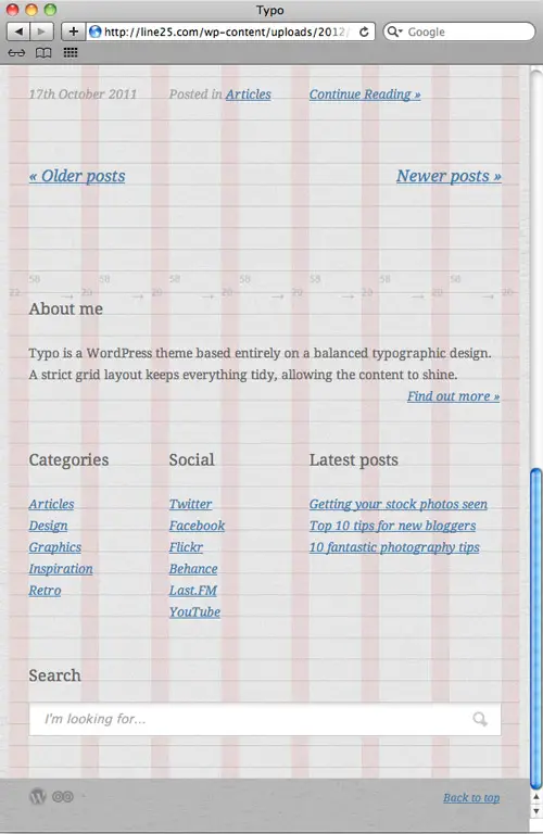
The value of 758px can then be used for the next media query, so anything smaller than this size will trigger the next layout. At this point the sidebar is too narrow to be made any smaller, so instead it can be naturally flowed underneath the main content when the grid is narrowed by a few more columns. This means the actual sidebar div’s width can be increased to fill the width of the new layout and its child elements floated to fill out the extra horizontal space.
Other areas such as the header have become too narrow to hold the logo and navigation side by side, so the navigation elements are altered to span the width of the layout on a new line.
@media screen and (max-width: 524px) {
	#container, footer, #sidebar, #content {
		width: 292px;
	}

	#content article h2 {
		font-size: 24px;
	}

	#content .postinfo li {
		margin: 0 10px 0 0;
	}

	#sidebar #social {
			margin: 0;
		}

	#sidebar #search #searchbar {
		width: 230px;
	}
}
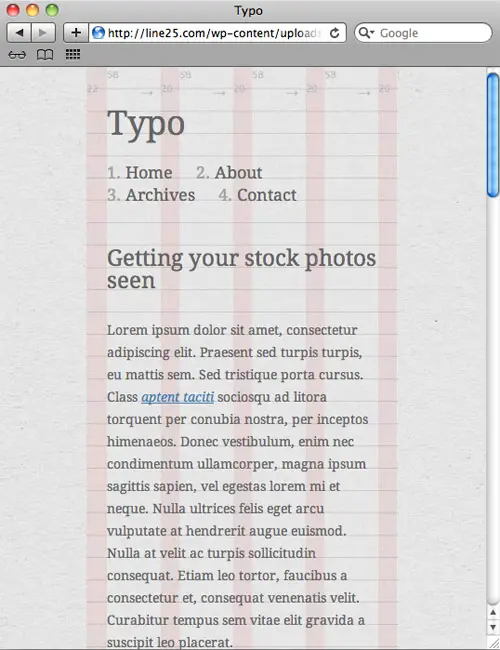
The third and final media query in our responsive layout will cater for extremely small resolutions such as smartphones. This particular layout is narrower than the original content width, so this div also needs altering with a new declaration in the media queries CSS file. The extremely narrow view has dropped each of the post-info links on a new line, but decreasing the margin between them helps repair some of the floats.
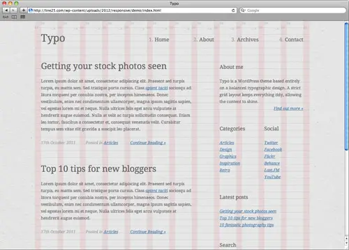
Thanks to these three sets of media queries our website layout is now responsive enough to cater for common viewport sizes and will aid readability by generating a designed layout in place of scrollbars or a scaled view. View the demo and scale your browser to see the responsive layouts for yourself.

It’s really helpful and wonderful tutorial, thanks
Thanks !
I have done with my website
google friendly website
Thanks for useful the tutorial. A great help for newbie as I am.
Thank you for this nice tutorial. By the way, Dreamweaver CS5.5 partly do it for you. I also heard that @media, @screen, @mobile etc. are not recognized by all devices, mostly older one. What I do when I design a website is add 3 different css without mention any of media above. We cannot forget that there are still many "flip-flap" mobile users. I make mobile sites, which will scale up to 240px so those with ordinary phones can see content on their devices as well.
Nice article
Thank you so much for the powerful tutorial. It helps my job easy.
Great tutorial. Simple and straightforward. I have used these techniques. Most of them started whether using 1024px until down to smartphones resolution. Nobody bold enough to give a tutorial starts from big resolutions like wide monitors and tvs. Hopefully somebody can start this.
This is a very helpful tutorial. Your articles always are in the simplest form so everyone could understand. Thank you so much. This is a great help for us beginning to explore the web design.
Thanks for taking the time to put this together. I was looking for something similar. This is great and very helpful!
Thanks for the info. I’ve been comparing top web hosts on my new blog, come check it out and pick the best for yourself. I thinking about redoing the whole site, let me know what you think.
I’m adding the media queries and additional declarations to a separate CSS file, but they could be added to your main stylesheet.
its relay useful, I was looking for the same :)
Hey!
The information you provided is very good.Thanks for sharing your post.I will recommend your post.
For crappy browses (IE8 or less) You can use this little polyfill. Although I don't think any tablet or smart-phones use IE6 as a preferred browser on their phone so there's not really need for it to adapt in IE8 or less. anyway here is the code
<!–[if lt IE 9]>
<script src="https://css3-mediaqueries-js.googlecode.com/svn/trunk/css3-mediaqueries.js"></script>
<![endif]–>
thank you for your easy following tutorial and it is very use full tutorial
Very useful tutorial. Thanks Chris!
If you owe the lending company $100 that's your condition. In the event you owe the financial institution $100 million, which is the bank's problem.
The trick of economic would be to have some understanding that nobody knows.
Thanks for creating this easy to follow tutorial and including a demo with it..that's exactly what I needed!
Hi!
Thanx a lot for tut. btw, this solution don't work on IE, isn't it?
I am very happy to read your articles it’s very useful for me,
and I am completely satisfied with your website.
All comments and articles are very useful and very good.
Your blog is very attention-grabbing. I am loving all of the in
turn you are sharing with each one!…
<a href="https://www.Laabhaa.com" title="Website Designing in Indore"
target="_blank">Website Designing in Indore</a>
Great post – really easy to follow and straightforward explanation! Cheers :)
As always Mr Spooner you explain things so easily, thanks again for another great tut.
Great and simple walk-through !
Thanks
Nice article! Thanks for sharing.
Btw, have you a portofolio in a self-promoting site like https://www.peopleperhour.com ?
I would use your opinion about it, if you ever have the time. ^_^
Keep on the good work!
Thanks for the tutorial. It may become useful in the future.
Hi Chris, nice article, i have tried few responsive layout using media queries, your tutorial is i will try this one.
Thanks, Chris! I posted this one for my students!
So freakin' co-incidential! I just worked on a website and was looking up for a way for media queries! Thanx a ton! :)
Scaleability is gonna help a lot!
*Bookmarked!*
Just started doin site like this, however regarding jqueryscrolling banners menusas dropdowns or fancy scrolling header banner is that able to be made responsive?
wow…you read my mind! I'm designing my first responsive site and I needed tutorials for the coding. Thanks!! :)
Hi Chris thanks for the great step by step tutorial. I've added it to the RWD resource list over on our site. https://responsivedesign.ca/developer-resources/articles
Oh, this site is awesome, thank you a lot
Cheers for that, had been thinking of looking into scaleability for web designs.
Chris, you are the MAN!!! Thanks for taking the time to write this.
Really helpful article, thanks for sharing
Really very helpful! Thanks for your excellent tutorial, Chris!
An excellent guide to make all those website mobile and tablet compatible. Nowadays it is must to get those websites look similar in all major device in order to facilitate easy scrolling of web page.
This is great! You always simplify everything as much as possible which is awesome! Wish this article was about a few months back when I was proper confused on this subject.
The only thing I would say is that some people will say this is more of an adaptive layout as the layout adapts to specific sizes. It would be more of a responsive layout if you used percentages for sizes rather than pixels.
p.s I way prefer adaptive designs
This is ow so helpful, thank you!!!