Line25 is reader supported. At no cost to you a commission from sponsors may be earned when a purchase is made via links on the site. Learn more
In a recent redesign of my own personal blog I decided to use a calendar style icon to display the post date . It’s one of those elements that would once have been created with background images, but now thanks to the wealth of CSS3 features it can be created entirely in CSS3. We’ll be using properties such as linear-gradients, border radius and box shadow to replicate the icon’s original Photoshop design.
The Photoshop concept
Many designers have taken the route of designing directly in the browser, but I’ll always be a fan of creating design concepts in Photoshop. Even though many of the effects can now be created directly in CSS, life is made much easier when you can simply copy across the figures from Photoshop’s layer styles, rather than testing out different effects by constantly changing your CSS syntax.
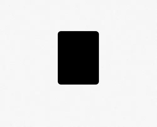
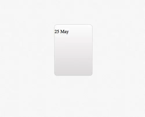
Begin by creating a rounded rectangle as the base of our calendar icon. Set the corner radius to 10px in the header. This is one figure we’ll be copying across to the CSS later, under the border-radius property.
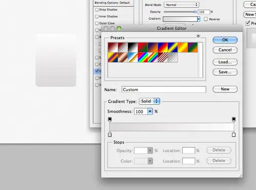
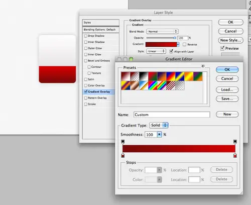
Add a Gradient Overlay layer style to the rectangle, using a vertical gradient running from #dad8d8 to #fcfcfc;
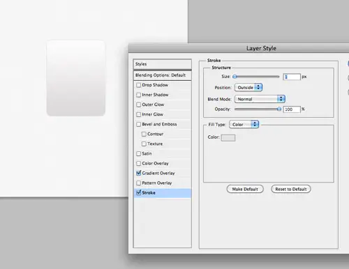
Give the icon a fine 1px Stroke using the colour #e3e3e3 to define its edges.
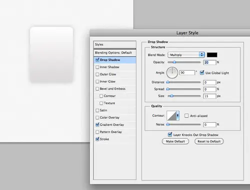
Finally add a Drop Shadow effect and adjust the sliders to 20% opacity, 0px Distance and 15px Size. These figures will come in handy when setting up the box-shadow property later.
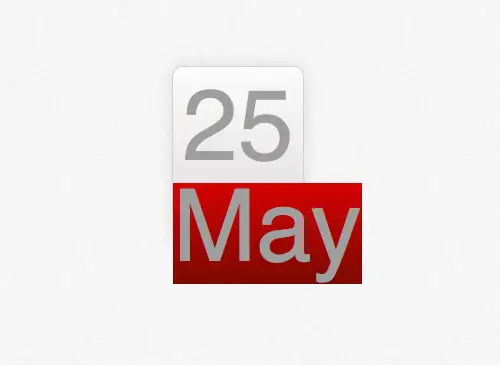
Duplicate the rectangle layer and delete away the upper portion. Change the Gradient Overlay colours to #790909 and #d40000 to create a red strip where the month will sit.
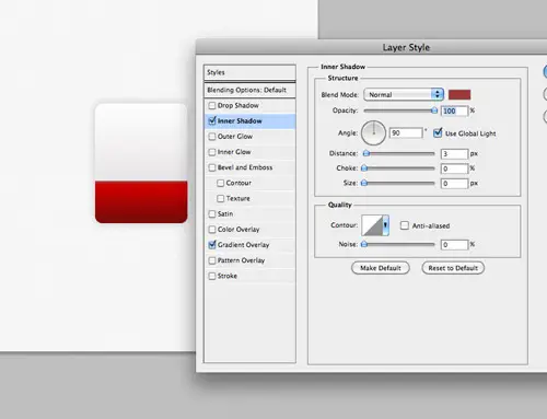
Configure an Inner Shadow to represent a top border by changing the settings to #a13838 Normal, 100% Opacity, 3px Distance and 0px Size.
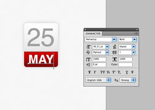
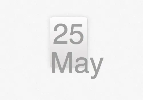
Use Photoshop’s Text tool to set up the date within the upper portion of the calendar icon. Here I’m using Helvetica in #9e9e9e;
Enter the month along the lower strip, changing the font settings to Bold and the colour to white.
This leaves our quick Photoshop mockup complete. Once upon a time we would export the background as an image then place HTML numbers over the top, but nowadays all these Photoshop effects can be created with CSS.
The HTML structure
<div class="date">
	<p>25 <span>May</span></p>
</div>
The HTML structure for this calendar icon demo is pretty simple. We’ll contain the date elements in a div with a class of “date”, then use a paragraph element to represent the date numbers. The day and month appear in different sizes in our design, so a simple <span> will give us a hook to target each one individually.
The CSS styling
.date {
	width: 130px; height: 160px;
	background: #fcfcfc;
	background: linear-gradient(top, #fcfcfc 0%,#dad8d8 100%);
	background: -moz-linear-gradient(top, #fcfcfc 0%, #dad8d8 100%);
	background: -webkit-linear-gradient(top, #fcfcfc 0%,#dad8d8 100%);
}
The CSS styling begins by setting the overall width and height of the object, taking measurements from the Photoshop design. The CSS gradient can then be easily replicated by copying over the hex colour values into a CSS3 Gradient Generator.
.date {
	width: 130px; height: 160px;
	background: #fcfcfc;
	background: linear-gradient(top, #fcfcfc 0%,#dad8d8 100%);
	background: -moz-linear-gradient(top, #fcfcfc 0%, #dad8d8 100%);
	background: -webkit-linear-gradient(top, #fcfcfc 0%,#dad8d8 100%);
	border: 1px solid #d2d2d2;
	border-radius: 10px;
	-moz-border-radius: 10px;
	-webkit-border-radius: 10px;
}
The thin 1px stroke from the Photoshop document can then be added using the border property, then the rounded edges are added using border-radius. Don’t forget to include vendor prefixes to enable the effects on the older versions of supporting browsers.
.date {
	width: 130px; height: 160px;
	background: #fcfcfc;
	background: linear-gradient(top, #fcfcfc 0%,#dad8d8 100%);
	background: -moz-linear-gradient(top, #fcfcfc 0%, #dad8d8 100%);
	background: -webkit-linear-gradient(top, #fcfcfc 0%,#dad8d8 100%);
	border: 1px solid #d2d2d2;
	border-radius: 10px;
	-moz-border-radius: 10px;
	-webkit-border-radius: 10px;
	box-shadow: 0px 0px 15px rgba(0,0,0,0.1);
	-moz-box-shadow: 0px 0px 15px rgba(0,0,0,0.1);
	-webkit-box-shadow: 0px 0px 15px rgba(0,0,0,0.1);
}
The final snippet of code to add to the “date” div is the box-shadow property to replicate Photoshop’s Drop Shadow effect. Add 0px for the horizontal and vertical offset, then use the 15px value from Photoshop’s Size option as the blur of the box-shadow code. The opacity from Photoshop can then be copied using the rgba colour mode, setting 0.1 as 10% for the alpha figure.
.date p {
	font-family: Helvetica, sans-serif;
	font-size: 100px; text-align: center; color: #9e9e9e;
}
The font styling for the date can then be added to the paragraph element. The font, size and color are copied from the Photoshop file, then the alignment is set to center using text-align. These declarations are also affecting the month from the date value, but these can be reverted by targetting the span individually.
.date p span {
	background: #d10000;
	background: linear-gradient(top, #d10000 0%, #7a0909 100%);
	background: -moz-linear-gradient(top, #d10000 0%, #7a0909 100%);
	background: -webkit-linear-gradient(top, #d10000 0%, #7a0909 100%);
}
The red strip is created by adding a new linear-gradient to the background of the span, this time using the red color values from the Photoshop document.
.date p span {
	background: #d10000;
	background: linear-gradient(top, #d10000 0%, #7a0909 100%);
	background: -moz-linear-gradient(top, #d10000 0%, #7a0909 100%);
	background: -webkit-linear-gradient(top, #d10000 0%, #7a0909 100%);
	font-size: 45px; font-weight: bold; color: #fff; text-transform: uppercase;
	display: block;
}
The font styling is altered to match the calendar icon design by changing its size to 45px, its weight to bold, color to white as well as being set to uppercase using the text-transform property. Changing the span to a block element will also allow it to fit to the size of its container, filling the area with the red background.
.date p span {
	background: #d10000;
	background: linear-gradient(top, #d10000 0%, #7a0909 100%);
	background: -moz-linear-gradient(top, #d10000 0%, #7a0909 100%);
	background: -webkit-linear-gradient(top, #d10000 0%, #7a0909 100%);
	font-size: 45px; font-weight: bold; color: #fff; text-transform: uppercase;
	display: block;
	border-top: 3px solid #a13838;
	border-radius: 0 0 10px 10px;
	-moz-border-radius: 0 0 10px 10px;
	-webkit-border-radius: 0 0 10px 10px;
	padding: 6px 0 6px 0;
}
All that’s left is to add the subtle top border, using the simple border-top CSS property, as well as rounding off the lower two corners with the border-radius property. A touch of padding then helps align the text by creating an even gap above and below the month text.
Browser inconsistencies

Despite all these advances in CSS that allow us to replicate Photoshop effects with gradients and shadows, we’re still met with the same old web designer’s nightmare that every browser renders your code differently. Firefox looks considerably worse than the others, but some quick and dirty Mozilla only CSS will help pad the texture down to even the gaps in its layout.
@-moz-document url-prefix() {
    .date {
        padding: 16px 0 0 0;
    }
    .date p span {
    	padding: 9px 0 3px 0;
    }
}
(I tried all kinds of line-height variations to try and get things to match up, with no success. As far as I’m aware there’s no real solution to these inconsistencies, but do let me know down in the comments if I’m overlooking anything. This is always the main problem I run into during my own web design projects.)
WordPress implementation
<div class="date">
	<p><?php the_time('d'); ?> <span><?php the_time('M'); ?></p>
</div>
Using this kind of icon in your WordPress theme is easy, just switch out the static date figures for WordPress the_time(); tags. Use the PHP date manual to choose the correct syntax to render out the right information (EG: “F” for April or “M” for Apr).
The completed icon
Our little CSS calendar icon is now complete. In a normal project this would all be included in your site’s CSS stylesheets, but in the case of this tutorial you can view the CSS icon in its own demo.
Comments are closed.