Line25 is reader supported. At no cost to you a commission from sponsors may be earned when a purchase is made via links on the site. Learn more
Whenever we start work designing a website one of the first things we always do is throw a bunch of colors and textures onto the canvas, but sometimes a design will benefit from the clean and crisp appearance of a pure white background.
This showcase rounds up 20 minimal website designs that prove that sometimes less is more. You may also want to check out ultra-minimal website designs that emphasize key pieces of information, images, and more!
Websites with Clean White Backgrounds
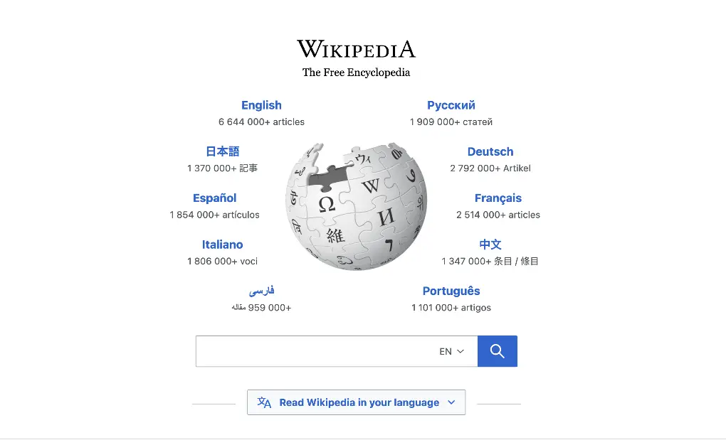
Some selections here may have updated their website since this post was originally published and may no longer show the white background. However, there are still some great examples listed here. Other great examples of websites that use just a pure white background are Wikipedia, Apple, Duda, UpWork, and Weebly.
Valdama
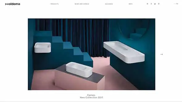
This white website design has a large slider on the homepage and a very simple and minimalist layout.
Ben Ashman
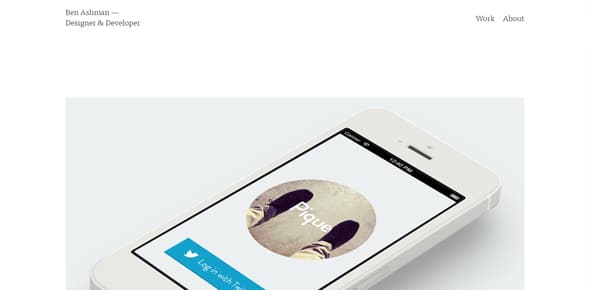
This is another simple, yet beautiful white website design with a clean layout and pixel-perfect photos.
iArk
This website has a clean, white background which focuses the visitors’ attention on the beautiful, large, wide photographs and sliders.
Manggis
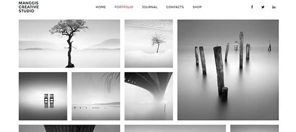
Manggis is a creative WordPress theme that you can use for portfolios or blogs. The photos look beautiful on a white background.
Friends of the Web
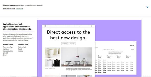
This website combines the benefits of white space and clean white backgrounds with some colorful flat-color accents. Looks beautiful!
Elegance
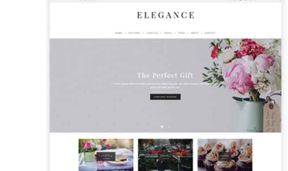
Elegance is a clean and elegant WordPress blog theme perfect for various niches. This multipurpose theme will fit any blog due to its white, clean design.
Willow
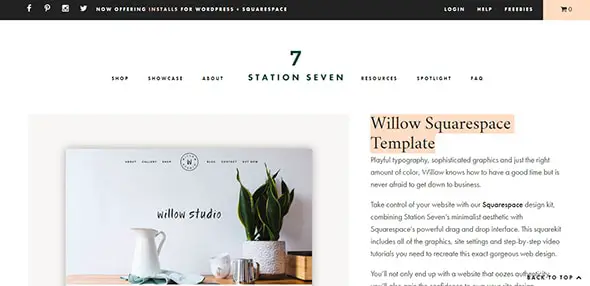
This Squarespace template has a minimalist, white design that offers a comfortable reading experience, which makes it perfect for blogs and online magazines.
Repetto Design Concept
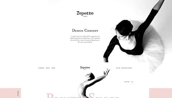
This website design has a white color palette, with monochrome, light images, and pink as an accent color.
Caress
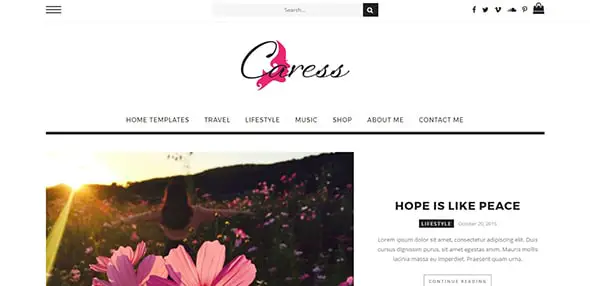
Caress is an elegant WordPress theme with a modern design and a predominantly white color palette. Use this template to quickly build professional websites.
Andrew Revitt
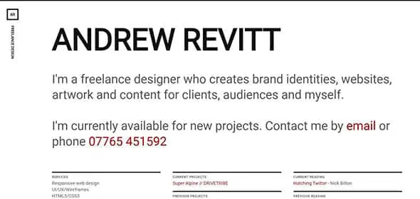
Andrew Revitt is a freelance designer working in web, graphic, branding, UI, and UX design. For his portfolio website, he chose a black and white, minimalist design.
Big Bite Creative
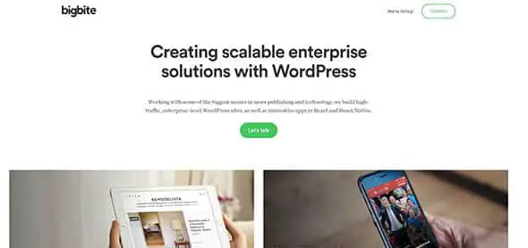
This website has a white background with green color accents for the most important elements, such as buttons and CTAs.
Electric Pulp
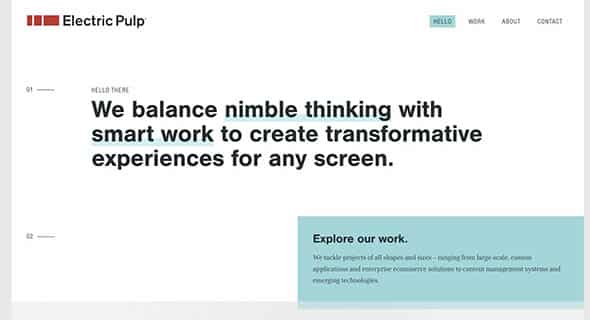
Electric Pulp is a digital agency focusing on Responsive Web Design, Web Development, and Mobile eCommerce. They have a white website design with large fonts and solid color elements.
Helen & Hard
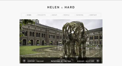
This website uses a very light gray shade as a background. It has a slightly retro theme due to some vintage-inspired details and a very clean layout.
Yaron Schoen
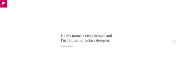
Simple and straightforward, these are the main characteristics of this clean, white portfolio website of a human interface designer.
b14
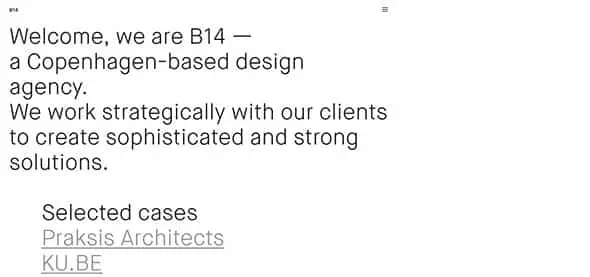
This is another example of an extremely minimalist website design that has only large text over a completely white background.
Eric Paul Snowden

This website design combines light gray tones with pure white on the background. The images pop out nicely and are the main focus of the page.
Daisho
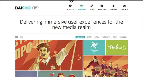
Daisho is a portfolio solution for creative professionals and companies looking for a minimal and professional look. They have a white presentation website with a few accent colors.
Hanzell Vineyards
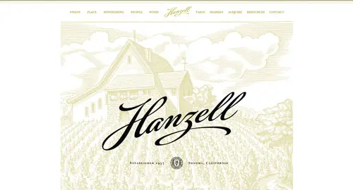
Here’s another vintage-themed website design with a modern touch and a clean white background.
Trent Walton
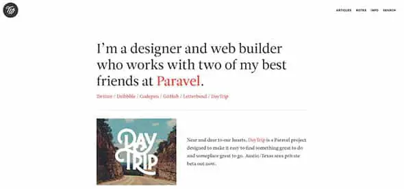
This is the portfolio of a designer and web builder. It has a white, clean background, a wide content area layout, and an overall minimalist style.
Additional Resources:
Editor X: This powerful website creation tool provides minimalistic and clean wireframes with white space as a starting point as well as templates.
FixThePhoto: Their featured post on product photography backdrops can be very helpful with your eCommerce project.
Envato Market: Here you can find WordPress themes that are clean, with white backgrounds to start with, and minimalistic.
Comments are closed.